Blog
65 Conversion Ideas for DTC Brands (Examples Inside)
Google conversion ideas for DTC brands, and you’ll find 1,000s of SEO-optimized articles. These articles have been written by content marketers who know how to rank for a whole variety of search terms. However these content marketers aren’t singularly focused on the subject of maximizing conversion rates for a DTC website. They’ve just been given the task of ranking for a search term.
This article follows none of those rules. This article was written by me: Rishi Rawat. I am a conversion optimization marketer who has been singularly focused on improving conversion rates for the last 16 years.
Hi, I’m Rishi.

Google may not love my conversion ideas for DTC brands article, but I’m pretty confident you will.
Every week, I spend at least six hours studying dozens of DTC websites. I am out on scouting trips to make note of clever techniques marketers all over the world are using to get the most conversion bang for their buck.
Here is a listing of all the ideas I’ve collected over the last 3 years. They aren’t in any particular order, so scan the whole list.
Ready?
1:
When one works so hard to attract visitors and showcase an assortment, it’s easy to forget to talk about why visitors should buy from you.
The why matters because pulling out one’s credit card on a new site is scary.
This visitor doesn’t know you’ve been in business for 15 years.
Or that 14,000 have bought from you.
They could walk over to your About Us page to learn more, but less than 5% do (I’ve checked).
So bring that trust-building content to them.
Add “why us” CTAs to your pages. Those interested will interact with it. Those who aren’t interested will ignore it.
When clicked, show your “why us” content as a page overlay. That way, when done, they’re still on the same page.
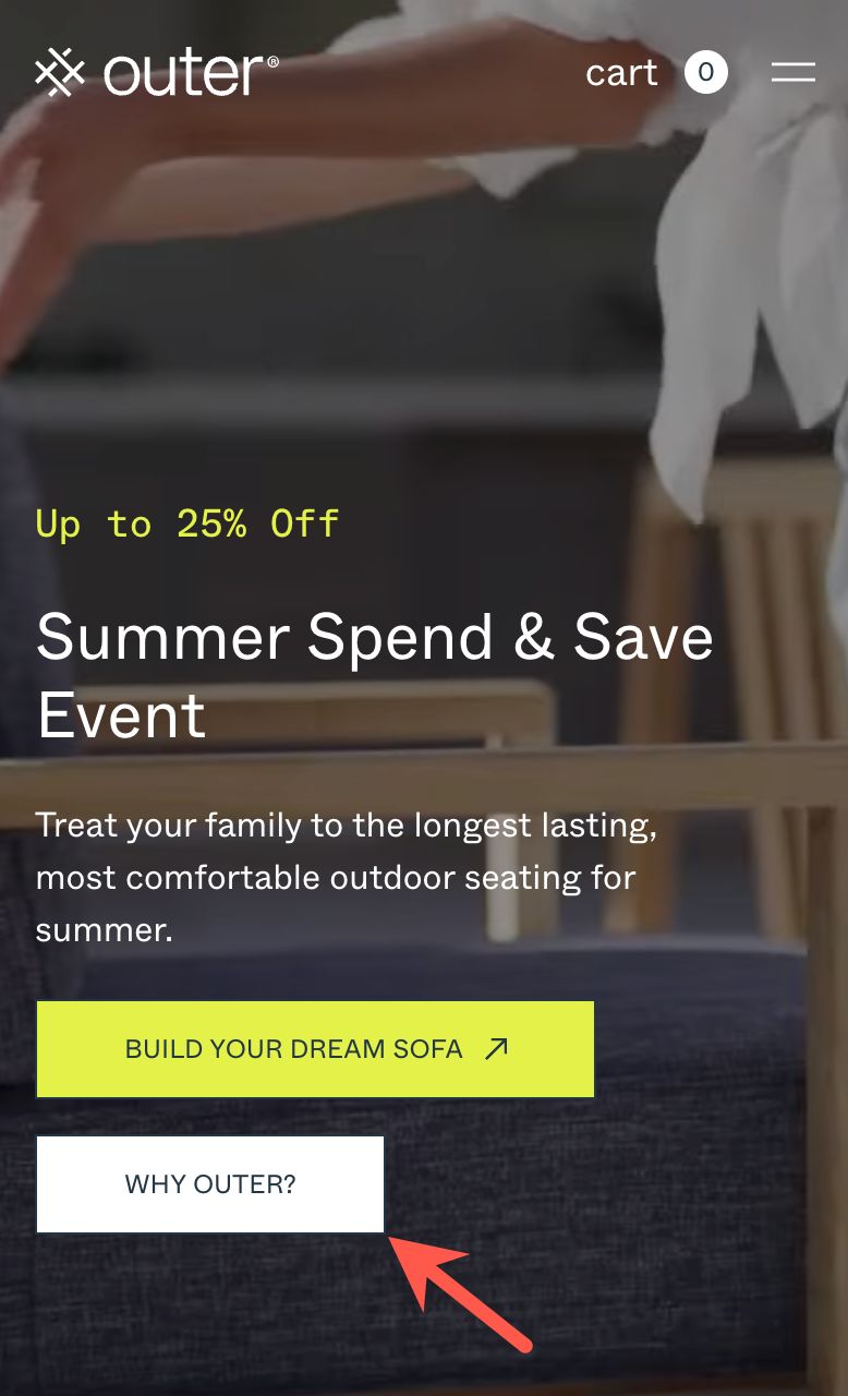
Check out the “why us” CTA on the Outer homepage:
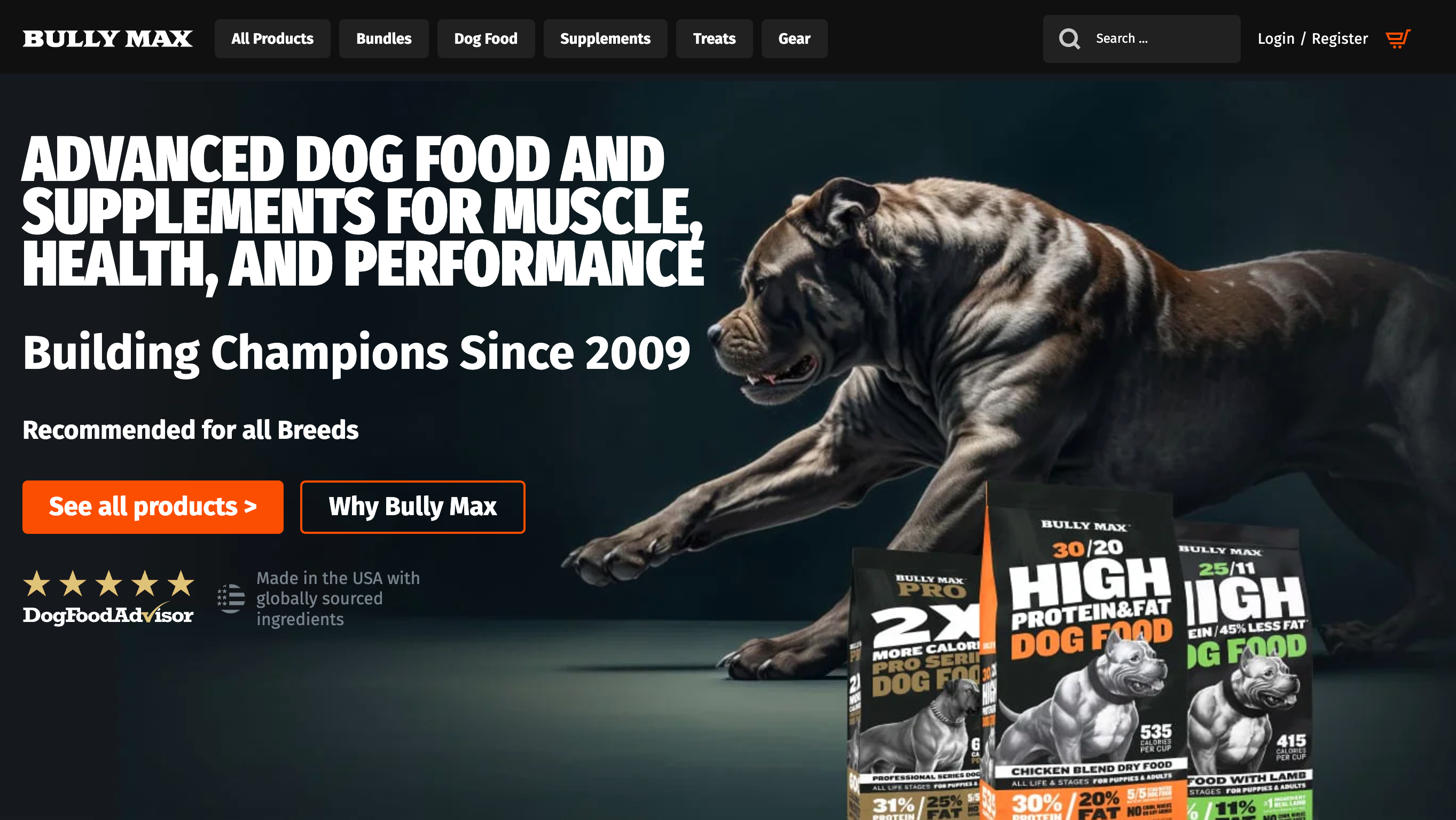
An example from Bully Max®:
2: Google Search CTA
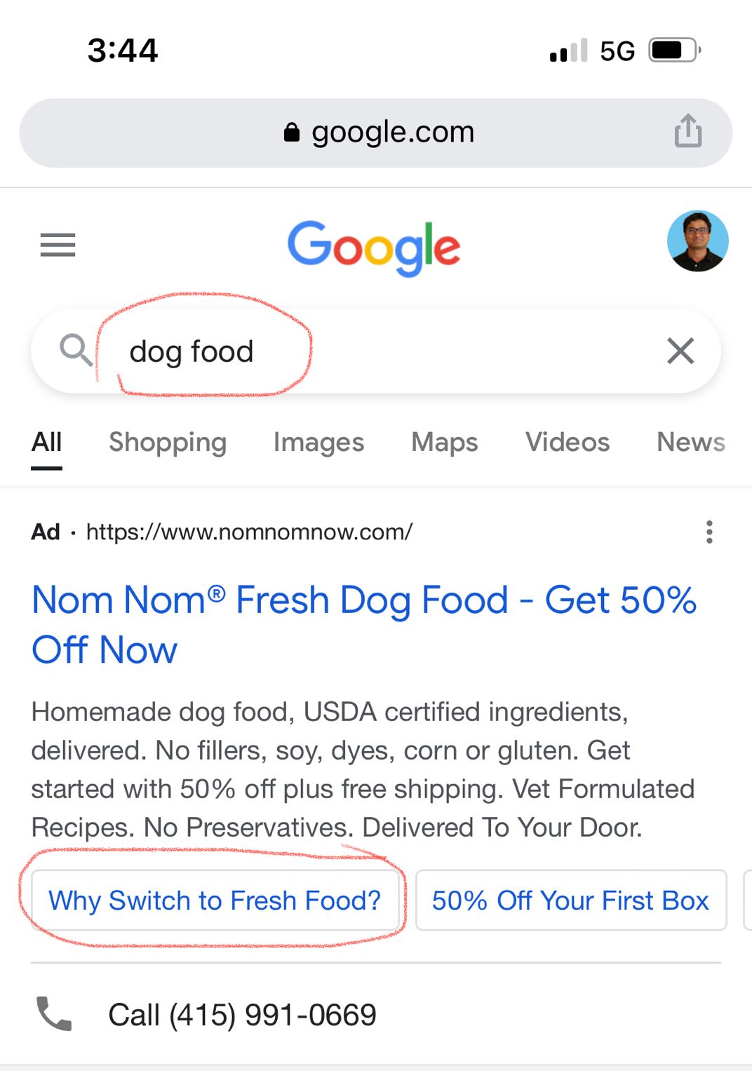
If you agree that the “Why Us” CTA on the homepage is a good idea, you should consider showing it in your ads.
Why? Because the number of people who see your ad is significantly larger than the group that clicks through to reach your homepage.
So if the “why us” CTA is working on the homepage, it makes even more sense to show it to the much larger audience that sees your ad. Like this site:
3: We’re Collecting More
We know review counts positively influence conversions.
But what is one to do when a product was launched 3 months ago and only has a few reviews?
This is a clever headline for the reviews section.
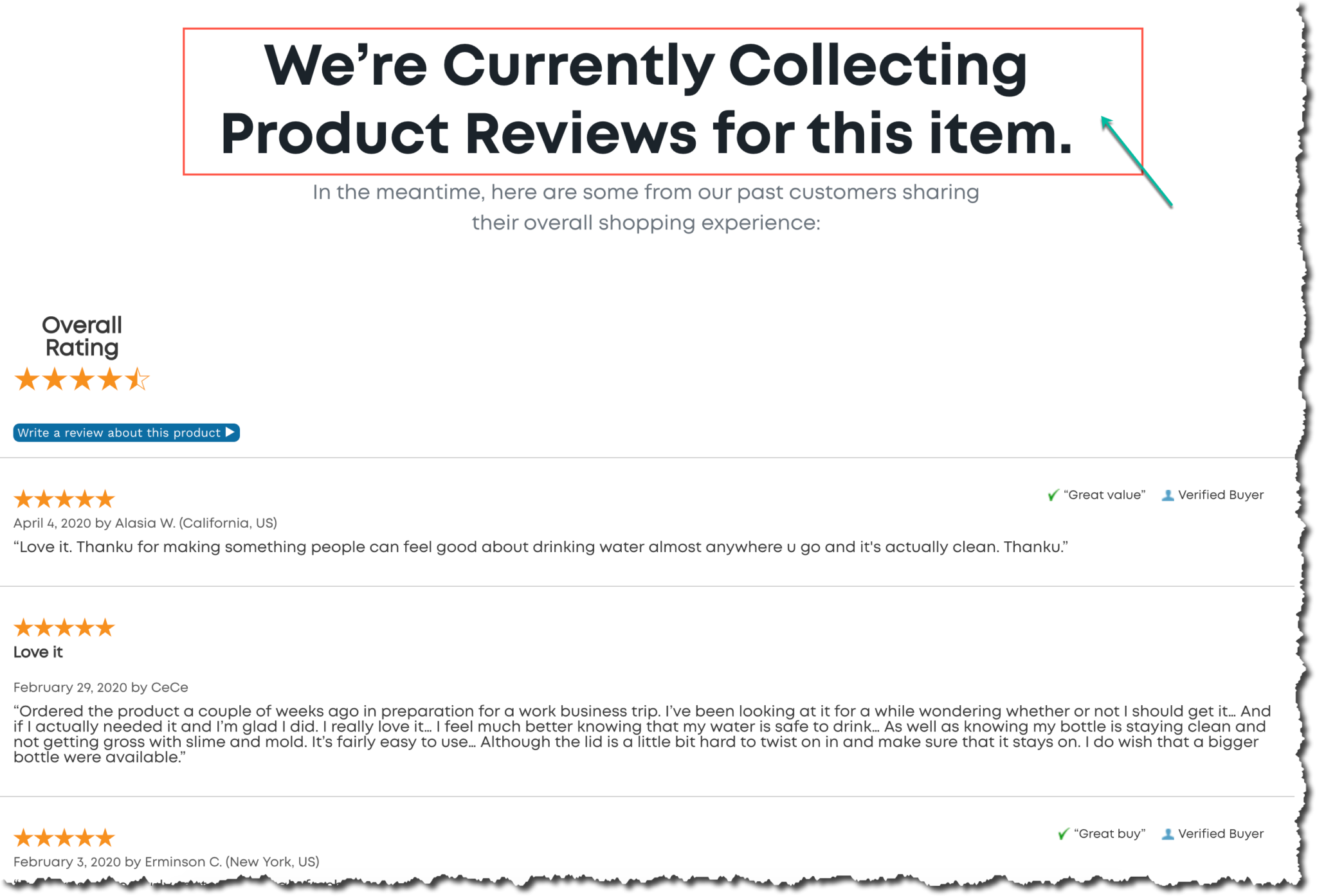
Why? Because it protects against the reader thinking, “Wait, they have just 12 reviews? 🤔”
This headline communicates “more on the way.”
4:
Test more crazy shape pop-ups.
You’ll be surprised by the results.
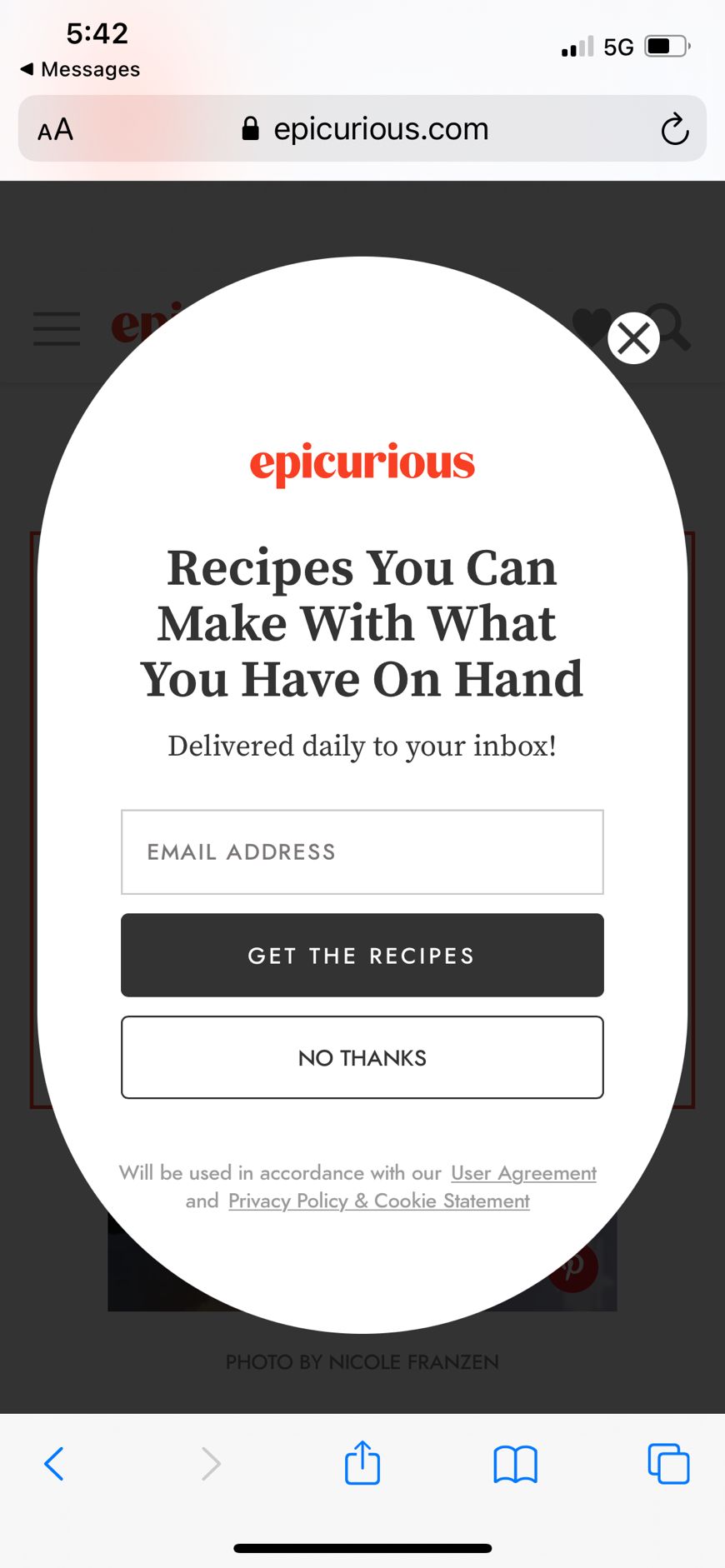
If you are interested in maximizing email signups via popups, we have 7 popup ideas for you to steal (we encourage it).
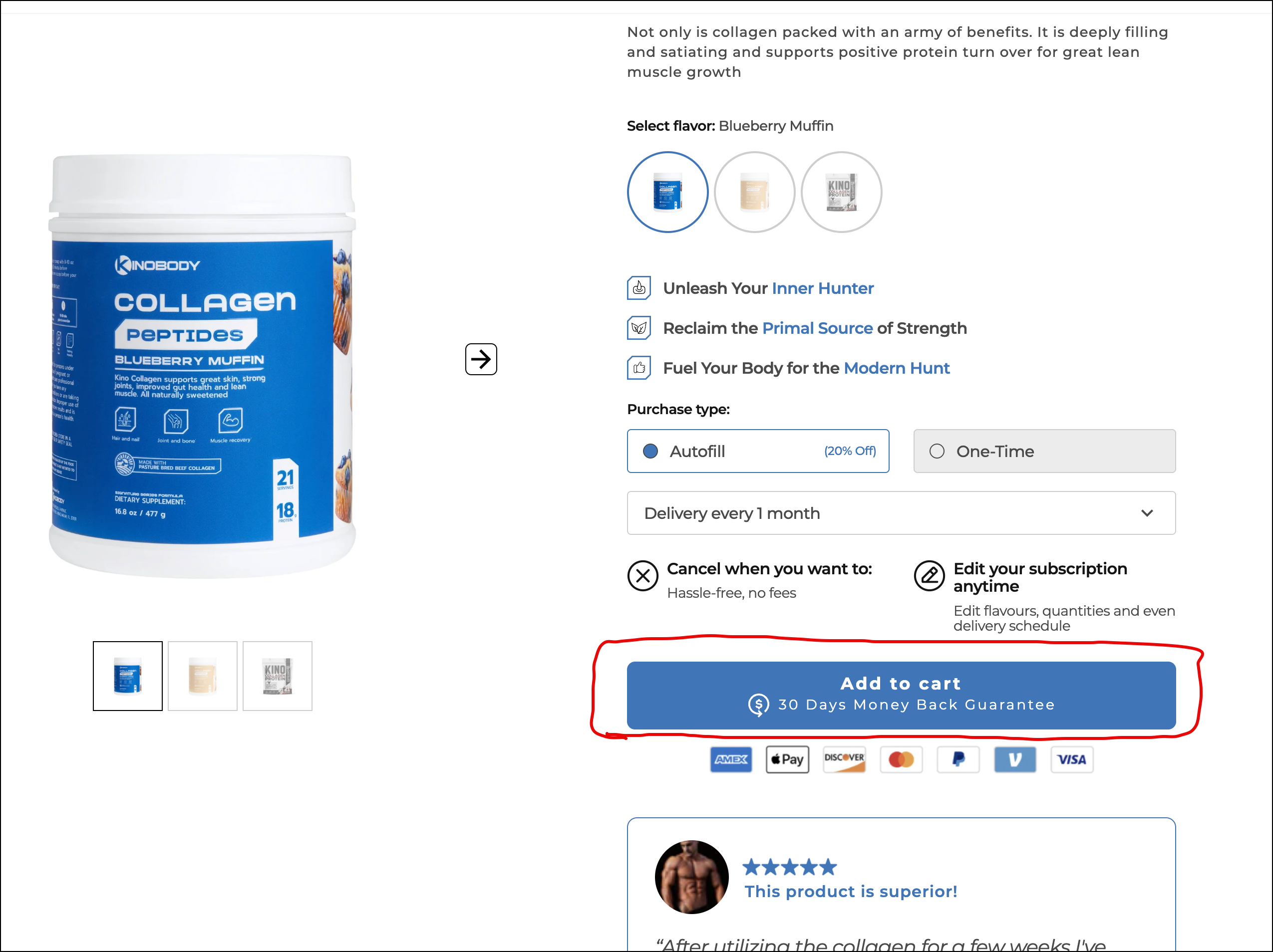
5: Return Assurance on Add to Cart Button
This isn’t an earth-shattering idea. It’s simple, but something I had never thought of before.
They’ve simply mentioned their return policy on their ‘Add to Cart’ button.
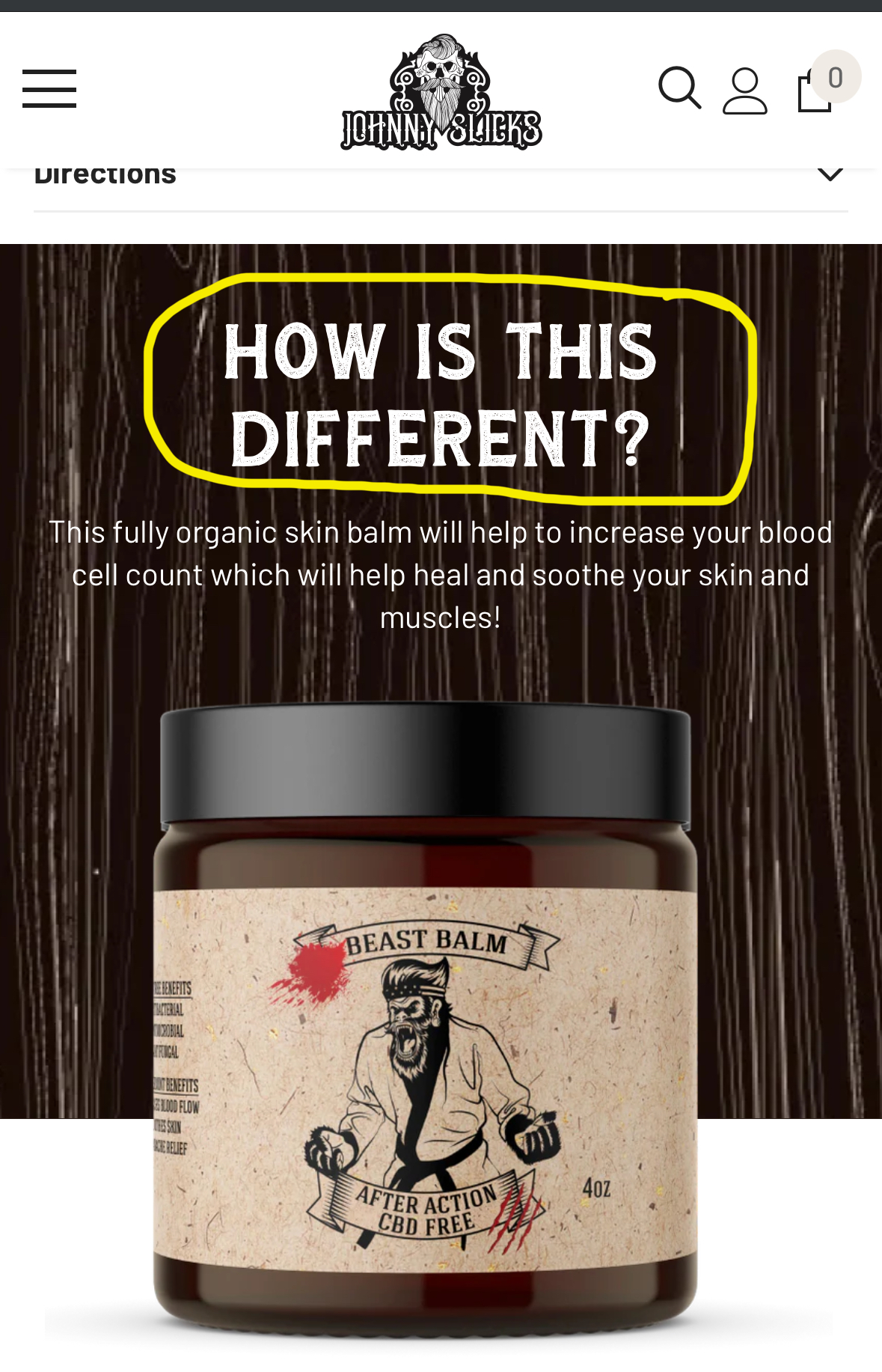
6: If You Are Selling Something People Think Is a Commodity
Every generic product (generic batteries, supplements, etc) should have a “how is this different” section in the PDP:
Another option is adding a section called “Why we made this”:


Since you like this article about conversion ideas for DTC brands, you’ll love my weekly newsletter.
Signup below. If it isn’t as good as I’m making it sound, unsubscribe with one click.
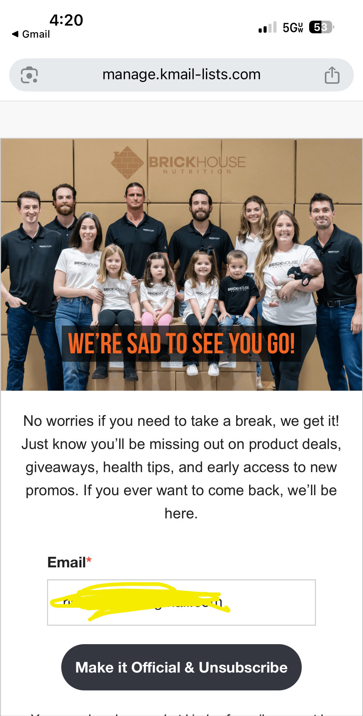
7: Clever Email Unsubscribe Message
Look at these guys, tugging at my heartstrings as I try and unsubscribe.
It’s actually a damn good strategy.
8: Audio Product Pages
The simplest way to boost conversion rates is to offer more alternatives.
The more options you provide, the higher the chance that one of them resonates with a specific type of buyer.
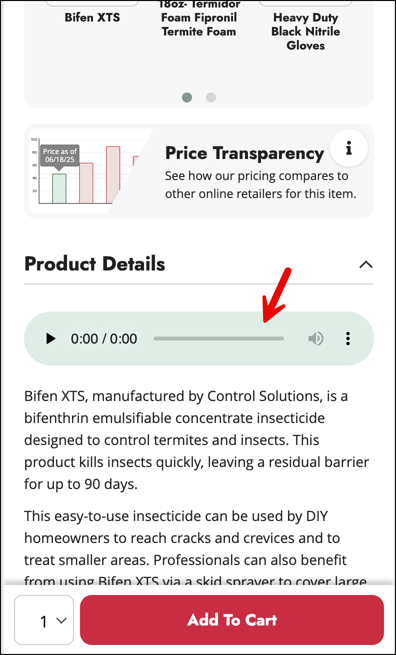
Product descriptions are great, but not everyone wants to read. Solutions Pest & Lawn includes an audio file explaining the product.
I love it because now the shopper has two paths. And even if only 10% of people listen to the audio, those are 10% of sales you were previously potentially missing.
9: If Your Product Page Review Counts Are Low
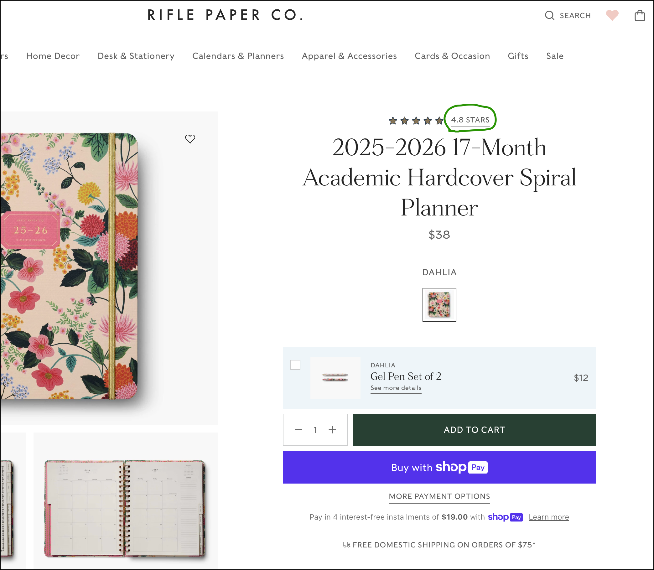
For products with an overall positive rating but a relatively low review count, this is a good strategy (see the image below).
It gives the shopper what they are looking for (that the item is liked) without drawing attention to the actual review count.
You can take this one step further and program your site so that products with fewer than 15 reviews use this method, and those with over 15 display the review count at that location.
10:
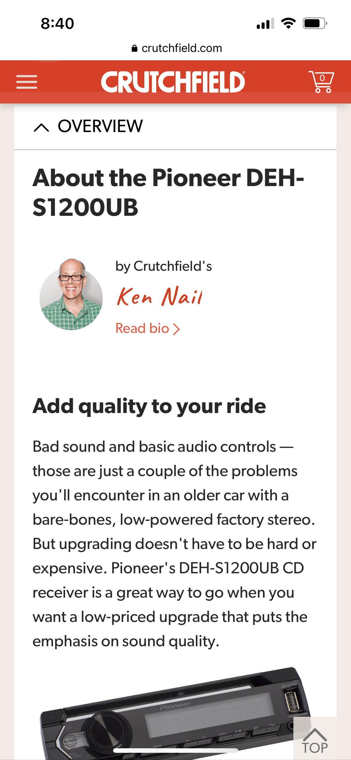
This is a product description on Crutchfield.com.
It’s such a genius idea to have the product described by a product expert on your team.
The shopper is reading an expert opinion 🆚 a marketer’s syrupy pitch.
Crutchfield.com has had this format for 15 years. Why haven’t other sites copied it? What’s wrong with them?
Steal this idea.
11:
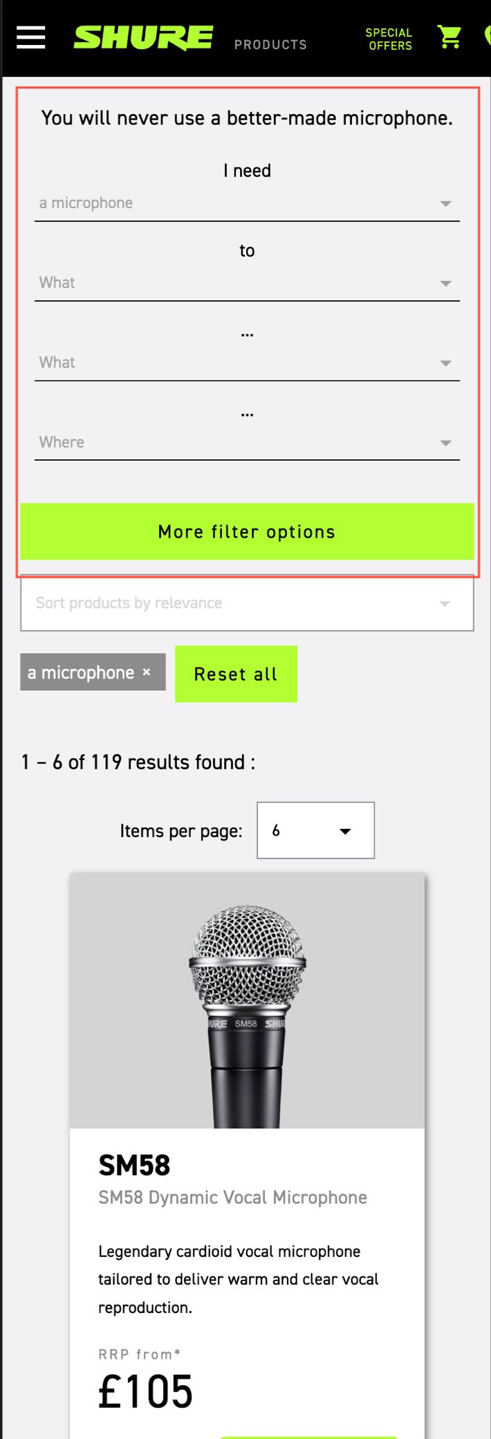
Really cool category page filter interface (outlined by the red box below):
This makes the filter a lot more conversational:
12:
Your PPC landing page matters:
– it’s the traffic you are paying for
– these are people looking for a solution
– if we don’t hook them quick, they’ll leave
I love this “The top X reasons why _______ is the best” landing page format.
It pulls in the casual visitor and compels her to check out all X reasons.
What makes it powerful?
This: copywriters know that getting visitors to linger 34 extra seconds massively impacts the probability of them buying. The whole game is getting the visitor down what Joseph Sugarman calls the “slippery slide.”
The “Top X reasons why _______ is the best” format helps get the visitor to linger just a little longer.


Since you like this article about conversion ideas for DTC brands, you’ll love my weekly newsletter.
Signup below. If it isn’t as good as I’m making it sound, unsubscribe with one click.
13:
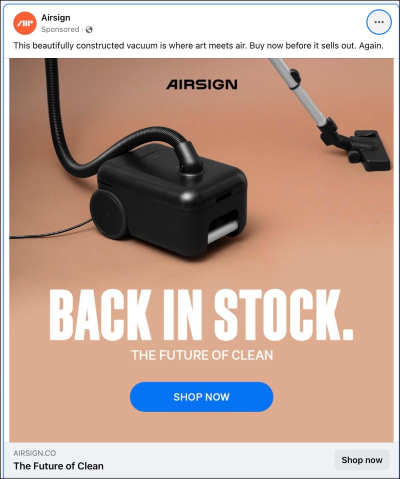
BACK IN STOCK is such a compelling message for an ad.
My brain 🧠 interprets it as, “This product is so popular it’s been out of stock. It’s currently in stock but may be out of stock soon because it’s so popular. Must investigate.”
14:
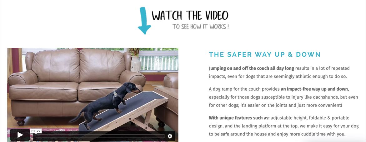
We assume that if a video is added to a page, people will see it.
Sometimes they do, sometimes they don’t.
Know what increases the odds of them watching your video?
Adding a prompt to drive attention to the video:
15:
Know the number 1 reason people don’t pull the trigger on your site? Concerns about cost.
Bean Products makes yoga-related items.
One of the emails in their sequence is laser-focused on price justification.
How brilliant.
Have you included a price justification email in your nurture sequence?

Learn more about price justification here: Increase Sales With Price Justification.
16:
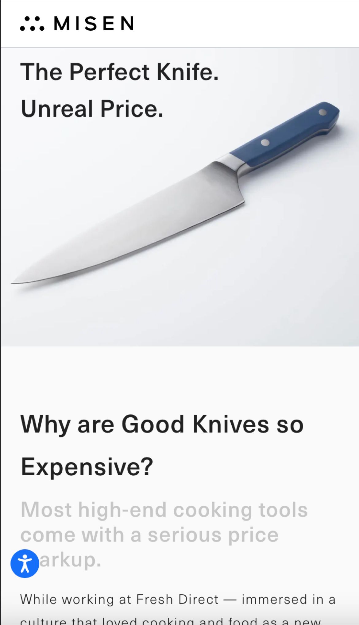
Addressing objections upfront is a great way to boost conversion rates:
17: Why did you buy?
A post-purchase survey is a no-brainer.
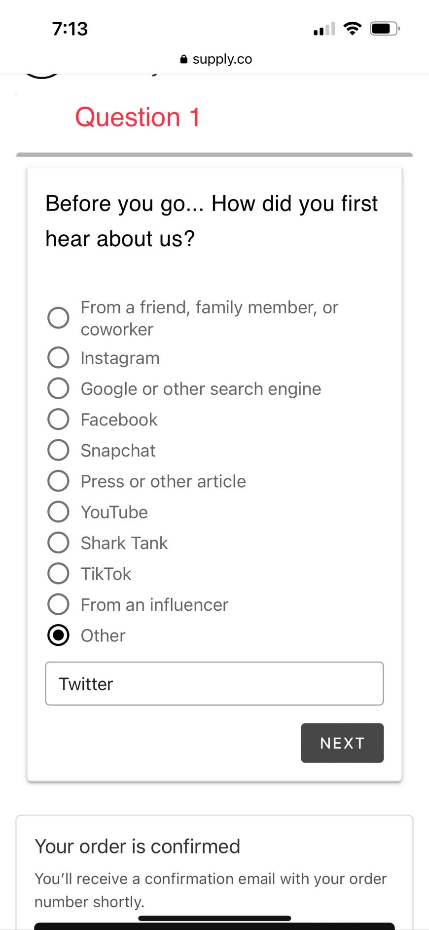
The customer has already completed their order. There’s no risk of disrupting the sale. That makes it the perfect moment to understand what actually drove the decision — and what almost stopped it.
I’ll take feedback from a verified buyer over anonymous site traffic any day.
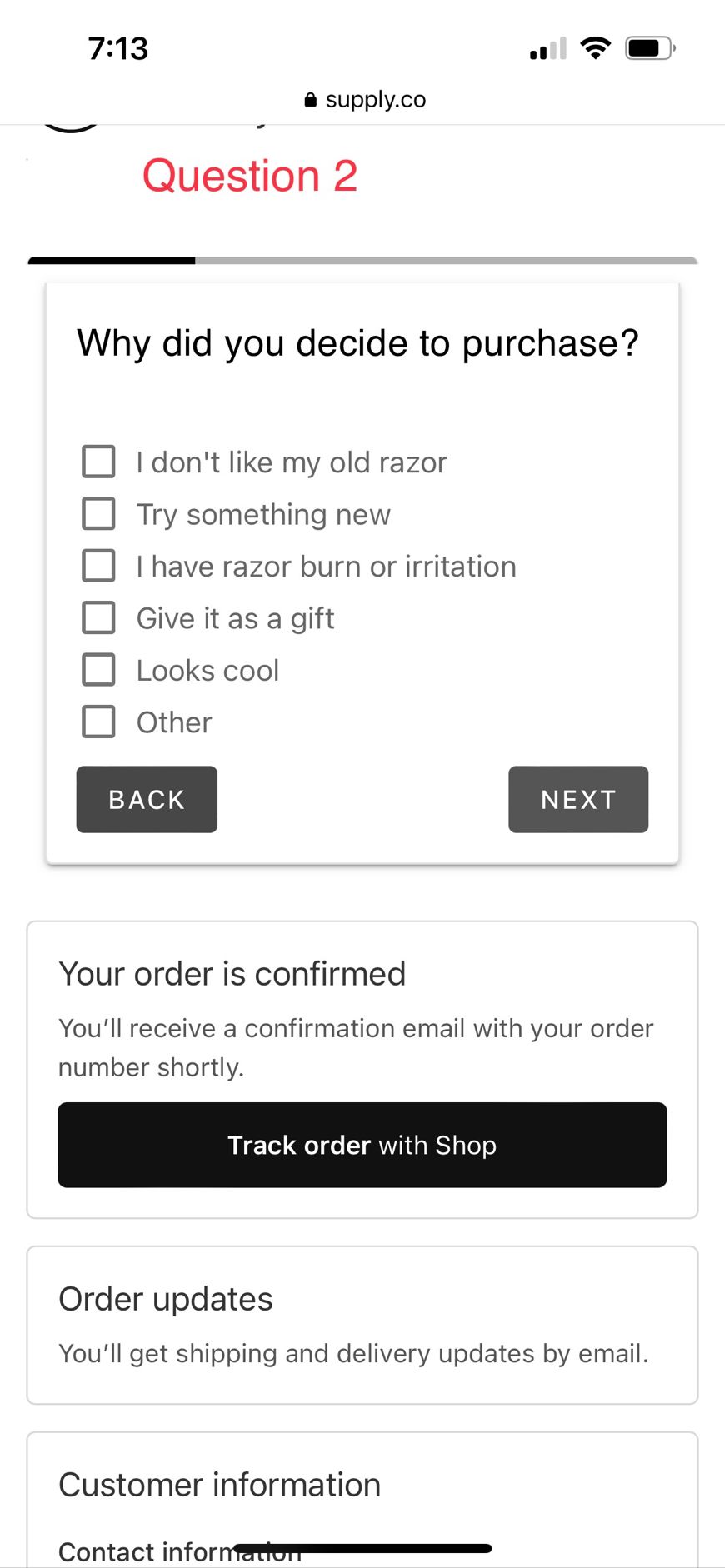
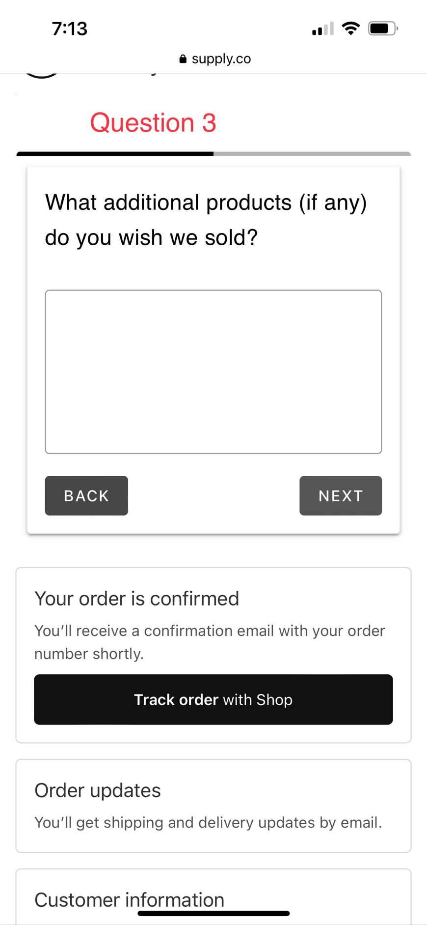
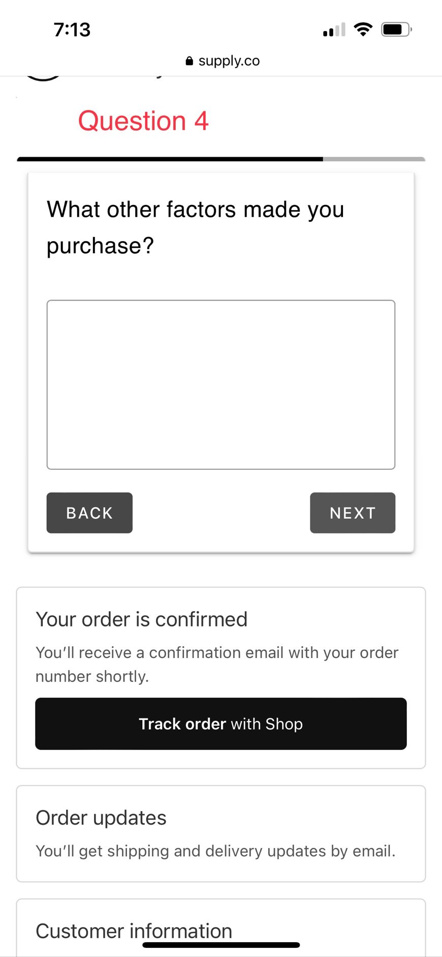
This survey appeared immediately after I submitted my credit card details:
Question 1:
Question 2:
Question 3:
Question 4:
18:
I like how this brand changed Reviews to Stories:
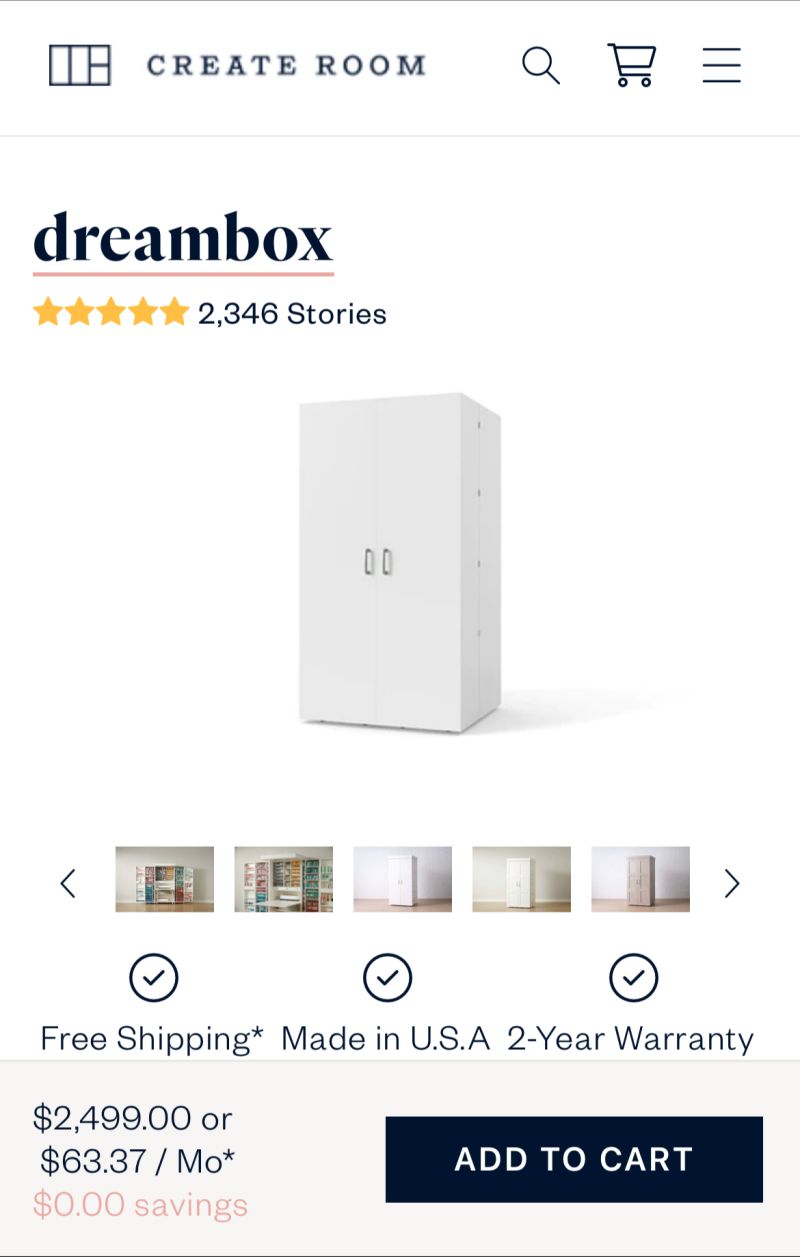
Another example: Don’t call them reviews; call them transformations.
A simple tweak, and suddenly, an element that many miss now stands out:

19:
90% of shoppers on the LiquidIV product page will not know what this chemical reaction means (I know I didn’t).
But they’ll feel good and likely convert at a higher rate, knowing the company behind the product understands the science.
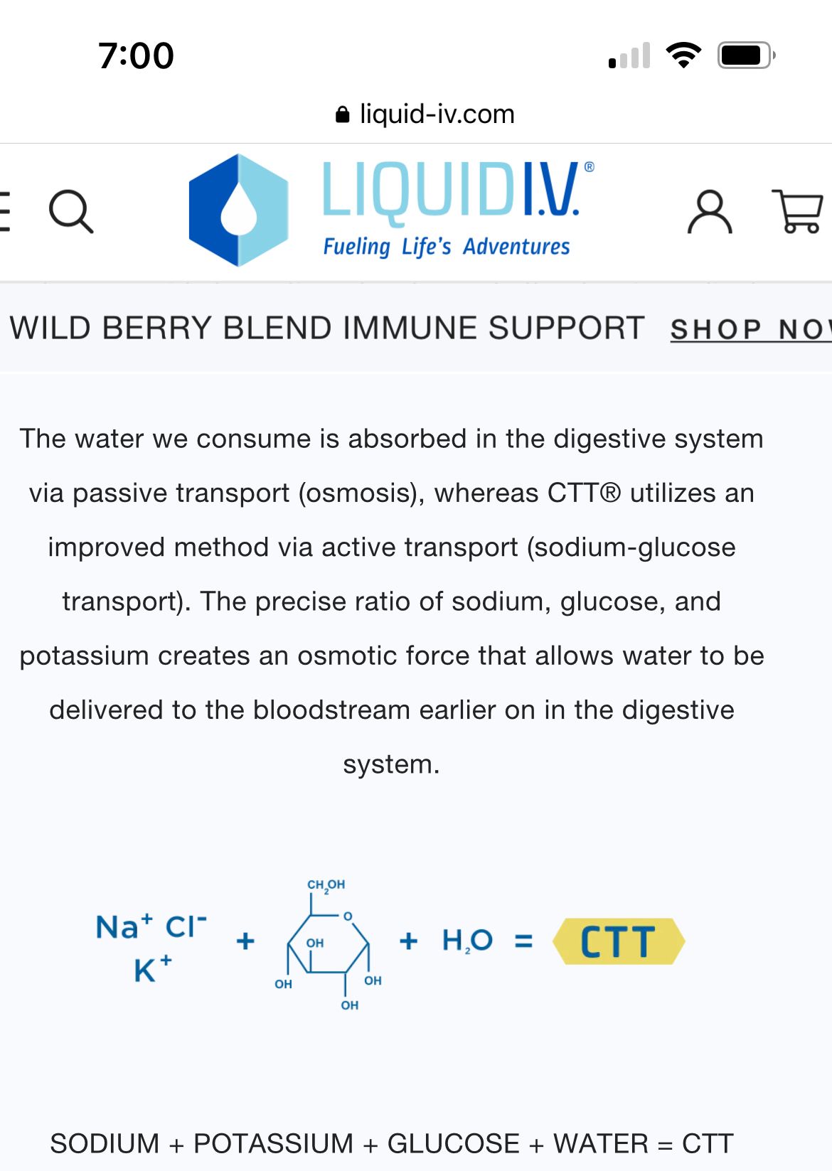
The lesson here is that if there is a technical reason why your solution is better, don’t be shy about getting into those technical reasons. It demonstrates expertise.
20:
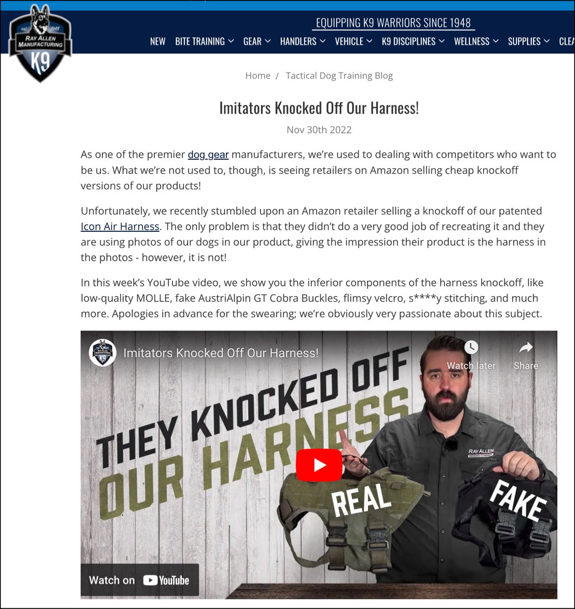
If you feel outraged, let site visitors know. It shows how deeply you care.
21:
This is an image in the product photo gallery of a shoe brand (Koio).
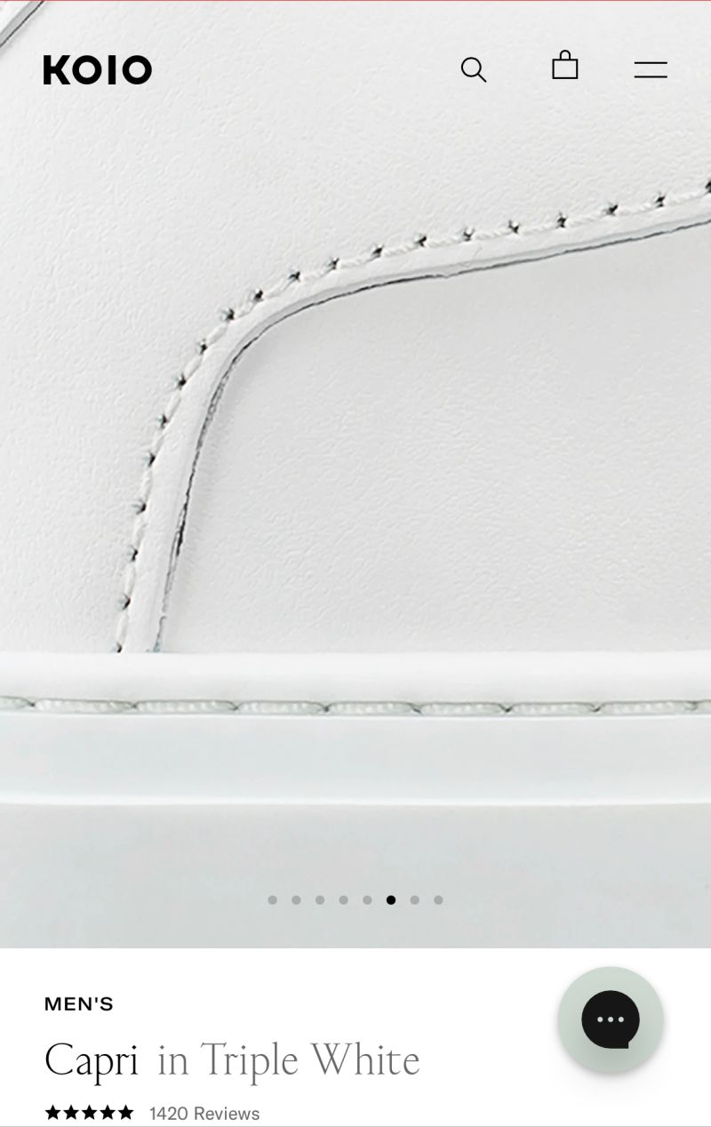
I didn’t zoom in; the image is zoomed in by default.
There is some serious buyer psychology happening here.
My theory: seeing a zoomed image of a handmade item subconsciously signals quality and attention to detail.

Since you like this article about conversion ideas for DTC brands, you’ll love my weekly newsletter.
Signup below. If it isn’t as good as I’m making it sound, unsubscribe with one click.
22:
Most sites have their founder story on their About Us page. But if the visitor is on your product page and they want to know about the people they are about to buy from, they will need to leave your product page. I’m not a fan of that. A much better idea is to have your origin story on the product page itself. That’s what this site does:

23:
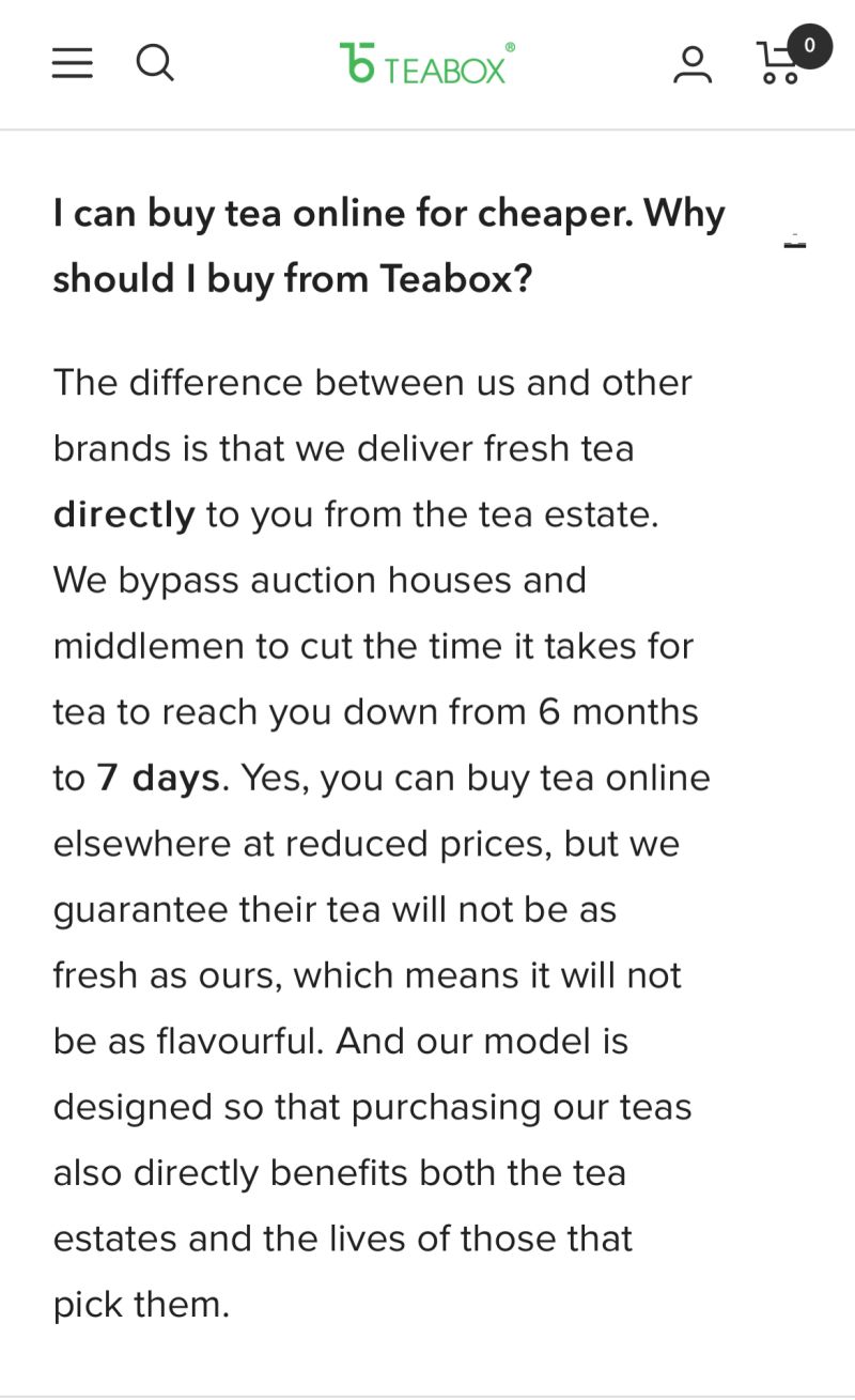
In public relations, the best strategy is to get in front of negative stories.
This also works for online retailers.
Don’t hide behind uncomfortable questions.
Everything is a trade-off, and there is a good reason why you’ve made your choices. Articulate them:
You can learn more about resolving negative thoughts in this article.
24:
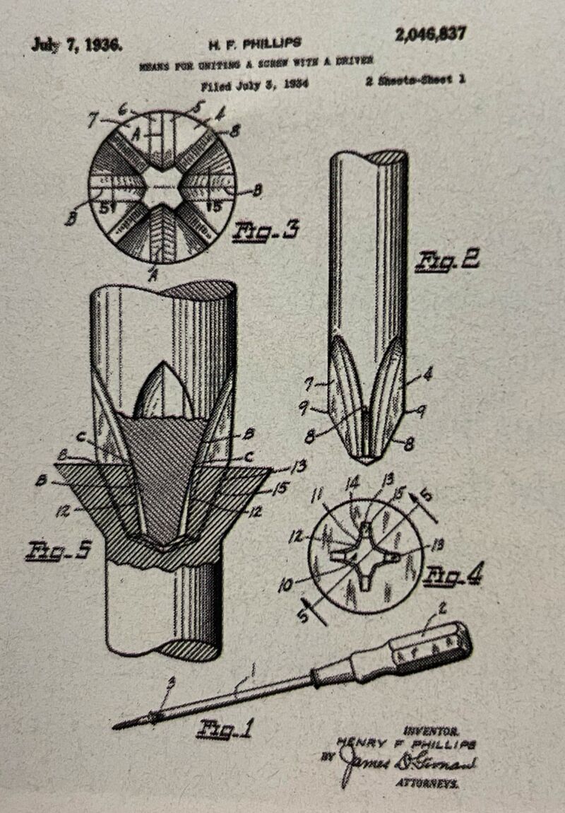
If you are selling a technical product (golf club, dog wheelchair, etc.), you probably have a technical image like this.
This should 1000% be on your product page. The image is for a screwdriver. A screwdriver isn’t an eye-stopping product.
But the amazing level of detail in this image makes it eye-stopping.
It makes the screwdriver so much more impressive. The viewer can instantly see the effort that went into the invention.
Use images like this on your product page, and send me a check later.
25:
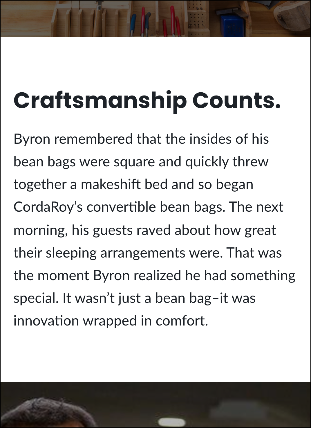
Many brands have a lifetime warranty.
See how CordaRoy’s makes theirs stand out.
It feels like a candid conversation.
This is how it’s done:
26:
Break your pitch into a series of questions.
Our brains are drawn to questions, and when one is encountered, we feel compelled to see the answer.
You can take your shopper pretty deep into your sales pitch with strategically placed questions.
Notice the red arrows in the screenshot below:

27:
Your review count is a form of social proof.
Just seeing a high number can influence someone to buy.
Even if they don’t read the actual reviews.
Marketers know this, which is why they work so hard to collect them.
6 years ago, 40 reviews on a product page were good enough. Not anymore.
Today, having below 200 reviews could be hurting conversions.
This site has a product with fewer than 200 reviews on its product page.
To prevent shoppers from thinking 176 is a low count, I’d add Only 176? link at this location:
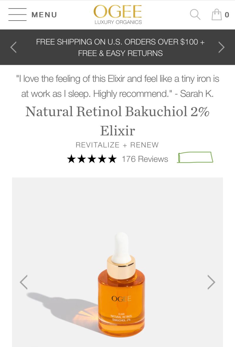
And on click, show a message like:
Every product has to start somewhere. We don’t have 2,000 reviews yet because most people struggling with text here haven’t discovered us. But that’s quickly changing.
We’re thankful to the people who visited in our early days and ignored the fact that we had 15 reviews–tried the product anyway–and returned to leave 176 reviews.
Our review count is growing fast. Word is spreading.
28:
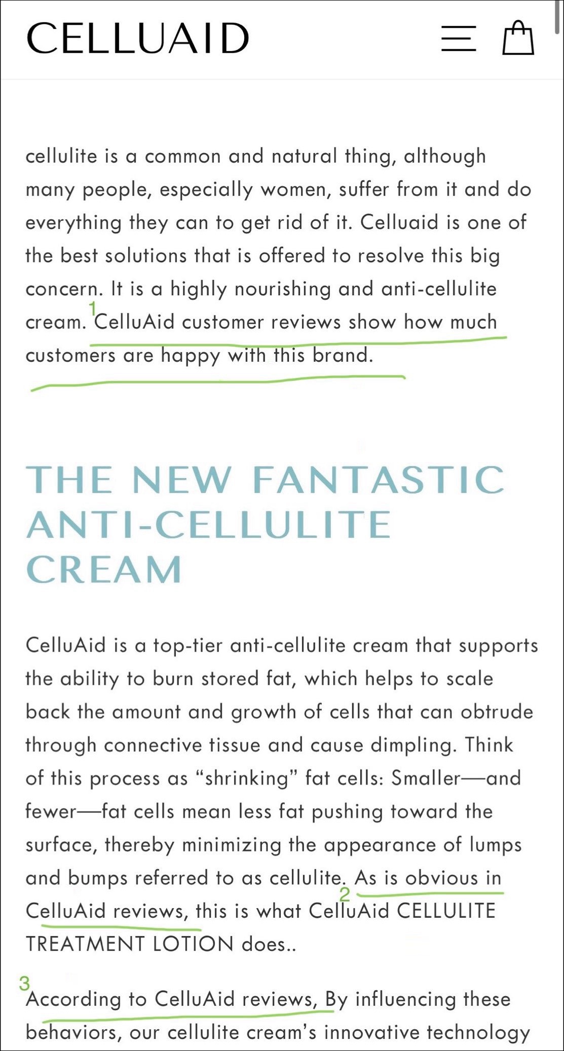
While studying a product page, I often discover an asset that’s super compelling but buried.
If you have a conversion-driving asset, don’t be shy about mentioning it several times.

Since you like this article about conversion ideas for DTC brands, you’ll love my weekly newsletter.
Signup below. If it isn’t as good as I’m making it sound, unsubscribe with one click.
29:
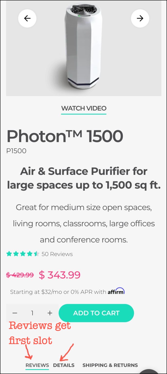
Your product page layout shouldn’t be designed based on the best practices.
It should be designed based on your situation and the nature of your product.
Puraclenz sells a device it claims destroys viruses and mold.
New visitors may be skeptical of a fantastic claim from a company they’ve never heard of.
So, instead of showing the product details as the first content block on the product page (a best practice), they show reviews.
Based on the nature of their product (skepticism-inducing), this is the precisely right strategy.
30:
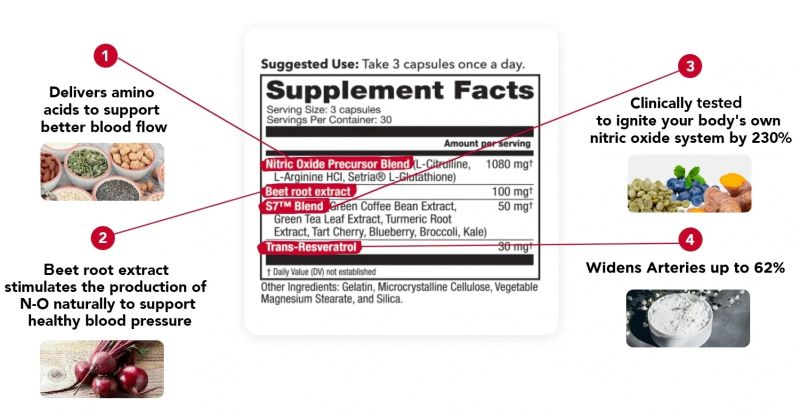
Nice way of showing Supplement Facts. It brings it to life:
31:
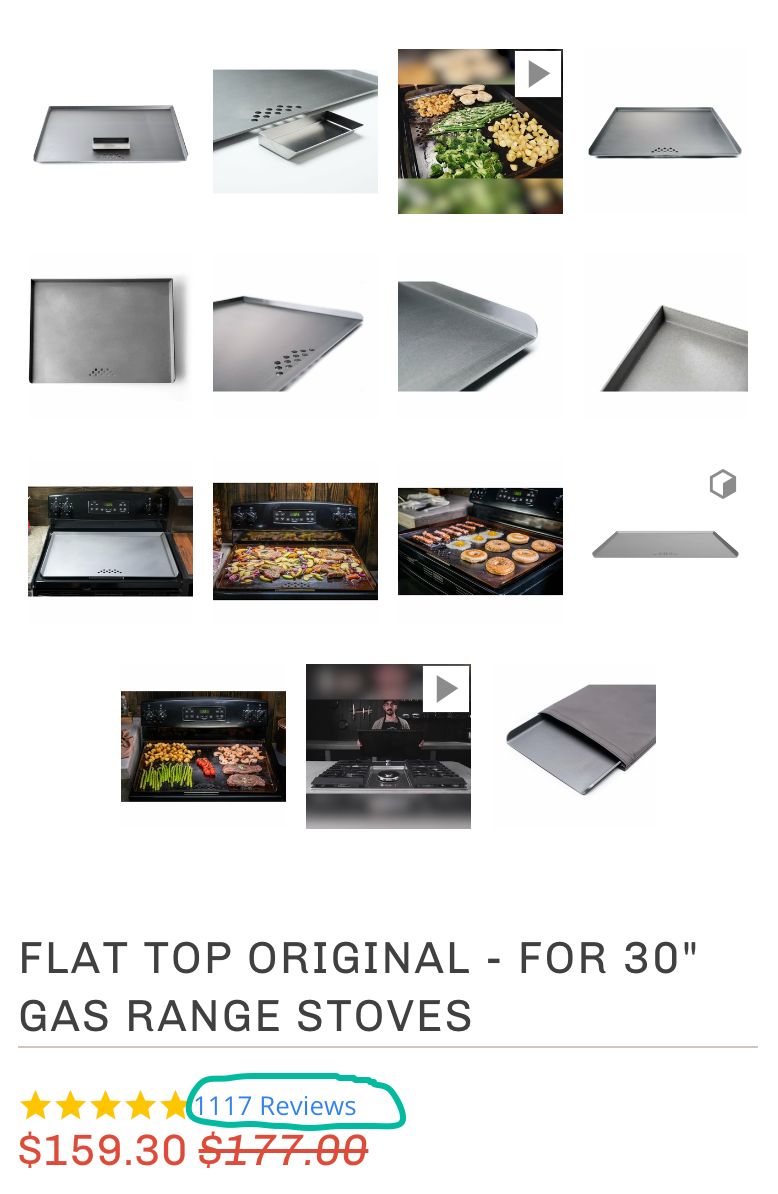
If your review count is more than 3 digits, add a damn comma. It makes it a little easier to read.
32:
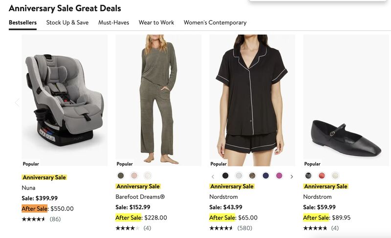
My buddy Travis Greenwood showed me a clever promo strategy.
The Nordstrom Anniversary sale shows the promo price and the price you’ll pay when the promo ends. Notice the After Sale highlight.
I’ve never seen this before and think it’s a brilliant way to drive action.
33:
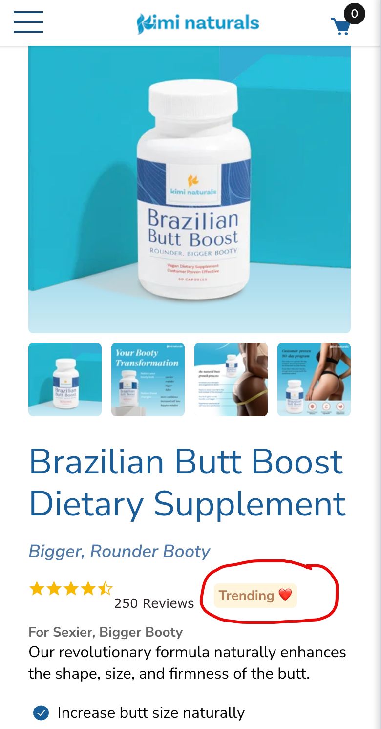
A marketer would look at this product page element and say, “What the hell is this? We’re now just adding badges to pages?”
That’s the problem. This CTA may be silly to a marketer.
But for the shopper moving at 60 miles an hour, it’s a subtle signal that the product is popular.
Shoppers don’t evaluate page elements the way marketers do.
Laugh all you want; CTAs like this work.
34:
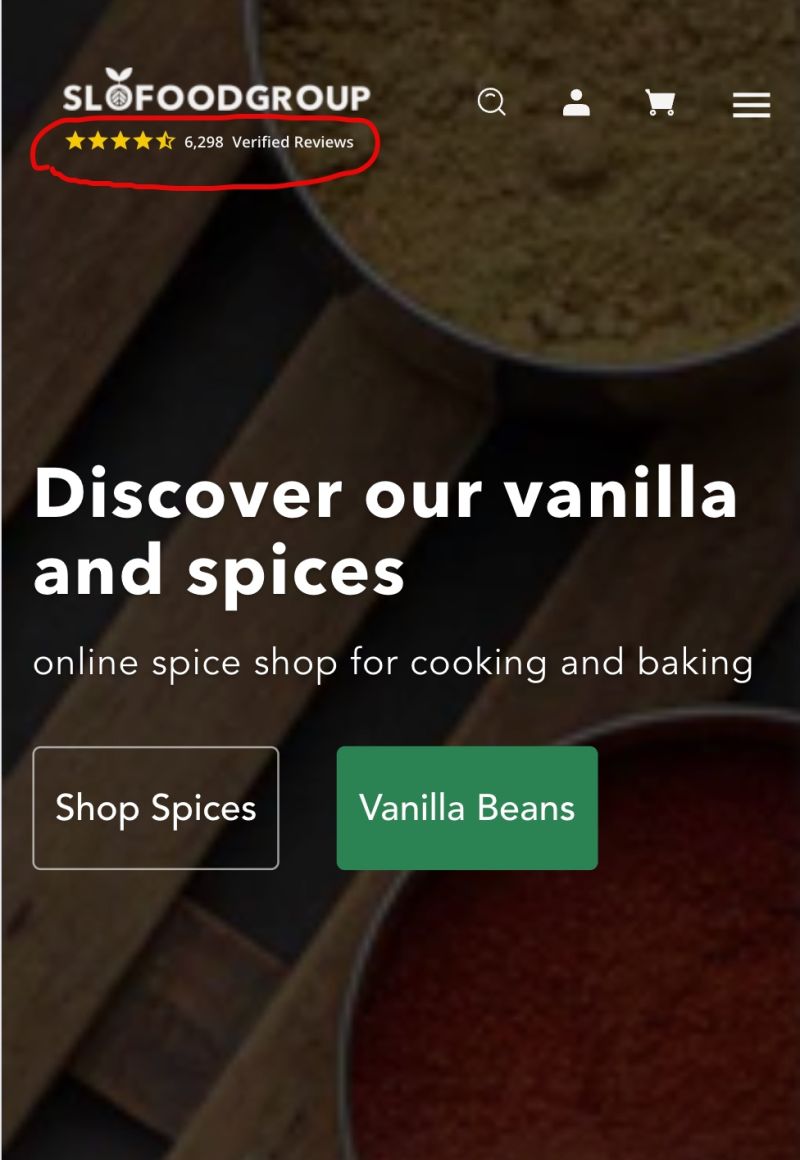
SLOFOODGROUP understands the importance of social proof, which is why they display their review count right below their company logo.
I’ve never seen this before, and I think it’s a brilliant placement.
35:
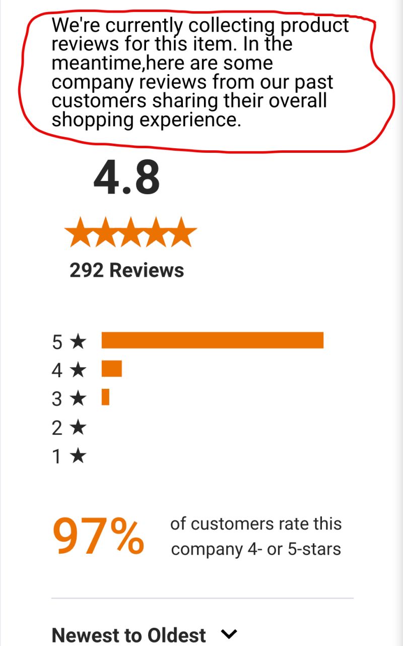
This site does something interesting.
They have a few products with 0 reviews.
Instead of showing no reviews, they show their company reviews with strategic justification.
It’s a great example of what to do when review counts are low:
36:
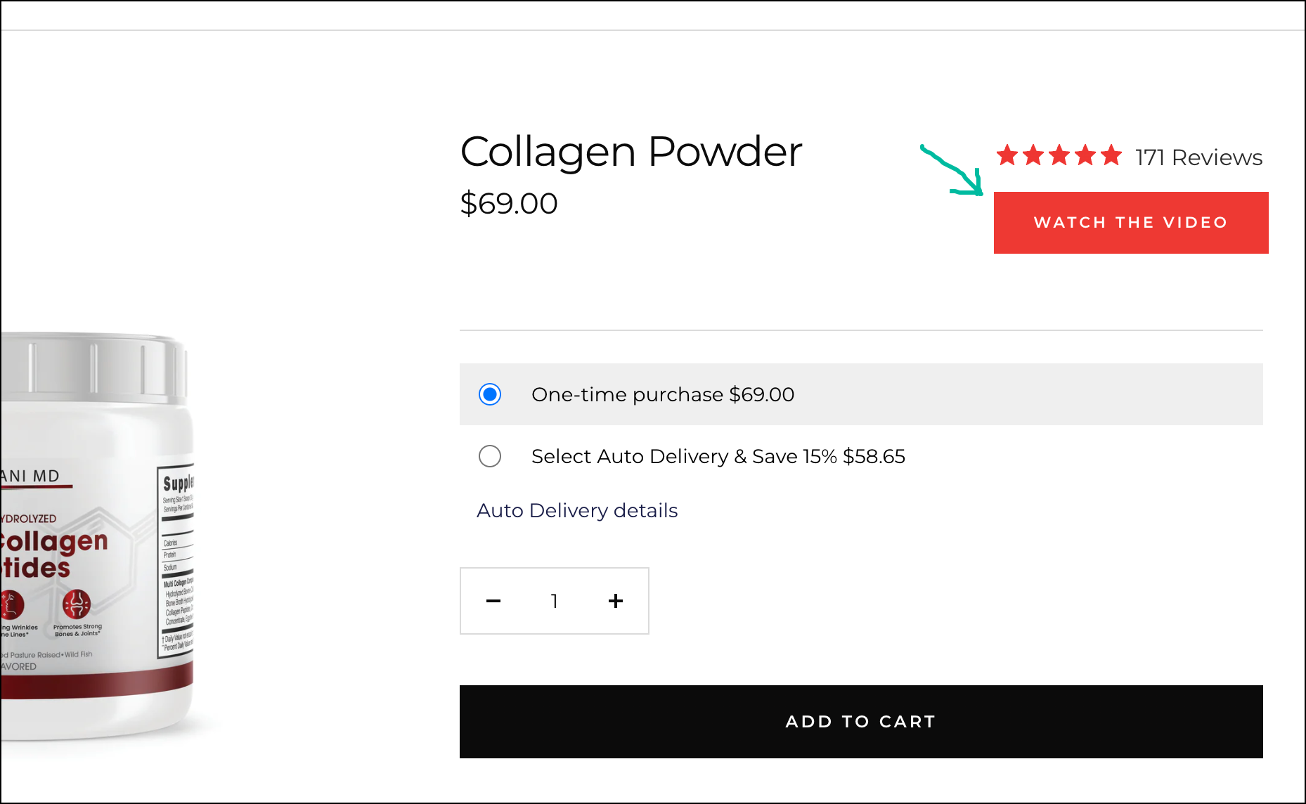
If your product page has a video that converts well and you want everyone to notice it, place its CTA here:
37:
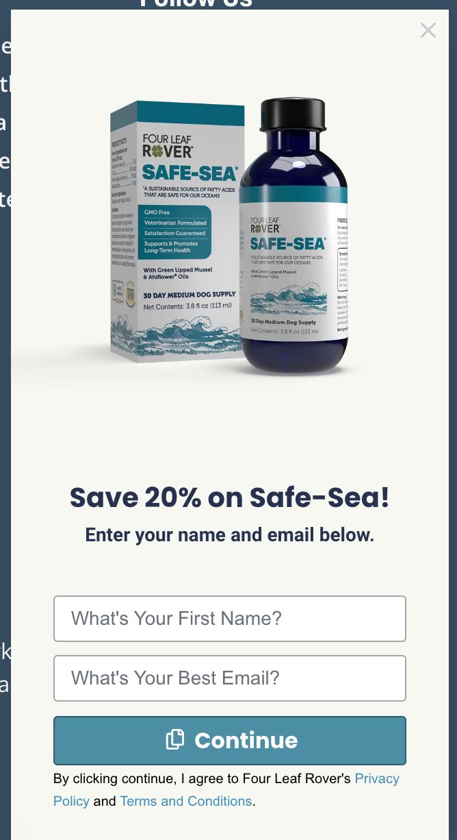
If you aren’t happy with your popup email signup rate, this idea is for you.
Don’t show a generic discount message. Instead, when a user exits a specific product page, show that product’s image and use the product name in the discount messaging.
In the example below, I was exiting the Safe-Sea product page, and you can see how the popup image and message have been personalized to my specific behavior:
38:
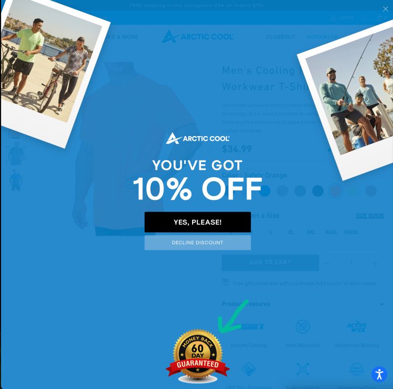
We’ve seen 100s of discount popup messages.
Every once in a while, you find someone with a little twist.
I like how this site emphasizes its return guarantee in the popup.
If you think about it, that’s a smart location.
The discount code is for new visitors.
New visitors are nervous to buy from a site they’ve never bought from before.
This 60-day guarantee seal acts as an anti-anxiety cream.
39:
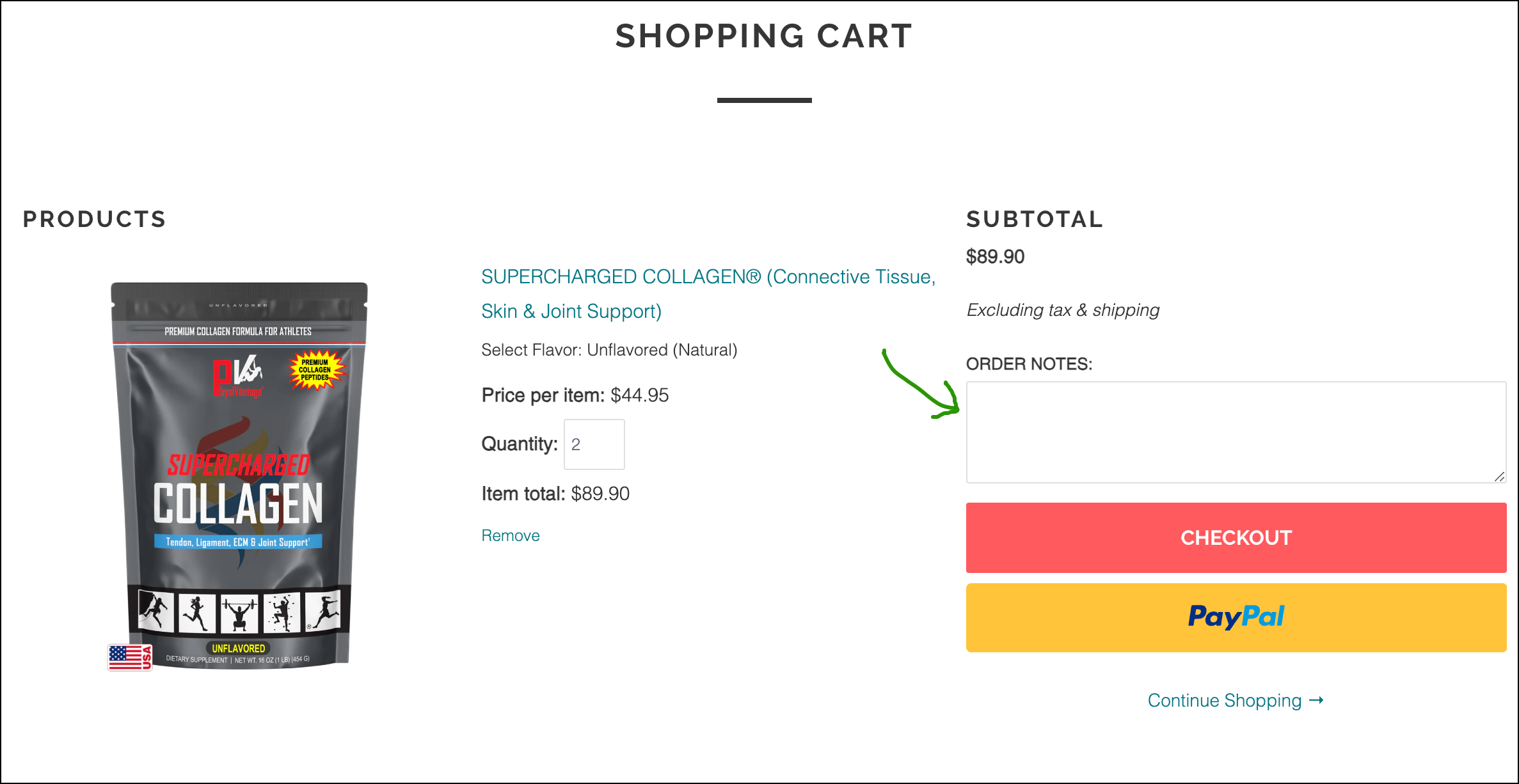
Users are most nervous when they start checkout.
PhysiVāntage® has an ORDER NOTES field on their cart page.
It’s possible that nearly everyone leaves this box blank, but just knowing it’s there may be calming nerves.
We all want a voice, and this box provides it.
40:
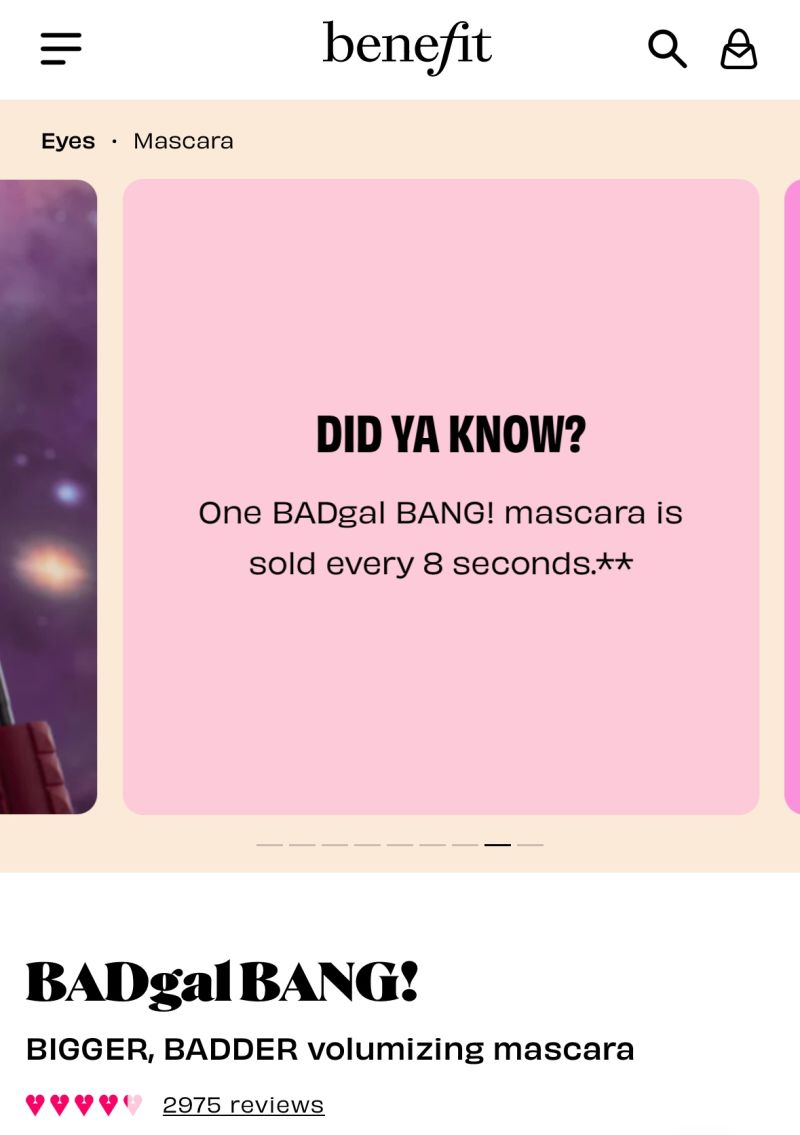
Your image gallery is often the first element visitors interact with on the product page. This is especially true if your product has visual qualities.
I noticed something smart on Benefit Cosmetics. Their image gallery included some content to give me the confidence to buy.
While your user’s attention is on the image gallery, you can use it to help with the selling. What key product information can you add to your image gallery?
41:
I saw this on an Urban Decay Google ad:
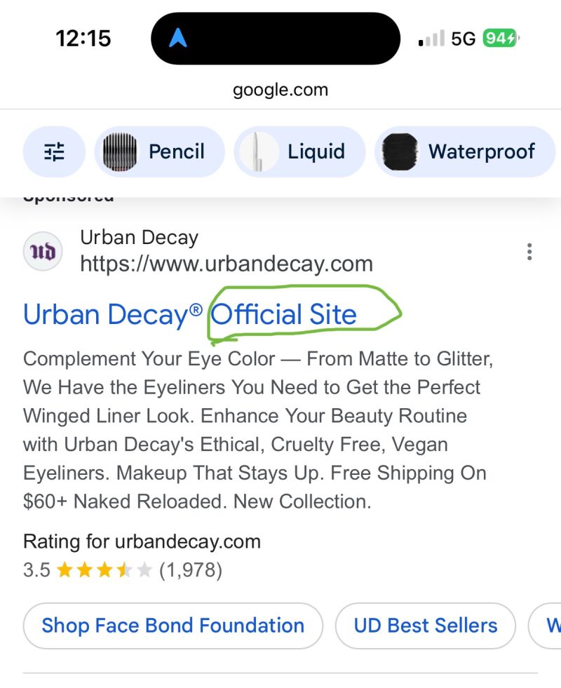
Official Site sends a subtle psychological message.
It suggests the brand has imitators, but this is their official site.
Even if your site is small, it’s worth adding this line to your title tag—it signals authority.
What do you think? Do you think it’s worth doing? If I were a DTC brand, you can bet I’d do it.
42:
If most of your product page traffic is mobile and you want to ensure they read your product description, do what Dior does—> Video on LinkedIn.
43:
I’ve never seen a wizard directly embedded onto a product page.
This execution is really good:
44:
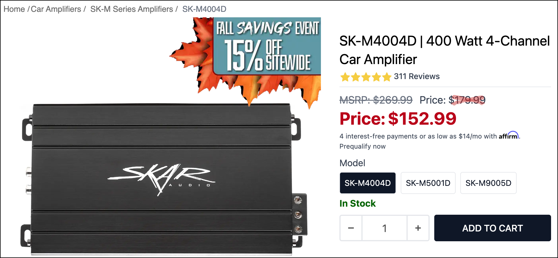
When offering a discount, we want people to notice the full price so they can appreciate the savings.
I like how Skar Audio strikes out $179.99.
Using a light red transparent color makes $179.99 stand out even more.
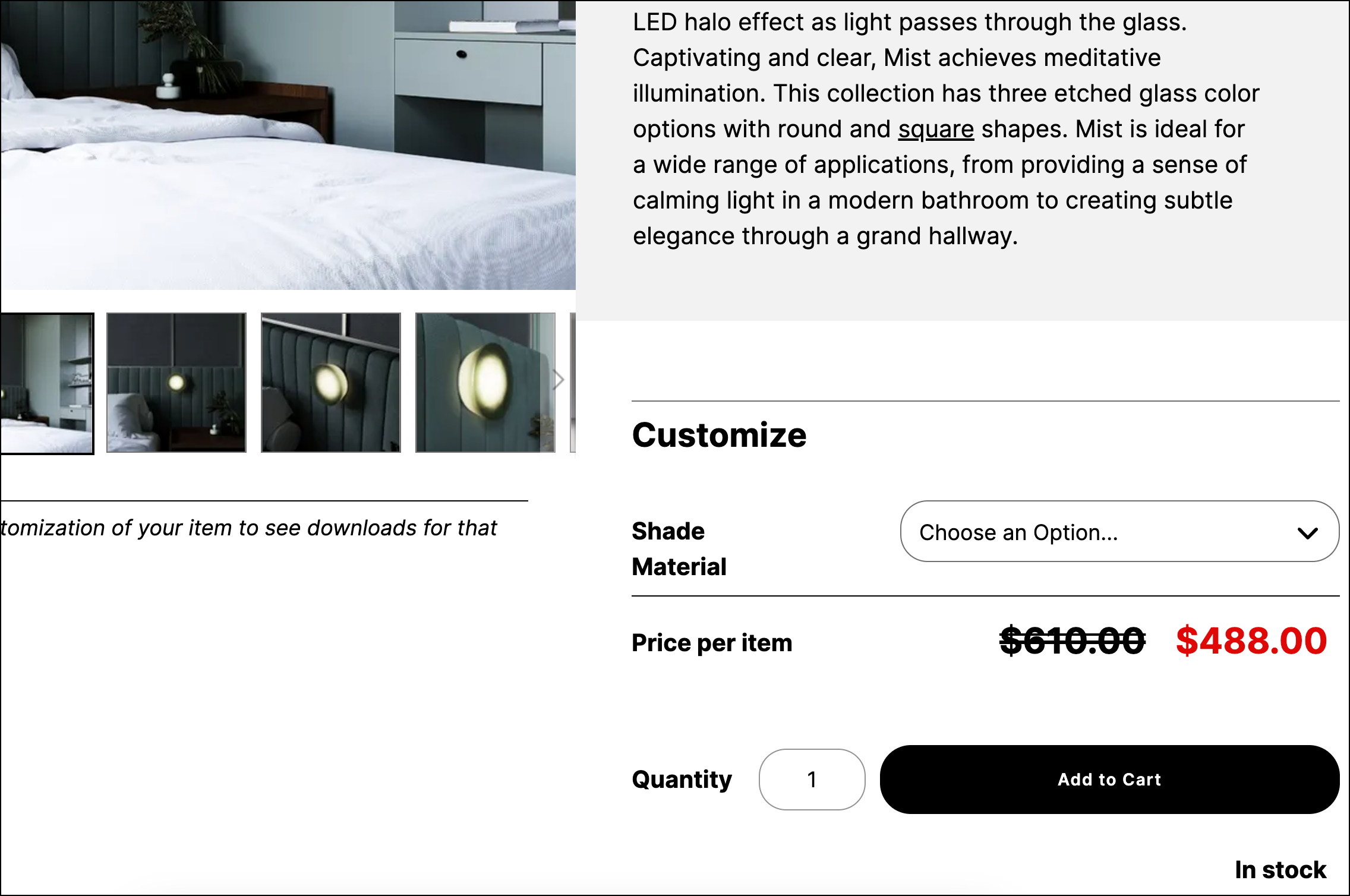
And if you want to be a little subtler but still have your strikethrough price stand out, do what sonnemanlight.com does:
45:
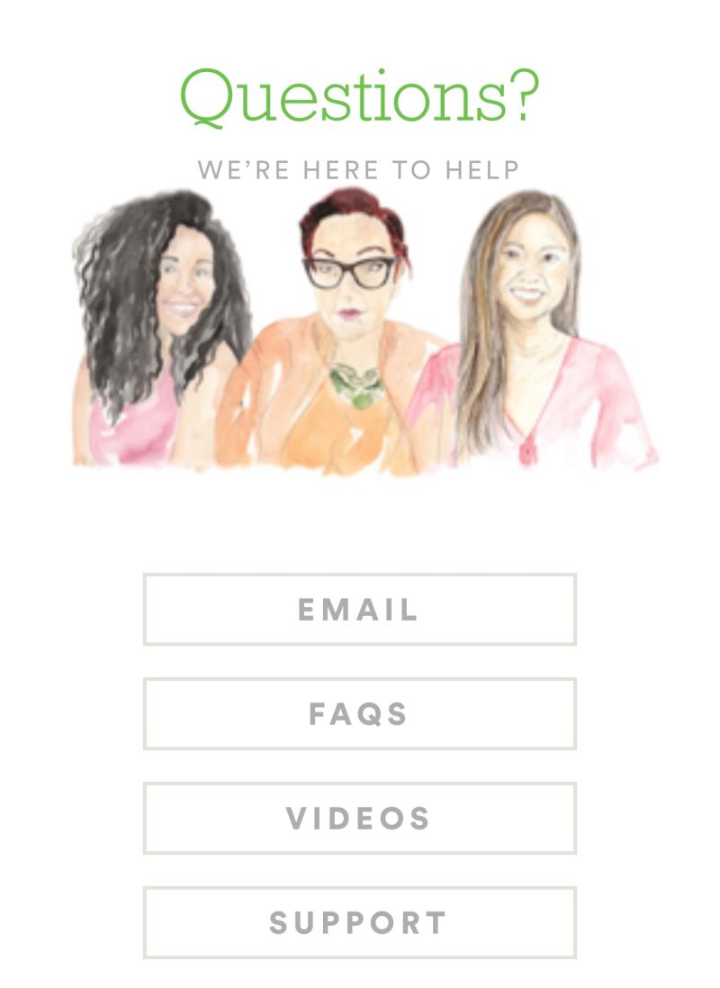
Shoppers often avoid customer service—not because they don’t need help, but because they fear stock responses.
A welcoming, hand-drawn sketch can make customer service feel human and inviting.
46:
If there’s an asset you want to stand out, don’t be shy about doing whatever it takes to make it stand out.
Your product page is like a resume. The hiring manager will not go out of her way to understand what makes you special. If it doesn’t jump out, she won’t see it.
Guess what this site is drawing attention to?
PS: I didn’t add the animation.
47:
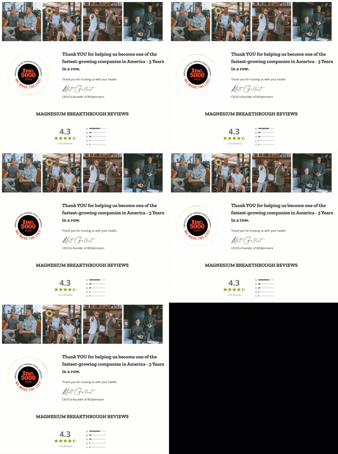
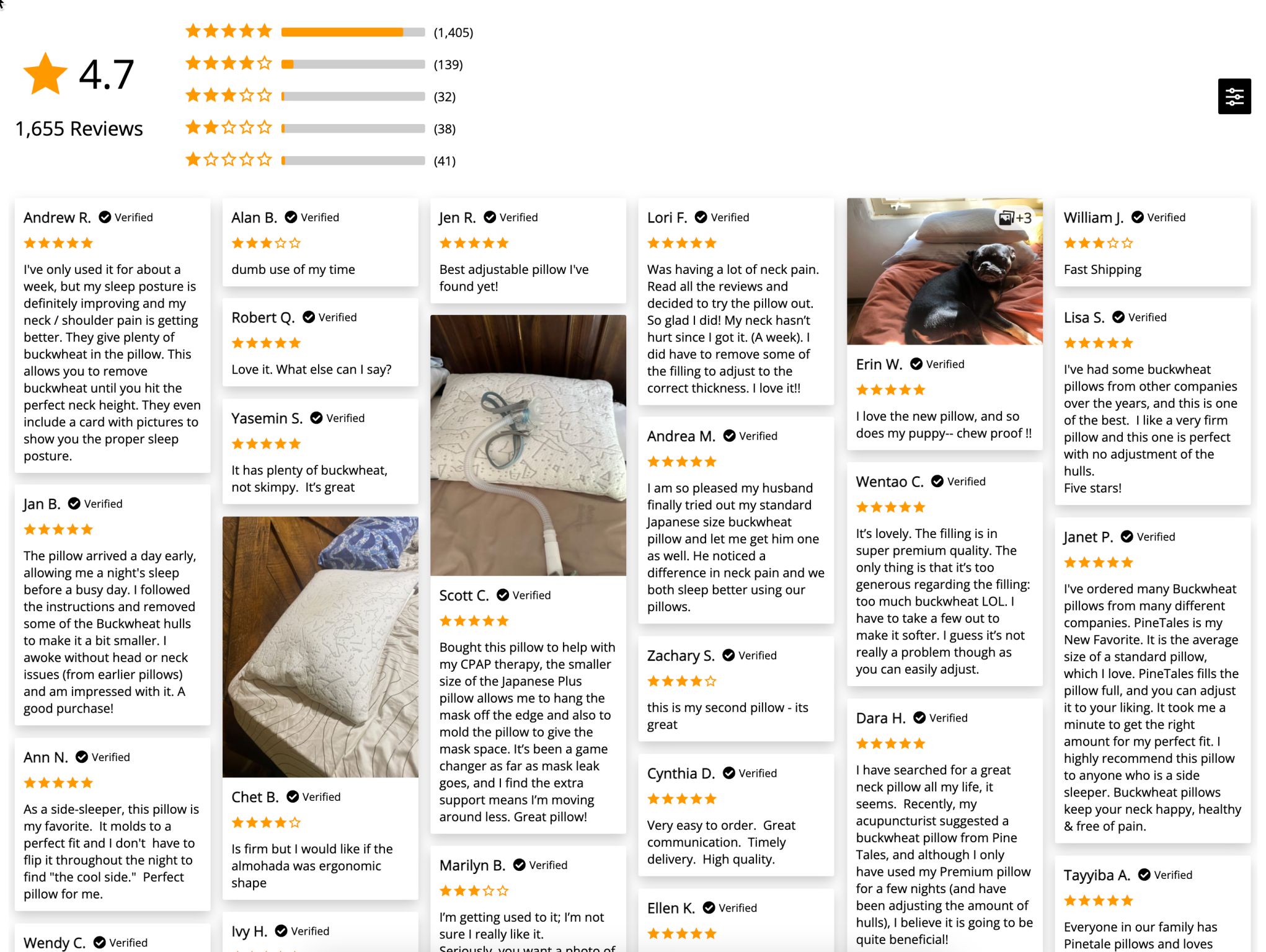
In the pursuit of pixel perfection, it’s easy to forget that on an eCom site, every element has a job.
Shoppers scan reviews, so the job of the reviews section is to neatly fit as many as possible without overwhelming the shopper.
If one design allows scanning 3 reviews in 4 seconds and the other 20, the other is better.
Function over design, most of the time.

Since you like this article about conversion ideas for DTC brands, you’ll love my weekly newsletter.
Signup below. If it isn’t as good as I’m making it sound, unsubscribe with one click.
48: Image Gallery Optimization
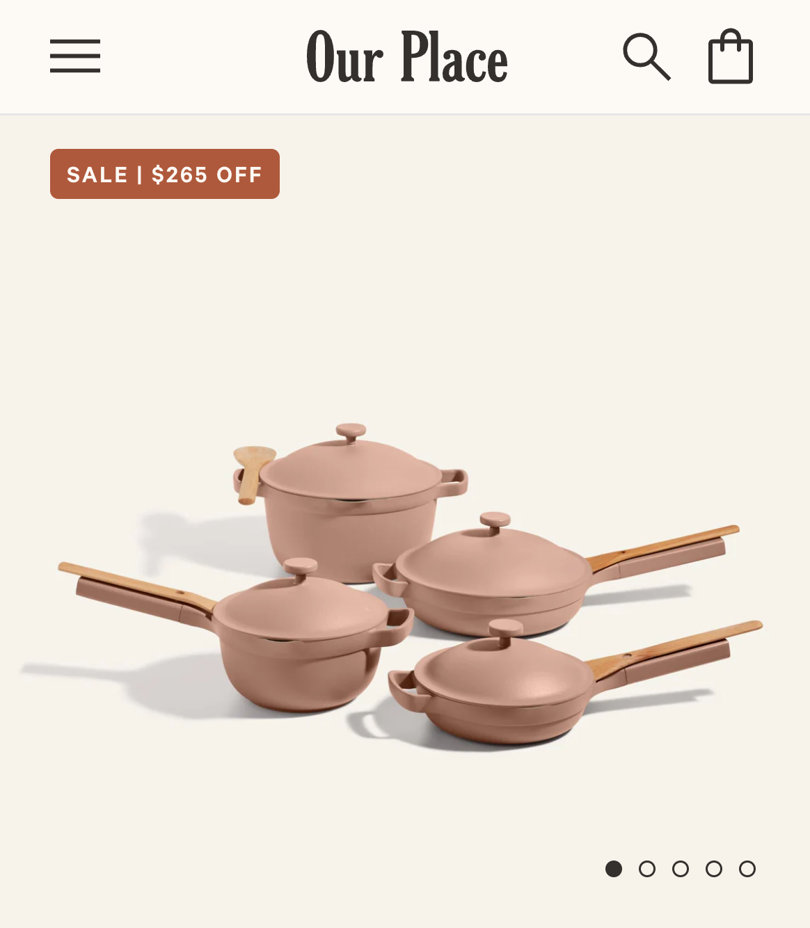
If your product is visual, your product page image gallery will probably receive a fair amount of traffic.
Sites typically place their “we have multiple images” cue right below the first image.
That may get overlooked by people who are engrossed in the image.
I like how https://fromourplace.com/ includes the nudge within the image itself.
49: Highlighting Key Details
I kinda dig this product description format where key details are highlighted (in green highlight in the example below.)
Makes it easier for skimmers to skim.
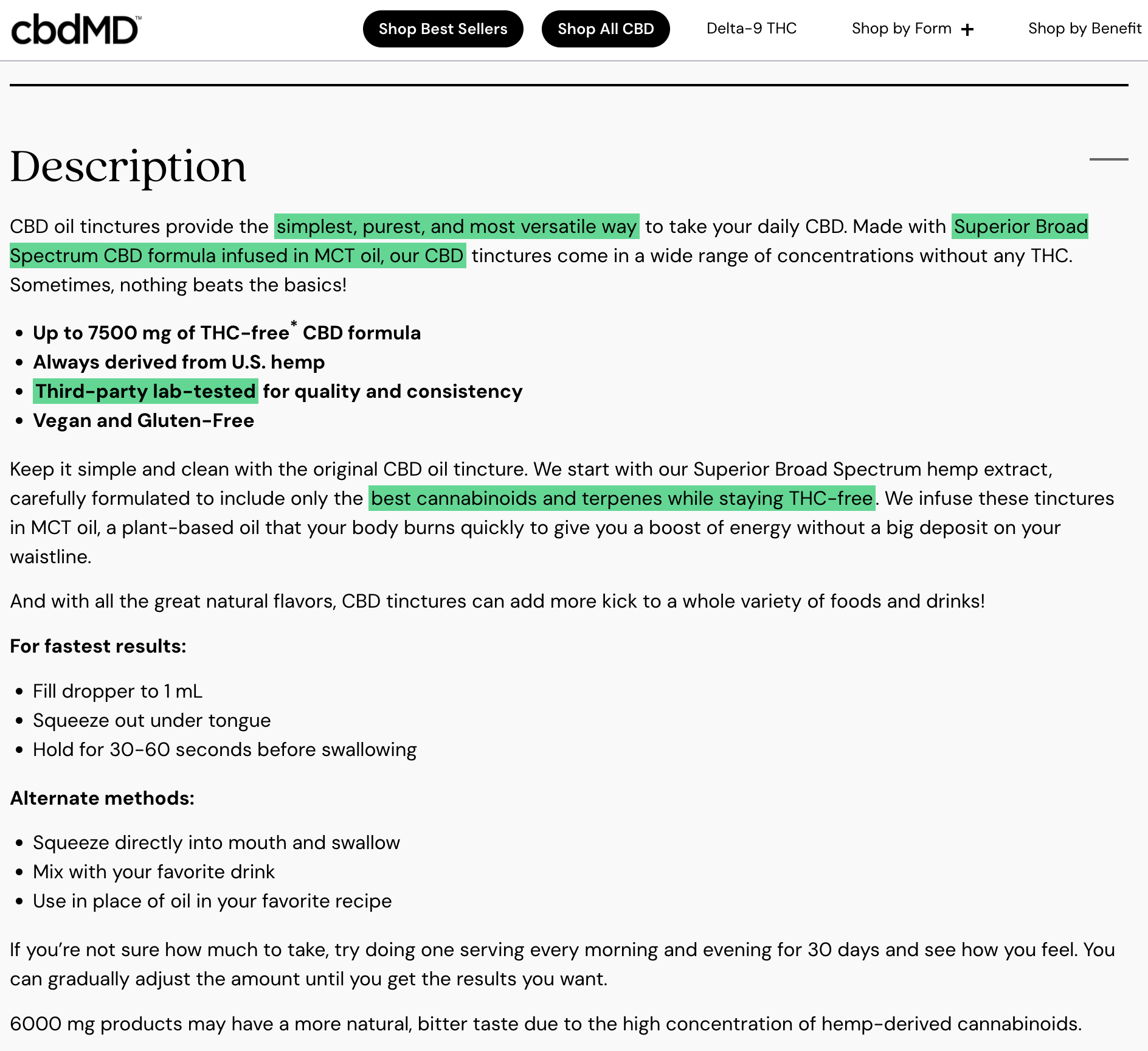
If you want to add an interesting highlighter effect to your text, you can use CSS like this.
50: DTC Social Proof
The first job of the marketer is to convince the new visitor that they can trust the brand. I really like how gardentowerproject.com approaches this. At the bottom of their homepage, they have a map of the US with all the locations they ship to. There is also a magnifying glass so you can zoom in on a region of your interest.

Here’s a video to explain this.
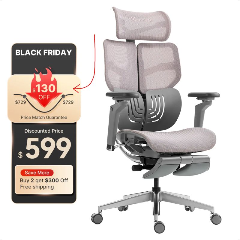
51: Clever Way to Visually Emphasize a Discount
I have to say, this way of showing a Black Friday deal is pretty compelling:
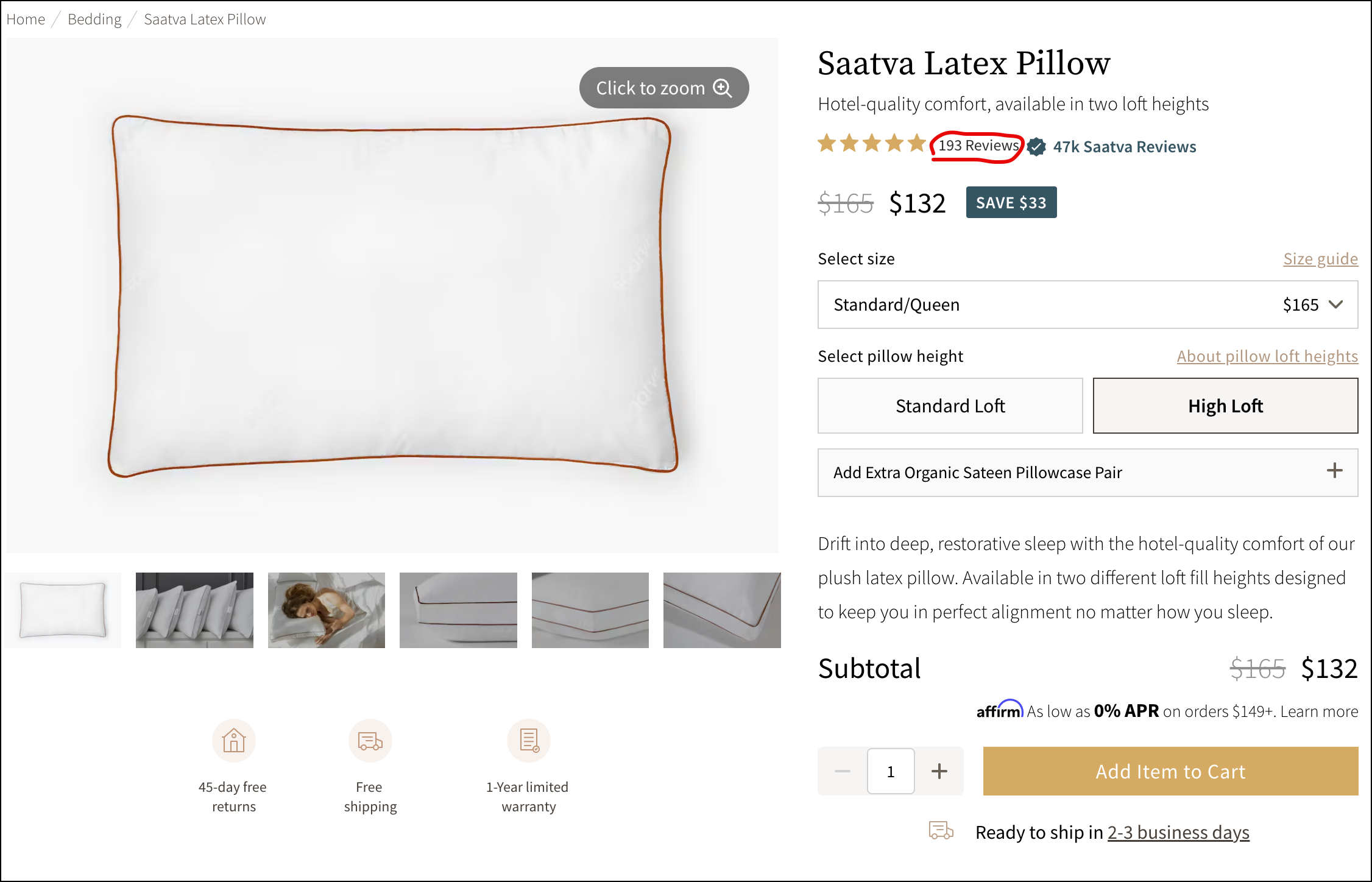
52: When Your Review Counts Turn to Justice to the Product’s Popularity
I like how someone seeing the 189 review count and thinking, “That feels low,” also sees the 𝟰𝟬𝗸 𝗦𝗮𝗮𝘁𝘃𝗮 𝗥𝗲𝘃𝗶𝗲𝘄𝘀 assurance message text to it.
53: When You Aren’t Running a Discount
Brands don’t run discounts all the time.
But we’ve done such a lousy job setting expectations that shoppers expect a discount every time they buy.
This idea is for the times when you aren’t running a discount.
The truth is that when the user comes to this page and notices the $238.95 price, they’ll be like, “Woah, no discount?”
I suggest adding a call to action right next to the price (see image below):

When clicked, show a lightbox with your best explanation. If you are looking for an example of what type of content to show when the user clicks the message, join my free weekly conversion ideas newsletter.
54: What’s The Best Location For A Chat Prompt?
I like this placement right next to the add-to-cart button:

55: Making Your Discount Stand Out
You want visitors to notice your discount. You want them to appreciate it.
This site sells a product for $122 but is offering it for $96. That’s a sexy discount. The brand wants you to know that. So they do this:

56: Improving Form Submission Rates
Are you trying to improve your site’s lead submission rates?
Do what this site does (link):

57: Putting Your Contact Details Out There
The biggest conversion blocker on your site is skepticism.
The visitor, who doesn’t know you, doesn’t know if they can trust you.
Can’t blame them; this is 200,000 years of programming at work.
I don’t know why it works, but there is something deeply, psychologically reassuring about the business head sharing their contact details.
Most visitors won’t reach out, but just seeing that you’re willing to be reachable changes things. It signals confidence. It signals accountability.
Every ecom site should include the CEO’s email.
You can have two email IDs. Keep one private, make the other public.
58: Making Your Discount Stand Out
Spotted this on HairMax.com and had to make a video:
59: A Better Email Signup Strategy
As marketers, we work hard to try and close every visit into a sale. If you are sending something inexpensive, that might be a decent strategy, but if someone is looking to buy a lawnmower, it is doubtful that they will purchase it on that first visit.
A much better strategy would be to use that first visit to get them to give you their email address, and if you can tell her the message of the pop-up to match up with where they are on their buying journey, you are much more likely to get an email sign-up.
I have seen hundreds of pop-ups that try to use a discount to get an email sign-up, but I’ve never seen one that does this.
PS: this is a made-up example; I just mocked it up. But I wish some sites would use it.

60: Optimizing Your Product Page Image Gallery
We already know shoppers spend time looking through your product page image gallery.
I like what TRUVANI is doing here.
They use one of their slides to show a magazine-style ad for their product.

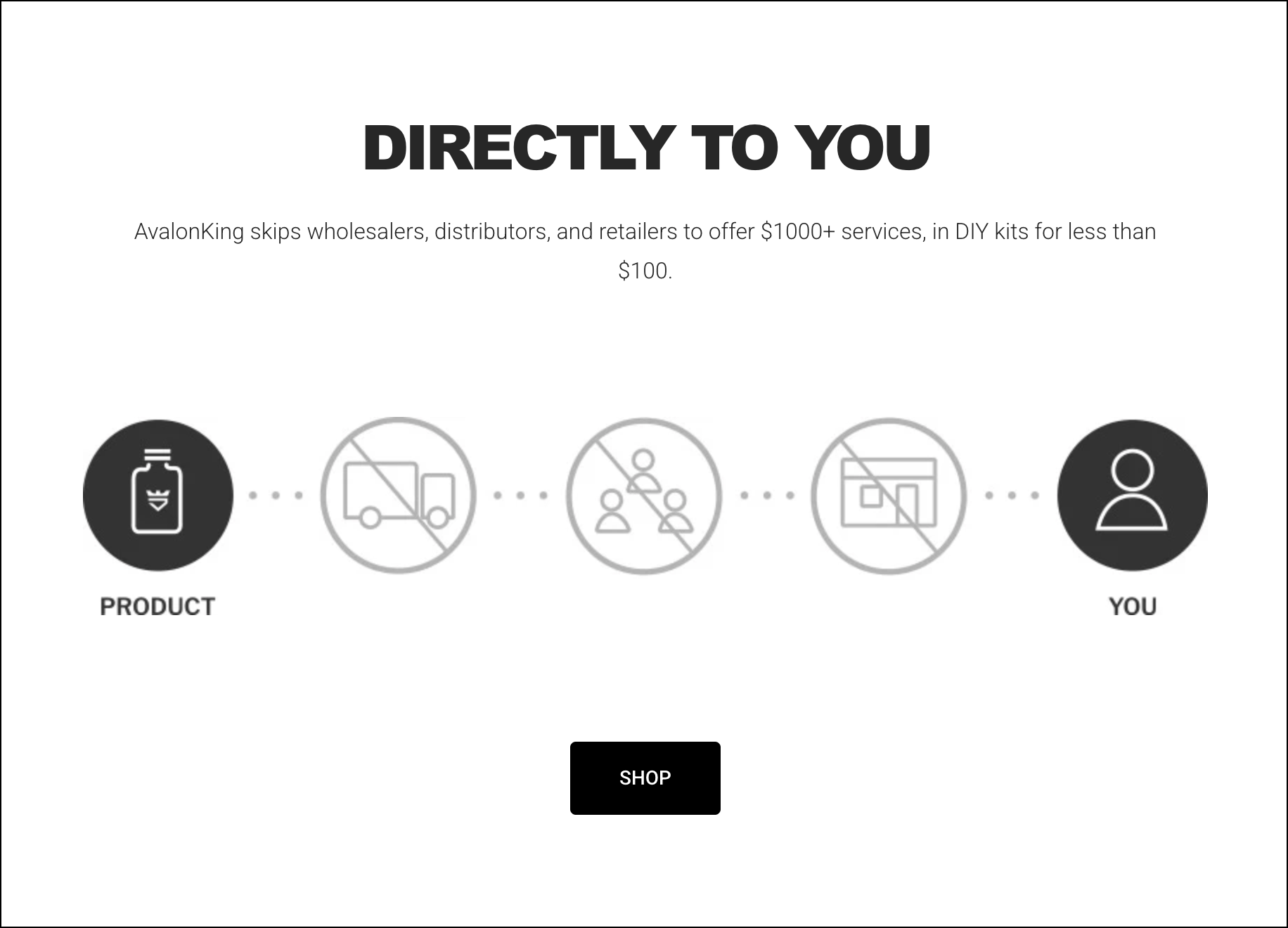
61: Visual to Show Savings
We sometimes avoid an idea just because we’ve seen it too many times. But that’s not a good enough reason.
This graphic works because it quickly and visually shows the shopper the benefit of buying directly from the brand. Taken from AvalonKing’s About Us page.
Here is another example from curistrelief.com:
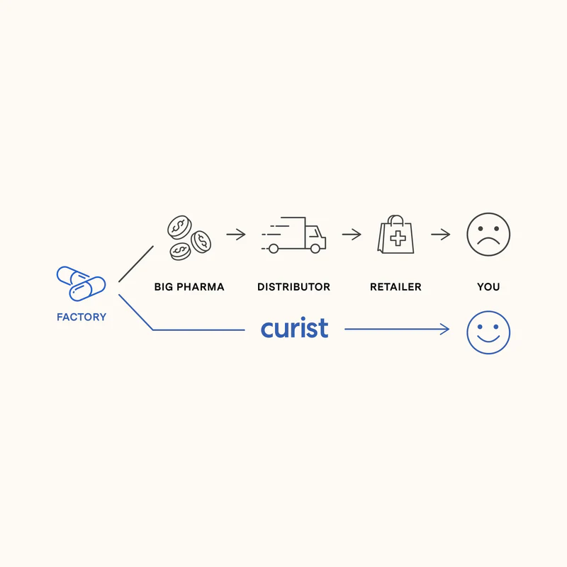
62: Increasing Product Page Views
Sometimes, the metric to optimize is getting visitors to see more of the products we carry.
You don’t want visitors to see just one product page; once they’ve seen one, you want them to see a few more.
This is why I really like what GunDogSupply.com is doing:
63: Let Your Product Describe Itself
In most product descriptions, the seller is describing their product.
But what if the product were able to describe itself?
This may not work for many brands, but it does work for a few. Found a nice example on https://hipswan.co.uk/:

64: Clever Email Pop-up Strategy
We can all agree that pop-ups are annoying. But that doesn’t mean there aren’t ways to make them more effective.
Many marketers talk about pop-ups that appear after a specified delay or after a specific user action. These are good ideas.
I found a good example today from the clothing brand Penguin.
Here’s how it works. First, the pop-up appears:

The only way to exit it is by clicking this:
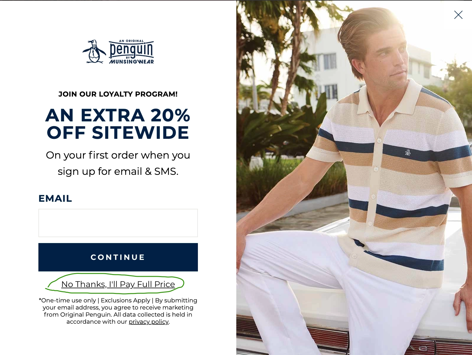
And when you do this warning appears:
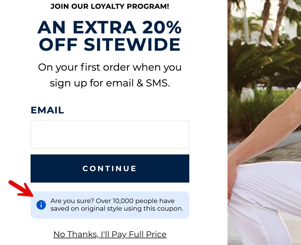
I love it. Do you?
65: Converting People Not Ready to Buy Today
Here’s the concept: When someone is about to exit your product page, they see an exit intent popup like this:
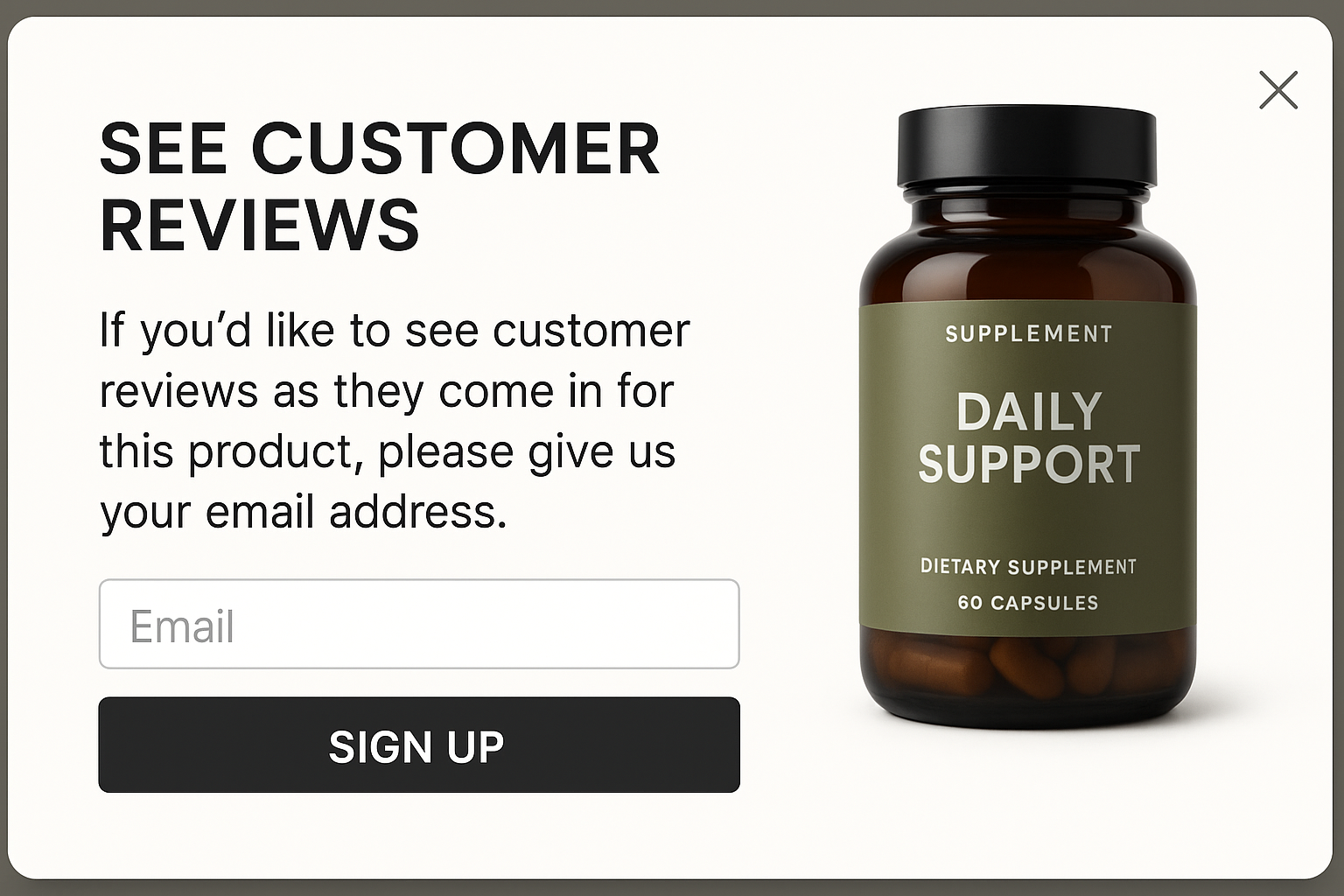
Once the prospect joins, they receive an email every time a new review for this item comes in.
Each review email is a micro nudge. Once they make the purchase, they are removed from this mailing list.
PS: You can even set it so they only receive 4 and 5-star reviews.
Are You a Marketer?
I suspect you are because only a marketer would be interested in a topic like conversion ideas for DTC brands. If you are a marketer and liked this article, boy, do I have something fun for you.
Revealing It All
In our marketing lab 🥼, experimenting 🧪 for the last 16 years, we’ve discovered that one reason marketing campaigns fail is because they try to do too much.
Site visitors fall into 3 groups:
— Ready to buy
— Will never buy
— Interested, but need a little more convincing
The 3rd group has the biggest revenue potential.
Evidence Our Formula Works
This strategy mentioned above isn’t a theoretical framework. It’s the base formula for all our conversion work for clients. This marketing framework can be used to boost sales for sports products. To sell skincare products. Pet products. Consumer electronics. Athletic gear. Back pain solutions. Food items. High-end cooking tools. Plant growing soil.
Does the sales pitch always need to be shown as a popup? Nope.
It can also convert cold Facebook ad traffic, improve mobile conversion rates, generate calls, optimize your most important landing page, etc.
It can even be used to improve your overall conversion rates.
Converting Interested, but Need a Little More Convincing Group (With Examples)
Explained in this👇🏼 Nine Truths article.


Comments 12
Love this idea – certainly worth testing. We sell diamond engagement and wedding rings.
ReplyRishi Rawat
Hey, LSP. Nice to hear from you. This approach definitely works for expensive items like engagement rings. Here is another idea that you may also like: https://frictionless-commerce.com/case-studies/alternatives-to-pop-ups/
ReplyLike it Rishi!! We just sell scooters, but it’s true that for some people it will take a couple visits!
ReplyRishi Rawat
🙂
ReplyLoved this newsletter, Rishi. Just wondering if you’ve tested this out with any of your clients? As a marketer myself, I have learned that I can generate 100s of ideas but only when it is validated, it holds value.
ReplyRishi Rawat
Hey, Joshua. I have tried this out with clients. Here is a similar concept for which we have a case study. It uses the basic idea that not everyone is ready to buy on the first visit: https://frictionless-commerce.com/case-studies/alternatives-to-pop-ups/
ReplyAlthough this is geared to products, I always think whether this would work for an intangible product/service, like insurance or other financial services – I think it could work if the messaging was on point. A trusted adviser is something a lot of ppl ruminate and research on for a while, particularly given the financial consideration involved.
ReplyRishi Rawat
Hi Alex. I not only think it applies—I’d argue it applies even more when the risk of a wrong choice is high, like in financial services. Let me give you a recent, practical example: I’m working with my brother, who runs a travel agency, and we’re using those same principles to drive leads through their website.
ReplyExcellent idea!
ReplyRishi Rawat
Glad you liked it, Ron. Hope all is well with you.
ReplyPretty smart action. In my opinion it’s worth testing this tactic, I have already a client in my mind. Thanks Rishi!!
ReplyRishi Rawat
Awesome!
Reply