
Case Studies
Efficiency vs Efficacy: How Increasing Call-Ins Generated $3,000+ More in Sales Per Week
- Goal:
- To increase call-ins to HandicappedPets.com’s customer service team, which converts 52% of their calls.
- Solution:
- Add conditional call-to-actions at strategic locations on the site (e.g. places where users have a higher likelihood of getting confused). When a user interacts with these calls to action or action buttons, show them how they can contact customer service for help.
- Outcome:
- A lift in weekly call-ins and revenue generated from orders placed over the phone.
Backstory
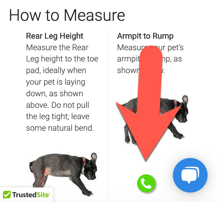
HandicappedPets.com offers a number of products that require the user to take some measurements of their pet. This can be a big moment of friction for people because of a couple of things: 1) they may not know how or what to measure, 2) they may be nervous about entering the wrong measurements and having to return or exchange their order, and 3) it requires work (and people are instant gratification animals, especially when shopping).
The best way to address this is to have an expert walk the user through the process. This is, of course, difficult to do on a website, but that’s where customer service comes in.
However, using a phone call to make a sale is more expensive than generating a sale naturally on your website. While call-ins are less efficient, they are much, much more effective in converting shoppers. Why? A customer service representative can communicate directly with the shopper, anticipate their concerns and questions, pick up on verbal social cues, and guide shoppers. On a website, shoppers are free to roam anywhere they please and get easily distracted.
Our Hypothesis
We believed that by inserting calls to action in high-friction areas, we could increase call-ins and generate at least 18 additional orders per week (the number we needed in order for the concept to make economic sense for HandicappedPets.com).
Test Concept
If you’re like us, you probably are wondering: what changes I make to my site flood my customer service team with too many calls? The last thing you want is a mob of angry customers on hold. That’s why action buttons are such a useful thing to add to your optimization toolkit.
In our concept, we placed low-profile action buttons in locations where we knew only engaged and potentially confused shoppers would notice them. For example, there is a section on HandicappedPets.com that asks users to select the way they’d like to buy their dog’s wheelchair (by weight, by the measurement calculator, or by using a sizing chart). Some shoppers are unsure of what to do at this point, which is why we added this action button:
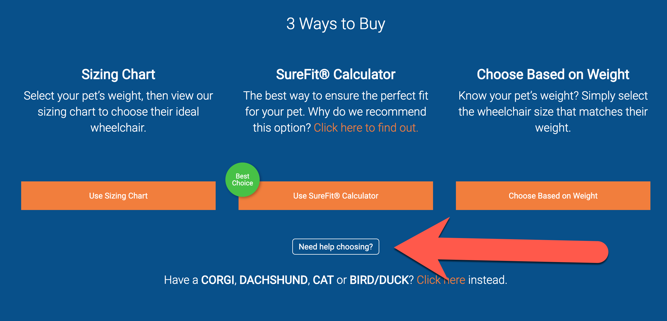
At first glance, an action button can look like an ordinary call to action, but it’s something more. It doesn’t take the user to a product page or sign them up for an email series. Instead, it lets us know what the shopper needs.
When a shopper clicks on “Need help choosing?”, they see this lightbox:
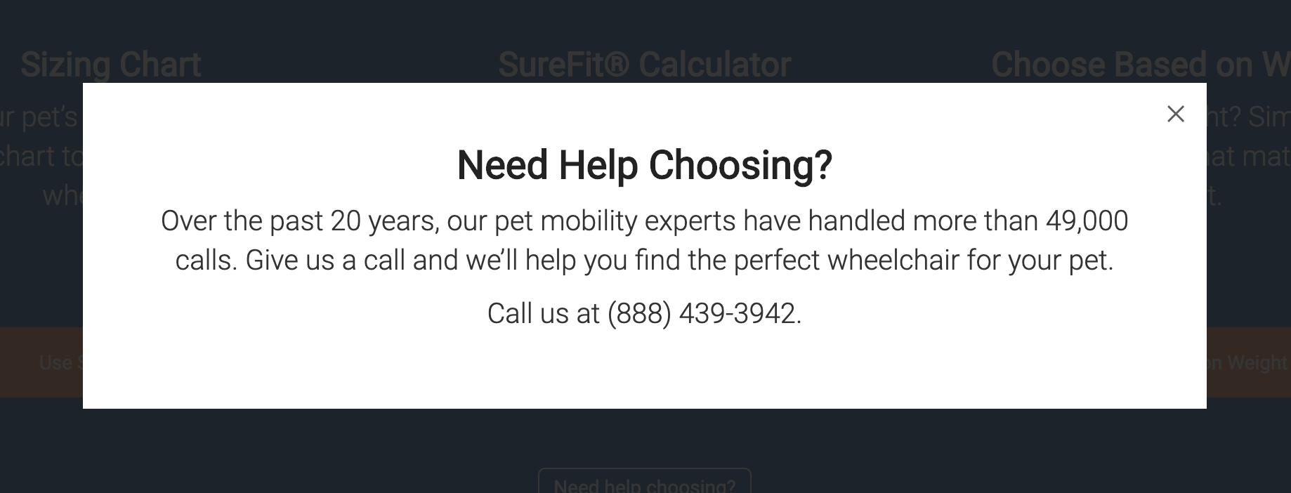
Note: Always think about your mobile experience. For mobile users, the phone number in this lightbox is clickable so that the user doesn’t have to manually enter the number in their phone.
On the measurement calculator page, we showed the following “Need help?” button beside the measurement section only if the user had been on the page for at least 25 seconds:
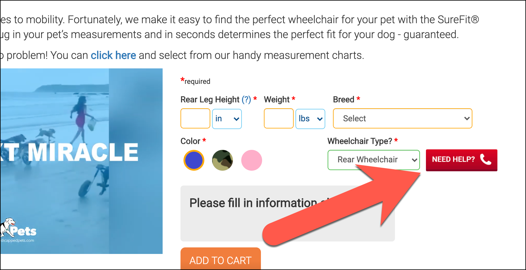
This 25-second delay increases the visibility of the button because when something appears out of nowhere, it naturally catches your attention.
Finally, we also added a fixed phone call icon to the bottom right corner of the user’s screen (mobile only):
On click, we again showed a lightbox that allowed users to call customer service.
This was placed beside the chat prompt to give shoppers an alternative to chat. Some people prefer talking over the phone; others prefer talking over chat — why treat everyone the same?
Outcome
After 4 weeks of running our concept, our concept generated an average of 17.90 additional orders and $3,006.54 per week. Not adjusting for growth or seasonality, translates to $156,000 in additional revenue over the course of a year.
Why Our Concept Won
There are 2 types of shoppers: 1) self-directed, independent shoppers who don’t need help, and 2) shoppers who struggle to make a purchase for one reason or another. It’s difficult to know where these shoppers are struggling without talking to them. That’s where call-ins can really shine.
More Evidence
%
Tiege.com was already doing really well. They wanted to see how much further test to paid search landing page could be pushed.
Read Case Study%
What's better than a sales pitch that converts? A personalized sales pitch that converts.
Read Case Study%
Stix is on a mission to disrupt the golfing game. Consumers don't just buy a new golf club. A lot goes into that purchase.
Read Case Study%
Glemnetic.com is a leader in its space. We wanted to see if we could push conversion rates higher.
Read Case StudyARE YOU OUR NEWEST CASE STUDY?
We are laser focused on the type of client that our methodology and skills will give the highest return on investment and so if you meet our criteria for taking on new projects, we are confident you will see results like these.


