
Case Studies
How Revealing Your “Why We Exist Story” Can Boost Conversions Sitewide
- Goal:
- Improve the conversion rate on product pages outside of the wheelchair category by 5%.
- Outcome:
- 14.61% conversion rate lift on non-wheelchair product pages.
The Setup
We usually focus our attention on just one product page. For HandicappedPets.com, that’s usually one of their Walkin’ Wheels® pet wheelchair product pages. This category is responsible for a bit more than half of their revenue.
However, we couldn’t ignore the fact that almost half of their revenue was coming from various other product categories. It would have taken ages to optimize each non-wheelchair product page individually, so we had to come up with a different approach.
The Problem
If you do a Google search for “dog ankle brace”, this is what you might see:
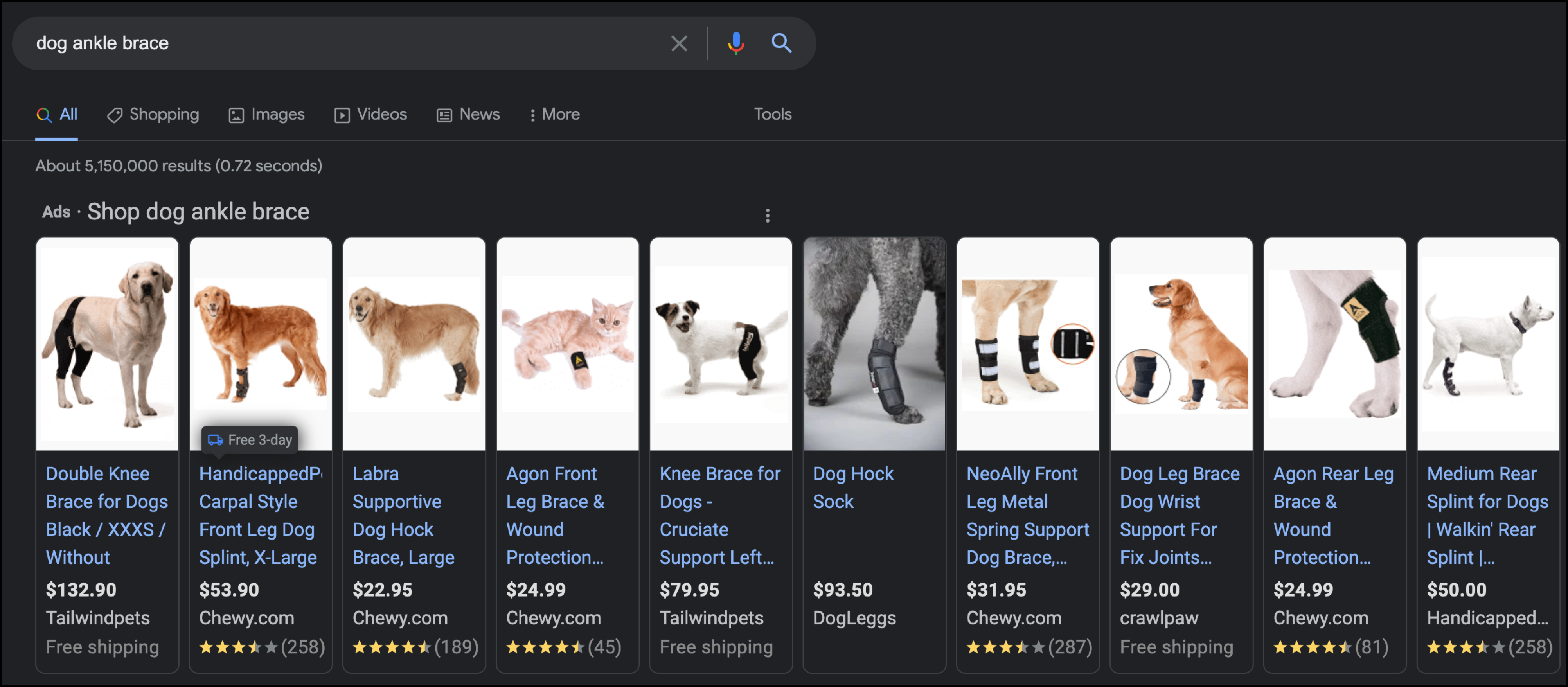
So many options from so many different places.
Shoppers will often open results in different tabs to compare options. If we can’t make ourselves stand out as the best choice, then we’ll lose the shopper and the sale. If we could reveal to first-time shoppers what makes HandicappedPets.com unique, then we could boost sales on their non-wheelchair product pages.
The Concept
We created a special “why we exist” sales pitch for new buyers and placed it on all product pages.
And on each product page, this “why we exist” sales pitch was revealed when the call-to-action (CTA) was clicked.
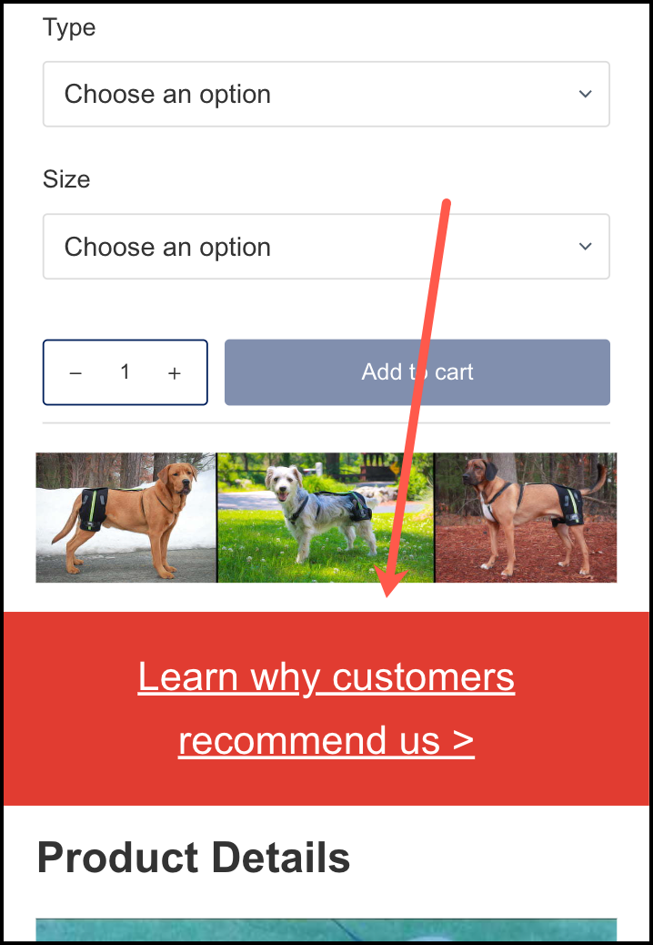
But if the CTA was placed at one location on the page many shoppers would miss it. So we conditionally repeated it multiple times across the page.
Location 1: Just below the Add to Cart section:
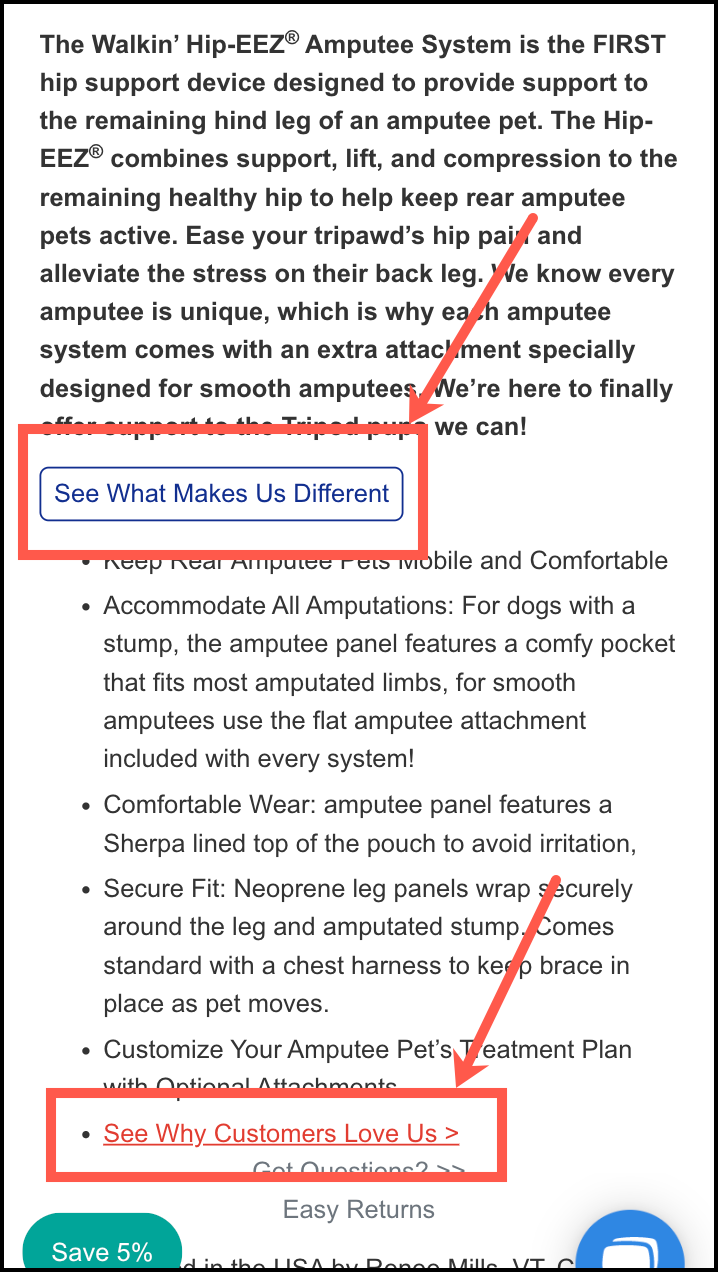
Location 2: In the Product Details section:
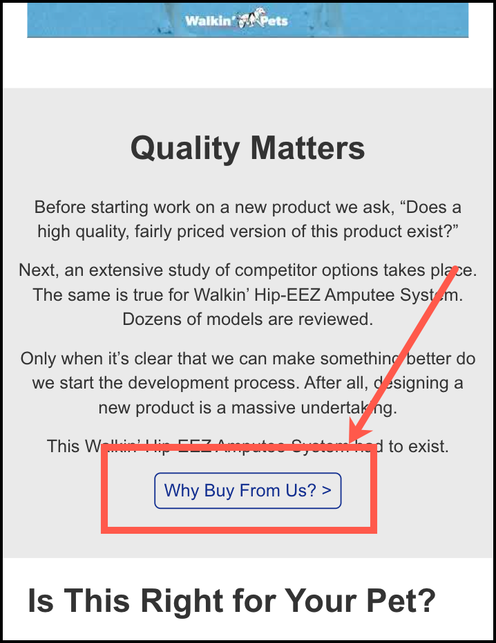
Location 3:
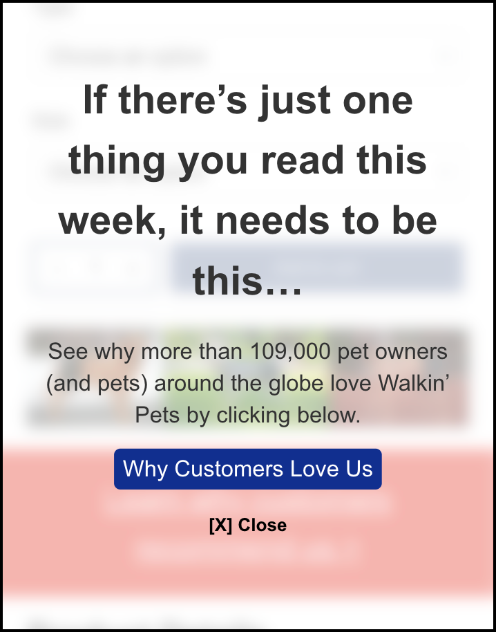
And lastly, we added a screen overlay that appears when one of two conditions is met: 1) the shopper scrolls 40% of the way through the product page without clicking on any of the CTAs mentioned above, or 2) the shopper spends at least 2 minutes on the page without clicking on any of the CTAs above.
This is what the screen overlay looked like:
What Happens When Someone Clicks One of Our CTAs?
Now you’re probably curious about what happens when someone interacts with any of these calls to action.
Two things happen:
1: All the other CTAs disappear. This prevents shoppers from clicking different calls to action but seeing the same content, which can hurt conversions. By hiding the other call-to-actions when the first one is clicked we were maximizing visibility while minimizing repetition. You can learn more about this technique in this article: Conditional Elements.
2: We show the shopper our “Why We Exist” pitch in a lightbox window. This is where we create a controlled, distraction-free environment where the shopper can only focus on our full sales pitch.
Since this test was running on all product pages it was written in a way it made sense no matter what product page it was activated on.
Does this strategy make sense? /

Here’s What Our “Why We Exist” Pitch Looked Like
Click on the annotations (green and blue numbers) to read the explanations for the copy choices we made in the lightbox the visitor sees.
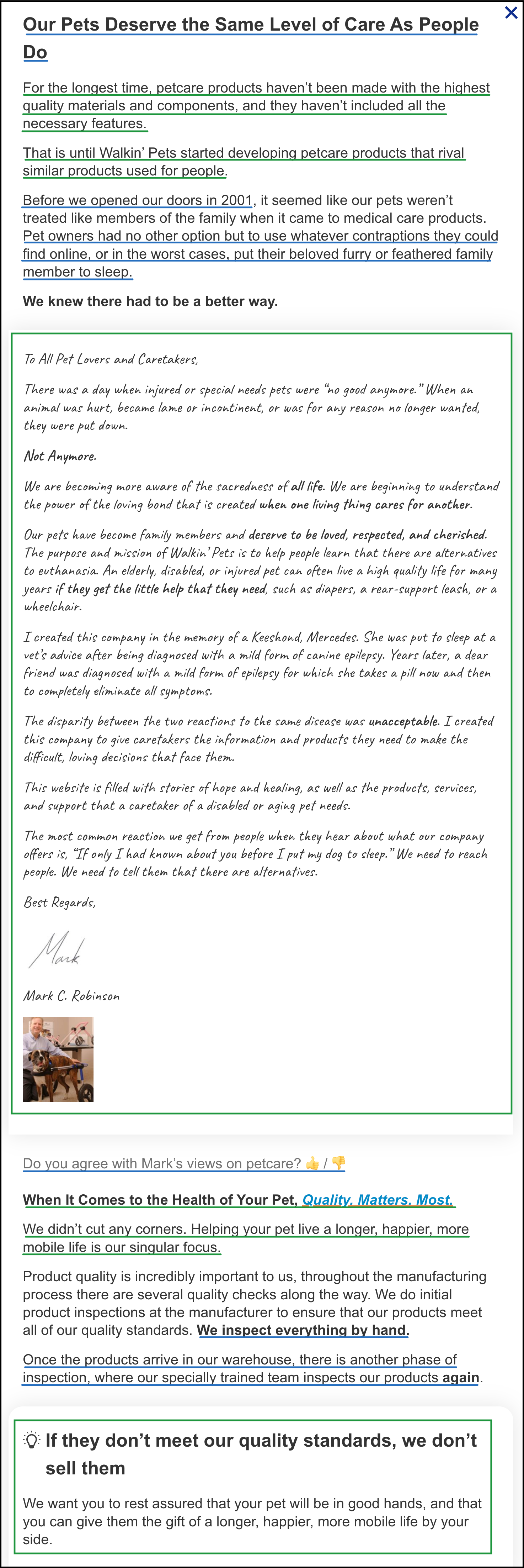
Choosing what to buy is hard– there are so many things to consider. So our brains have developed shortcuts that help us know what to buy and what to ignore. After 16 years of experimentations we’ve been able to identify the 9 truths about online shoppers and these are what we use to construct sales pitches.
Were the copy choices in our sales pitch clear? /
Outcome
The test was exposed to 38,493 visitors and recorded 990 orders by the time a statistically significant (at least a 95% confidence level) winner was declared.
In the end, the test concept achieved a 14.61% conversion lift at 98.52% confidence. Additionally, the test led to a 15.74% revenue increase during the test period.

More Evidence
%
Tiege.com was already doing really well. They wanted to see how much further test to paid search landing page could be pushed.
Read Case Study%
What's better than a sales pitch that converts? A personalized sales pitch that converts.
Read Case Study%
Stix is on a mission to disrupt the golfing game. Consumers don't just buy a new golf club. A lot goes into that purchase.
Read Case Study%
Glemnetic.com is a leader in its space. We wanted to see if we could push conversion rates higher.
Read Case StudyARE YOU OUR NEWEST CASE STUDY?
We are laser focused on the type of client that our methodology and skills will give the highest return on investment and so if you meet our criteria for taking on new projects, we are confident you will see results like these.


