
Blog
Website Popup Ideas (8 Examples to Steal) [UPDATED: August 2025]
We’re always on the hunt for email pop-up ideas, and we’re going to share our favorite website popup ideas in this article.
Why Website Popup Ideas Matter
While email signups are critically important, 98.05% of our site visitors ignore them (source).
Have you considered using principles of buyer psychology for email signups?
What’s Buyer Psychology?
It’s the study of shopper behavior. As much as we like to believe each person is totally unique, we behave in very predictable ways. By understanding the psychology of site visitors, we can better connect with them. By better connecting, we can do a better job of converting them.
Email Pop-up Ideas and Buyer Psychology
We all show the same email pop-ups with the same generic messaging. Would you sign up for your own email newsletter? Chances are you would close out of a pop-up before reading the first 3 words.
It’s because our pop-ups are easy to ignore.
These 7 email pop-up ideas stand out because they’re unique and different, which is why they will help you optimize conversion rates.
Seven website popup ideas for you to steal.
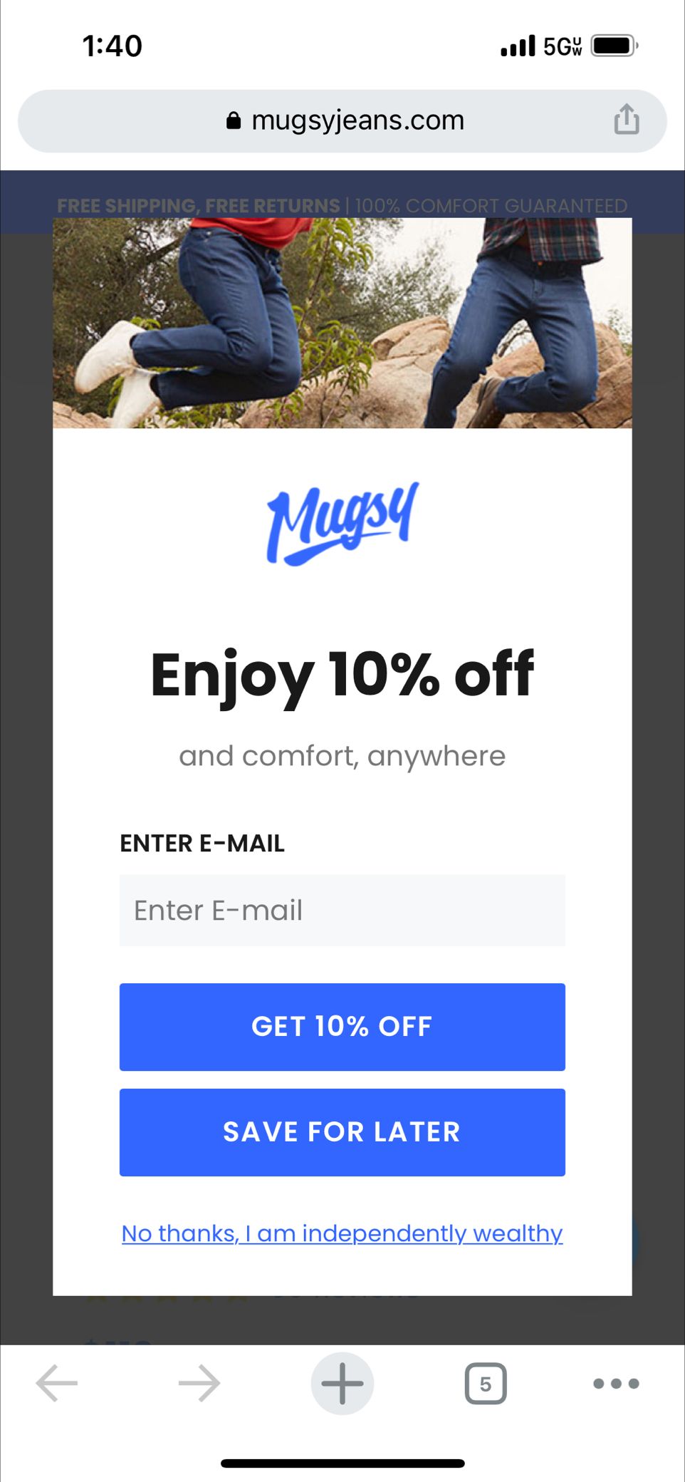
Idea 1: Unconventional Design
90% of the pop-ups out there look exactly the same. They’re rectangular and feature an easy-to-spot and all-too-enticing ‘close’ button on the top right corner.
Seems like a good way to immediately tell users how to close your pop-up, right?
So why not try an alternative pop-up shape—something that will make your shopper stock for an extra second because they weren’t expecting something so different?
3D pop-up design on StriVectin (strivectin.com). I love this email signup buyer psychology tactic because the 3D effect makes me slow down. That slowdown grants an extra few seconds for the visitor to notice the 15% off message:
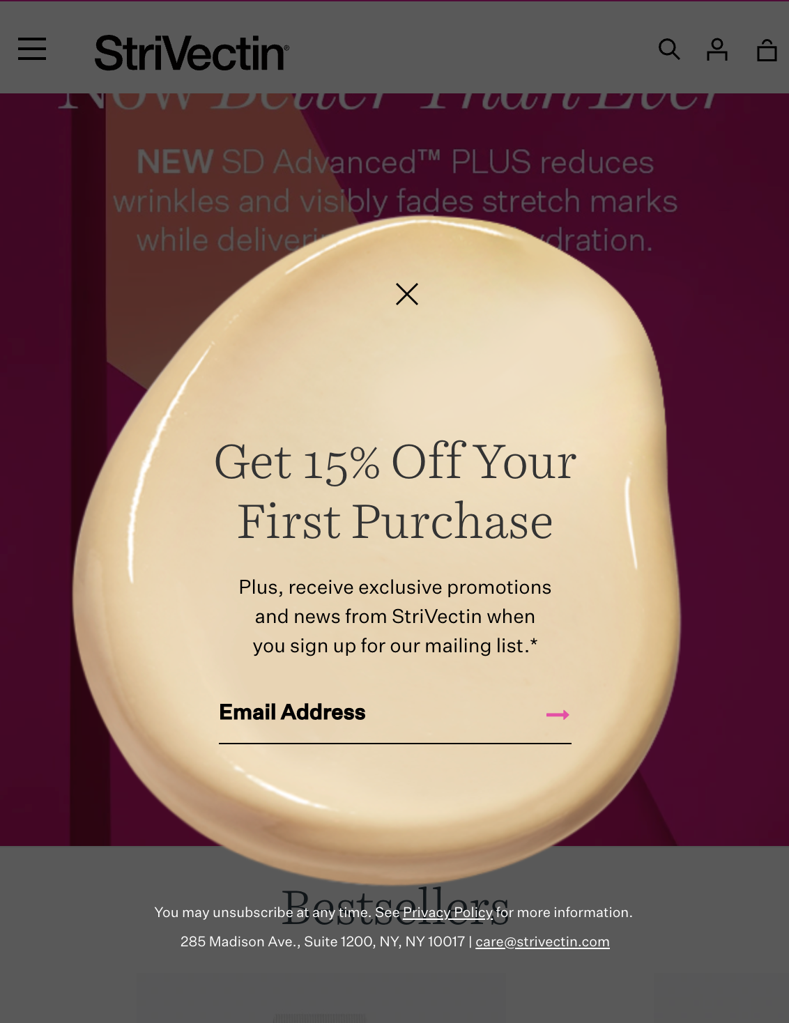
Here is a stacked look that stands out because I’ve never seen this before. When shoppers encounter a design or message they haven’t seen before, it slows them. That small shift can make a big difference.
Here’s another unexpected shape:
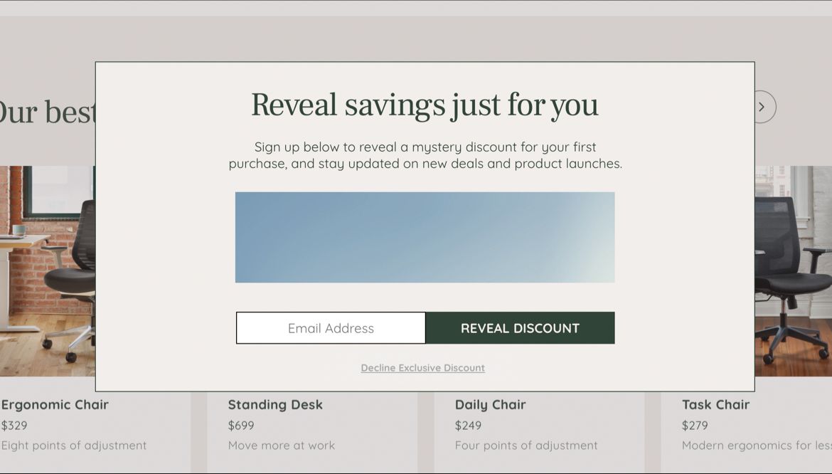
Idea 2: Can You Keep a Secret?
You probably want to know what the secret is, right?
As I said earlier, people are naturally curious. UncommonGoods.com knows this and they’ve taken advantage of this with their email signup.
Take a look at this floating tab that appears on their site:
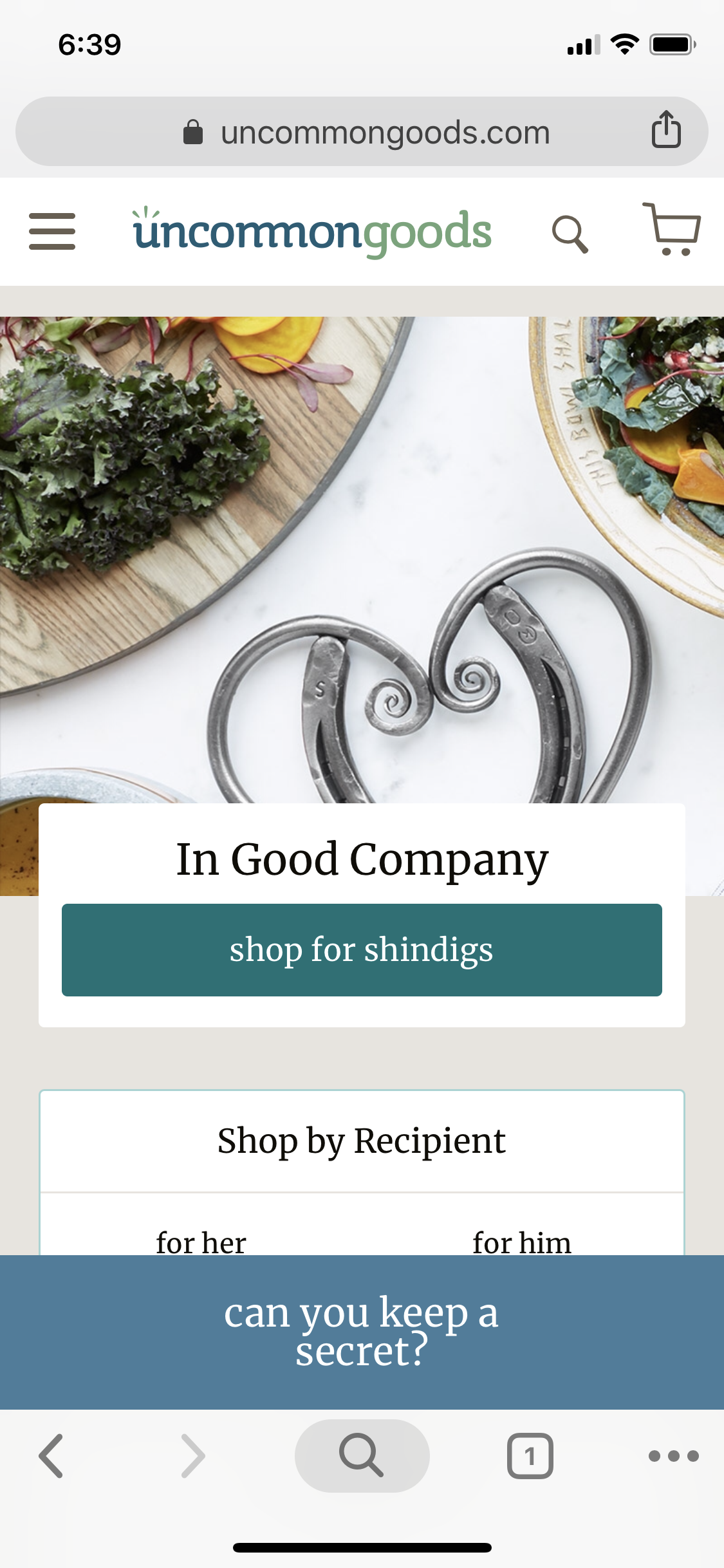
Many shoppers will definitely want to know what the secret is, so they’ll click on this floating tab. When they do, they’ll see this:
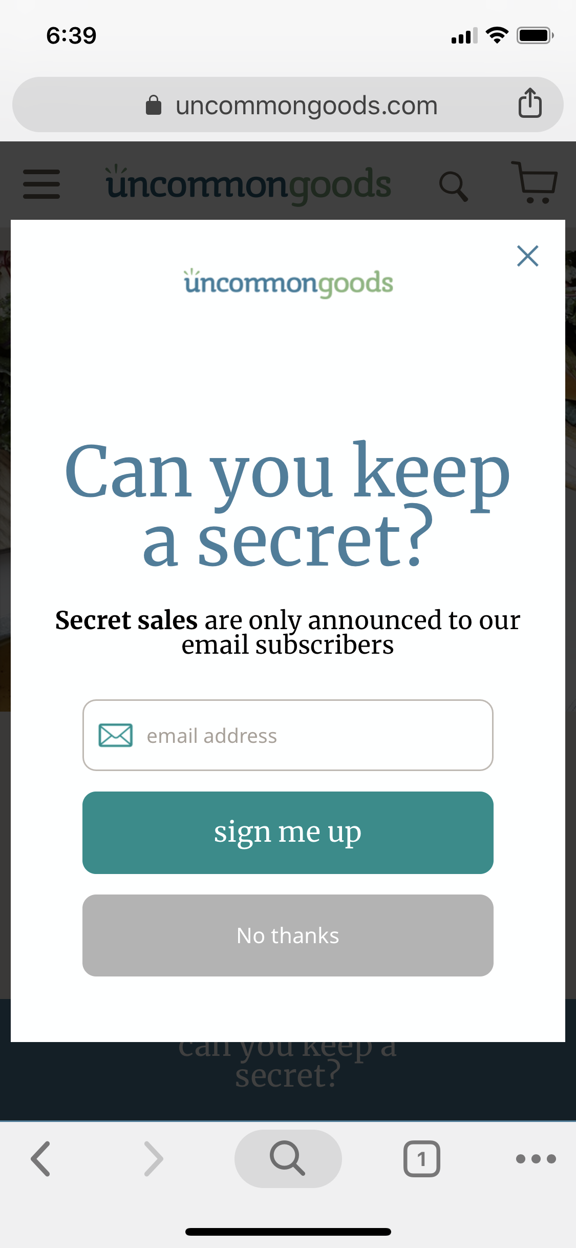
UncommonGoods.com is making their shoppers feel exclusive. After all, only people who subscribe will be notified of “secret sales.” Do you think all shoppers would be able to resist the urge to find out what secret sales they could benefit from?
This is a clever buyer psychology example for email pop-ups.
Idea 3: Framing Things Differently
You’ve seen those “I don’t want to save money” messages on email signup popups.
They can be annoying.
At least this one gave me a chuckle. It’s not so in your face.
Note to self: humor is a conversion tool.
Idea 4: Interaction
If you can make the user interact with your popup, do it.
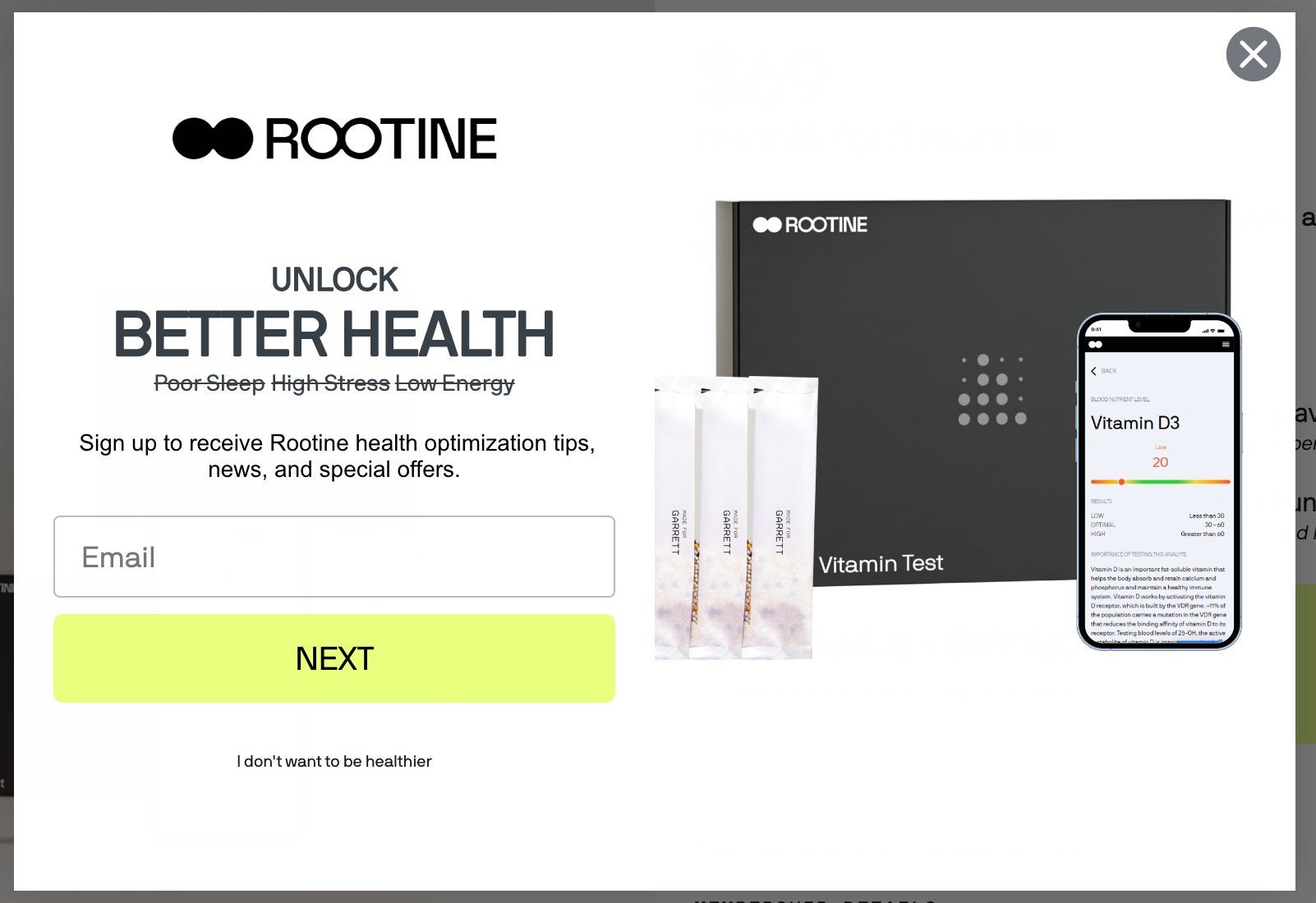
Idea 10: Strikethrough
There is something indescribably attention-grabbing about a strikethrough. Use it wisely.
Idea 5: Animated
Here’s another interesting pop-up design where one part appears first, and the other slides into place after a short delay.
It feels like a small detail, but when it comes to pop-up design, animations matter.
We’re trying to accomplish two things:
— Not feel like a standard pop-up
— Surprise the user a little to delay them from exiting
All of this is an effort to earn a few extra milliseconds, as they’re the difference between the offer being noticed and missed.
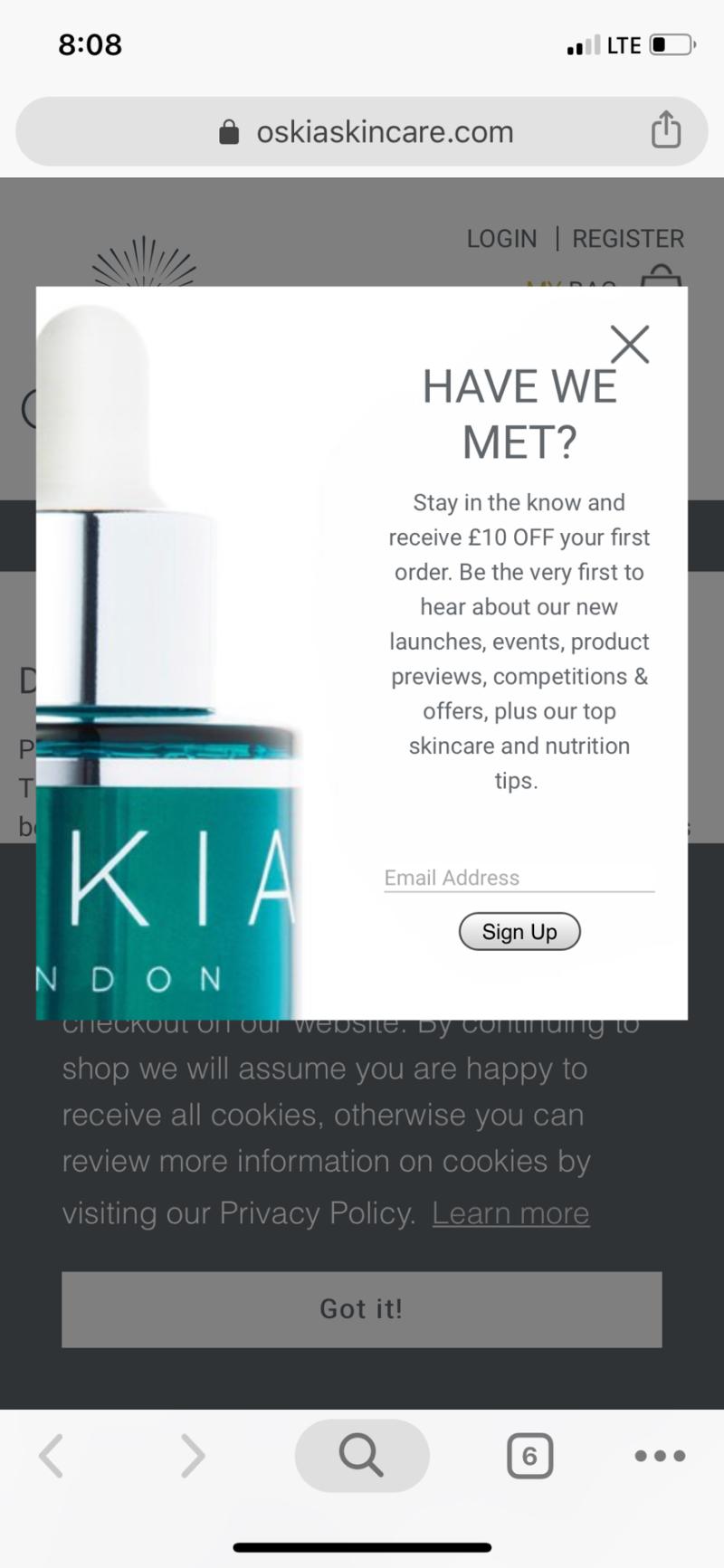
Idea 6: Great Headline
Having seen 10,000 popup messages, I like this “Have we met?” headline:
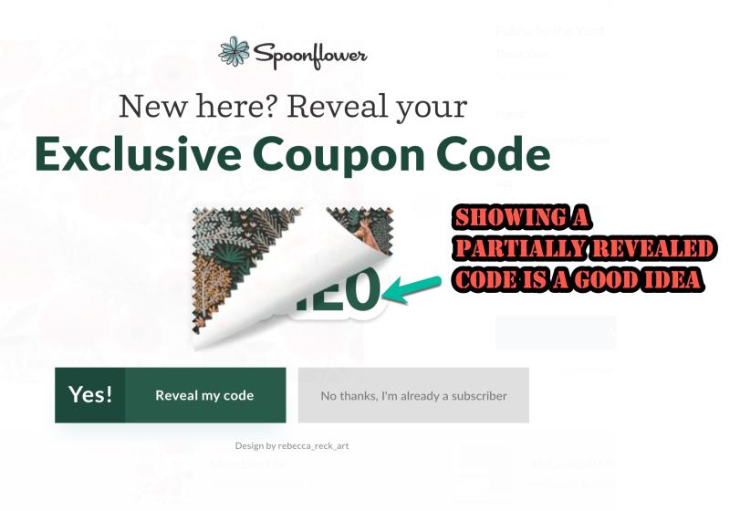
Idea 7: Partially Revealed Code
I liked this partially revealed code idea:
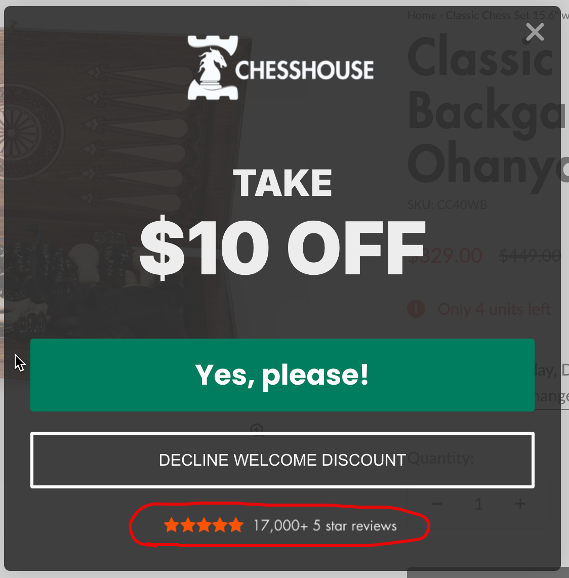
Idea 8: Social Proof Review Count With Email Signup Popup
I like how chesshouse.com reduces my anxiety about giving up my email address by letting me know that they have 17,000 5-star reviews.
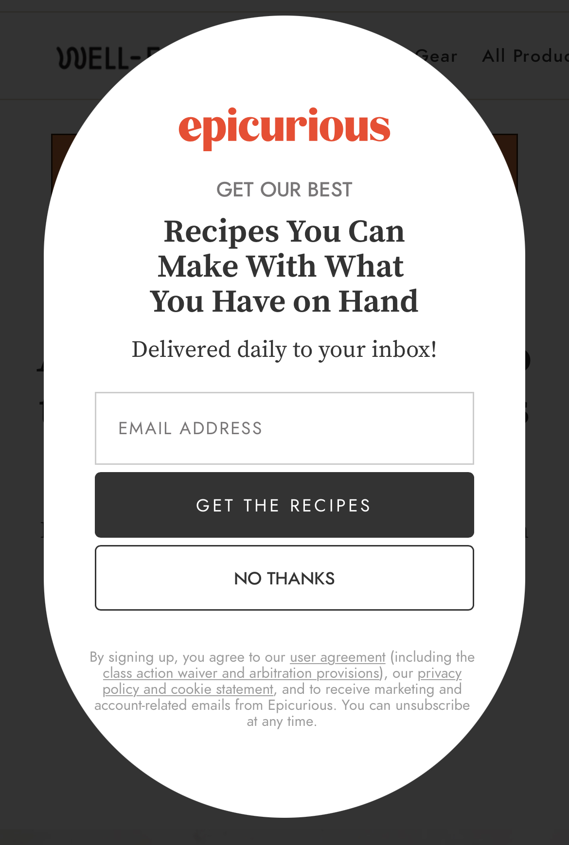
Want More Examples?
I spend 20 hours a week truffle hunting for interesting marketing ideas. In my searches, I find a lot of interesting things, including clever popup ideas, like the strikethrough example above. If you want me to share my findings, please consider joining my marketing newsletter.
Are You a Marketer?
I suspect you are because the subject of website popup ideas could only interest marketers.
And if you are a marketer and liked this article, boy, do I have something fun for you.
Revealing It All
In our marketing lab 🥼, experimenting 🧪 for the last 16 years, we’ve discovered that one reason marketing campaigns fail is because they try to do too much.
Site visitors fall into 3 groups:
— Ready to buy
— Will never buy
— Interested, but need a little more convincing
The 3rd group has the biggest revenue potential.
Evidence Our Formula Works
This strategy mentioned above isn’t a theoretical framework. It’s the base formula for all our conversion work for clients. This marketing framework can be used to boost sales for sports products. To sell skincare products. Pet products. Consumer electronics. Athletic gear. Back pain solutions. Food items. High-end cooking tools.
Does the sales pitch always need to be shown as a popup? Nope.
It can also convert cold Facebook ad traffic, improve mobile conversion rates, generate calls, optimize your most important landing page, etc.
It can even be used to improve your overall conversion rates.
Converting Interested, but Need a Little More Convincing Group (With Examples)
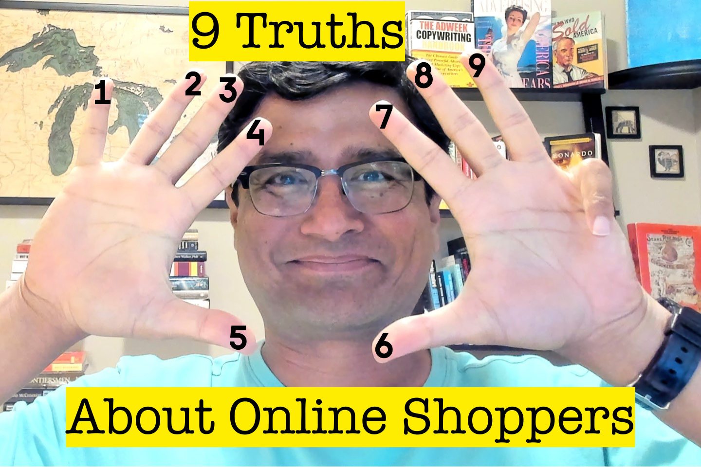
Explained in this👇🏼 Nine Truths article:


Comments 7
That’s a really nice list of options if you insist on using a pop up.
My favourites: The ‘can you keep a secret’ and the ‘Get a mystery discount’, as they use the open loop. I’d never have thought on using this psychology tactic on pop ups.
I’ve bookmarked your blog. Thanks for taking the time to create an overview of options!
ReplyRishi Rawat
Thanks, Hanna. I’m so glad you liked the examples.
ReplySuper useful advise as always, thanks Rishi!
ReplyI believe that using this type of CTA is much more effective at motivating users to sign up, but are we sure that the leads we’re collecting aren’t just interested in getting the discount?
ReplyRishi Rawat
Thank you so much for dropping a comment, Mattia. I believe this is the first time I’m seeing a comment from you, so yay!
Now, back to answering your question.
You have a valid point. One that marketers have been debating for a very long time: Is more better?
I think it’s something a brand would have to actually measure on their own site to see if it’s worth it. But all else being equal, more people signing up for the offer is a better outcome for the business, assuming the business can still make a profit with the discount.
The biggest challenge with pop-ups isn’t that the offer wasn’t compelling for the buyer. It’s that the buyer often never even noticed it because they exited the pop-up so quickly.
That’s the specific problem we’re trying to solve with this design solution.
ReplyLove this. Would love to hear your thoughts on 10% discounts that most sites use.
ReplyRishi Rawat
While I personally don’t like them at this point I feel we’ve set customer expectations so not offering it can be a disadvantage. But it’s best to verify by running an A/B test.
Reply