Blog
The Endowment Effect And Your Product Page
Let’s face it. What you want is to convert. You want your visitors to hit BUY NOW and turn into customers. Your product is fantastic. You’ve optimized your product page.
So what’s missing? It’s time to get into some psychology and better understand your visitors.
Enter the endowment effect—a cognitive bias that can be a game-changer for conversions on your product page. We’ll walk you through this powerful tool and how you can use it to supercharge conversions.
But first things first…
What is the Endowment Effect?
Picture this: You’re having breakfast with your friend at the local coffee shop. You both order the same coffee. You both take the first sips of your coffee. You’re delighted with your choice, and it shows. Your friend notices and wants a sip, too. You let them, but once they taste it, they ask to swap.
Assuming you both paid the same amount for your coffees, how ready are you to swap? Chances are, you’ll be reluctant. Why?
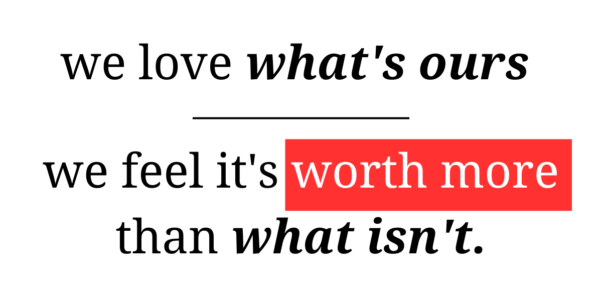
The endowment effect is a quirky psychological phenomenon where people overvalue things they already own. In other words…

This is why people hoard everything from physical assets to stocks. You want this in your toolkit if you’re looking for an unfair advantage.
But how can you make it work for you?
How to use the Endowment Effect
There’s plenty of great advice out there. Like…
- Create a Sense of Ownership
- Offer Personalization
- Price Like a Pro
Studying what’s out there, you may think you need a complete overhaul on your product page, but we have a better way.
How we do it
The endowment effect has a permanent place in our toolkit. It’s woven into our unique system for supercharging conversions. You can find a demonstration here.
But below is a sneak peek into how we get we can optimize your product page for massive conversions using techniques like the endowment effect without having to change your product page.
Our target:
A group of visitors that deserves 100% of your attention. They’re people leaning in with interest—the curious shoppers taking in your product page fully, looking for the info they need to take them over the edge and hit buy.

Some of them will buy, and that’s great. But we focus on those who don’t. Then, we use a 3-step process to get them to buy.
Step 1: Map out High-Visibility Locations
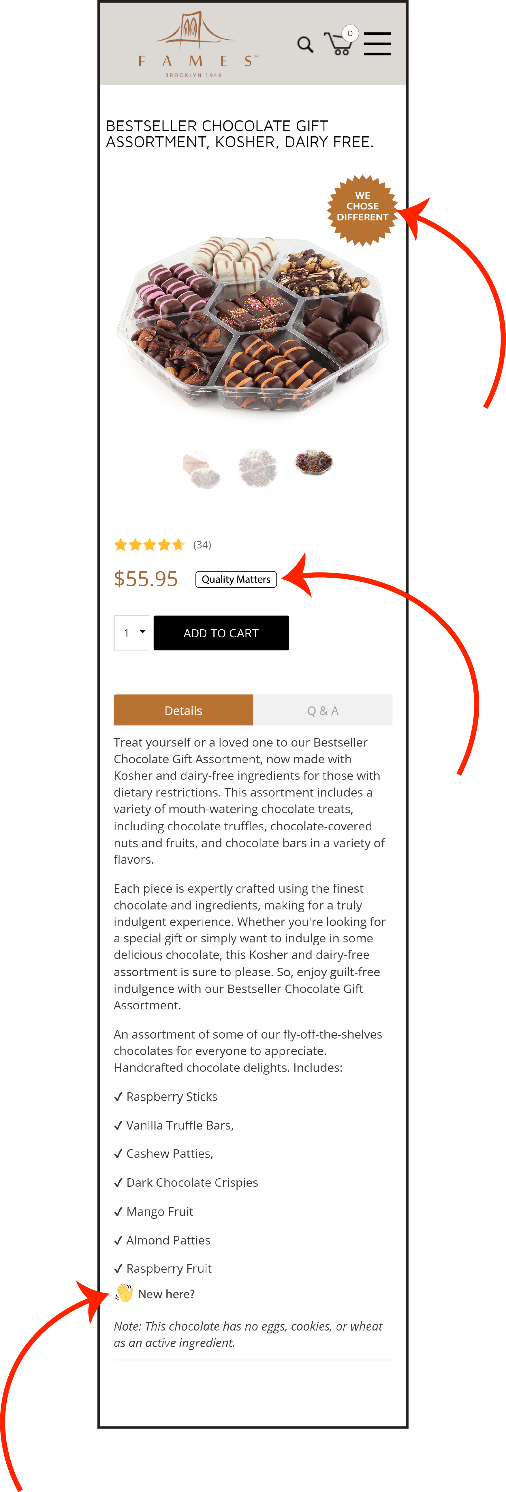
We place subtle CTAs in strategic locations on your site where we know your target audience will spot them. We’ve attached red arrows in this example so it’s easy to spot where we’d place the CTAs.

Step 2: Build the Sales Pitch
When they click one of our CTAs, the rest of them disappear. Then, they see a powerful sales pitch that’s been custom-built to convert.
We have a solid formula for building our pitches based on the 9 Truths About Online Shoppers. Those truths have the endowment effect and many other psychological principles woven in.
Step 3: Find the Winning Pitch
Our 9 truths formula allows us to build many sales pitches. But we don’t know which is the best, so…

To see the 3 steps in action, check out this article.
Evidence
This concept isn’t a theoretical framework. It’s the base formula for all our conversion work for clients. This marketing framework can be used to boost sales for sports products. To sell skincare products. Pet products. Consumer electronics. Athletic gear. Back pain solutions. Food items.
It can also convert cold Facebook ad traffic, improve mobile conversion rates, generate calls, optimize your most important landing page, etc.
You can use it to improve your overall conversion rates.
Want to try it out for yourself? Drop me a comment, and I’ll show you how.


