Blog
Infographics and Conversion Rates
Infographics are used to convey information visually.
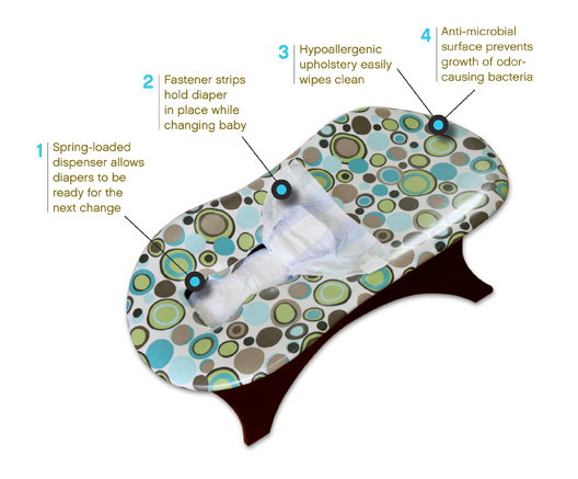
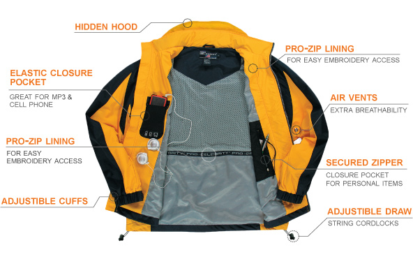
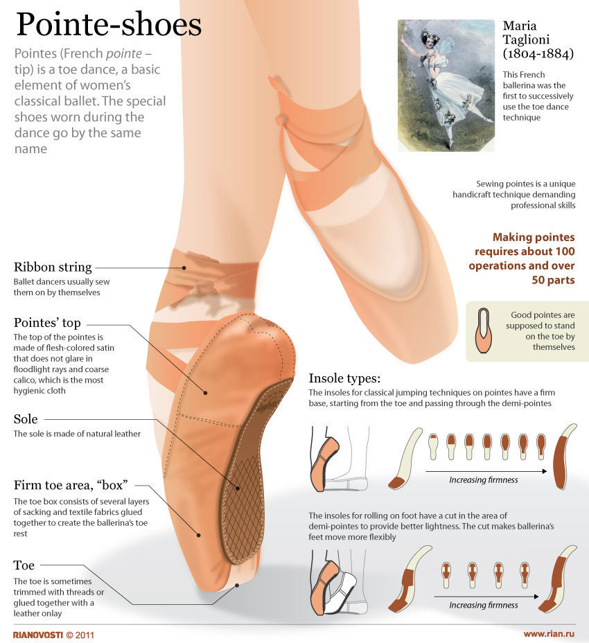
The standard product page consists of a product image followed by a product description. However, to support product description if you can repeat the most important/differentiating points from your description into product image you will dramatically improve effectiveness. Posted below are some e-tailer examples. As you can see, this strategy works for all types of items- from diaper changers to ballet shoes:
Why Infographics Matter
Visitors typically visit a site just once. If you go to your Google Analytics and peek into the Audience –> Overview report you’ll find a pie chart that shows your site’s returning visitor rate.
Here’s mine:
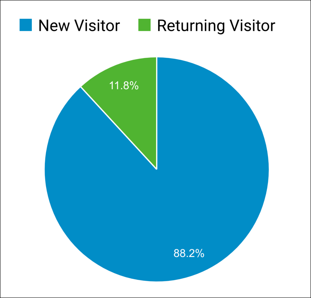
Even if your return rate is 20% it means 80% of visitors see your site just once.
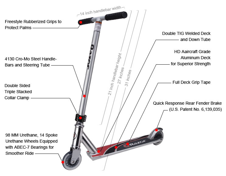
Those are garbage odds. This means the marketer needs to convey as much information as possible on the first visit itself. Infographics help with this. Here are some more infographic examples:
Infographics and Picture Stories
The difference between an Infographic and Picture Story is that the infographic contains technical information whereas the Picture Story is used to reinforce the marketing message for the product. See this article for an example of a picture story.
Are You a Marketer?
I suspect you are because you are curious about infographics and website conversion rates.
If you are a marketer and liked this article, boy, do I have something fun for you.
Revealing It All
In our marketing lab 🥼, experimenting 🧪 for the last 16 years, we’ve discovered that one reason marketing campaigns fail is because they try to do too much.
Site visitors fall into 3 groups:
— Ready to buy
— Will never buy
— Interested, but need a little more convincing
The 3rd group has the biggest revenue potential.
Evidence Our Formula Works
This strategy mentioned above isn’t a theoretical framework. It’s the base formula for all our conversion work for clients. This marketing framework can be used to boost sales for sports products. To sell skincare products. Pet products. Consumer electronics. Athletic gear. Back pain solutions. Food items. High-end cooking tools.
Does the sales pitch always need to be shown as a popup? Nope.
It can also convert cold Facebook ad traffic, improve mobile conversion rates, generate calls, optimize your most important landing page, etc.
It can even be used to improve your overall conversion rates.
Converting Interested, but Need a Little More Convincing Group (With Examples)
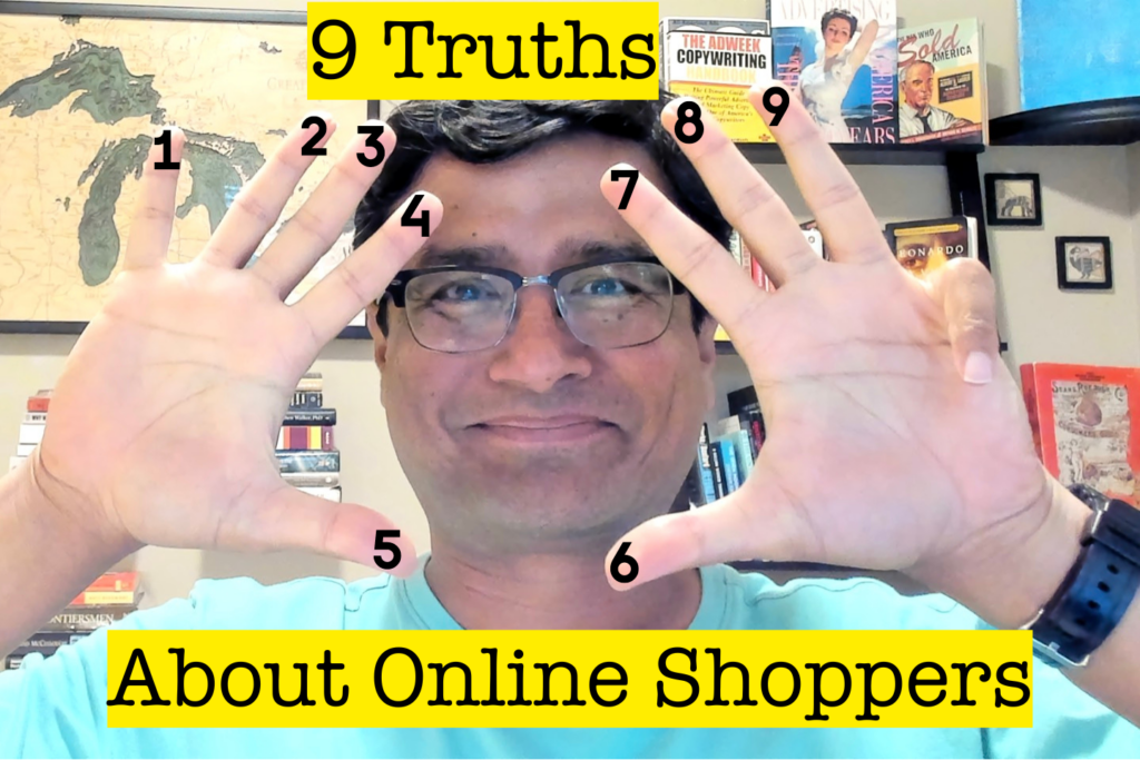
Explained in this👇🏼 Nine Truths article.



Comments 6
Interesting and attractive idea but I am reluctant to include text (solely) in my product images because search engines do not (yet) index this text, and so the important relevance signals from this text are lost. I doubt that the img alt tag would be of much use as a substitute for the lost textual content. An SEO-acceptable version of this idea would be awesome.
Replybetterretail
Hi Ted,
The product page should use the image format above while keeping the existing product description. Based on your comment I’ve updated the language above to– However, to support product description if you can repeat the most important/differentiating points from your description into product image you will dramatically improve effectiveness.
Thanks for the comment!
Rishi
ReplyRishi, great post. I think it would be interesting to better explore the economics of the production of these types of images. When does it make sense invest in this type of informative image. Depending on my SKU depth it may or may not make sense to invest in this. A simple ROI model that takes into consideration the improvement in conversion would be a good tie in.
Great work. Keep it up.
Shilo
Replybetterretail
Thanks for the comment, Shilo. I agree with your point– “Depending on my SKU depth it may or may not make sense to invest in this.”
I don’t think the retailer needs to make a choice between having all images in this format or none. They can pick and choose. I’d consider this tactic for the following–
1. Products that have a lot of technical specifications/differentiations. Dyson vacuum cleaner is a good example.
2. Product pages with a low look-to-book ratio.
3. Products that generate higher net-margins.
And I’d definitely run this as a test.
ReplyThis is great stuff – thanks for sharing. mj
ReplyHey Rishi, its a new and attractive idea. May be it will not work well for SEO point of view but surely will attract the users to buy the same.
Reply