Blog
DTC CRO: How to Optimize Your Direct-to-Consumer Conversion Rates
Welcome to the ultimate guide on optimizing your Direct-to-Consumer (DTC) conversion rates! Whether you’re a seasoned marketer or a budding e-commerce enthusiast, mastering the art (and science) of Direct-to-Consumer Conversion Rate Optimization (DTC CRO) is key to unlocking your online store’s true potential. So, read on for tips, tricks, and game-changing insights.
But first things first.
What is DTC CRO and Why Should You Care?
Direct-to-consumer conversion Rate Optimization enhances your online store to convert visitors into customers. It’s like turning your website into a well-oiled, customer-attracting, revenue-generating machine.
Why should you care? Because higher conversion rates mean more sales, and more sales mean more revenue. More revenue? Well, that just means more reasons to celebrate!
So, here are 7️⃣ DTC CRO tips to keep in mind.
The Basics of DTC CRO (or what everyone else should be doing)
1. Know Thy Audience
Before you even begin Direct-to-Consumer CRO, you must first understand who your audience is. It’s like dating—before you can impress someone, you need to know what they like. Use analytics tools to gather data on your customers’ behavior, preferences, and demographics. Are they night owls browsing at midnight? Do they love cats more than dogs? Okay… maybe not that. But every bit of information can be valuable.
2. Streamline the User Experience
Nobody likes a clunky website. If your site is slow, you’re losing potential customers. Optimize your site speed, ensure mobile-friendliness, and simplify the navigation. Remember, a happy customer is a converting customer!
3. Craft Killer Content
Your content should be as irresistible as warm bread fresh out of the oven. Use engaging, high-quality content that speaks directly to your audience. Don’t forget the magic of SEO to drive traffic.
4. Leverage Social Proof
People trust people. Display customer reviews, testimonials, and case studies prominently on your website. Seeing others rave about your products can nudge hesitant shoppers towards making a purchase. Show them that your party is already the place to be!
5. Optimize Your Checkout Process
The checkout process should be smoother than a jazz solo. Minimize the number of steps, offer multiple payment options, and ensure security. Abandoned carts are the bane of DTC CRO—don’t let them haunt you.
6. Personalization is Key
Imagine walking into a store and being greeted by name, with a selection of products tailored just for you. That’s the magic of personalization. Use data to offer personalized recommendations and create a unique shopping experience for each visitor.
7. A/B Testing for the Win
Never underestimate the power of A/B testing. Test different versions of your web pages, headlines, images, and call-to-actions to see what resonates best with your audience. It’s like trying on different outfits before a big date—find out what makes you look (and convert) best!
Okay, all great stuff. But I promised game-changing insights. And I keep my promises 👇
DTC CRO the Frictionless Way
First, let me commend you for researching DTC CRO and reading up to this point. For that alone, you’re already ahead of the curve. But what you’re about to uncover isn’t just about getting ahead—it’s about making your competitors irrelevant.
For over a decade, we’ve been brewing marketing magic in our lab 🥼, refining strategies, and conducting experiments 🧪. With our clients investing over $2.9 million, we’ve gathered a treasure trove of insights, some more surprising than others.
The Lesson of a Lifetime
One crucial lesson we’ve learned is that trying to capture every site visitor is like trying to boil the ocean—impossible and exhausting. There’s a much smarter approach.
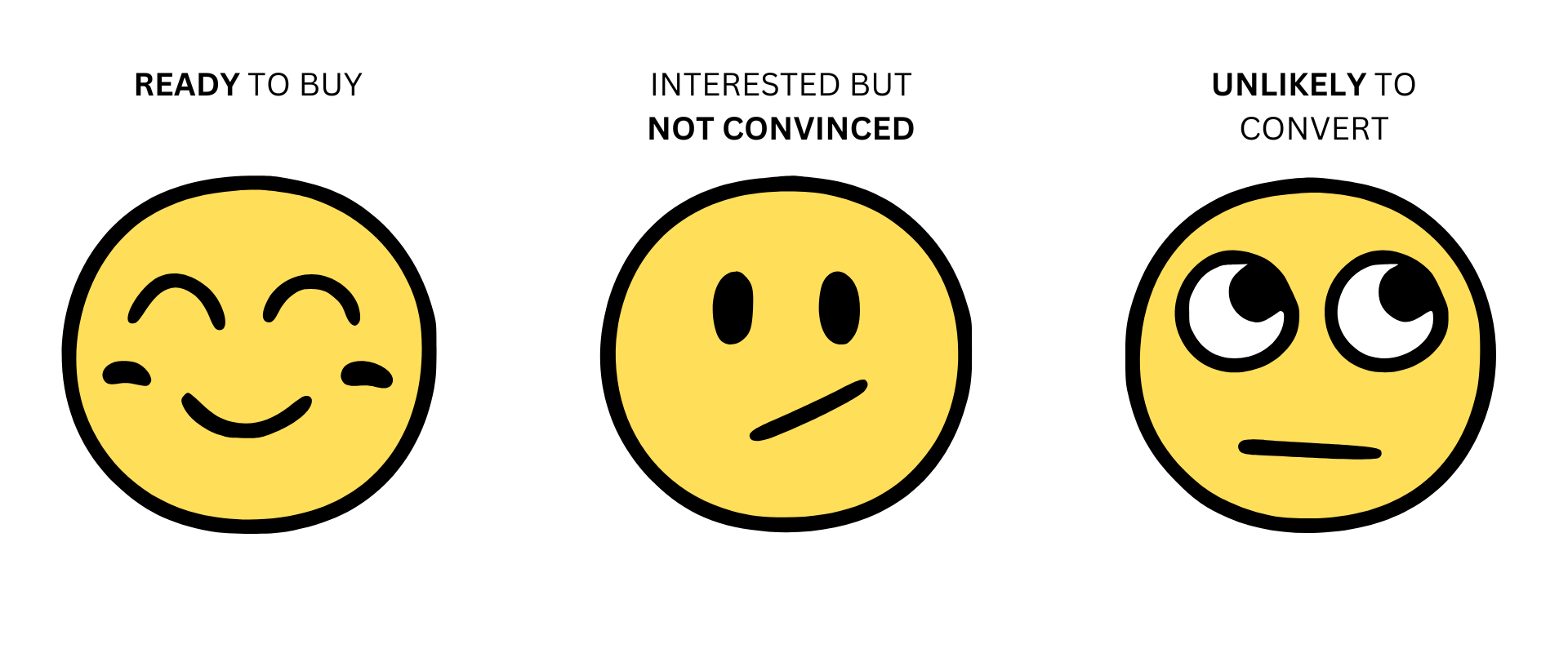
In reality, your site visitors can be categorized into three distinct groups:

You’ve already got the first group in hand, and the third group? A waste of time and resources. The key, we’ve discovered, is to focus on that sweet second group—the interested but not yet convinced. We’ve spent 16 years targeting and converting this audience.
They’re leaning in, fully absorbing your product page, searching for that final piece of info to push them over the edge. Here’s how we target this group for a staggering 20% surge in conversions within just 90 days—without butchering your product page.

Step 1: Map Out High-Visibility Locations
First, we strategically place call-to-actions (CTAs) in easy-to-spot yet unobtrusive areas on your website. The goal? Maximum exposure for our target audience and minimal friction for everyone else. Below, we’ve highlighted these locations with red arrows for clarity.

Step 2: Build the Sales Pitch
When visitors click on one of our enticing CTAs, all others fade away. They’re greeted with a customized pop-up sales pitch, meticulously crafted to convert. This pitch is based on our 9 Truths About Online Shoppers. These truths allow us to build highly effective sales pitches, leveraging the most impactful insights we’ve gathered over decades of studying shopper behavior.
Step 3: Find the Winning Pitch
Of course, we can’t know which pitch will convert best without a little experimentation. So, we A/B test multiple versions of our sales pitch.
To see these steps in action, check out this article.
Where’s the Evidence?
I hear you—you want hard proof 👇
This strategy forms the backbone of all our conversion work for clients. It’s how we’ve boost sales for sports products. Sold skincare products. Pet products. Consumer electronics. Athletic gear. Back pain solutions. Food items.
Does the sales pitch always need to be shown as a popup? Nope.
This strategy can also convert cold Facebook ad traffic, improve mobile conversion rates, generate calls, optimize your landing page, etc. You can also use it to improve your overall conversion rates.
Want to watch it work for you? Comment ‘SHOW ME 20%’ below.


