Blog
Optimize Conversion Rates By Understanding How Shoppers Behave Online
Summary:
- Google “optimize conversion rates” and you’ll see 106,000,000 results. That’s a lot.
- These articles compete for organic ranking, and ranking is an entirely different game, which we suck at.
- But if you want to know what one man discovered, you’re in for a treat. I’ve been studying this topic for 16 years. It’s all I do.
Every online business is on the hunt for a conversion edge.
Unfortunately, marketing teams make these projects unnecessarily complicated. Before you know it, your simple “let’s improve our conversion rates” project has turned into a six-month saga.
The solution is simple— identify your most important customer segment and triple down on converting them.
Segmenting Your Audience
Talk to 434 marketing agencies, and you’ll receive 434 different segmentation suggestions.
Often, these suggestions are in conflict.
Just one segment matters:
PEOPLE WHO ARE LEANING IN WITH INTEREST.
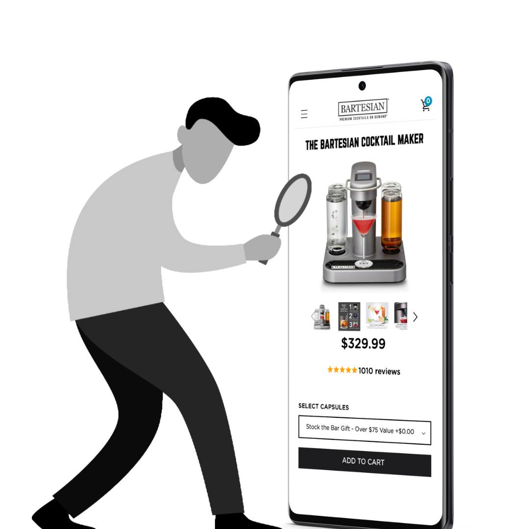
This group can then be further subdivided into:
Group 1: People who are leaning in with interest and buying.
and Group 2: People who are leaning in with interest but not buying.
We don’t need to worry about Group 1—they are already buying. We should make Group 2 the center of our universe. They are the 🔑 to our optimize conversion rates quest.
But Where to Start?
Consumers discover new brands via a variety of paths. Let’s focus on the two that the marketer controls.
Path 1
The consumer has a problem and goes to Google to research it.
We Googled “How to improve home air quality” and saw a bunch of promising product ads:
The shopper doesn’t know which air purifier is best for them, so they open four or five tabs:
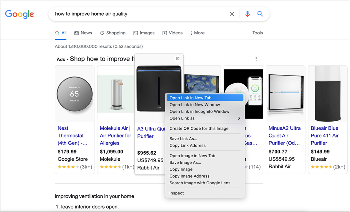
At this point, our shopper is in an uncommitted state of mind.
Path 2
The other way shoppers discover new brands is while scrolling their social media feeds:
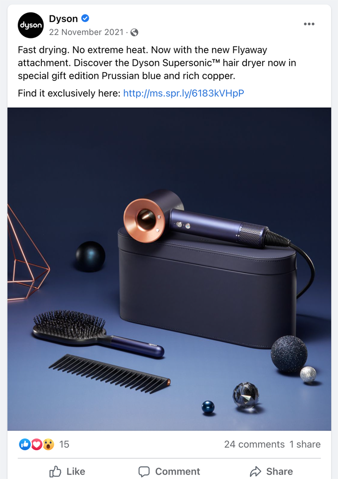
In both scenarios clicking the ad leads the shopper directly to your product page.
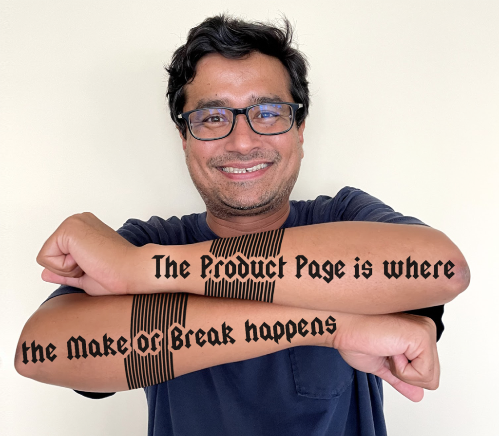
The product page matters because the shopper knows beyond it; they must pull out their 💳.
If I had the guts, I’d get this tattoo:
Was this section about placing the sales pitch on the product page clear? /
Glad that makes sense.
Uh oh! Let's get in touch so I can explain this better...
We'll talk soon!
Quick pause:

Since you're liking this article on how to optimize conversion rates you're gonna love the conversion ideas I share in my weekly newsletter. Signup below. If it isn't as good as I'm making it sound unsubscribe with one click.
The Recipe
Earlier in the article, we talked about the two main segments:
Group 1: People who are leaning in with interest and buying.
and Group 2: People who are leaning in with interest but not buying.
Group 1 is buying, so we don’t want to do anything to disturb them. This is why we don’t like making massive page changes—those could end up disturbing current buyers—which is literally the opposite of our objective.
To identify Group 2, we need a delicate tool, a scalpel.

Our strategy is to add subtle CTAs at strategic locations on the page.
We use subtle CTAs because we don’t want to distract buyers who don’t need extra convincing.
People leaning in with interest behave in specific predictable ways:

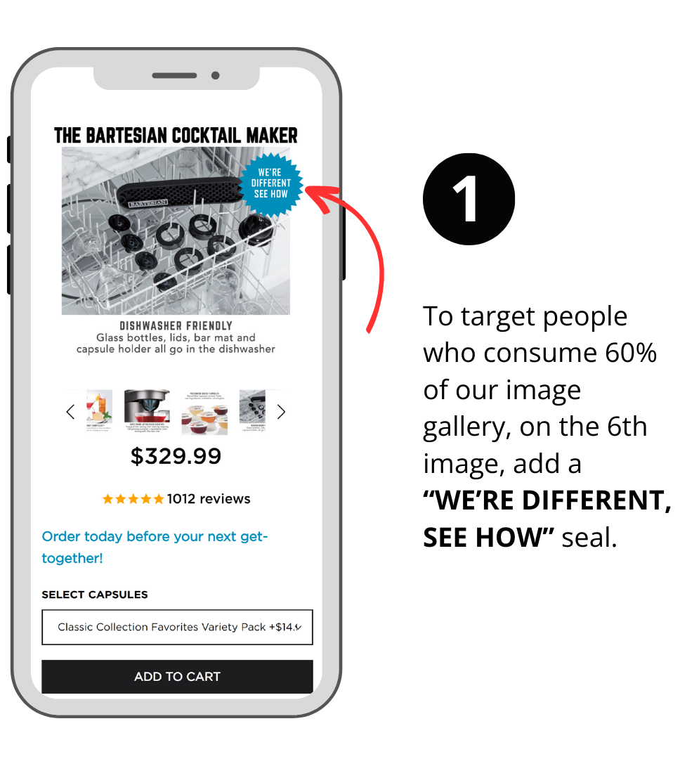
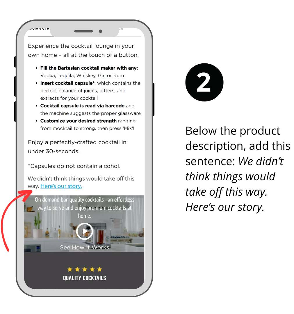
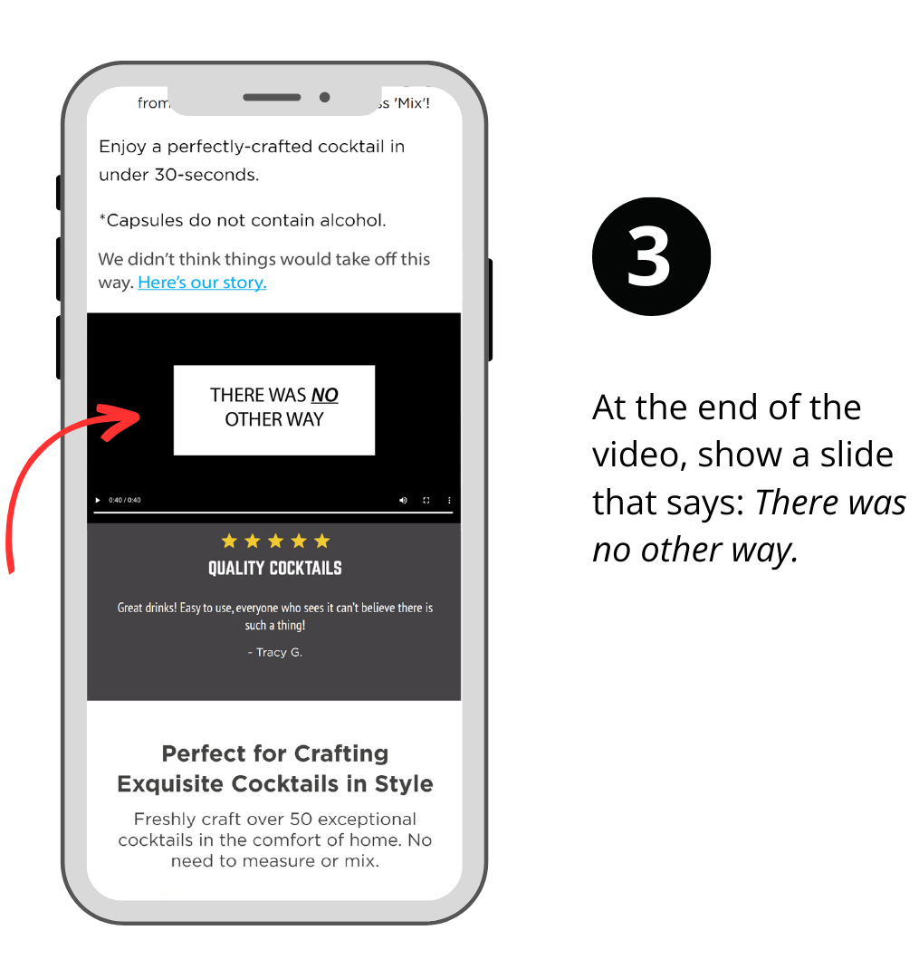
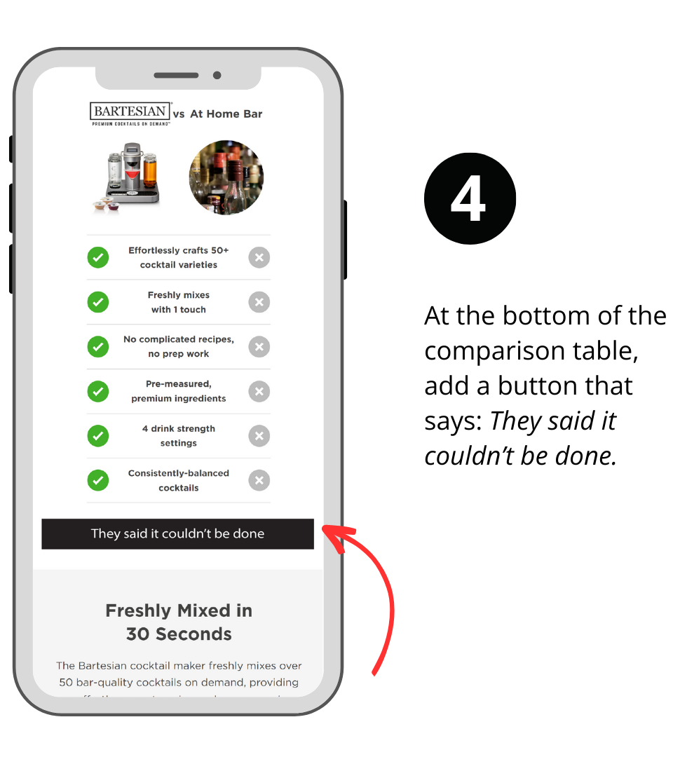
So these are the 4 locations where our subtle CTAs should be added.
Location 1:
Location 2:
Location 3:
Location 4:
How you name your links and buttons is up to you.
Do these 4 CTA placements make sense? /
🙌
Uh oh! Let's get in touch so I can explain this better.
We'll talk soon!
When Happens When a CTA is Clicked?
When any one of the CTAs shown above is clicked, we reveal our sales pitch.
The sales pitch overlayed on top of the page. That way, when the user clicks out of it, they are back where they started.
Clicking any link makes the others invisible. This is done to maximize the link discovery rate while ensuring content isn’t repeated for the shopper.
On our homepage, we’ve added a demo product page, and you can see this link hiding functionality there (link).
This sales pitch overlay is the canvas on which we do all our A/B testing.
It’s possible some of our link clickers are people who are already ready to buy.
Don’t worry; seeing your additional information is unlikely to cause them not buy.
Worst case, if they are ready to checkout and activate our overlay, they’ll just close it and proceed to 🛒.
We still don’t know what content will impact the most sales. This is why we need to A/B test different flavors.
There are an infinite number of things you could talk about. And you should construct multiple radically distinct versions of the pitch. The more distinct the pitch, the faster you’ll see conclusive A/B test results. We explain that approach in this Radically Different Ideas article.

After years of A/B testing all sorts of formulas (most of which didn’t work), we discovered The 9 Truths About Online Shoppers. And these are the nine truths we use to build our sales pitches.
Some of the sales pitches just singularly focus on one key idea like the demonstration of expertise and very gently tread on the remaining 8 elements.
Other sales pitches rely on multiple elements of the 9 to create a more rounded pitch.
Then there is another type of treatment that can sit on top of a pitch: tone. Examples of tone:
— Funny
— Casual
— Quirky
— Confident and assertive (this is the one we like best)
Sales Pitch Examples to Optimize Conversion Rates
Here are a few for you to consider:
Example 1: How a site like RockinGreen.com could optimize its bestseller conversion rates. First, read the sales pitch. Below it, there is a link; click it for an explanation of how this pitch was built using the nine truths.

The logic behind the construction of this pitch.
Example 2: How SmartyPantsVitamins.com could optimize conversion rates (at least, this is how we’d do it for them). First, read the sales pitch. Below it, there is a link; click it for an explanation of how this pitch was built using the nine truths.

The logic behind the construction of this pitch.
And, Example 3: How SuperiorNut.com should optimize its overall conversion rates. First, read the sales pitch. Below the image is a link; click it for an explanation of how this pitch was built using the nine truths.

The logic behind the construction of this pitch.
Free offer. Share the URL of your bestseller, and we’ll put together a sales pitch for you.
Proof This Approach to Optimize Conversion Rates Works
If there is one thing we’ve collected over the last 16 years, it’s evidence that this system works.
This marketing framework can be used to boost sales for sports products. To sell skincare products. Pet products. Consumer electronics. Athletic gear. Back pain solutions. Food items.
It can also be used to convert cold Facebook ad traffic, improve mobile conversion rates, generate calls, optimize your most important landing page, etc.
It can even be used to improve your overall conversion rates.


Comments 12
Wait for these little nuggets every week. 🙂 Really helps see copy and conversions in a different (unique) light.
ReplyRishi Rawat
Hi, Trina. Thank you for sharing your comment. Means a lot. Truly. –Rishi
ReplyVery timely article Rishi. I am working on a major revamp of our Amazon A+ content and much of the advice in this article makes a lot of sense for my project. I’ve been on your mailing list for years and I’m surprised how often I find new reasons to be glad I joined!
ReplyRishi Rawat
Hi, Ted. You’re one of my earliest subscribers. I often wonder, “I’m talking about such a narrow topic, wonder if people will get bored?”
What’s surprising is that every time I dig deeper I find a new beautiful little room.
Do share your A+ content when it’s ready 🙂
ReplyThank you for this lesson.
Question1 – If I lead a customer to my page via a video that explains the part 1 “why we exist?”, do I still either post that video on the page again or create a written summary of the video on the page? Or can I go right into part 2 of the reasons my product is better?
Question2 – Say my product is better because of 10 aspects. On the product page, do I list the subset of aspects that most to all people could benefit or list all and push the less likely valuable aspects lower in the list?
ReplyRishi Rawat
Great questions, Jim.
— You can post the video again on the page. But below that video go into part 2 of the reasons to buy.
— Place the less valuable benefits lower on the list.
Great questions.
ReplyI absolutely LOVE these blog posts – I read them in my inbox every week. However, it is possible to be even *more* granular when it comes to referring to why an ad works or doesn’t work?
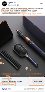
To demonstrate what I mean, I’ve annotated the Dyson ad in the attachment below with the sort of pointers I think you’d include!
ReplyRishi Rawat
Hi, Paul. Great to hear from you. Glad you are liking the content. All 3 annotations in your Dyson ad are spot on. Love seeing your perspective.
ReplyHi Rishi,
I was reading your article word by word and not even a single line distracted me. Optimizing returning visitors rate is one part and adding value to your product/service day by day is another important factor that helps in conversion.
ReplyHi Rishi. Awesome content. I was wondering, however, HOW does one add those Clear/Unclear questions in the page? Is there an app for that? Or do I need to know how to code?
ReplyRishi Rawat
Hi, Xavier. I appreciate your comment. I’ve been getting this question a lot.
Currently, we hardcode it.
But guess what? I’m working on a Shopify product page app that will make this as simple as drag and drop.
That app should be out in the next 6 months.
I will be announcing it via my newsletter: https://frictionless-commerce.com/JOIN
ReplyVery funny, but I’ll bite.
Reply