Blog
Provenskincare.com Sales Pitch Using The 9 Truths
In our earlier examples, we’ve seen strategies to target shoppers on your product page and sitewide.
But a lot of sites use funnels and quizzes so we’re going to show you how we apply our conversion strategy within a quiz.
For this example, we’ll be using a brand called Provenskincare.com. Keep in mind this is not an actual client. We aren’t allowed to show the work we do with most clients (there are a few exceptions), so we’re using a made-up example that exactly mirrors what we do for client projects.
So our sales pitch makes sense, it’s important to give you an elevator pitch for the products we’re targeting:
— PROVEN offers skincare that utilizes artificial intelligence and a large proprietary database of skin-related information to curate a personalized selection of products that target your unique concerns.
— They’ve designed a quiz to collect data about your skin, allowing them to pinpoint exactly what products you need for your skin concerns.
— Users may have tried many skincare products in the past, including products that worked for others but didn’t work for them.
— Shoppers are looking for products that are guaranteed to work, not just hype.
With that out of the way, here’s the 3-step process we’d use if Provenskincare.com hired us.
Step 1: Mapping High-Visibility Locations
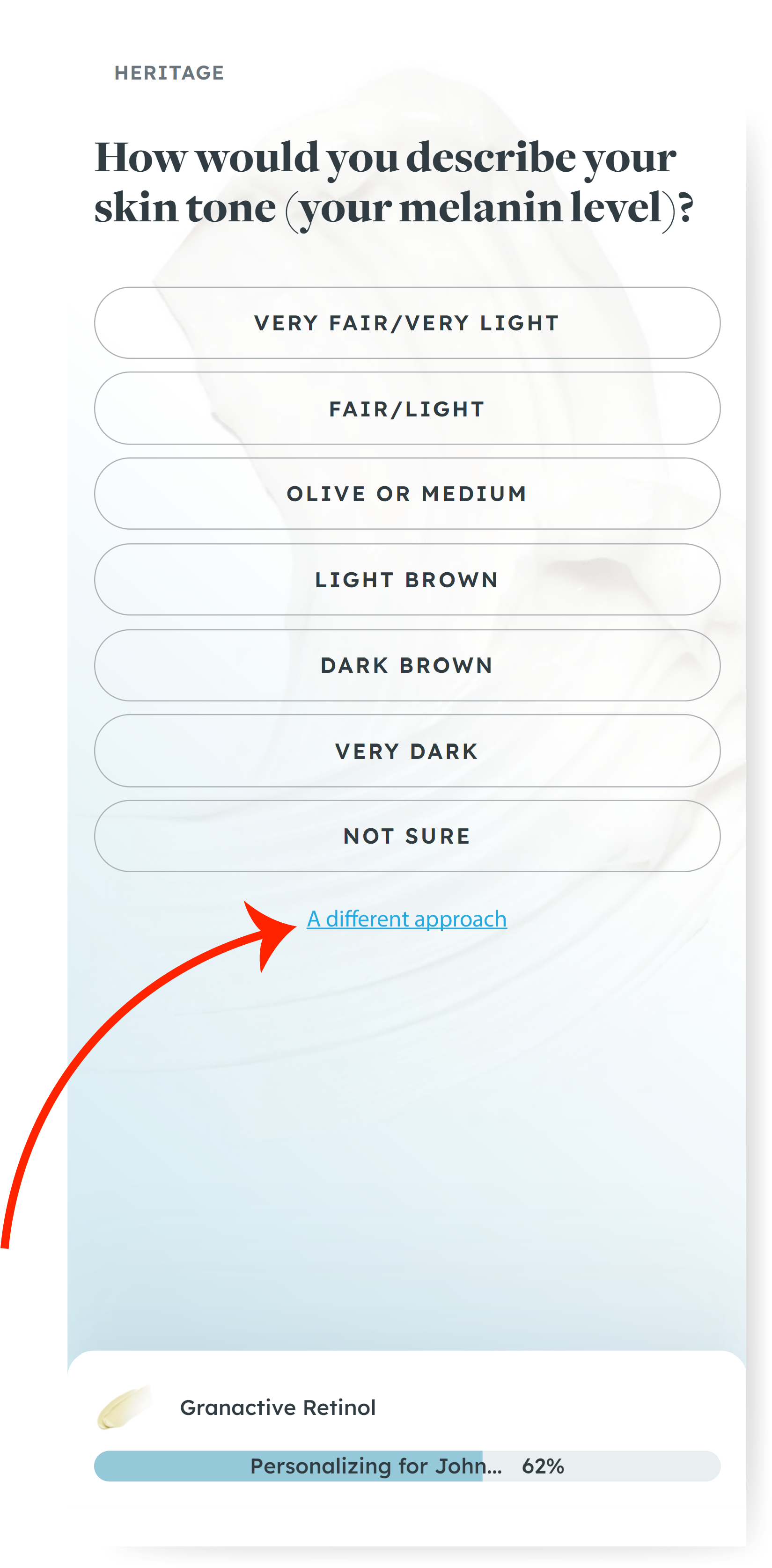
We’ve added red arrows next to all the locations we’ve added our call-to-actions so it’s easy for you to spot them:
On the home page(top of the funnel)

On the first screen of the quiz

Some of the way through

Halfway through

Near the end

Step 2: The Sales Pitch
Once a shopper clicks on one of the CTAs you placed on your page, we’ll show our sales pitch that’s been custom-built to convert. We’ve kept it brief so the shopper can comfortably return to the quiz. Below the sales pitch, you’ll find another screenshot explaining why we made the various copy choices.

Here’s how we built this pitch using the 9 truths. If you are seeing this article on your 🖥️, click the image below to see the zoomed view. On 📱, you can pinch and pull the image (clicking it locks the pinch-and-pull mobile feature):

Step 3: Finding the Winning Pitch
As usual, I’m only showing you one sales pitch flavor. For actual client projects, we run dozens of copy variations until we find the winning ticket. For example, one flavor might focus on your origin story; the next flavor might leverage us versus them messaging; another one might double down on selling the shopper on your point of view (how you see the world).
Great, but Where’s the Proof?
20% more conversions is a bold claim. But we have receipts. We’ve boosted sales for sports products by designing our sales pitch this way. We’ve also sold skincare products. Pet products. Consumer electronics. Athletic gear. Back pain solutions. Food items. And more.
It can even be used to improve your overall conversion rates.
Want to see it work for you? Drop me a comment below, and I’ll show you how.


