Blog
Mobile Product Page (PDP) Layout
Your mobile product page layout matters for two reasons:
1: Your paid mobile traffic directly lands here. This is likely the first and only page they’ll see on your site.
2: Because mobile space is limited. You don’t have room to cram a lot here.
Why Listen to My Mobile Product Page Layout Advice
My job is to create highly converting mobile product pages for clients. To do this I spend a lot of time studying what other marketers are doing with their mobile PDP (product detail page or just product page). I allocate time every week for this activity and have been doing so for the last 16 years.
This might be my favorite PDP mobile layout:

It’s taken from CosyHouseCollection.com and I like it for 3 main reasons:
A: Unlike most mobile product pages that are thought about after the desktop page is done this one has clearly been designed under the mobile-first mindset. It’s very clear to me that the information layout and sequencing have been designed for people scrolling on their phones.
B: Mobile real estate is limited so most marketers try and fit as much into tiny spaces. This makes things feel claustrophobic, which increases shopper anxiety and hurts conversion rates. These guys— and I don’t know how they did it— manage to keep all the mobile content fairly large with a good amount of breathing room. The breathing room really helps cancel out the feeling of claustrophobia.
C: On most mobile PDPs not only do things shrink in size content is shortened too. This means all the extra stuff about the product, the stuff Diggers care about, is pushed below the reviews section. Look at your mobile product page’sscroll mapand you’ll see most visitors don’t go below the reviews section. This is because historically reviews were the last item shown on a product page. By placing stuff below the reviews it’s really hard for Diggers to discover it. Poor content discovery directly impacts your overall conversion rate (and not in a good way). Luckily, CosyHouseCollection.com doesn’t make that mistake.
I posted this article on LinkedIn and received a whole lot of great responses. One of those was from Joshua Vizzacco who is a CRO-focused designer. His site is Art of the Cart. Joshua has some general suggestions for your mobile product pages. Make sure:
– Product title is clear and doesn’t include SKUs, brand names, or sizing information. It is above the mobile ‘fold’
– That product images are maybe a bit squat to fit better on mobile, they are in a carousel that is clearly indicated with both dot/line indicators and some button controller (that is easy to see and tappable area of 44px min)
– Joshua likes hinted carousels where the second image pokes out from the right.
– Price is clear above the ‘fold’.
– Anything clickable is clearly a link with color shift + underlined.
– Accent / actionable colors used in buttons and links ARE NOT used in the body copy.
– Review link with stars is clearly clickable.
– There are apparent and web-compliant visual differences between product unselected/selected options, especially when using radio/dropdown patterns.
– There are color labels visibly shown when a color is selected.
– Prices change according to the options.
– Badges DO NOT look like or cannot be mistaken for buttons.
– Sticky ‘Add to Cart’ in mobile.
– Product descriptions are kept high level with a way to ‘read more’.
– There are indications of shipping times located right under the main CTA.
Wow, thanks, Joshua!
Unique Mobile Product Page Layout
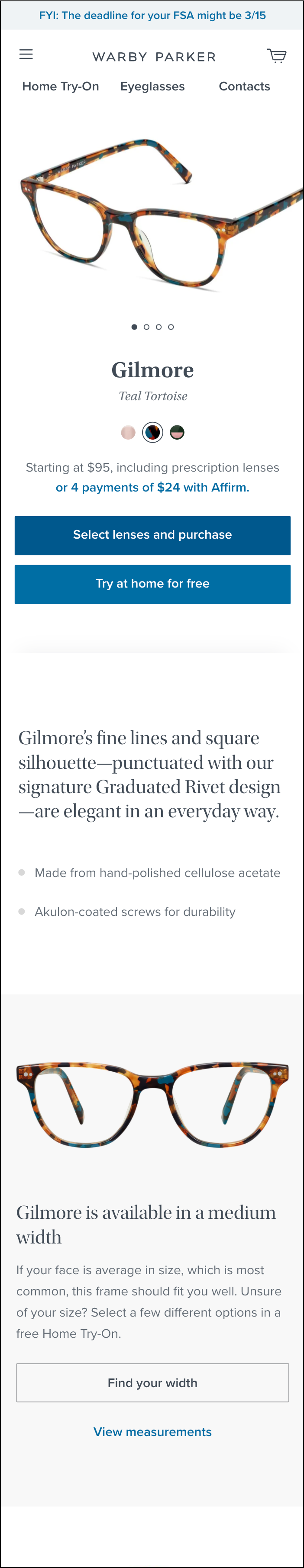
Here is an interesting mobile product page concept. Normally on mobile product pages, the layout looks like this (example from warbyparker.com):
Here is a mobile product page I’ve never seen before. It’s an experimental concept where the retailer (theraspecs.com) is showing their unique selling proposition at the very top of the page. Click the image for zoomed view:

Floating Image Mobile Product Page Layout
There’s a mobile product page layout puzzle I’ve been thinking about for years.
It’s this–
The user lands on mobile PDP and sees the main product image. She then scrolls to read the description, and now the image is no longer in her view.
What a risky move. As a marketer, I want the product photo to ALWAYS be in view.
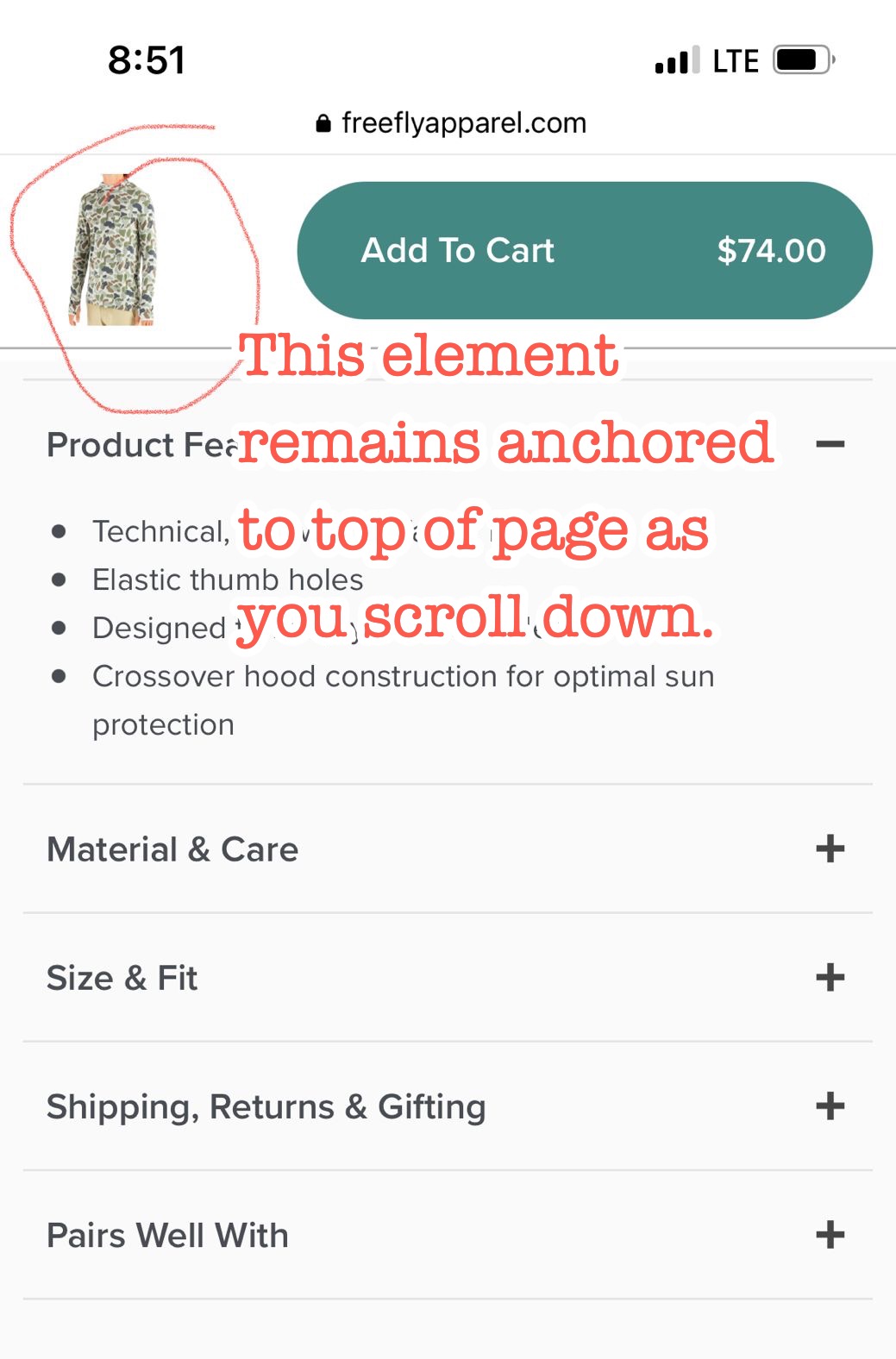
This is a hard design puzzle but I like how Free Fly Apparel is doing it.
On their mobile PDP (link to their mobile product page) as you scroll down (attached screenshot) the product photo remains attached to the top of the screen. Very clever.
Mobile Product Page Layout Case Study
We do a lot of testing at Frictionless Commerce and we did a mobile product page test for ZQuiet.com that resulted in a 29% lift in sales for their most important mobile product page. Interested in seeing what we did? ZQuiet.com Mobile Conversions Up 34.04%.
What Next?
First of all, you are ahead of the pack because you are considering things like mobile product page layout. This means you understand the importance of considering the movie experience, and why product pages matter so much.
But nailing the design is one thing, what you really need to figure out is how to present your sales pitch on your mobile product page. Now we’re talking about my real area of expertise— conversion copywriting.
Let me just point you to my most important article: The 9 Truths About Online Shoppers.