Blog
How Using Feedback Beacons Is Basically Cheating
Feedback beacons are going to change your life. Give me 4 minutes and I’ll show you how.
You’ve worked so hard to construct your long-form sales pitch.
How do you know it’s working?
How do you know which part was good and which part sucked?
If you relied on just the A/B test result you’ll know if the pitch (as a whole) was good or bad. If it is bad you’d have to rewrite the whole thing.
But if we could pinpoint where we lost the buyer it would save us from having to rewrite the whole dang thing– we could focus on fixing the precise point that broke the shopper’s attention. That’s what Feedback Beacons fix.
Nature of Feedback Beacons
Feedback Beacons are simple. After each milestone idea has been presented the marketer simply adds this line: Did this make sense? 👍 / 👎
When 👍 is clicked show this message: Thanks for your feedback.
When 👎 is clicked show this message: I’ll share this with my team and rework this section. Thank you.
In the back end, you are having your developer record these responses so you can see where the pitch flow broke.
You can see an example of a Feedback Beacon in this case study (clicking the link will scroll you down to the part of the case study where the Feedback Beacon was used).
Our goal is to find vulnerabilities in our pitch.
A chain is as weak as the weakest link.

The beauty of this architecture is that we’re collecting feedback from actual hot prospects as they are consuming our sales pitch.
Why Knowing the Precise Breakage Location Matters
Let’s look at two shoppers.
Shopper A drops off at the end of paragraph 1 because she doesn’t resonate with the first selling angle that was presented to her.
Shopper B loved the selling angle that was presented in paragraph 1. He also loved the selling angle presented in paragraph 3. What didn’t work for him was the stinking selling angle that materialized in paragraph 5. The moment that idea infected this shopper’s mind he was a goner.
The A/B testing tool would simply say we lost both shoppers. It wouldn’t tell us where we lost them. Using Feedback Beacons you’ll know the precise location.
Next, I’m going to show how that type of insight is an unfair advantage.
How Feedback Beacons Are An Unfair Advantage
Marketing is warfare and marketers are combatants. Companies A and B are fierce competitors. Both companies make curling irons.
Both companies are constantly testing new sales pitches and A/B testing them.
There are 40 hours in a week.
For company A it takes 20 hours to construct a fully orchestrated Long-form Sales Pitch which means they can run two tests a week.
If test 1 fails they could either speculate on why it failed or start from scratch.
Company B also takes 20 hours to fully orchestrate a Long-form Sales Pitch. But company B deploys Feedback Beacons along the Long-form Sales Pitch. When a test fails they don’t speculate on why it failed or start from scratch. Instead, they open up the test and look at the votes placed against their Feedback Beacons. Once the weak link has been identified the marketer simply rewrites that section. This takes 2 hours and relaunches the test.
Can you see how the 18 hours company B is saving every week is basically guaranteeing they will always outpace company A?
Frequently Asked Questions
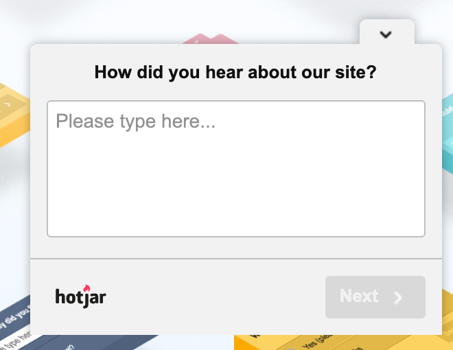
Couldn’t I use a tool a feedback tool like Hotjar?
Hotjar is a great tool. I use it too. But the poll prompt . . .

. . . is activated at the page level. But questions form in the minds of buyers while they are reading product descriptions. We need to address these questions the moment they appear. Can’t afford to rely on a timed prompt.
Isn’t this increasing page friction?
In marketing, we are taught to always remove friction. It’s a sin not to. So at first glance, it might look like adding Feedback Beacons is a bad idea because they increase friction. It’s important to understand the difference between good and bad friction. If inconveniencing the shopper with one extra click to gain insights into exactly where the shopper lost us, so we can fix that section and improve the shopper’s satisfaction level then that’s a good tradeoff– it’s good friction.
Next Steps
We’ve done a lot in this step: you’ve Deconstructed your most important page, identified key Selling Angles, added a bunch of Micro-improvements, constructed a killer Long-form Sales Pitch, and added Feedback Beacons.
Now just one thing remains, having statistical confidence that our new template truly is better and making micro-adjustments so it ends up perfectly even if it doesn’t start that way. That’s covered here: Building An Effective A/B Testing Strategy.


Comments 2
“IF THE COMMENT SECTION REMAINS EMPTY I’M GOING TO LOSE MY JOB” ?
ReplyHello0000, any one there? This article is written in 2022. Its March 12th 2024 while I write this comment. Hope he still has the job. Ah wait. I arrived here because his newsletter, so I guess Rishi still has his job. Must have been quite a balanced sales pitch he wrote to not get kicked out. Bless him.
Rishi Rawat
Hello, Hank. This is Frictionless Commerce’s HR department. We fired Rishi two years ago because he was not able to get even one comment on this article.
But seeing your comment, we have used our Time Machine to go back and rehire Rishi. Thank you.
Reply