
Case Studies
Improving Conversions by Changing Shopper Habits
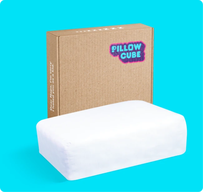
When you think of a pillow, what shape comes to mind?
This is how PillowCube looks:
There is a ton of science behind this amazing product and our job was to build a compelling pitch to get curious visitors to fire their current pillow and hire us.
PS: Pillowcube.com made a product video that went mega-viral:
- Goal:
- This viral video was driving a ton of traffic to their bestseller page. Our job was to convert that traffic.
- Outcome:
- 10.17% increase in conversion rates.
Note: this is the outcome of one test. Over a 90-day project, dozens of tests are run. The total lift of those tests adds up to 20% or more.
- 10.17% increase in conversion rates.
The Problem
There are two types of people on this page:
— One group sees the cool pillow, reads the reviews, and is ready to try it (the brand offers free shipping and returns). This group is already buying, the client doesn’t need our help converting them.
— The second group (Healthy Skeptics) sees this odd-shaped pillow as a potential gimmick. They wonder if it will deliver better sleep. They are nervous about the near $90 price tag. This is the group I want to convince; this is the group our test went after.
Control
Here is a screenshot of what the mobile page looked like before we got started.
Test Concept
The four key sales pitch changes we made—
A:
The first thing shoppers do is look at the price tag. In the screenshot below, this general area is a hotspot, so we added our Quality matters link right next to it.
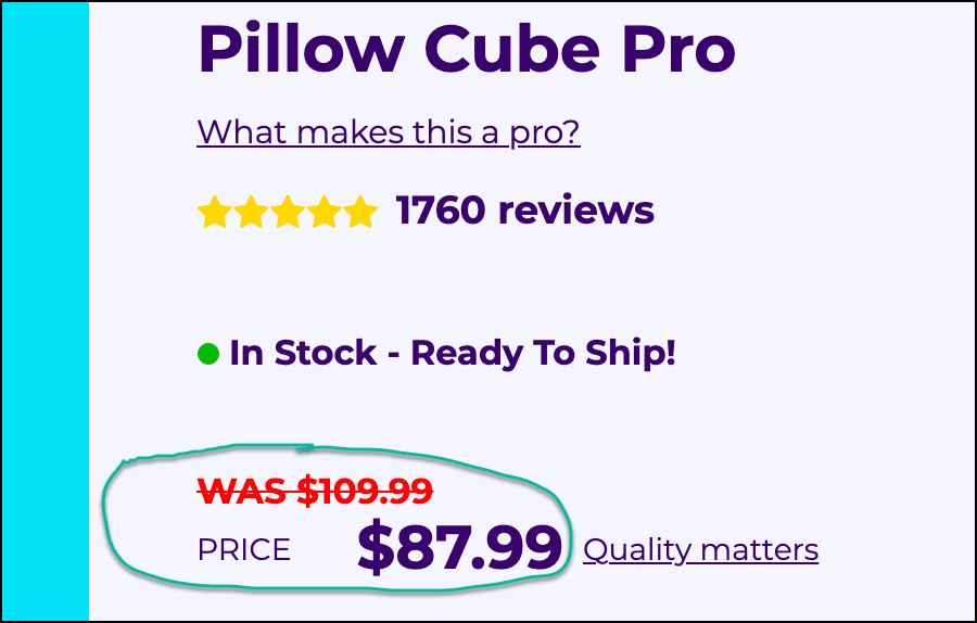
A shopper who is anxious about the price will fixate on the price. Their mind may wonder, “Isn’t $88 too much for a pillow? My current pillow is $30.”
As they are having this question they will notice our
Quality matters link. It perfectly matches the question in their mind. So they will click it, and when they do, we’ll display a targeted sales pitch about quality. This technique is called price justification.Clicking
Quality matters reveals this lightbox content: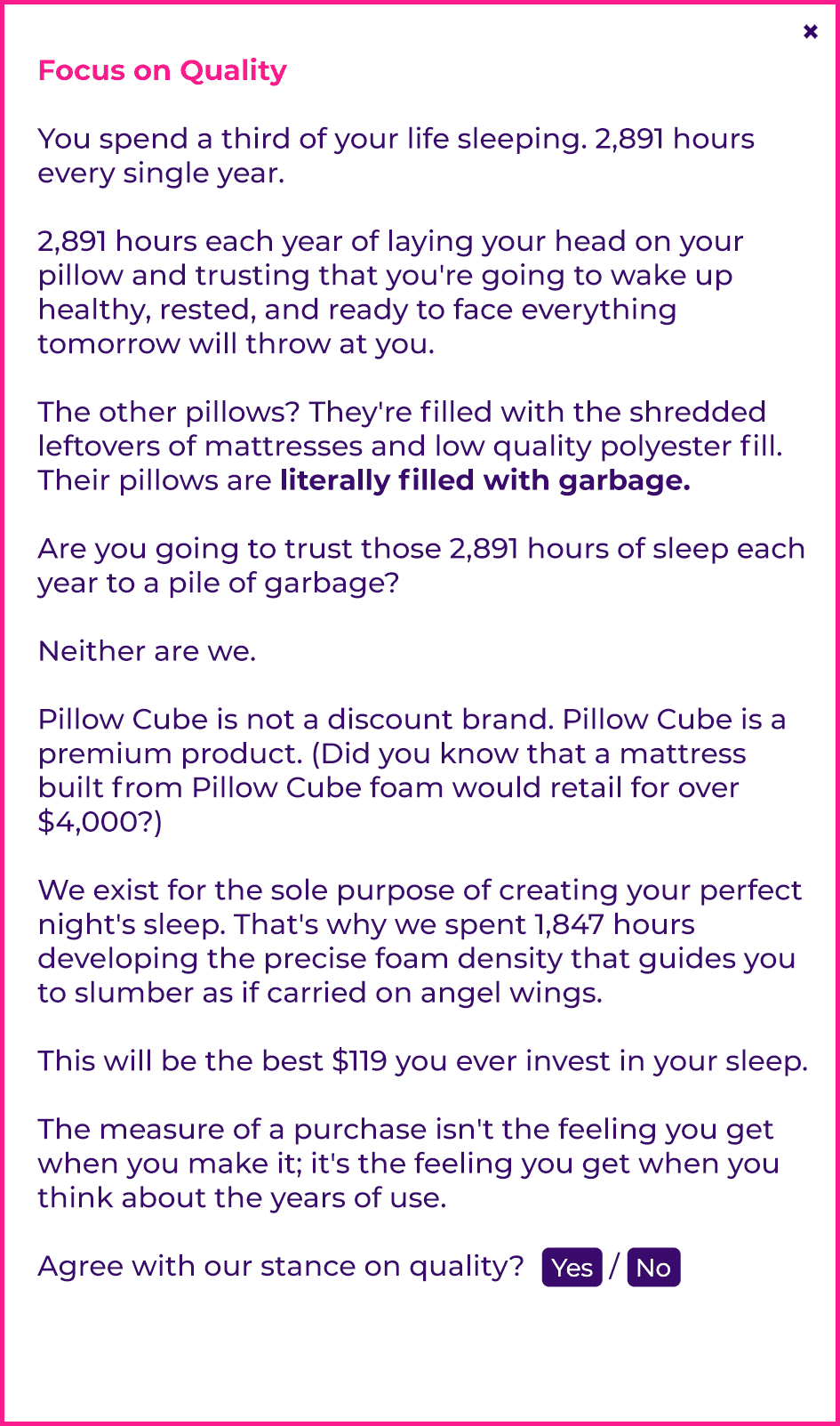
This new content is what we call a micro-improvement.
PS: notice the {Yes} / {No} buttons added to the bottom of the pitch in the screenshot above.
By default, the test tracks overall conversions. But, as the copywriter, I need to know how individual arguments in my sales pitch were received by the buyer.
This data is collected via these clickable buttons that are added at strategic locations across the sales pitch.
Now I know which parts of my sales pitch need reinforcement. It’s the ultimate cheat code for the marketer.
B:
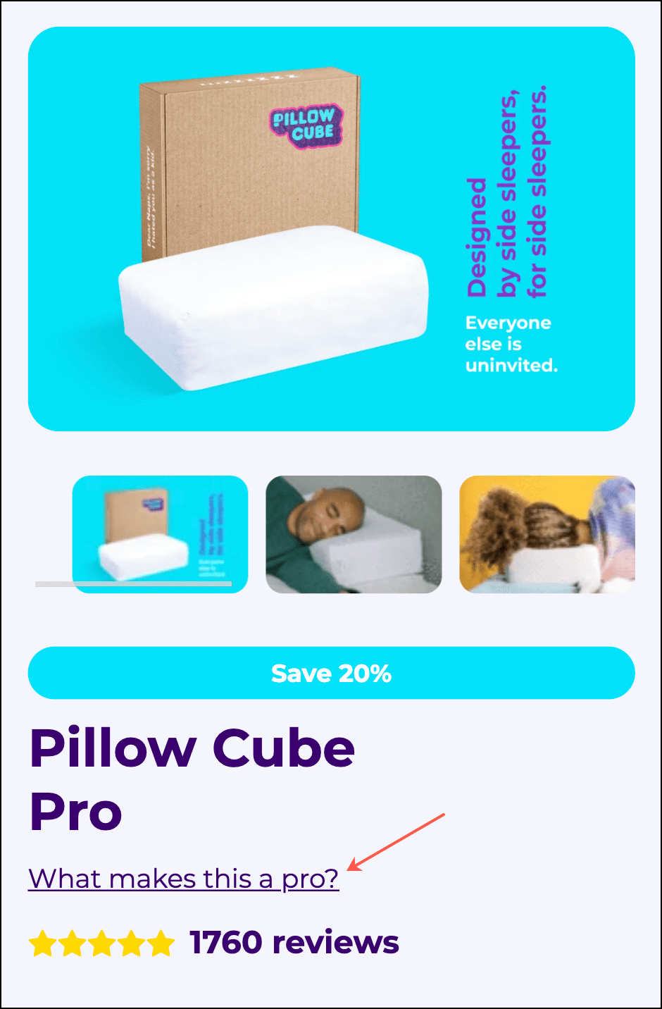
Here is the second micro-improvement.
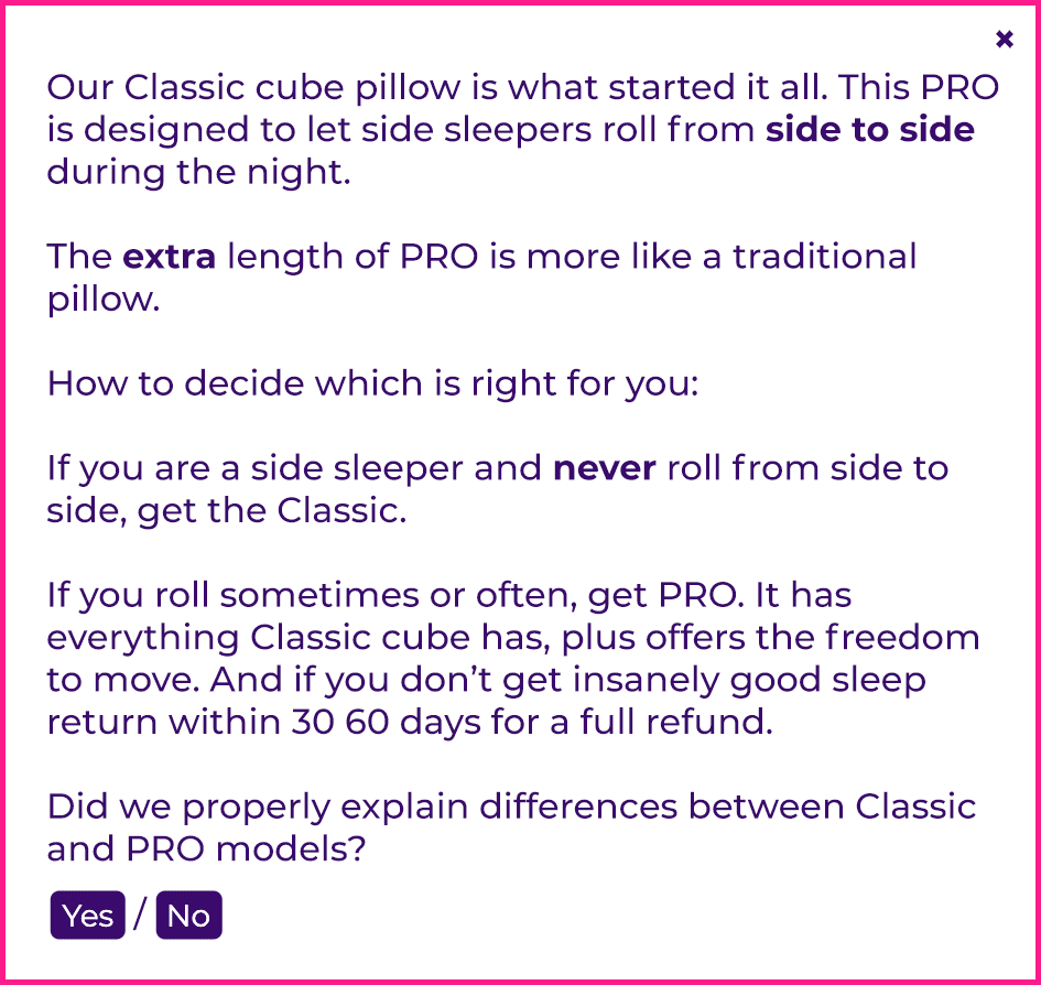
Pillowcube.com has two models— Pillow Cube CLASSIC and Pillow Cube PRO.
This PRO page is competing against Pillow Cube CLASSIC even though that’s our product too.
Marketers are scared to say anything that could make another product on our site sound inferior, so they don’t say anything. This fear hurts conversions.
Think about it— the shopper on this page is saying she wants the PRO model. To pull out her credit card she needs a compelling reason why paying more for PRO (versus the CLASSIC model) is a good idea. Give her that reason!
So, at this strategic location (arrow in screenshot below), we added the What makes this a pro? link.
On click this content is revealed:
C:
Our third micro-improvement.
The opening of any sales pitch is critically important, so we worked extra hard on ours. Here is our opening (explanation for each numbered section below screenshot):
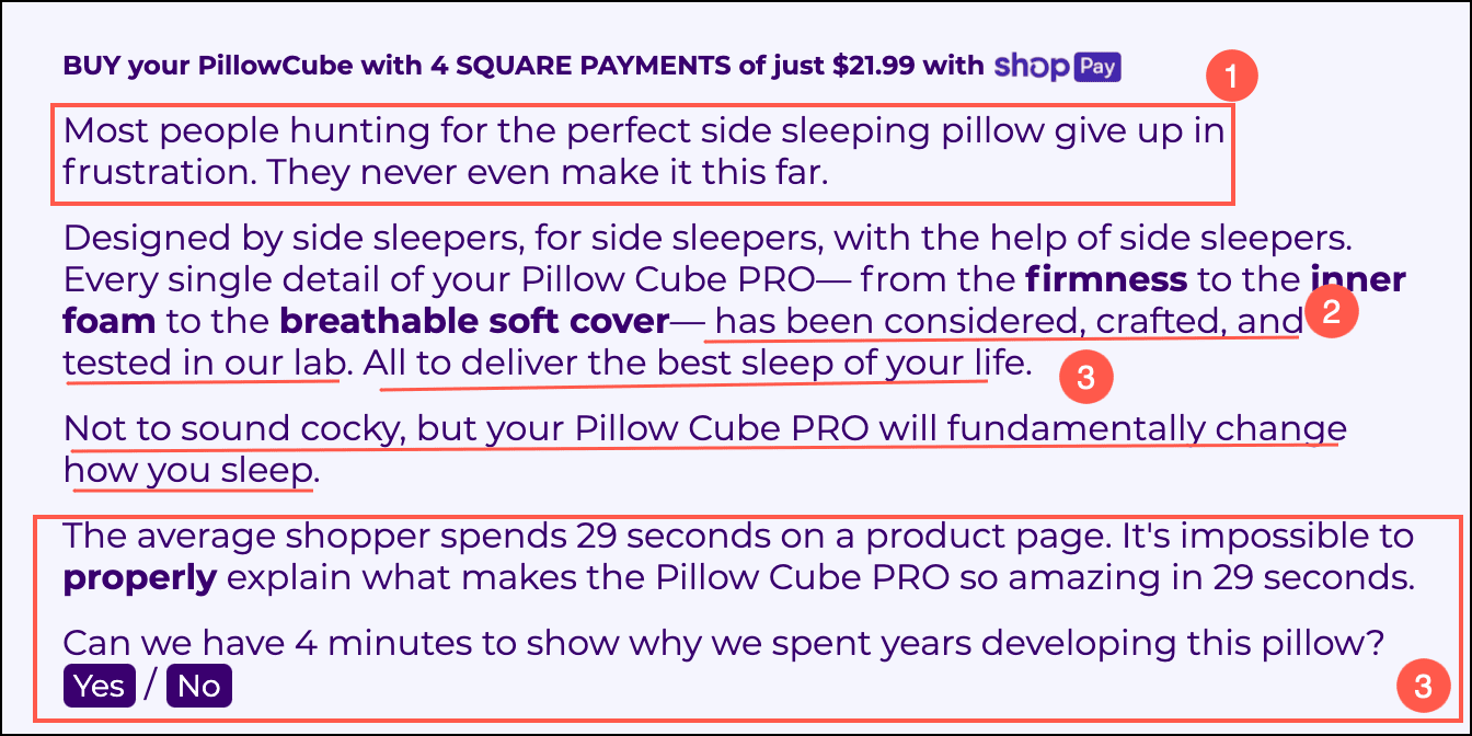
- New visitors land with one foot out the door. This is true for any site. It’s for this reason the opening needs to connect. The “They never make it this far” line is very intentional. It’s there because we know shoppers like knowing they’ve stumbled onto something rare.
- Since this is a technical product we wanted to double down on demonstrating expertise. This is why we used the term “lab” in the copy. That isn’t an untrue statement— the product truly has been developed in the lab, we just wanted to make that point stand out more, thus the sentence structure.
- Buyers buy from experts. And experts are confident. The next two underlined sections (in the screenshot above) have been developed to communicate confidence.
- This is the most important element of all. Before I can convert this buyer I need to get them to agree to spend more time with me.
The longer they spend reading my pitch, the higher the likelihood of them buying. To produce this effect we added a “The average shopper spends 29 seconds on a product page. It’s impossible to properly explain what makes the Pillow Cube PRO so amazing in 29 seconds.” line, and below that we’re asking if they are willing to spend more time with us. This is a Priming technique.
Most click Yes and by doing so are making a commitment. Humans work hard to stay consistent so this simple click will get them to stay longer. And staying longer increases the probability of them buying.
D:
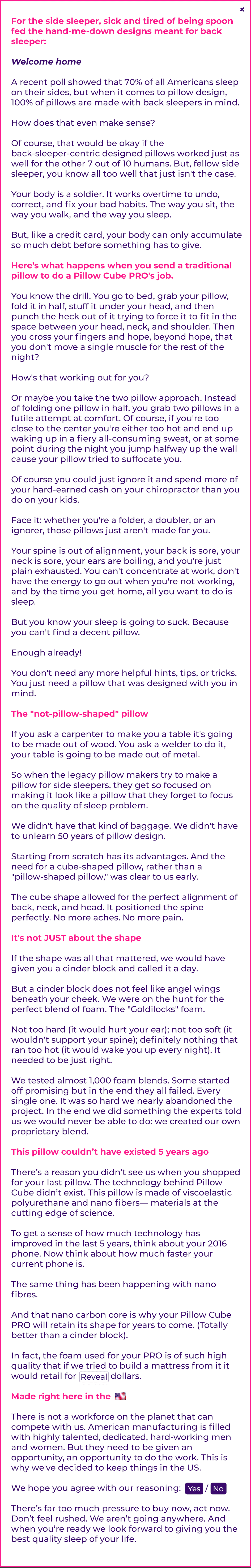
Our strategy, for any test, is to keep the page design unchanged. We want the page to be on-brand for the client. To work around this constraint we create mechanisms for shoppers to raise their hands if they are looking to dig deeper. To identify these Diggers we added this button at 3 strategic locations on the page:

The button text was intentionally worded to connect with people looking to learn more (the diggers.)
When clicked we displayed our long-form sales pitch in a lightbox modal. Here it is:
Outcome
The test ran for nearly 4 weeks. It was exposed to 60,000 new visitors and generated 4,903 orders. The conversion lift was 10.17%.
We tested 3 variations. Variation R1C1A5 was the best performer. 10.17% lift with 99.34% statistical significance.
If you liked this case study you are bound to love my favorite case study: How One Section Lifted Overall Sales
CLIENT TESTIMONIAL
“I have a lot of experience with running a conversion optimization program. Most optimizers are focused on UI/UX-based improvements.
Rishi (and his team) are different. They focus on individual product pages. They treat the product page as a direct response ad. To them, the goal of the product page is to connect with the buyer, demonstrate our expertise, and close the sale.
I knew I liked their process but was still very happy to see VWO declare their concept the overall winner.”

Josh Carr
Chief Marketing Officer
Pillow Cube
Why Our Concept Won
Our concept won because the sales pitch worked for both skimmers and diggers. Skimmers could continue reading what was on the main page (we tightened the copy but didn’t increase the word count). But we gave a chance to the Diggers to devour our long-form sales pitch.

More Evidence
%
Tiege.com was already doing really well. They wanted to see how much further test to paid search landing page could be pushed.
Read Case Study%
What's better than a sales pitch that converts? A personalized sales pitch that converts.
Read Case Study%
Stix is on a mission to disrupt the golfing game. Consumers don't just buy a new golf club. A lot goes into that purchase.
Read Case Study%
Glemnetic.com is a leader in its space. We wanted to see if we could push conversion rates higher.
Read Case StudyARE YOU OUR NEWEST CASE STUDY?
We are laser focused on the type of client that our methodology and skills will give the highest return on investment and so if you meet our criteria for taking on new projects, we are confident you will see results like these.


