Blog
Want to Increase Conversions? Learn 3 CRO Tactics Inspired by Consumer Psychology
As a Conversion Rate Optimizer (CRO) you need to be an expert at consumer psychology. We can’t do our jobs (improving conversion rates) if we aren’t intimately aware of the driving force behind consumer buyer psychology.
BUT, those that DO understand this psychology will not only improve conversions 5%, they’ll improve it 40%. Simply put, CROs who can navigate the labyrinth of consumer psychology will win every time.
Before getting deeper let’s define what this term “Consumer Psychology” means.
Definition
Consumer Psychology is the study of shopper behavior. As much as we like to believe each buyer is unique, as a group, we behave in extremely predictable ways. By understanding the psychology of site visitors CROs can better connect with the subconscious minds of buyers.
THE WORLD OF ONLINE SHOPPING IS CHANGING—AND SO IS THE WAY WE THINK
With the advent of the world wide web and other modern technologies, namely smartphones and tablets, the way the human brain works has changed.
At least that’s what many researchers currently believe, particularly when it comes to our attention spans.
For many millennials and, especially, Gen Zers, the internet has become a sort of external brain. Don’t have an answer? Simply Google your question.
This isn’t to say that Gen Xers and Baby Boomers aren’t internet savvy as well, but the importance of the internet and smartphones will certainly increase with the younger generations and generations to follow. Not a moment will go by where all the world’s knowledge isn’t at their fingertips.
And as the world’s technology evolves, so does ecommerce. Amazon and the countless online businesses have changed the way shopping looks and operates. Thousands of brick and mortar stores around the world are closing their doors—either for good or to transition to the online space. Let’s also not forget about the mobile boom (mobile internet usage has increased by 504% since 2011).
Us marketers have also had to adapt to this rapidly changing shopping landscape. For example, mobile traffic now makes up more than half of total traffic for most ecommerce businesses, which means new emphasis has been placed on the mobile shopping experience.
But more importantly, people are becoming increasingly distracted.
Think about the last time you watched TV. Were you 100% invested in what was on the screen? Or did you check your phone every few minutes to read some emails, visit Facebook or Twitter, or browse Amazon?
If you’ve done this yourself or have witnessed others doing it, then you understand just how overwhelmed with technology people are today. For most ecommerce businesses, this constant battle with human attention has been a challenge. Their conversion rates have worsened or stagnated. They’re so caught up in SEO and PPC to stay competitive, but higher click through rates don’t seem to help.
This brings us to the purpose of this article: to show you how you can use 3 conversion rate optimization (CRO) tactics and leverage your understanding of how online shoppers in 2019 think and operate to boost your conversion rates.
WHAT ARE CRO TACTICS?
If you do a Google search for “conversion rate optimization tactics”, what you’ll often find are articles talking about using heatmaps, recordings, and click tracking.
While these tactics can help you see what shoppers are doing, they can’t tell you why. The “why” requires a deep understanding of consumer behavior and a history of experimentation.
We have both!
In the past 10 years, we have A/B tested for 194 different ecommerce businesses. Humans are better at pattern recognition than machines (at least for now—we welcome our new computer overlords) and while A/B testing for all of these clients, we uncovered a number of patterns and trends that heatmaps, recordings, and click tracking couldn’t reveal.
What did we see? In short, we saw that shoppers were behaving in similar ways when presented with thematically similar test elements. We noticed that each of these “themes” were directly related to various aspects of human psychology—in other words, they’re almost unavoidable, which gives us a huge advantage as marketers.
How? If we know which aspects of human psychology are at play, we can target those aspects and influence shoppers (ethically because, as Spider-Man’s uncle Ben stated, “great power comes with great responsibility”). This realization is what inspired our 3 conversion rate optimization tactics—Serendipity, Narrative Control, and Visualization.
SERENDIPITY
When one experiences serendipity, they are experiencing a fortunate, but unforeseen event. That is the traditional definition of the word.
Over the course of running hundreds of A/B tests, we’ve seen how people react to seemingly serendipitous content. In short, the results are almost always positive.
Have you ever met a stranger who shared a birthday with you? How did you react? Did you think, “wow, what are the odds?” When in this scenario, the overwhelming majority of people would find the stranger immediately more likable. There’s no logical reason to like someone more just because they have the same birthday as you, but our brains are wired to like similarity between ourselves and others.
This same phenomenon can be applied to websites to create a sense of serendipity in the shopper—to make them feel as if we have predicted something about them, shared their experiences, and thought the same thoughts. Once a shopper experiences this, they become more comfortable with the company and the product or service.
It’s always important to be subtle with Serendipity. When too aggressive, the tactic can have the opposite effect we’re looking for. For example, you wouldn’t want to tell your shopper that you know their address, right? Let’s look at a couple good examples of Serendipity. (Note: All examples shown below are not from our actual clients. However, many of the examples we have designed ourselves for illustration purposes.)
Using Serendipity to relate to the shopper’s experiences
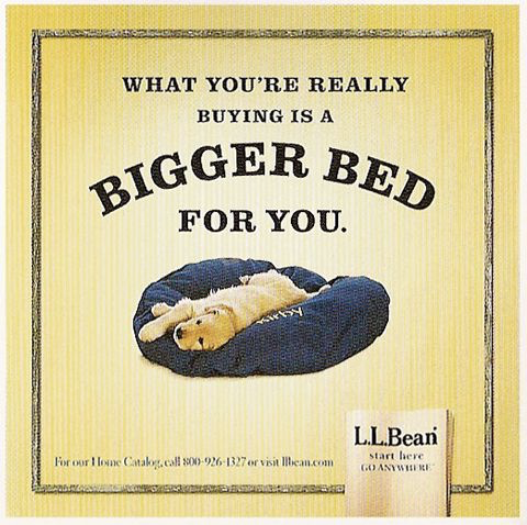
In the ad above, L.L. Bean is attempting to relate to the shopper’s experience of having no room on the bed due to their dog. We’d say they were pretty successful and we’re willing to bet they saw a positive impact on sales due to this ad.
What makes this ad successful?
Dog-owning shoppers who read this ad instantly relate to the ad. They’ve likely had their bed hogged by their dog so they understand that buying this dog bed also means receiving more room in their own bed. Because they can relate to the ad, they are more likely to like the ad, the company, and eventually the dog bed.
In turn, they’ll be more likely to buy the dog bed.
Using Serendipity to anticipate and address the shopper’s concerns
Another way to use Serendipity is to anticipate and address the big questions and concerns shoppers could have when on your site. Let’s take a look at a product page on Privé Revaux’s site.
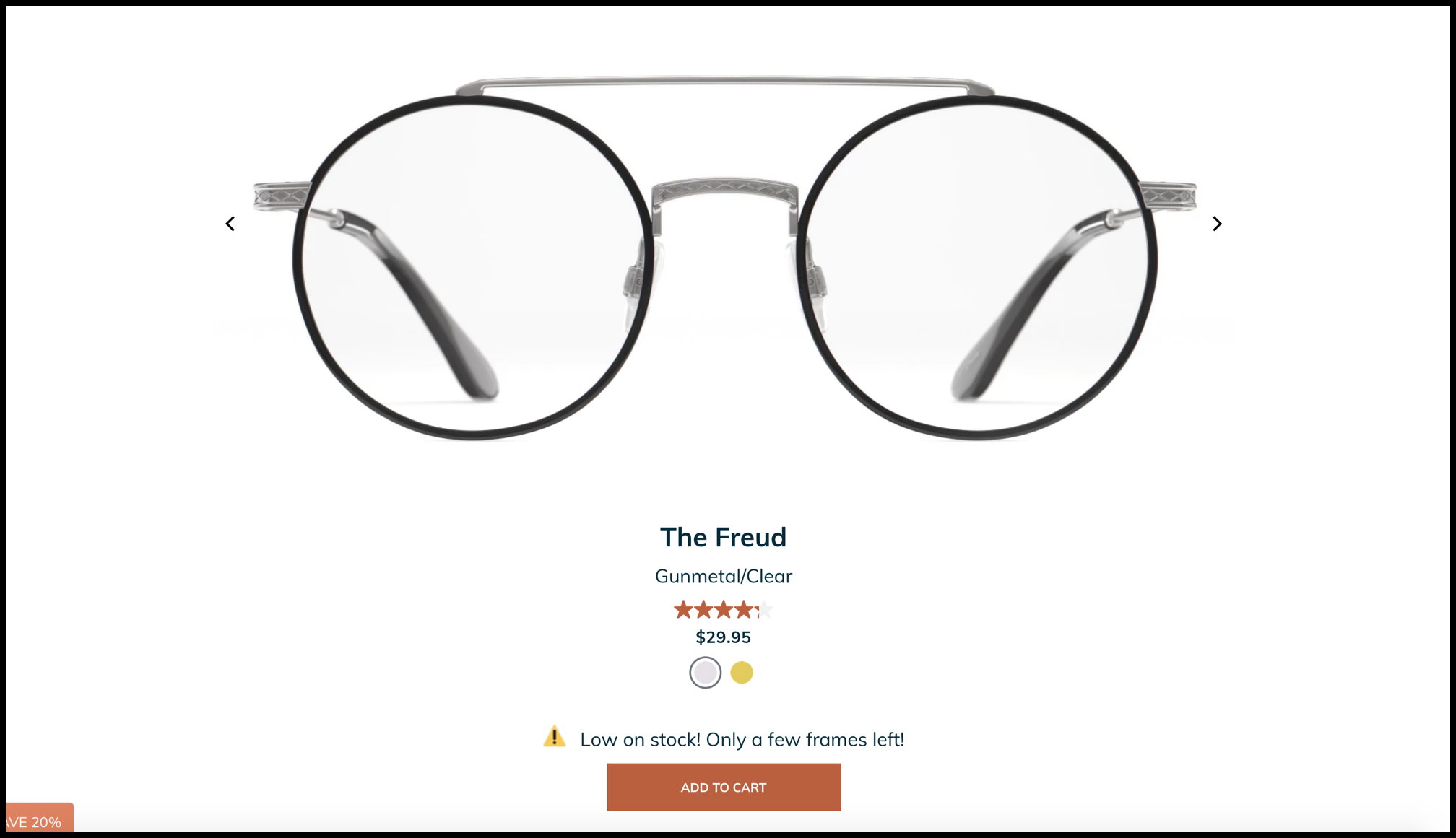
Privé Revaux is a manufacturer and seller of affordable, high-quality glasses. One of this company’s biggest selling points is their low prices. In the above image, you can see that this pair of glasses is only $29.95. However, for a minority of shoppers—let’s say 10%—such a low price for something that’s typically +$100 seems too good to be true.
As marketers, it’s our responsibility to repeatedly review our messaging and content to see if there are any areas where we haven’t addressed the shopper’s concerns. For some shoppers, Privé Revaux’s prices are one of those concerns.
Using Serendipity, we added a button beside the product’s price:
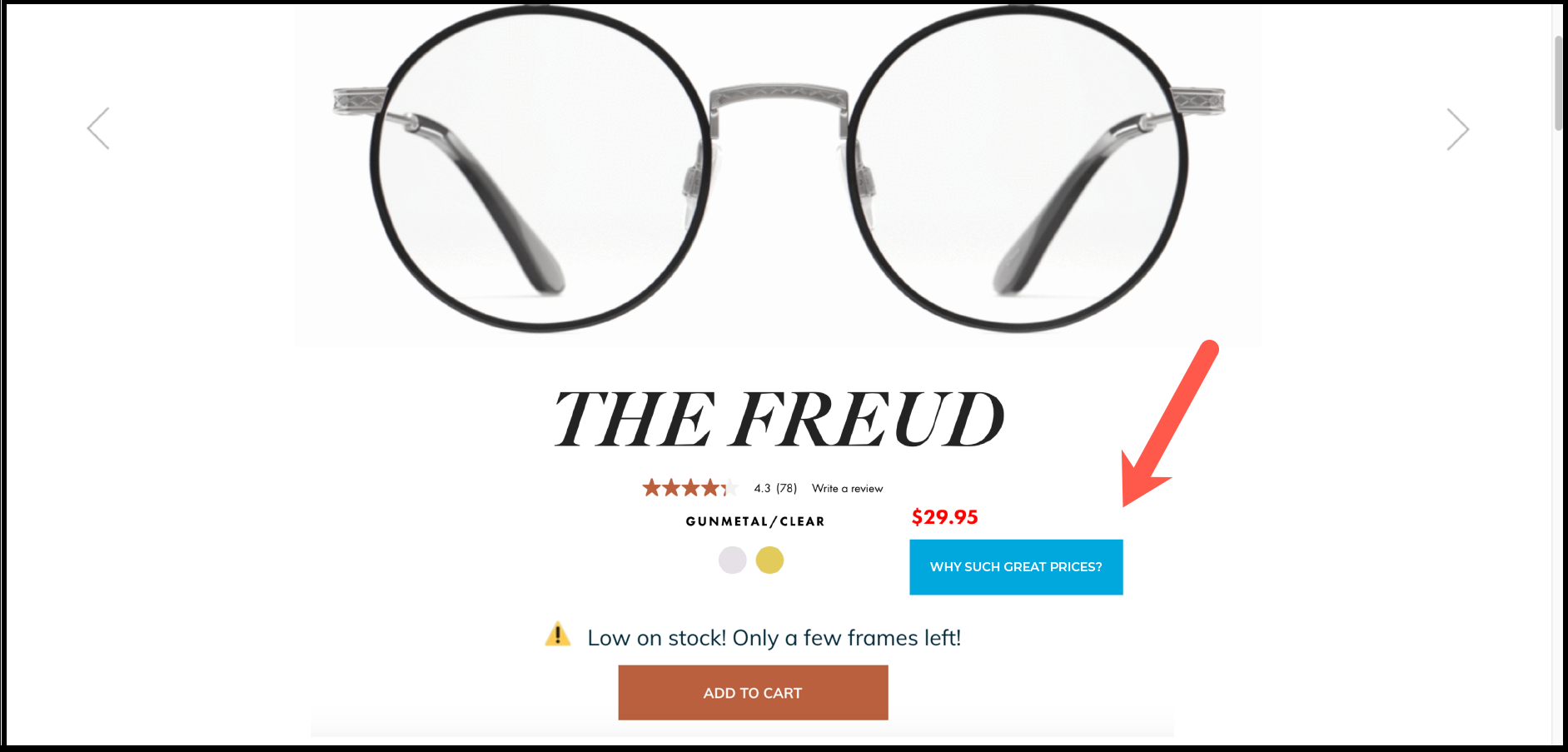
For the 10% of shoppers that are wondering how glasses can be as cheap as $29.95, this button creates a feeling of serendipity. Why? Because the site anticipated a concern they had while on the product page and addressed it (can you see how this relates to the birthday example we shared earlier?).
See more examples of Serendipity here:
NARRATIVE CONTROL
Before we talk about Narrative Control, we need to talk about why it exists. That requires us to explain the phenomena of negativity bias and status quo bias.
What is negativity bias?
Simply put, negativity bias is the idea that negative thoughts, emotions, interactions, and so on have a much greater influence on a person’s state of mind than neutral or positive things.
What is status quo bias?
Status quo bias describes people’s tendency to maintain things as they currently are either by doing nothing or by standing by a previously made decision. This bias is especially present on some sites that have too many options (the human brain sometimes has difficulty deciding between more than a handful of options).
Why does this matter for us marketers?
Well, it really should mean the world to us. Think about all the potentially negative thoughts a shopper could be having on your own site. Think about your own negative shopping experiences.
Have you ever encountered a site that says “Free shipping to the contiguous United States”? Now place yourself in the shoes of a Hawaiian or Alaskan shopper. Guess what? You’ll immediately view this “benefit” as a negative since it singles you out as someone who cannot receive free shipping. The state of mind of the vast majority of Hawaiian and Alaskan shoppers will become overwhelmed by the negative thought of shipping costs (negativity bias).
The result? They’ll leave your site, never to be heard from again (status quo bias).
Here’s what many marketers will think when they experience this: “Well, unfortunately that’s too bad. I can’t afford to change my shipping policy to appease 2% of my potential customers. There’s nothing I can do to address this.”
But they’re wrong. Dead wrong.
They don’t need to change their shipping policy. All they need is a dash of salt and a pinch of Narrative Control.
What is Narrative Control?
Narrative Control is the second of our 3 CRO tactics to influence consumer psychology. It describes the process of influencing thought. Specifically, any of these 4 potential negative thoughts a shopper could have:
- This sounds too good to be true.
- This is confusing or negative.
- What about your competition?
- Couldn’t I just do nothing?
Let’s tackle these one at a time with an example.
1. This sounds too good to be true.
You know what’s great? A diamond necklace. You know what’s even better? A diamond necklace that’s 60% off.
Wait… 60%? How is that possible? The necklace must be damaged, second-hand, or fake, right?
Over the years, we’ve worked with a lot of clients. Some have amazing discounts on many of their products due to their direct-to-consumer model, for instance. In fact, for some of these clients, these huge discounts are considered a unique selling proposition (USP) because they’re just so unprecedented.
But these discounts are also a double-edged sword. On the one hand, many shoppers will be so floored by these discounts that they just have to buy now. On the other hand, a good portion of shoppers—let’s say 15%—will pause for a moment with skepticism. They don’t know why the product is so cheap, so they resort to the worst case scenario as human nature dictates. They assume that the product is damaged, used, or fake, then negativity bias takes over.
These shoppers will then decide to leave the site and look at your competitors. It seems crazy to us that someone would view such a good deal in a negative light, but the human mind works in mysterious ways.
How do we address this issue without changing the client’s pricing strategy?
A great idea we’ve had success with is adding a call to action beside the discount that reads, “See why our discount is so high”. You can probably already tell where we’re going with this.
Once a shopper clicks on this call to action, they’ll see a lightbox window like the one below that explains in detail how these large discounts exist:
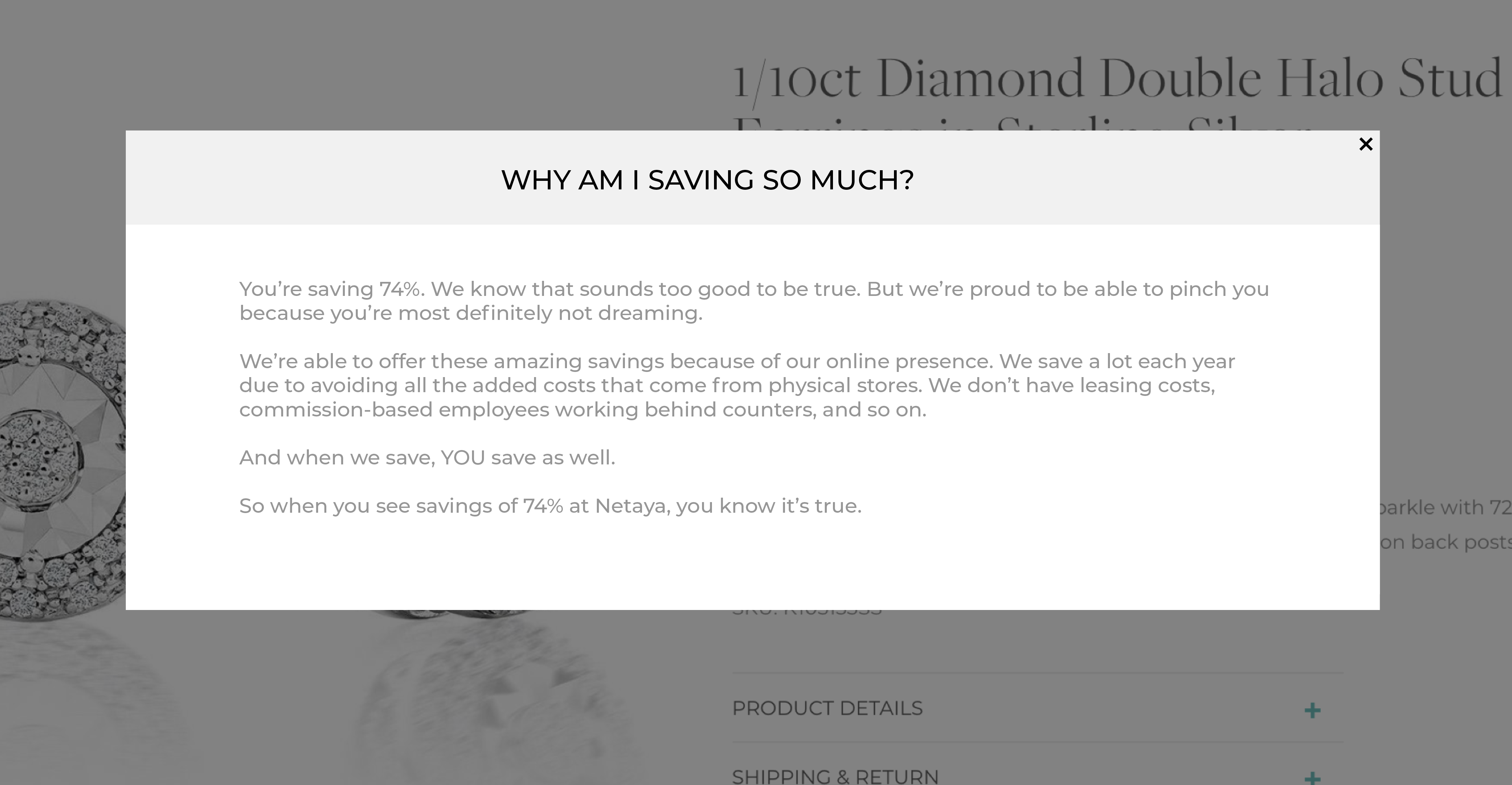
Addressing the shopper’s thought that these discounts are “too good to be true” is using Narrative Control. This would certainly result in a boost in conversion rates, especially after maximizing clicks on the call to action.
2. This is confusing or negative.
$16.99?! But this other site is offering the same thing for $12.00. What gives?
Speaking of discounts, not all businesses can offer them for various genuine reasons (not because they’re penny pinchers, as many consumers would like to assume). Most marketers view this as a disadvantage; they have to come up with other strategies to get shoppers to convert.
In reality, this doesn’t have to be a disadvantage. Let’s take a look at an example of a product from Ora.organic (not an actual client of ours):
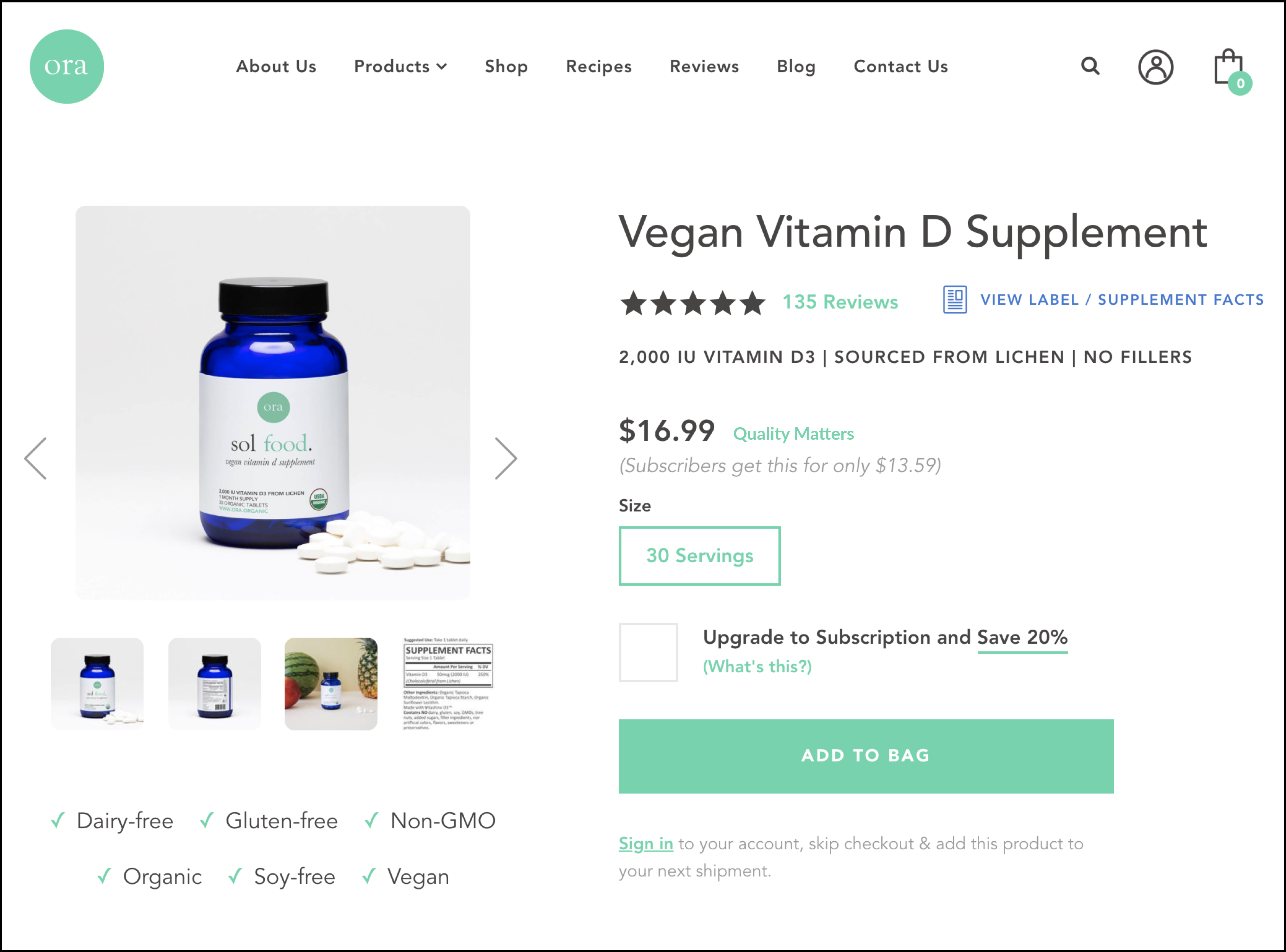
When we saw that Ora was offering a vegan vitamin D supplement for $16.99, we were a bit sticker shocked. We’ve worked with various supplement businesses before so we knew that $16.99 was a bit on the high end. If we were a typical shopper, we likely would have fixated on the high price (negativity bias) and gone with one of the $12.00, $8.00, or $4.00 options from Ora’s competitors instead.
To prevent this from happening to their actual customers, we came up with an idea that uses Narrative Control.
First, we added a link beside the price:
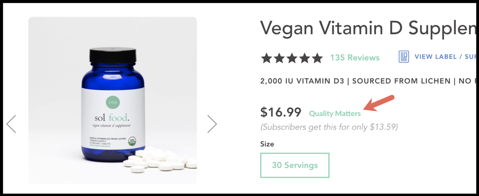
Once clicked, shoppers will see the following lightbox window:
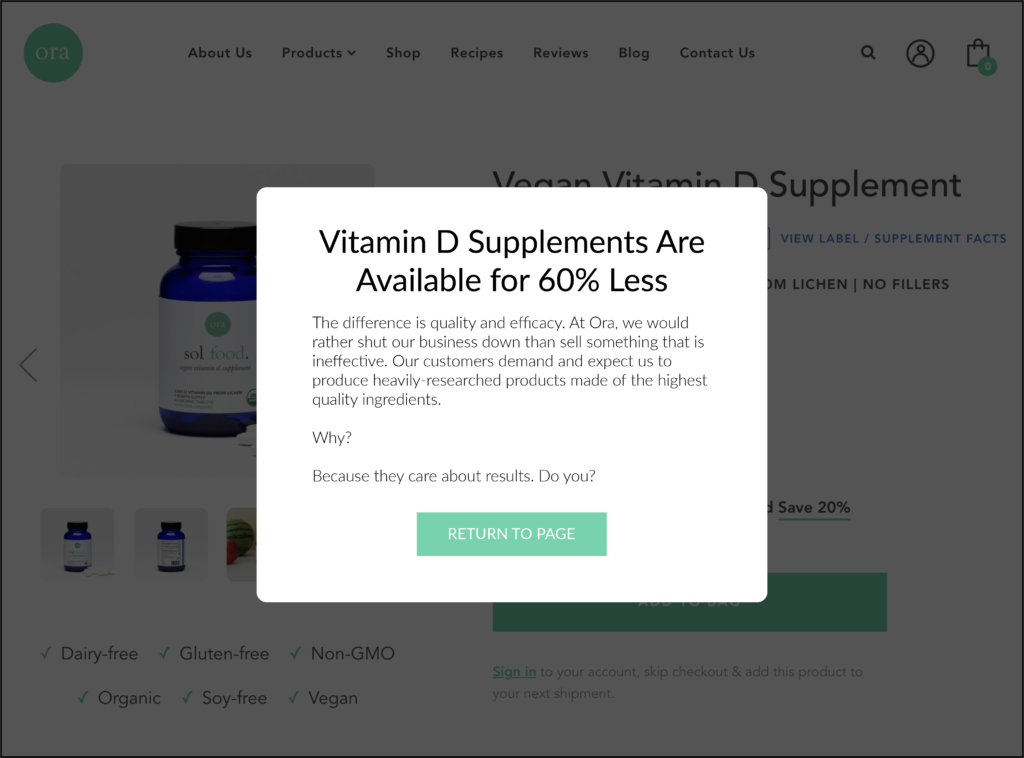
There’s an old adage that many people stand by: “you get what you pay for.” That’s the exact sentiment we’re using here to help shoppers understand why this product is a higher price that of the competition—top quality. In other words, more shoppers will now understand that they’re paying a premium for a better product.
3. What about your competition?
This is a thought that no business wants their potential customers to ever think. If you’re shopping for shoes on Nike’s site, you don’t want anyone thinking about the better options Adidas might have and vice versa.
But some of their shoppers will inevitably have that thought and leave the site to research the competition.
How do we prevent this? It’s simple, we promise.
For example, if your business is in the probiotic industry, then you know there are dozens of different types of probiotic products out there on the market (ranging from pills to powders to juices) from hundreds of different companies. That’s a lot of competition.
But what do most sites do? They talk about themselves and themselves only. This leaves a lot up to the shopper’s imagination. For example, if they see your probiotic pills cost $55, they could assume that there’s a lower price elsewhere—even if you offer the best price available.
Or maybe your probiotic pill has the best effectiveness but you haven’t told your shoppers that you’ve tested all the other probiotic pills out there to come to that conclusion. Guess what? Your shoppers will be just as skeptical with you as they are elsewhere. So how do you overcome that hurdle?
Let’s continue with this example and look at a product page:
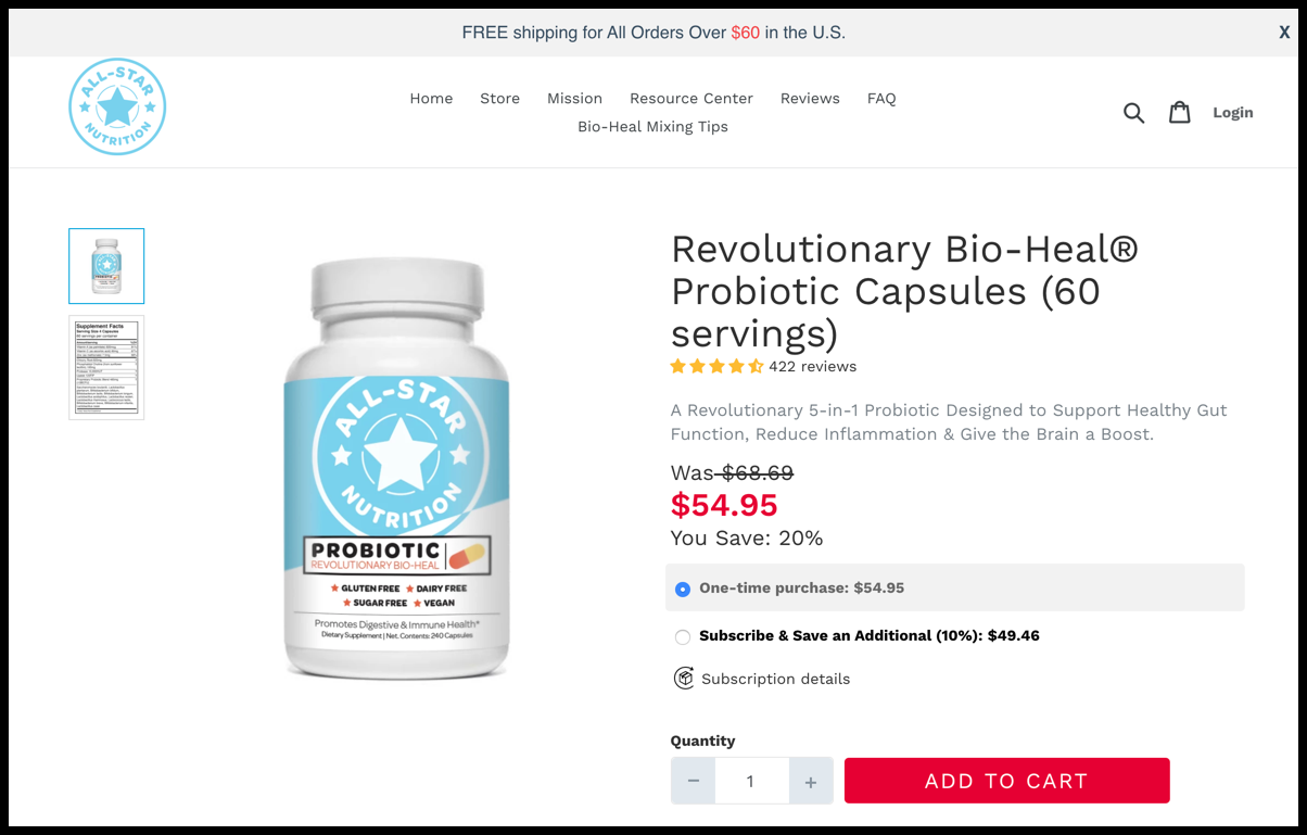
To prevent shoppers from leaving the site to research the competition, we’ve added the following. It shows how understanding the shopper’s mind helped us, as CROs, to rewrite the product description so we could influence the psychology of the consumer visiting this page:
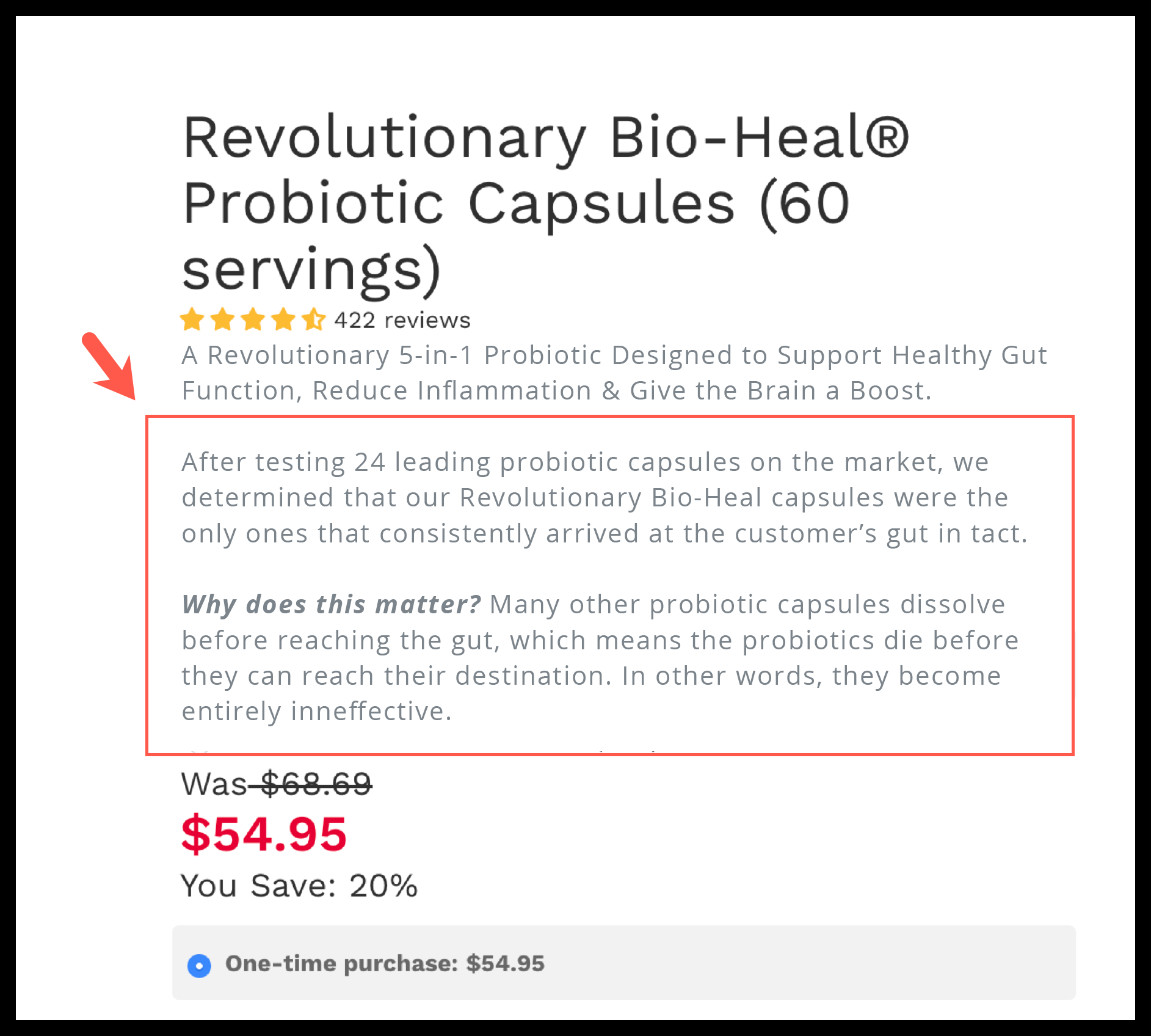
This will invariably result in more shoppers staying on your page because you’ve shown confidence in your product’s superiority over the competition.
4. Couldn’t I just do nothing?
Now that we’ve explained status quo bias and people’s predisposed tendency to do nothing, the importance of this potential question a shopper could have is not to be taken lightly.
How do we prevent shoppers from believing they could simply not buy your product or service? Currently, the solution most businesses come up with is coupon codes, discounts, free gifts, and so on. But what if we told you this isn’t necessary?
The better solution is to revisit your copy and visual aids (images and videos). Are you truly providing the shopper with compelling reasons to buy the product or service—reasons that make the shopper feel like they can’t live without it?
Let’s look at this product description, for example:
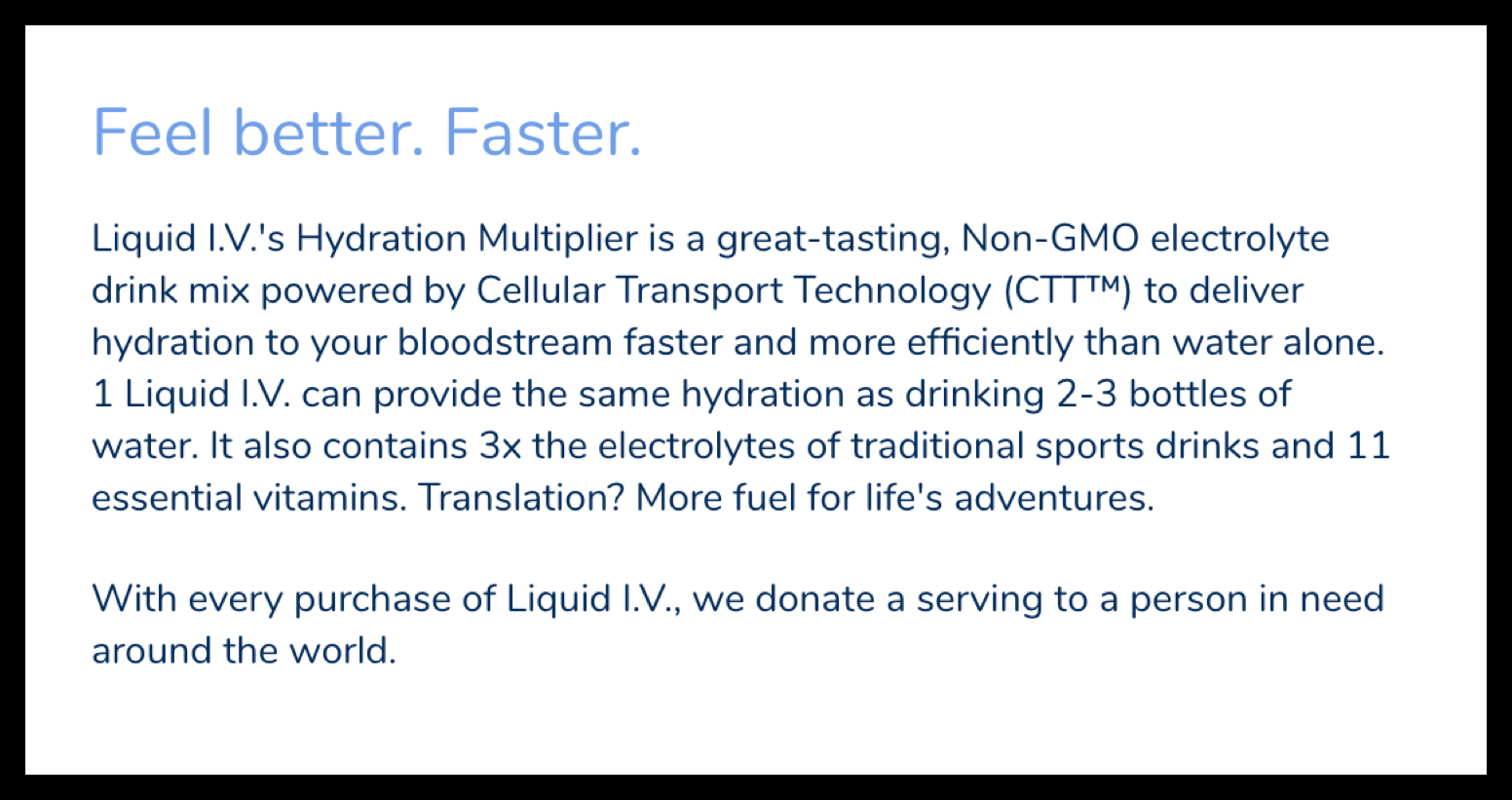
What a potential shopper could be thinking after reading this copy:
This product seems great. But I really don’t want to spend $1.25 per drink right now when I already drink water or spend the same amount on energy drinks, so I’ll just get it later.
(Note: the vast majority of any site’s traffic is new traffic, so chances are most of the shoppers that think the above are not actually going to return later.)
The solution here is not to mark down the price and devalue your product. Instead, we need to stretch out our copywriting muscles and make the following changes:
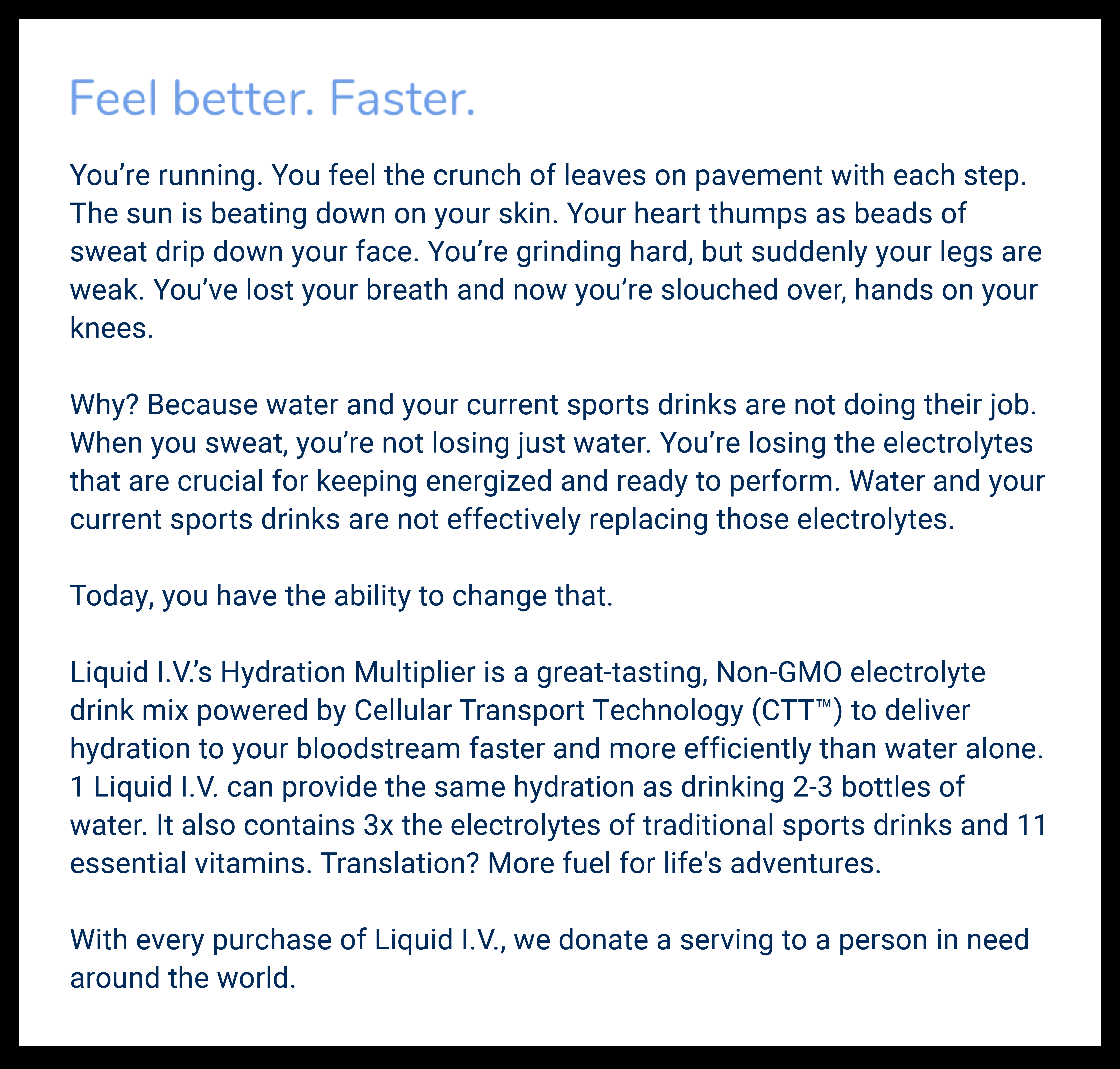
This new copy encourages the shopper to buy right now, but not explicitly (that would result in the opposite effect we want). Instead, we encourage the shopper subtly by forcing them to imagine themselves during one of their jogs in the park or through the neighborhood—to imagine the sudden loss of energy they feel after they’ve jogged for a while.
When they see themselves in this scenario (note: this is a bit of a teaser for our Visualization tactic as well, so continue reading!), they’ll be more likely to realize the value of this product over water or their current sports drink (the status quo).
In the end, we’ve increased the likelihood that the shopper will remain on the page and click ‘add to cart’.
And sure, our copy is much longer. But what we’ve seen in our A/B testing is that long-form copy isn’t a conversion killer. In fact, long-form copy can be a conversion tool. But the copy has to be engaging.
See more examples of Narrative Control here:
- Narrative Control
- Choose a Plan: Bait and Switch or a Good Discount?
- Clever Way to Increase Lead Submissions
VISUALIZATION
Of our 3 CRO tactics to influence consumer psychology, Visualization is the simplest to explain. But it’s severely underused by marketers. Before we explain, let’s discuss what’s at work in the human brain that makes Visualization so impactful.
How fast does the human brain process images?
Here’s something surprising to many: the human brain processes images 60,000x faster than words. You read that right.
Additionally, 65% of us are what you would call “visual learners”, meaning the majority of us comprehend visual representations of information easier than written or verbal information. Whether we believe this to be true or not is irrelevant because the proof is in the pudding. In other words, A/B testing shows us that replacing written content with visual content often results in winning tests.
What is Visualization?
The third and final of our CRO tactics, Visualization is the process of reinforcing a point using a visual device. We can do this in two ways:
- Through visual media, e.g. images, infographics, videos, etc.
- Through words.
“Wait, through words? But you just said the human brain processes images faster than words!”
You got us. But we’ll explain what we mean below. We promise.
1. How to apply Visualization using visual media
“Our device’s response rate is 5 milliseconds.” How fast is that?
Visualization can and should be used by all businesses. However, Visualization is especially important for expressing technical or abstract information. In the above example, it’s highly likely that most people won’t be able to visualize how fast 5 milliseconds is. It’s difficult to picture. Consequently, most people won’t be able to comprehend how effective the device is.
To address this, we had an idea. This response rate chart uses our Visualization tactic. CROs use it to influence consumer psychology:

This infographic helps the shoppers easily visualize what can be blocked by this filter. In effect, their desire to purchase the product is amplified, leading to higher conversions.
Visualization can be used in videos as well. If you’ve ever seen a paper towel commercial, then you know exactly what we’re talking about. Time and time again paper towel manufacturers demonstrate how absorbent their paper towel is versus the competition’s.
Not sure what we’re referring to? Watch this video to jog your memory.
If you’re not in a position to watch a video right now, here’s a screenshot. As a CRO it’s clear the image has a big impact on the psychology of the consumer who sees it.
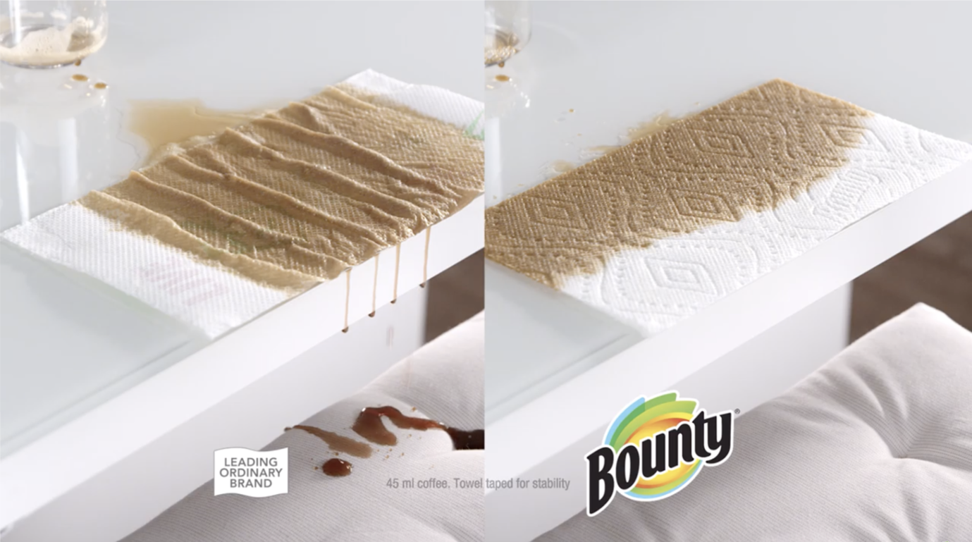
This commercial takes advantage of a tried and true strategy: showing, not telling. If Bounty were to test two commercials—the one above and one where the narrator simply said “Bounty is 2x more absorbent than other brands”—we guarantee the first commercial would outperform the second by a mile.
That’s because people process visuals faster than words
2. How to apply Visualization using words
“MGM Resorts has saved 794 million gallons of water in the past 5 years.” What the heck does that mean? How much water is that?
When a business makes a claim like this, it can sometimes be difficult for a person to fully comprehend what is meant. To some, 794 million gallons of water may sound like an ocean. To others, it may sound like a swimming pool. How do we clarify this to make this message as impactful as it was meant to be?
How MGM leverages consumer psychology to change behavior:
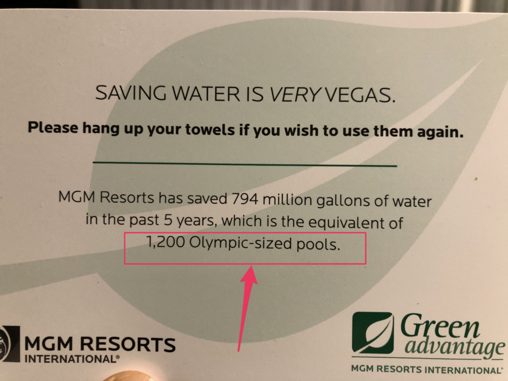
Many people have watched the Olympics or been to a public pool. Because of this, they can easily visualize an Olympic-sized pool. They know it’s big. They know it holds a lot of water. And they know how to multiply. Therefore, they can easily understand that 1,200 Olympic-sized pools is a heck of a lot of water.
See more examples of Visualization here:



Comments 2
Brilliant! I hope you’re writing a book!!
ReplyRishi Rawat
Thanks, Julie. I very much plan to write a book. When? No idea. But that’s the big plan.
Reply