Blog
Unique Product Page Layout & Design
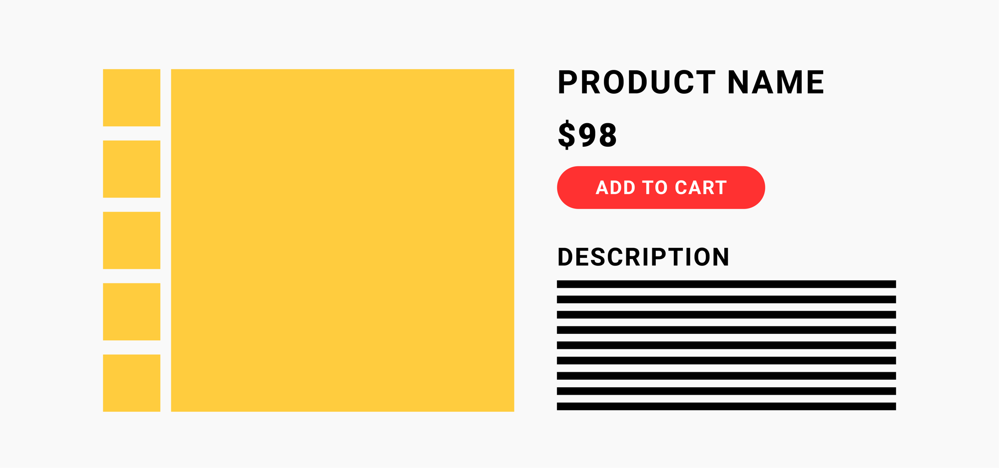
Around 16 years ago a pioneering graphic designer decided that this was a good layout for a product page:

The idea took hold and we’ve been following it ever since. But why is the product page laid out this way?
– Is it because this is the best layout from a conversion perspective?
– Is it because this is the layout that’s most familiar to shoppers?
If we had a good scientific reason for why product pages all look the same I’d be fine with it. But my hunch is there is a little bit of “the others are doing it this way, let’s not rock the boat” going on here.
But product pages don’t have to be the way we’ve been designing them. I’m going to share two examples.
Product Page Layout Example 1
Have a look at this innovative design on thenueco.com:

Product Page Layout Example 2
The next example I’m going to share is from GEM Daily Essentials. Their design team has gone with a boxy look for the desktop view. These are the types of bold designs that push the DTC world forward. It doesn’t matter if this particular design helped or hurt conversion rates. What matters is that marketers are still innovating. That’s what we need to celebrate.

Revealing It All
We hope you liked this product page layout article.
But we have so much more to share with you.
Why Listen to Us?
We’ve spent all our time in our marketing lab, experimenting with online shoppers. We’ve learned a crap ton and are ready to share those learning.
What we’ve learned is that the real secret to growing sales is to ignore 84% of your site visitors so you can triple down on a very special group. We call this group Healthy Skeptics. 👈🏼 click the link to your left for an unfair advantage over the competition.


Comments 5
There is no such thing as the “right product page design”. Old or new. Each product/customer combination has its own set of needs. One might require a strong emotional hook, another a longer logical explanation. For another, strong third party validation might be critical. Each of these will be best achieved with a different graphic layout. The only way to know is through A/B testing. It is VERY easy to fall in love with a cool new design, only to discover that it doesn’t convert as well.
ReplyRishi Rawat
Hi, Mark. That’s exactly right 🙂
ReplyNever thought about this. It’s so common that I never stopped to think, “why are products page this way?” It’s great to get a glimpse into the world of CRO.
ReplySOOOO Many things that could be designed and tested!
ReplyI wish I had more traffic to allow for the resources to test this product page design out.
Rishi Rawat
Love seeing your comments come in. Ron, I’m always happy to do a free project for my buddy. Just need enough traffic for an A/B test.
Reply