Blog
Subscription Marketing: Getting More Recurring Plan Signups
Subscription marketing has one goal: to get more buyers to buy your subscription plan.
Some businesses are designed for repeat orders. Think health supplements, meal services, coffee, etc. For these businesses, it’s ok to not make a profit on the first sale. The idea is that once the buyer signs up they will likely continue buying in the future. The marketer has opportunities to monetize the relationship over time. These brands need subscription marketing.
Then there is a whole other group. Things like dog wheelchairs, room air purifiers, steel plates to bake the perfect pizza, etc.

People don’t typically buy a dog wheelchair more than once. These brands don’t need
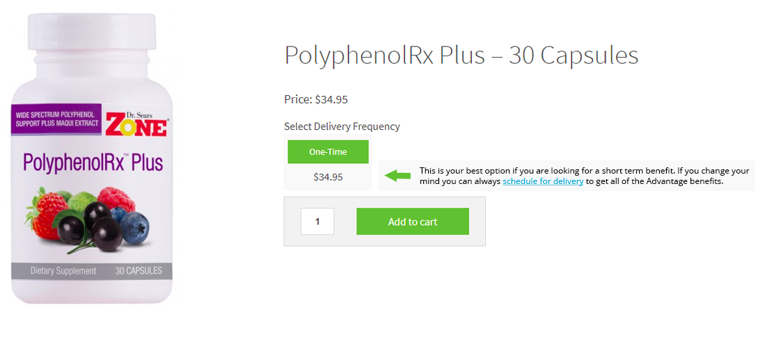
subscription marketing.But if your business depends on repeat, ongoing orders you are going to love this idea. Say you are the marketing manager at zonediet.com (made-up example) and are working on PolyphenolRx Plus page. Buyers on this page have two purchase options:
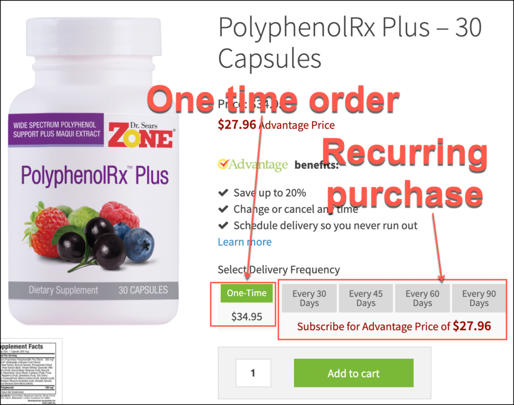
Looking at the analytics data and notice that 60% of buyers purchase the one-time plan. You also notice that people who take the subscription plan have a much higher lifetime value. Our objective is to get people to buy the monthly auto-ship plan (and not the one-time option).
On the current page, everything is laid in front of the user. This can cause analysis paralysis (too many options). Also, the shopper is likely to pick the one-time option because they don’t want to get into a monthly membership.
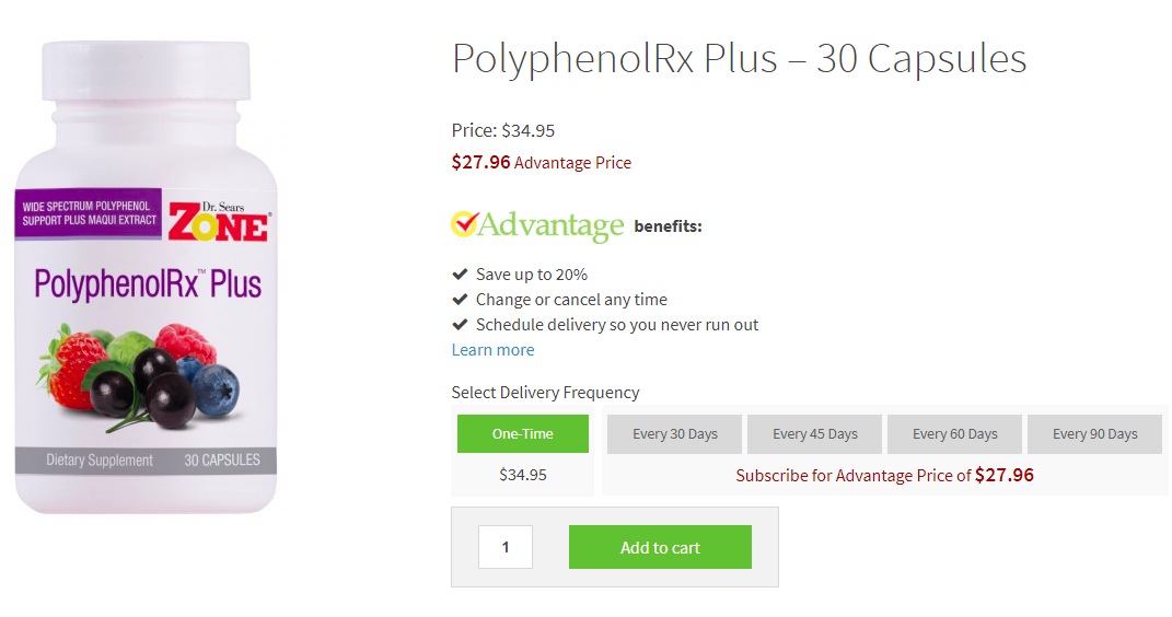
I had an idea to make this better
We added a priming treatment. The idea is to activate System 2 for the shopper. Where System 1 cares about the short-term (impulsive emotional side), System 2 cares about the long-term (rational side).
Now when the user reaches the product page we show a welcome message and ask them to make a selection (click to see zoomed image):
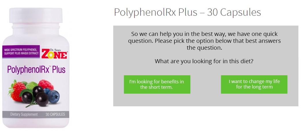
This activates System 2. We fully expect most shoppers to select, “I want to change my life for the long term” option. Who wouldn’t? When they do that we show them this screen (click to see zoomed image). Notice we’ve eliminated the one-time purchase option.
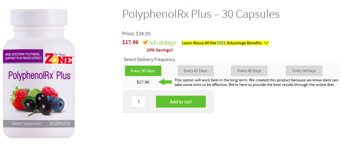
The user will be surprised but immediately remember, “Oh that’s right, I did say I wanted long-term benefits”. It’s now 7% more likely people will stick with this choice.
If the shopper had selected “I’m looking for benefits on the short term” they would have seen this:
If You Liked This Idea
You’ll like our other ideas too.
We’ve spent the last 16 years in our marketing lab, experimenting on online shoppers. We’ve learned a crap ton and are ready to share those learning.
Here is a collection of our favorite conversion ideas for DTC brands.




Comments 3
Interesting. Note that I think your bottom two pics are filpped.
Replybetterretail
You’re totally right. I just made the switch. Thank you for pointing this out.
ReplyInteresting, yes, I think this might work!
Reply