Blog
Strange Amazon Coupon Code Functionality
Amazon is the biggest retailer on the planet; if any retailer understands buyer psychology it’s Amazon. And Amazon uses buyer psychology everywhere on the site, even with coupon codes.
How Big Is Amazon?
Amazon’s share of the US ecommerce market hit 49%. That’s 5% of all retail spending across the entire country.
To put things in perspective, this is more than Amazon’s top three competitors combined, with eBay coming in at 6.6%, Apple at 3.9%, and Walmart at 3.7% (source).
Amazon has incredible transaction volume. Shoppers purchased more than 100 million products during the Amazon Prime day in 2018 (CNBC, 2018).
With this type of volume and Amazon’s legendary reputation as being a company that tests every site detail, it’s fair to assume everything you see on Amazon is there for a reason (is there to influence your buyer psychology.
Our Experience
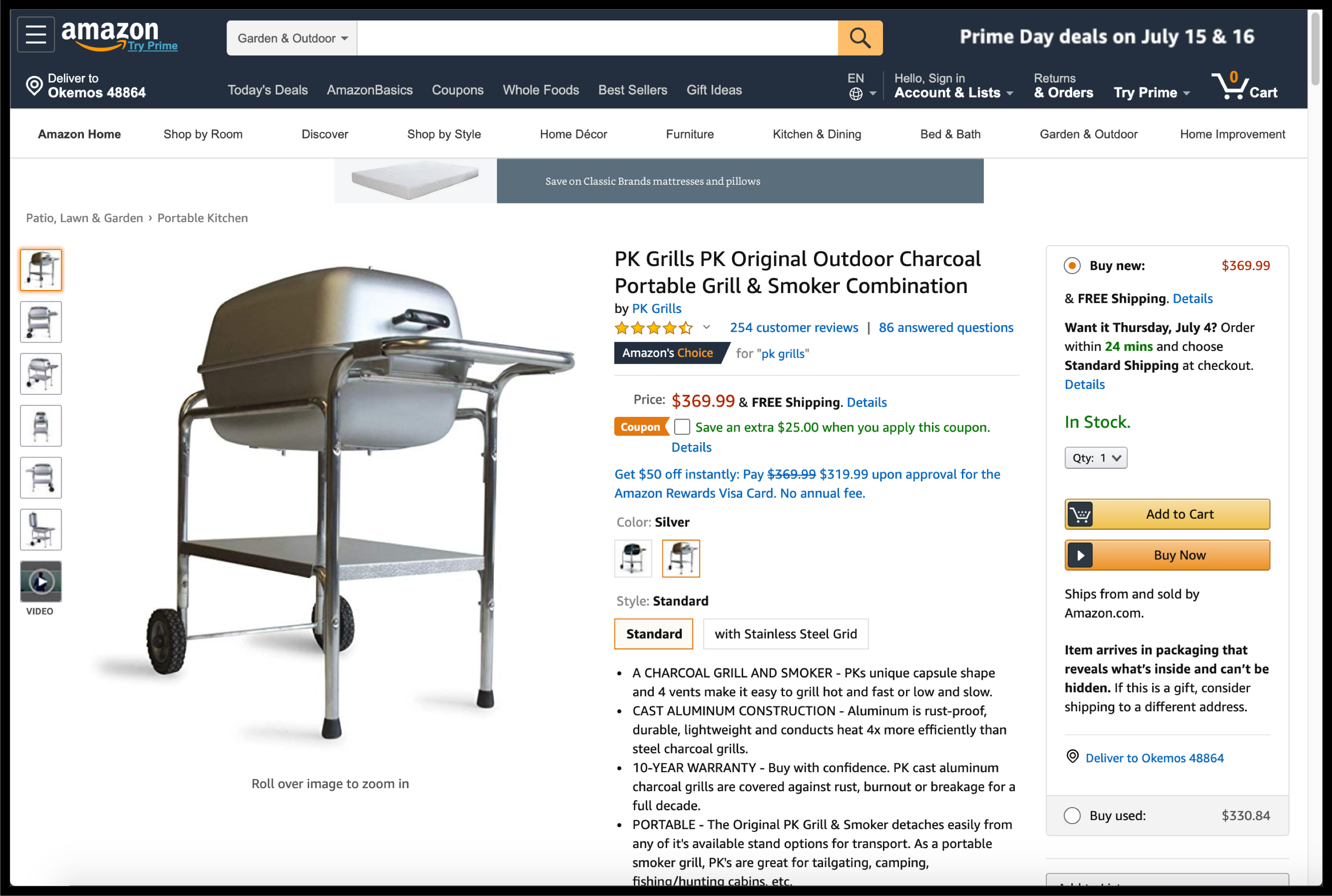
Recently, we stumbled upon an Amazon product detail page that looked like the following:

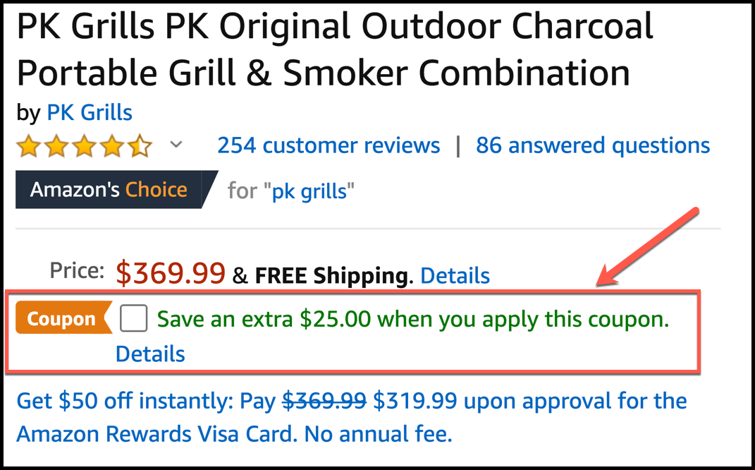
What stood out to us was the checkbox below the price:

The text reads “Save an extra $25.00 when you apply this coupon.“
We haven’t seen this before, and after digging around Amazon some more we saw that this checkbox only exists on a handful of products.

Since you're liking this article on strange amazon coupon code functionality you're gonna love the conversion ideas I share in my weekly newsletter. Signup below. If it isn't as good as I'm making it sound unsubscribe with one click.
But What’s the Purpose of This Amazon Coupon Code Functionality?
Why is Amazon making the grill shopper click on an extra checkbox to apply this coupon?
It would certainly be easier to automatically apply the coupon to the price and show the following: “Price: $369.99 $344.99 & FREE Shipping”.
But easier doesn’t always mean more effective.
Amazon Buyer Psychology
We suspect Amazon is taking advantage of buyer psychology by tapping into the shopper’s desire for control. Amazon determined that showing “Price: $369.99 $344.99 & FREE Shipping” wasn’t as effective as allowing the shopper to activate their coupon themselves. They likely thought that shoppers would simply read the price and move on while in System 1 mode (automatic, fast, unconscious).
But the Amazon Checkbox Changes Their Buyer Psychology
With a checkbox, the shopper’s System 1 thinking is interrupted. They have to slow down. They now get to make a decision—they get the pleasure of driving their own experience by applying the coupon themselves.
Cognitive Consistency
Definition from alleydog.com: Cognitive consistency is a psychological theory that proposes that humans are motivated by inconsistencies and a desire to change them. Cognitive inconsistencies cause an imbalance in individuals and the tension from this imbalance motivates people to alter these inconsistencies. The tension arises when thoughts conflict with each other and this tension creates a motivation to change and correct the inconsistency. When this tension is reduced balance is achieved in the individual.
How This Relates to the Amazon Coupon Code Buyer Psychology Example Above
As we saw above Cognitive inconsistencies cause an imbalance in individuals. The individual is constantly trying to seek balance.
In this case, when the user clicks the discount activation checkbox they are signaling that they are interested in a discount. Once that announcement has been made the most consistent thing to do is to complete the purchase.
Revealing It All
We hope you liked this Amazon coupon code buyer psychology article.
But we have so much more to share with you.
Why Listen to Us?
We’ve spent the last 16 years in our marketing lab 🧑🔬 🧪, experimenting on online shoppers. We’ve learned a crap ton and are ready to share those learning.
We want more marketers and CEOs to know about it.
Eventually, we’ll make this into a book. If you want an unfair advantage over competitors now is the time to steal our ideas because once they are published the cat will be out of the bag.
Each chapter in our forthcoming book will feed into the next. Click the link that best describes where you want to start the story:
Chapter 1: is all about conversation rate optimization (CRO). It talks about the history of CRO, statistics of CRO, and describes how most agencies do CRO. We need to describe how most are doing it before revealing our process (that’s the topic of Chapter 4.)
Chapter 2: For every 1,000 product pitches encountered the shopper buys 1️⃣ item (and we’re being generous). If the goal is to have the consumer choose your product we need to understand their selection criteria– we need to understand their buyer psychology. Marketers who nail this will always outrun their peers.
Chapter 3: Conversion optimization work typically focuses on design and layout changes. We don’t limit ourselves to design and layout. Through extensive experimentation, we realized that the thing that moves the conversion needle 🧭 are the words and ideas expressed on the page. Conversion copywriting is where it’s at.
Chapter 4: Marketers make a fatal mistake. They focus on optimizing the whole site. We focus on the tip of the spear. The most important page on your entire site is your product page. To understand why this is, read this post: Product Page Optimization.
About Frictionless Commerce
We only work with technical product DTC brands by improving advertising effectiveness by 20% in 90 days. This is achieved using a buyer psychology conversion copywriting framework. All paid traffic eventually reaches the product page and this is where we strike. Our process.
If you like doing the hard work yourself, our founder Rishi shares conversion ideas on LinkedIn every day. Connect with him here.
If you want to make your life easier and still increase conversions, jump on a call.


Comments 2
Hey Rishi, good stuff!
Yes, this is Coupon functionality that they’ve been testing for about 3 years now. I prefer to offer discounts using coupons, for my clients, because when the Coupon ends, the price doesn’t technically increase in a way that suspense the BuyBox for “raising prices” too quickly. It’s a bug, but that’s why we like Coupons.
Additionally, there are two banners for Coupons. One from the SRP page that is Green and stands out nicely on the SRP results.
Then when you click through to the Details Page the banner turns bright orange.
My guess is that these banners help CTRs and Conversion rates. Also, many sellers get the benefit of the coupon without shoppers actually clicking the coupon for the discount. So it helps CTR and Conversions that the items it priced less, but I believe it also helps tremendously to have a Green and/or Orange Banner on your listings to help the customer add to cart.
ReplyI was looking for if I needed prime to use that coupon, but this is actually interesting!
Reply