Blog
Psychology of Discounts In eCommerce
No two ways about it: discounting can hurt brand value. But if you stick around we’ll show a few ways it can be used to drive sales without hurting your brand.
I’m not a fan of discounting for a few reasons:
- It can lessen the perceived value of the offer.
- It can set bad expectations: if I land on your site and see a 20% discount on product A, I now expect to see a discount on product B, too.
- Even if I buy, I’ve now added you to the “this retailer offers great discounts” list. Now, when you email me to promote products I’ll only buy if they are on sale. You’ve trained me to act based on discounts (Pavlov’s dog).
Price Elasticity and Discounting
Price elasticity states that as price goes down, demand goes up.
This is why a full-priced item discounted by 20% typically generates a 20% lift in unit sales.
But this logic doesn’t work with deep discounting.
Why? Because as you get into deep discounting buyer psychology starts shifting.
Consumers aren’t used to seeing 40% or 70% discounts. So when we see those some of us start to wonder…
Wait
“Why am I getting this insane discount, what don’t I know?”
We start considering scenarios:
- Is this item about to be phased out?
- Could there be a defect with the item I’m not aware of?
- Is this company about to shut down? Inventory liquidation? If so, will I be able to make a return?
As you can see, a lot of chatter happens in the mind of the shopper.
But …
Sometimes, discounting is part of the retailer’s marketing strategy.
If that’s your situation my advice is to wrap the discount around a compelling sales pitch.
2 Types of Discounts
1: Good Discounts
I was on Withings and noticed they had a big sale going. The watch was $60 off.
This thought didn’t motivate me to buy– it had the opposite effect– it increased my skepticism (was this model about to be phased out?)
To connect with the shopper who had this thought I’d add a “Why the discount?” link right below the $119.95 price (see mockup below).
Withings isn’t a client, this is a made-up example to illustrate our copywriting process.
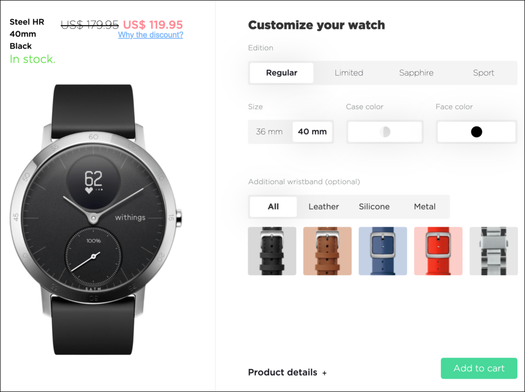
And on click, show a popup message like this:
Had you visited this page in February you would have seen the full price. We don’t discount often. But, we want to encourage shoppers to up their fitness game. And since the weather outside is improving we thought, “Why not? Let’s give a little boost to encourage shoppers to take their fitness to the next level.“
Here’s why this works: people who are skeptical about this $60 discount will naturally want to Why the discount? link. And when they do, they are shown a compelling explanation.
How to Know if This Discount Explanation Is Working
The wonderful thing about the world in which we currently live is that we don’t need to guess, we can simply set this as an A/B test. If the test fails that means your explanation didn’t work and you need to rework your popup pitch. And you need to continue testing it until you’ve unearthed the best version.

Since you're liking this article about the psychology of discounts you're gonna love the conversion ideas I share in my weekly newsletter. Signup below. If it isn't as good as I'm making it sound unsubscribe with one click.
2: Deep Discounts
We can see from the example above that Withings isn’t a deep-discount retailer. They just had a sale running.
What if you are a discount retailer where every item is discounted? That’s explained next.
Psychology of Discounts Explained Using a Deep Discount Retailer
Privé Revaux (not a client) is a manufacturer and seller of affordable, high-quality glasses. One of this company’s biggest selling angles is low prices. However, prices that are too low can trigger a “too good to be true” thought.
This screenshot is from Privé Revaux’s product page. You can see that the pair of glasses is only $29.95. For a shopper used to paying $100 for eyewear, $29.95 can feel suspiciously low.
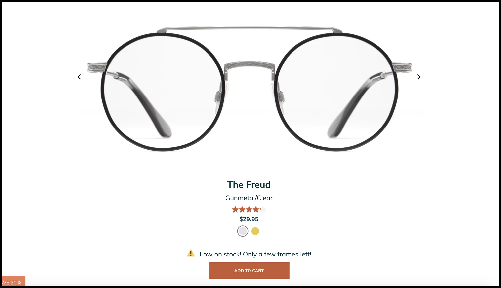
To satisfy this skeptical shopper we added a button below the price that says “Why such great prices?”
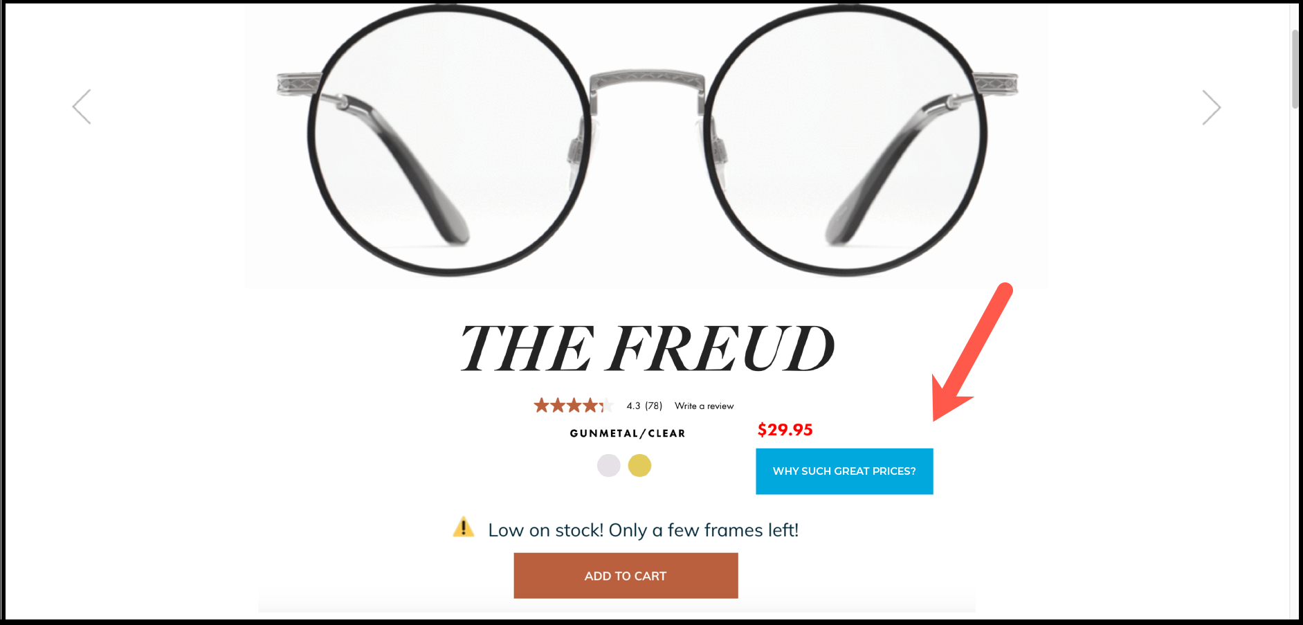
On click, this modal (popup video) will appear:
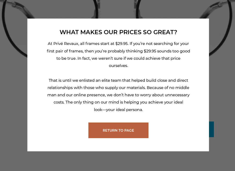
What’s so special about this modal? The only people who have a negative feeling about the discount will notice and click the discount explanation button. People who don’t have a negative response to the discount will likely not even notice the button. The brain is selective about how it processes visual information. It’s a phenomenon called selective attention.
When clicked, the modal directly addresses the concern of skeptical shoppers by explaining how Privé Revaux is able to offer such low prices.
Once the mildly skeptical shopper understands this, they are more likely to pull out their credit card 💳.
How to Know if the Message Worked?
One way to know is by setting it up as an A/B test where 50% of page visitors see the WHY SUCH GREAT PRICES? button and looking at the overall conversion impact. If you’re a marketer who uses A/B testing you will dig this article: A/B Testing in Marketing.
To take your A/B test to the next level I’d recommend adding this line at the bottom of the modal explanation:
You came here because you were curious about this incredible discount. Did we address your concern? 👍 / 👎
The beauty of this format is that the shopper is telling if my explanation increased the likelihood of them buying. If the majority of votes aren’t 👍 I’m going to continue refining the pitch till they are!
That’s the ultimate cheat code.
Don’t Show Discount Button on Every Page
If the user sees the same “Why such great prices?” button on every product page it will look gimmicky. Therefore, my idea is to set a cookie when, during their current session, the user first clicks the button. Now, when this user moves to the next product page they will not see a repetition of the “Why such great prices?” button. We have an article that explains this strategy in detail: Conditional Elements.
A Secret to Share
Since you’ve reached this far in this psychology of discounts article we think you deserve to know our biggest secret. It is this: the way to massively improve your eCom sales is by ignoring 84% of visitors to your site and tripling your attention on a group we call Healthy Skeptics.


