Blog
Point of View (POV)
People buy from people they like is an idea that’s well-understood in the world of sales.
But it also influences how consumers choose brands.
Especially in a direct-to-consumer (DTC) eCom environment where there is no physical contact between the buyer and seller, your point of view (POV) acts as a surrogate for trust. And trust is the cornerstone of commerce.
A dollar bill is nothing but faith in the US government:
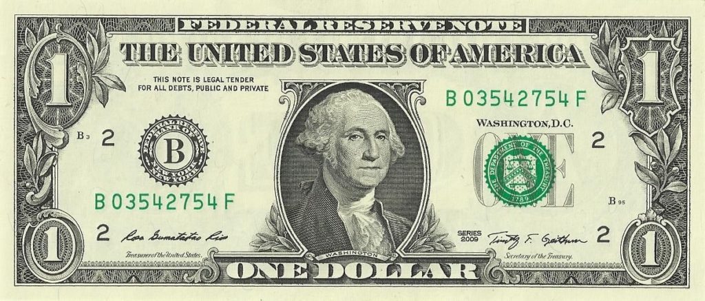
If people stopped believing in the value of this piece of paper, the world would devolve into chaos in minutes.
For an online shopper, it’s hard to know what a brand stands for. Customer reviews are one signal:
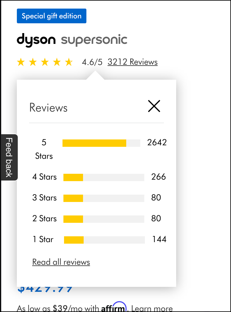
But buyers often need more.
You’re on a commercial flight and the person to your left strikes up a conversation. You aren’t interested in chatting but don’t want to be rude so you indulge them a little. Turns out, this person went to the same college as you. You even had one professor in common. At the start your guards were up, now they are lowered and you feel relaxed (even happy).
What changed? The shared college experience was a trust signal.
Analyzed rationally, this should have had no impact on your perception of this stranger. But it does. Yet another example of the power of system 1.
Point of View Examples
Here are some point-of-view themes retailers utilize.
Frustration
This is the POV used by Dyson (we covered this earlier).
Let’s look at a few more POV examples.
Quality or Nothing
The first thing shoppers see when they land on your product page is the price. It’s a good idea to draw attention to price if you are the low-cost leader. But, if you have made the decision to focus on quality (and I hope you have) then you may not have the lowest price. This could be a conversion killer for a visitor who is only judging you on price.
To combat that you should use the Quality of Nothing point of view.
Ora Organic (not a client) sells a premium vegan vitamin D supplement for $16.99:
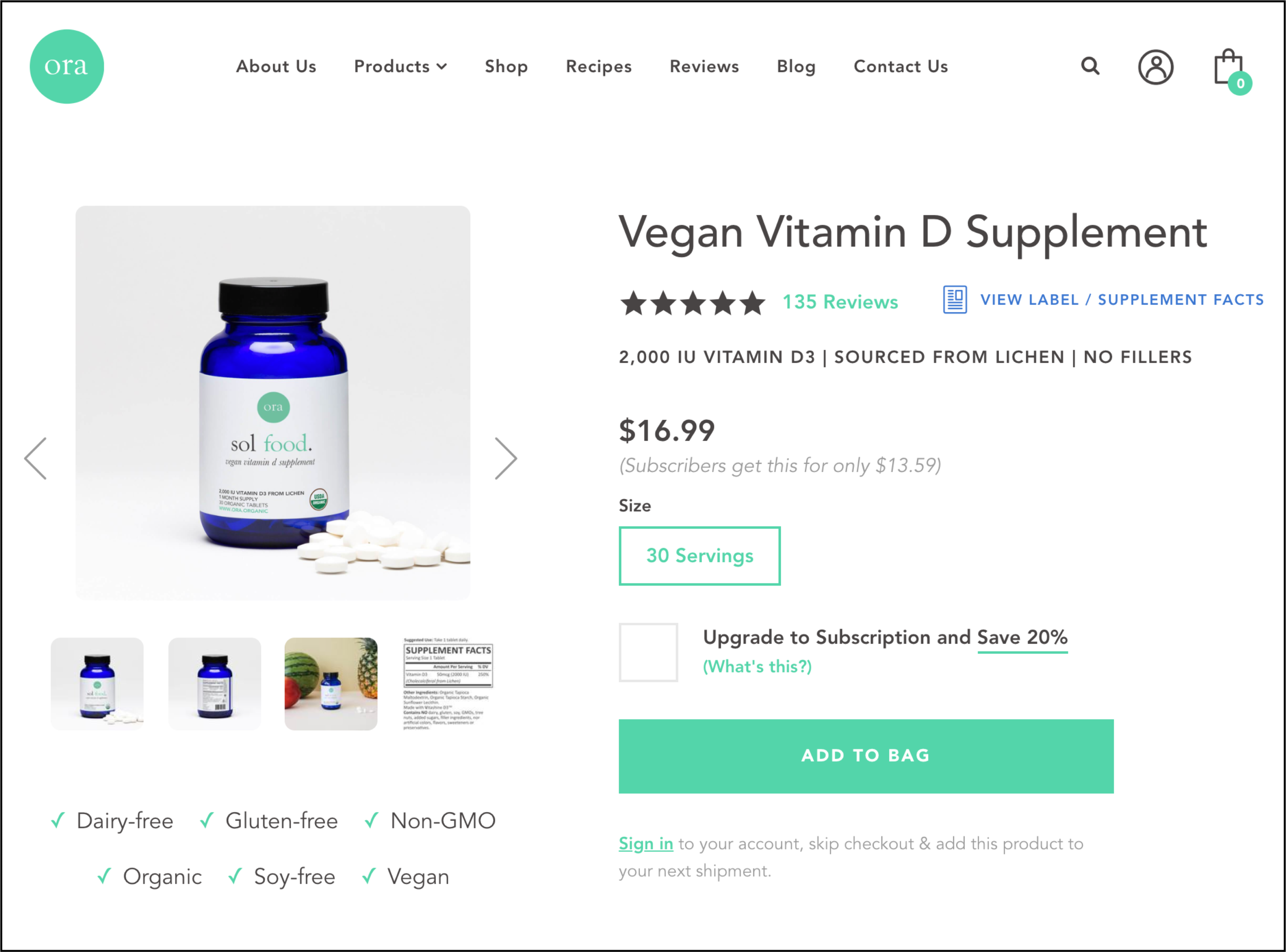
It’s a well-designed page and we’re sure this $16.99 price tag is acceptable to the people who are buying. But that’s not the group we care about. We care about people who got close to pulling the trigger but didn’t (we call these people Healthy Skeptics.)
To improve conversions, we shouldn’t think too much about people who are buying (they are already buying), we should obsess over those who came close to buying but aborted at the very last moment.
One reason someone may have decided against buying is they feel $16.99 is too much for a supplement. A quick Google search reveals vitamin D supplements are available for a lot less. The marketer needs to address the 🐘 in the room.
Here’s What We Did
A Quality Matters call-to-action was added next to the price (see screenshot below) because questions about price come up when the prospect is looking at the price:
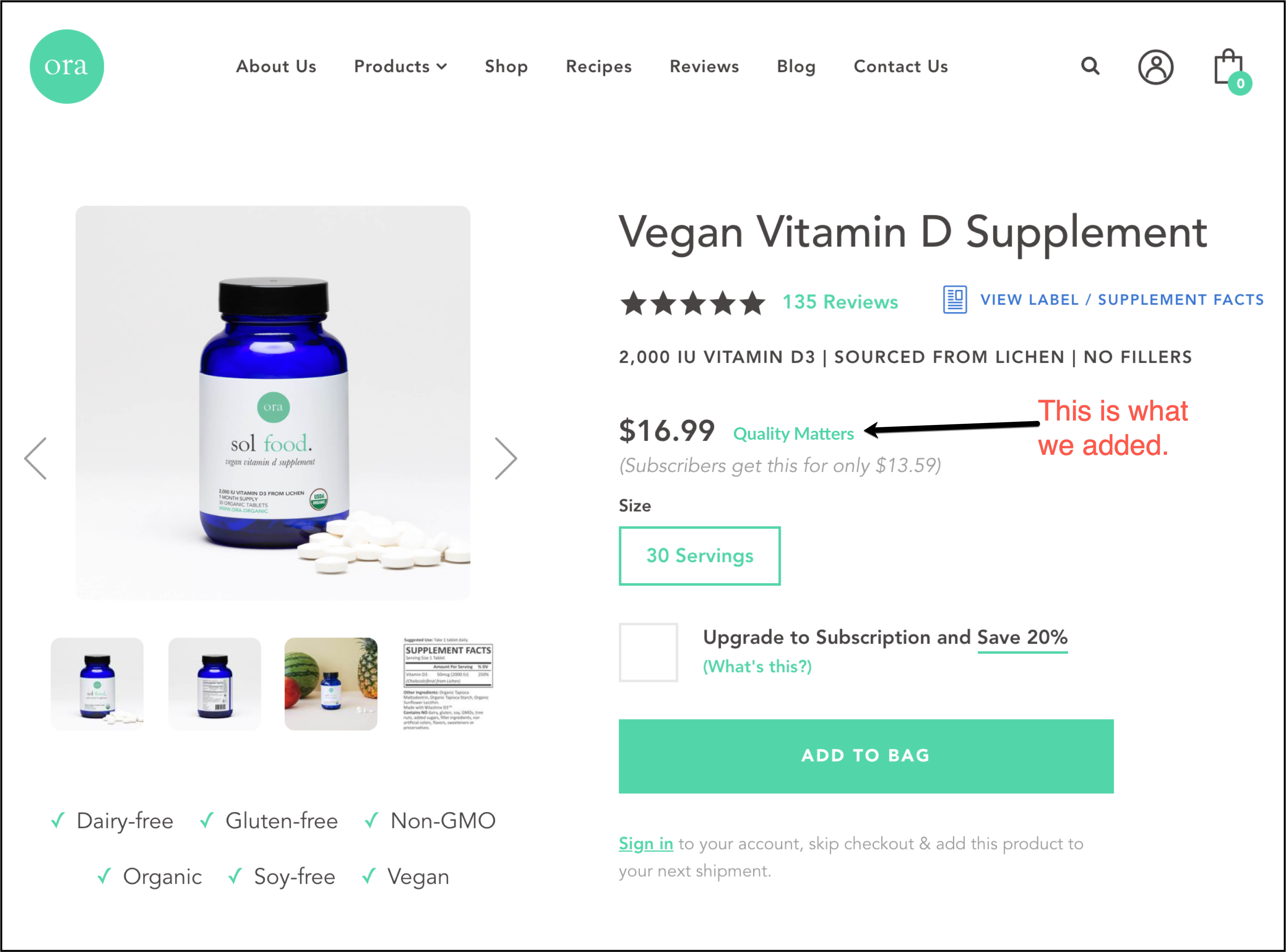
And when the link is clicked here is the price justification popup message (click the image to zoomed view):
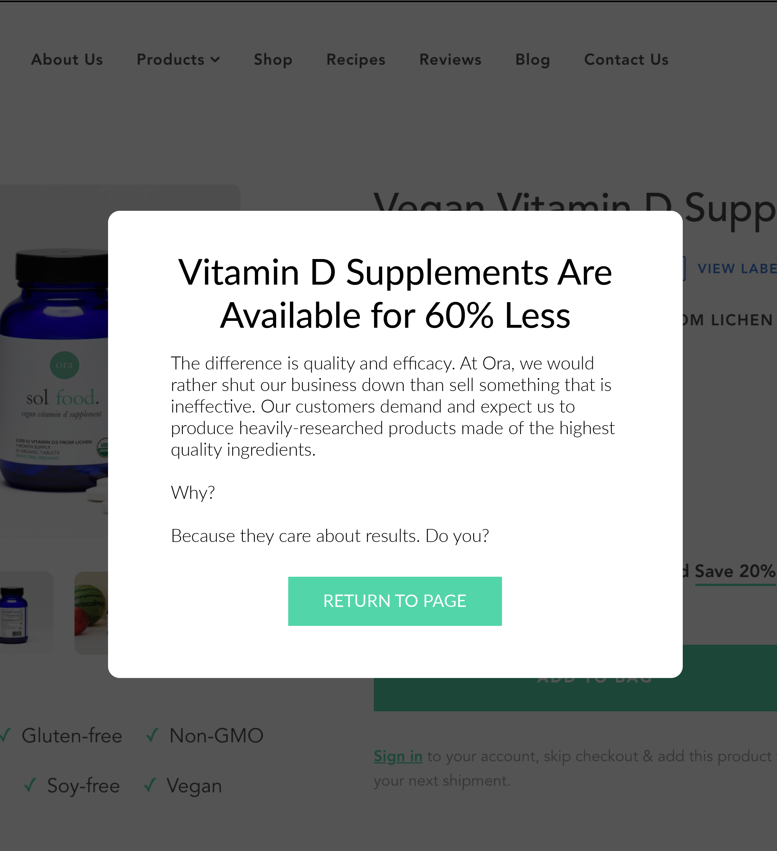
Is this the best popup sales pitch? Probably not. So we would A/B test 20 message versions till the golden ticket is found.
Does this approach make sense? /
🙌
Uh oh! Let's get in touch so I can explain this better.
We'll talk soon!
Minimalism
Asket.com is a clothing brand. They show this message on every product page on their site:
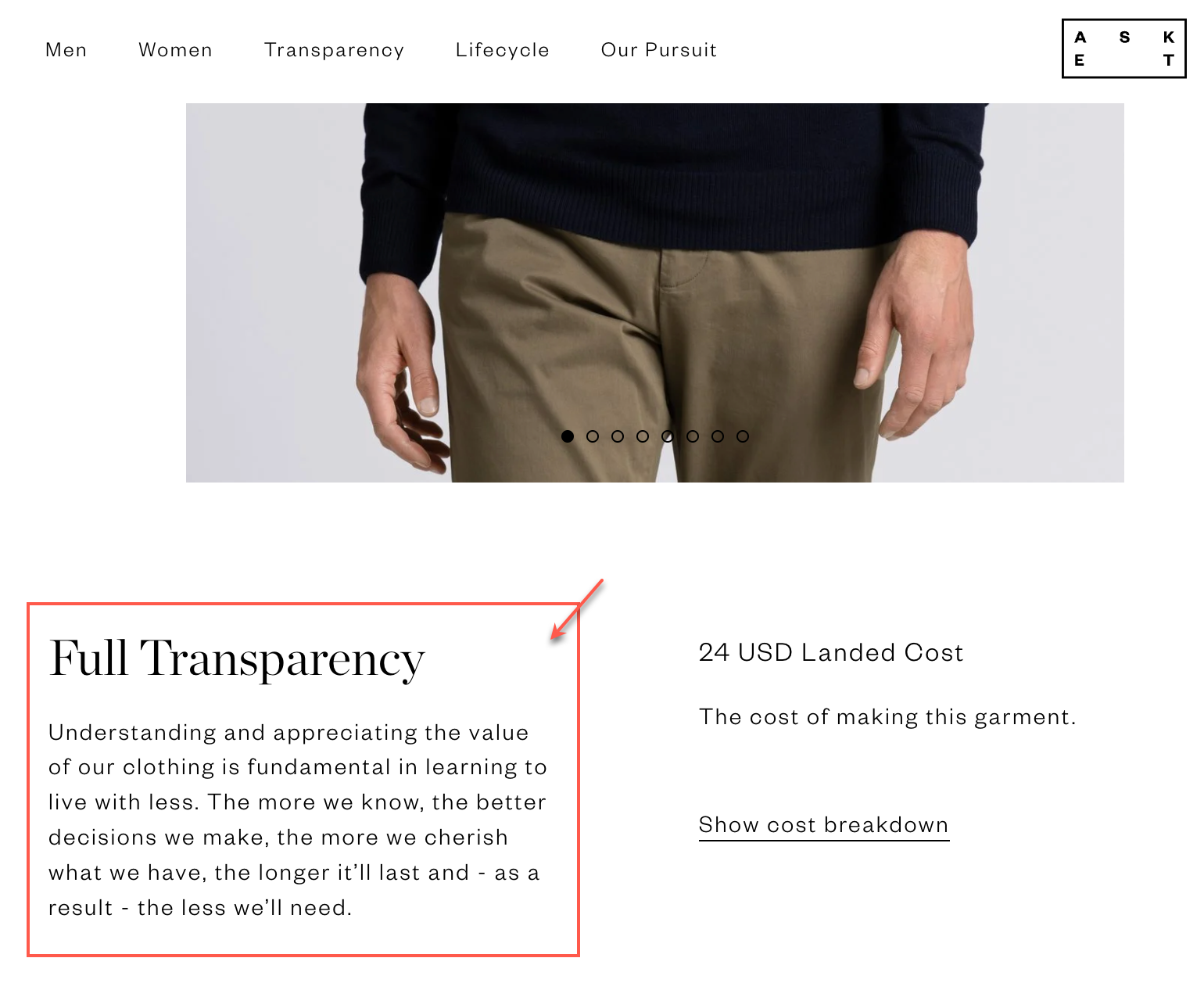
If you think about it, this point of view is very similar to the Quality or Nothing POV we saw above. It is. It’s just a different aesthetic for expressing the same basic idea of value for money. But aesthetics matter.
Quality for Less
Misen.com is a knife brand. Notice the Why are good knifes so expensive? headline.
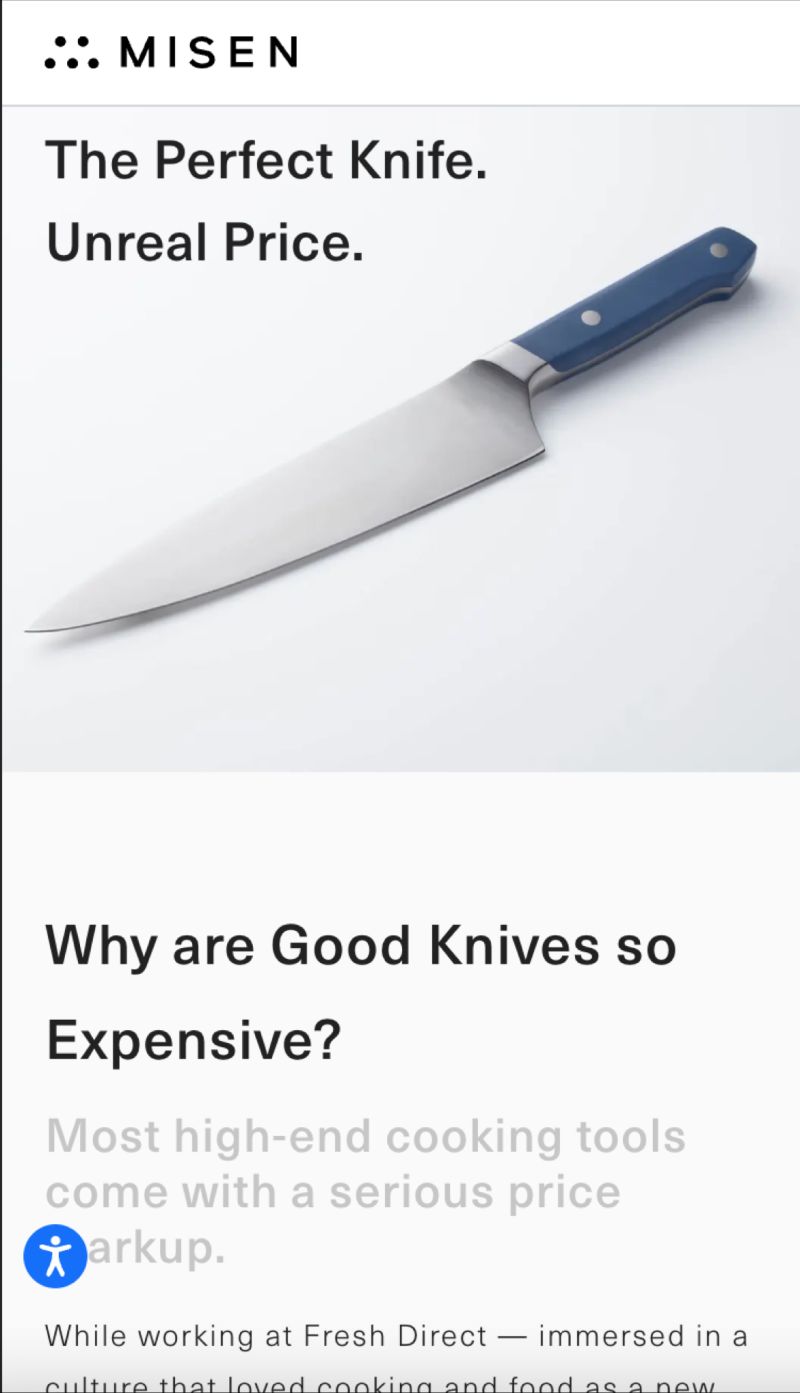
People who are confused about why good knives cost so much will immediately connect with this idea.
Embracing Imperfection
Point of view can be used to show transparency. I love this line on Bamboo Ave.:
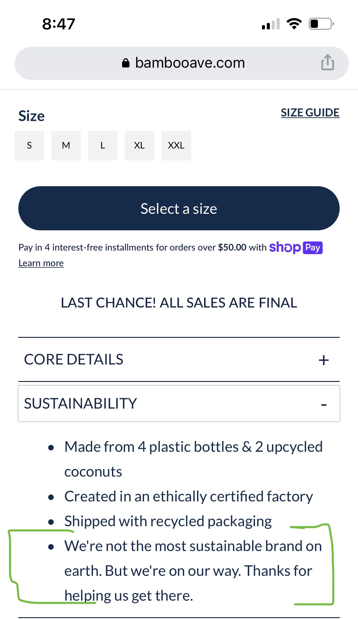
Outrage
Ray Allen Manufacturing makes K9 products. They were outraged that their inventions were being ripped off, so they spoke up:
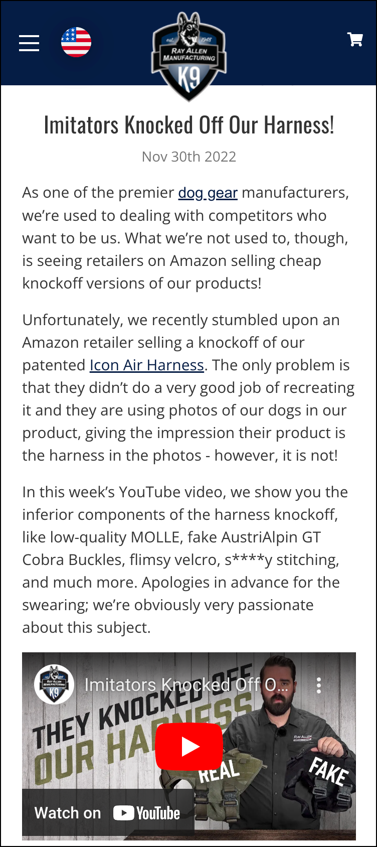
For those interested, here is that video:
You Can Have More Than 1 Point of View
Your POV doesn’t have to be one thing. It can be a combination of things. It could be part Quality for Less and part Outrage. Or it could be something we didn’t even cover in this article.
But It Must Be Unique
Points of view have lifecycles. When Henry Ford launched the Ford Motor Company manufacturing quality used to be shit. Saying “we care deeply about error-free production” was a potent point of view. It’s not that impactful today.
Similarly, a point of view like “we think customer service matters” doesn’t make you stand out— it’s what’s expected.
Pick a point of view you care about but is also unique.
Be Subtle
Let people know your point of view but don’t beat them over the head with it. Even people who agree with your point of view will be turned off if they sense you are being heavy-handed. It also makes it feel like you are trying too hard (“Is this brand using this line just to get me to like them?“). As with any form of marketing, the most effective ones are subtle (Implied Marketing vs. Stated Marketing).
Next Steps
We’ve completed step 8 of our checklist. All that remains now is step 9: We Must Resolve Shoppers’ Negative Thoughts.


