Blog
Product Page Long-Form Content [Killer Idea]
The most important page on your entire site is your product page. End of story. But if your product is complicated and has a lot of technical details it will naturally be long. So if you have long form content how do you maximize product page conversion rates?
If you prefer video watch this (below). If you prefer reading see written content below video.
Long-Form Content Example
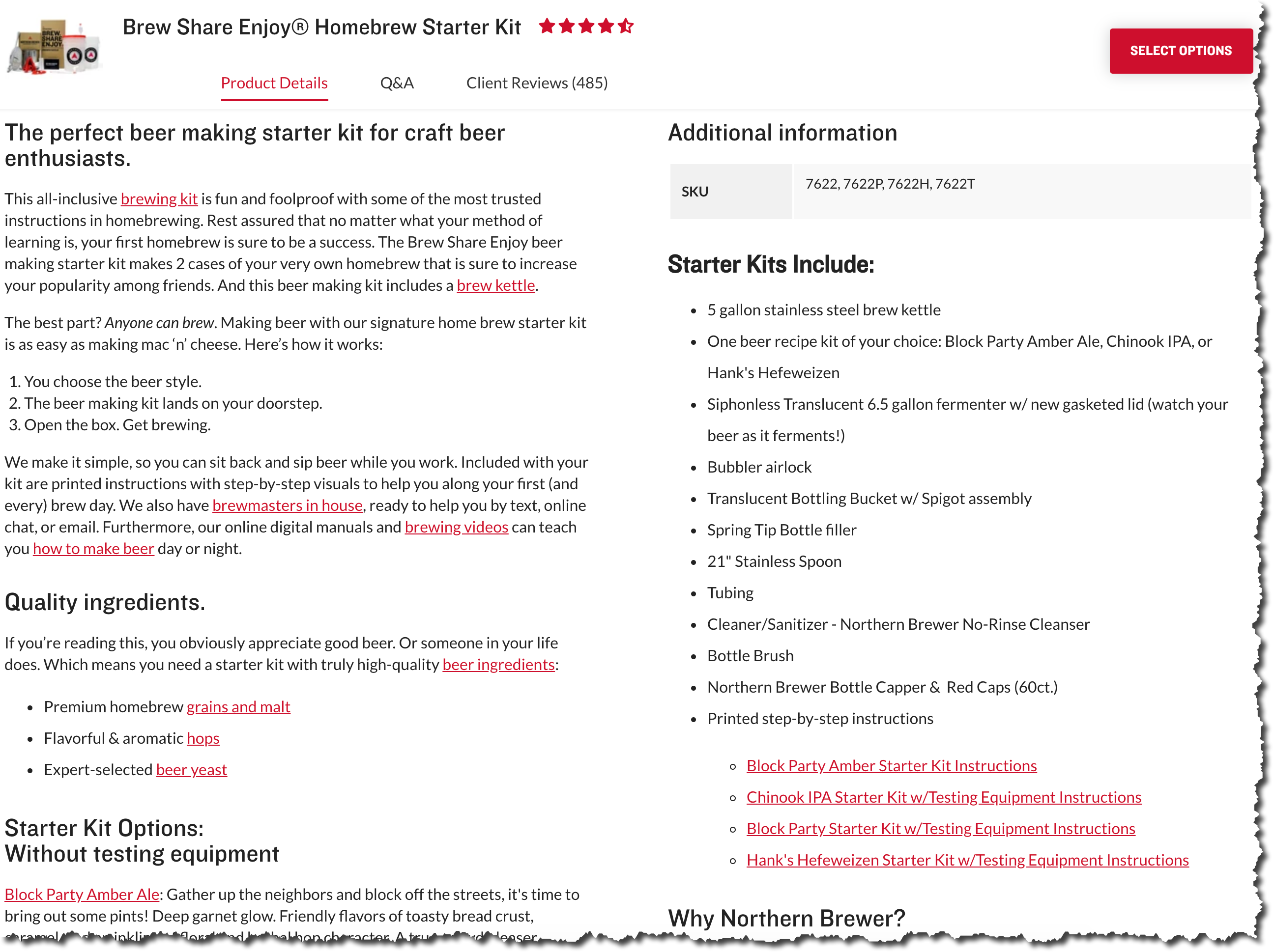
To get a sense for how overwhelming long-form content on a product page can be have a look at this example from Northern Brewer (not a client).
I could only fit 70% of the product description in my screenshot. It has a lot of words, and a lot of links. As a result the font size is tiny. This significantly increases the cognitive load for the online reader. I don’t know about you but I have a hard time reading lots of content on my screen.

Onto challenge #2
Some buyers have time to read a lot of info (Methodical shoppers) while others are looking for a quick summary (Competitive shoppers).
Marketers spend a lot of time analyzing their audience to decide which of these 2 groups matter more.
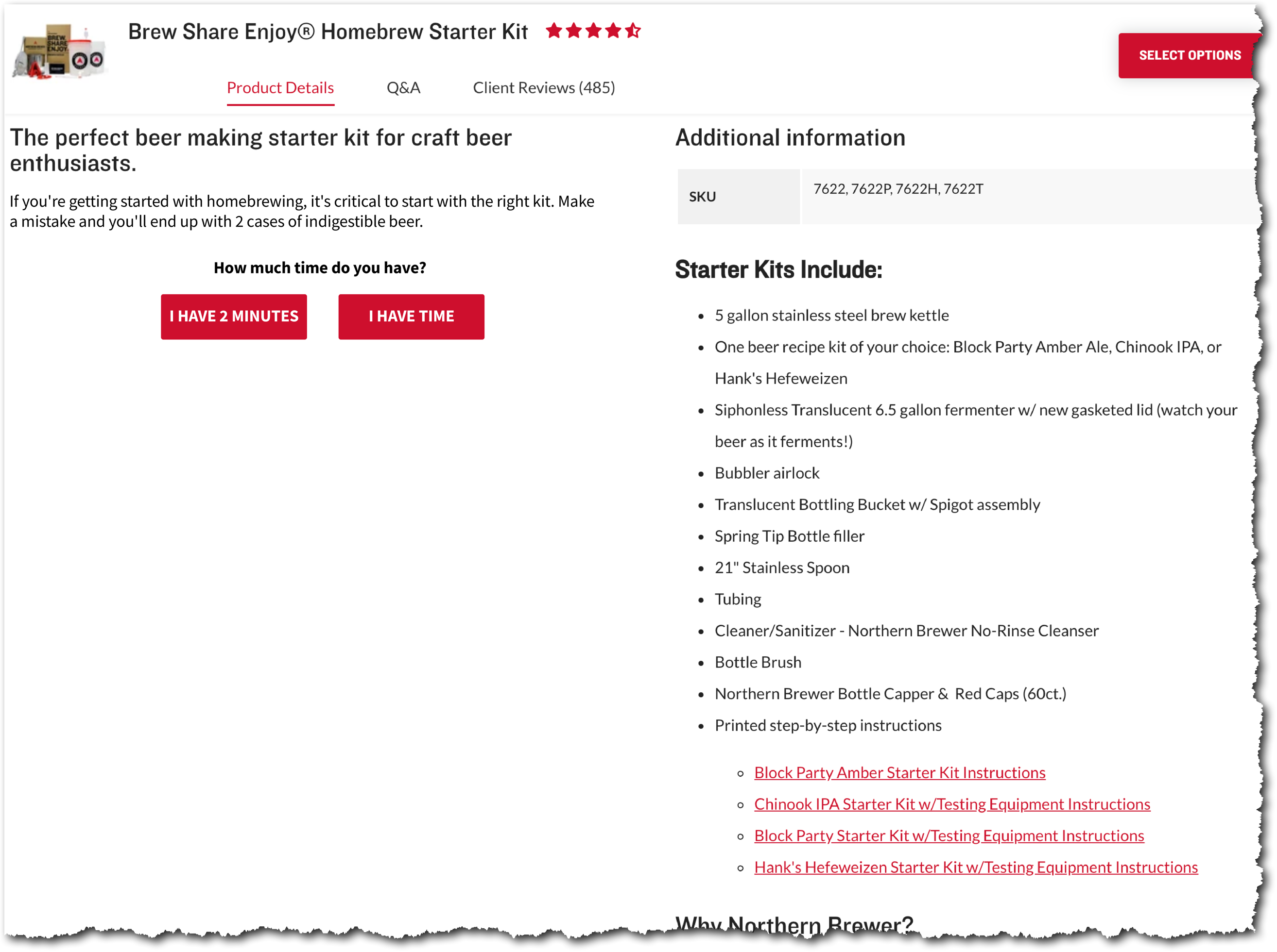
We’ve invented a way better solution (notice 2 buttons below):

Our solution is to let the shopper choose.
People who pick “I have 2 minutes” will see the quick to-the-point rundown and people who click “I have time” will see our detailed explanation.
PS: When we originally wrote this article it was a theoretical concept. Not anymore. We’ve tested it and it performed 30.56% better.
If you liked this product page idea you’re bound to also like our other thoughts about optimizing product pages:
— Unique Product Page Layout & Design


