Go back

Blog

Increase Sales With Price Justification

Irrespective of how amazing your product is, to maximize sales, price justification is needed.

Why? Because the moment new visitors land, they look here:
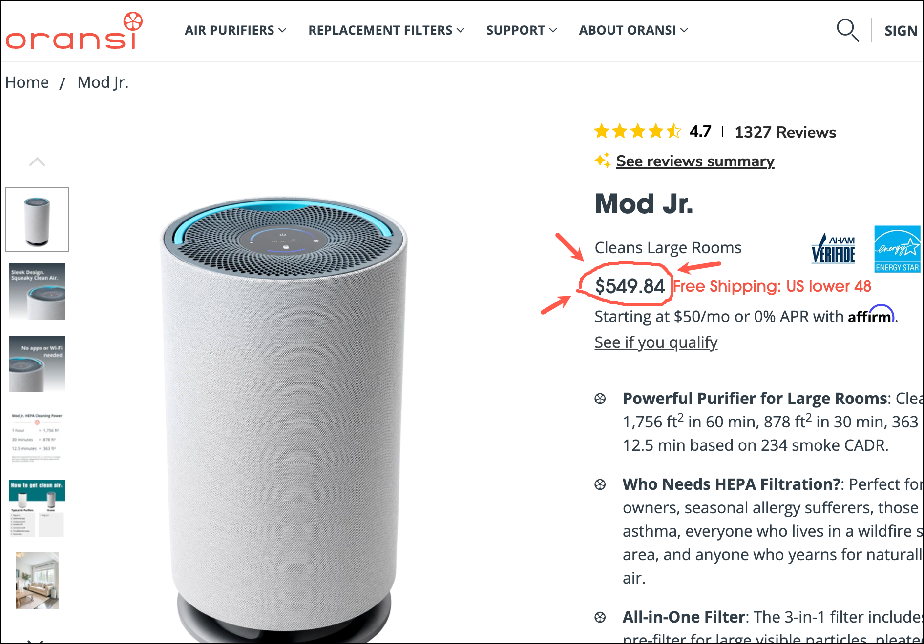
Price Justification

Product reviews and descriptions matter, but price matters the most.

And price isn’t a straightforward thing. To illustrate, let me ask a question:

What’s a good price for a pair of running shoes?

For some, it’s $90. For others, $45. It depends on the value the shoe delivers.

Context matters, and without it, many visitors default to using price as a filter strategy.

Because the price is the first thing landing traffic notices it gets imprinted. And you know what they say about first impressions.

This is a problem. The visitor has noticed the price before fully appreciating the context. That’s what price justification fixes.

Does this make sense? /

šŸ™Œ

Uh oh! Let's get in touch so I can explain this better.


    We'll talk soon!

    Price Justification and Online Shopping Behavior

    When shoppers are looking to solve a problem, they Google.

    They search for a term like “curling iron” and Google shows a bunch of ads.

    Next, they right-click and open each promising result in a new browser tab.

    Then they very quickly start closing tabs that don’t feel relevant.

    In this speed dating stage, the shopper isn’t systematically evaluating competing choices; no, they are rushing. Since price is easily available it’s used as a filter.

    But, as we saw above, price isn’t the best indicator of quality.

    What Price Justification Is Trying to Accomplish

    Shoppers are seeking a balance between price and quality.

    The marketer needs to convince the buyer their brand has the right balance.
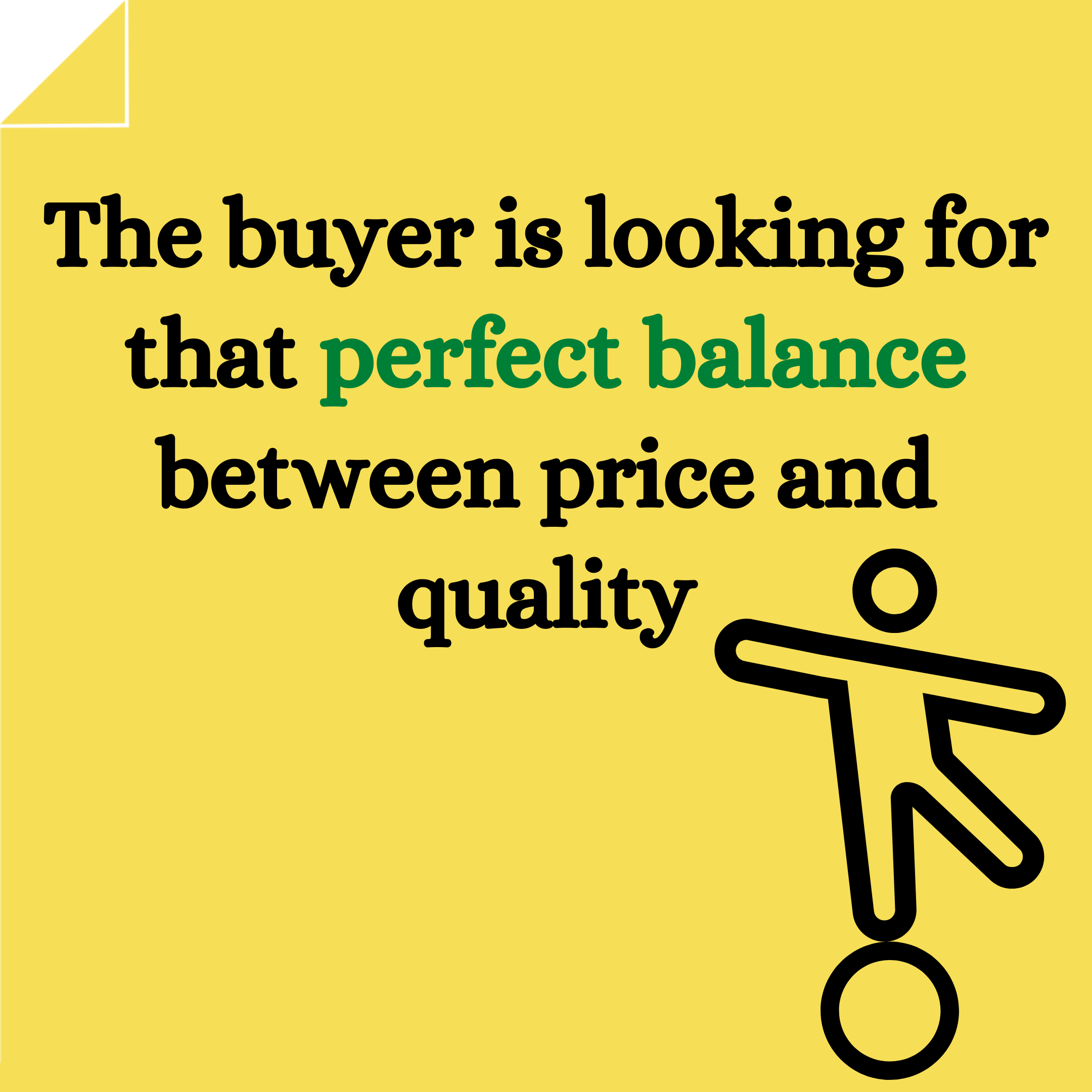
    Price justification balance between price and quality.

    And what can a conversion copywriter do for you?

    Prices too High the copywriter bridges the gap

    I use Price Justification in 3 scenarios.

    1: Price Justification for a Premium Product

    If you are selling a premium product, you are investing in quality, and this means your price will be higher.

    Ora Organic (not a client) sells a premium vegan vitamin D supplement for $16.99:
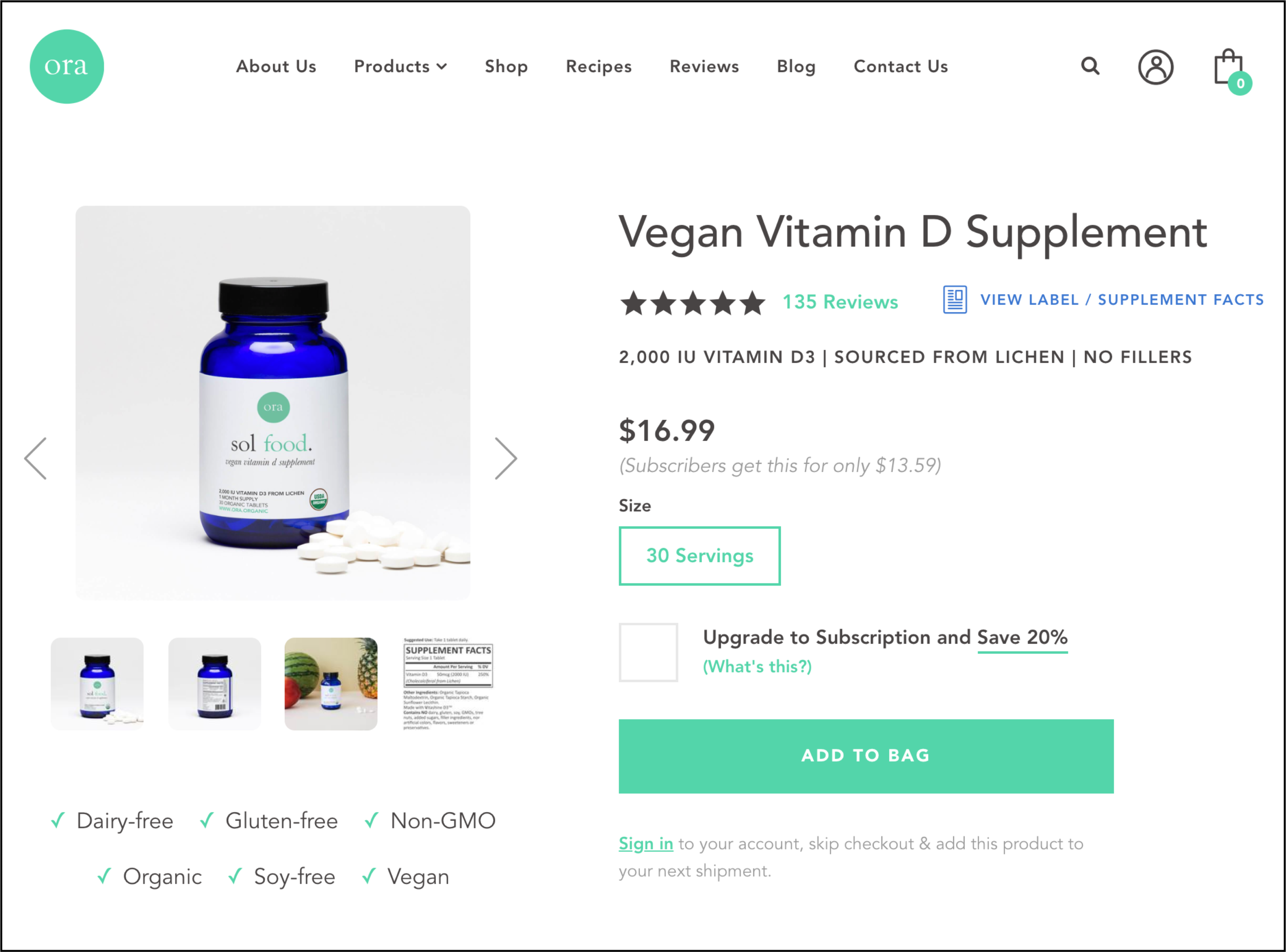
    Ora Organic Original Page
    Ora Organic product page

    It’s a well-designed page, and we’re sure this $16.99 price tag is acceptable to the people who are buying. But that’s not the group we care about. We care about people who got close to pulling the trigger but didn’t (we call these people Healthy Skeptics.)

    To improve conversions, we shouldn’t think too much about people who are buying (they are already buying), we should obsess over those who came close to buying but aborted at the very last moment.

    One reason someone may have decided against buying is they feel $16.99 is too much for a supplement. A quick Google search reveals vitamin D supplements are available for a lot less. The marketer needs to address the šŸ˜ in the room.

    Here’s What We Did

    A Quality Matters call-to-action was added next to the price (see screenshot below) because questions about price come up when the prospect is looking at the price:
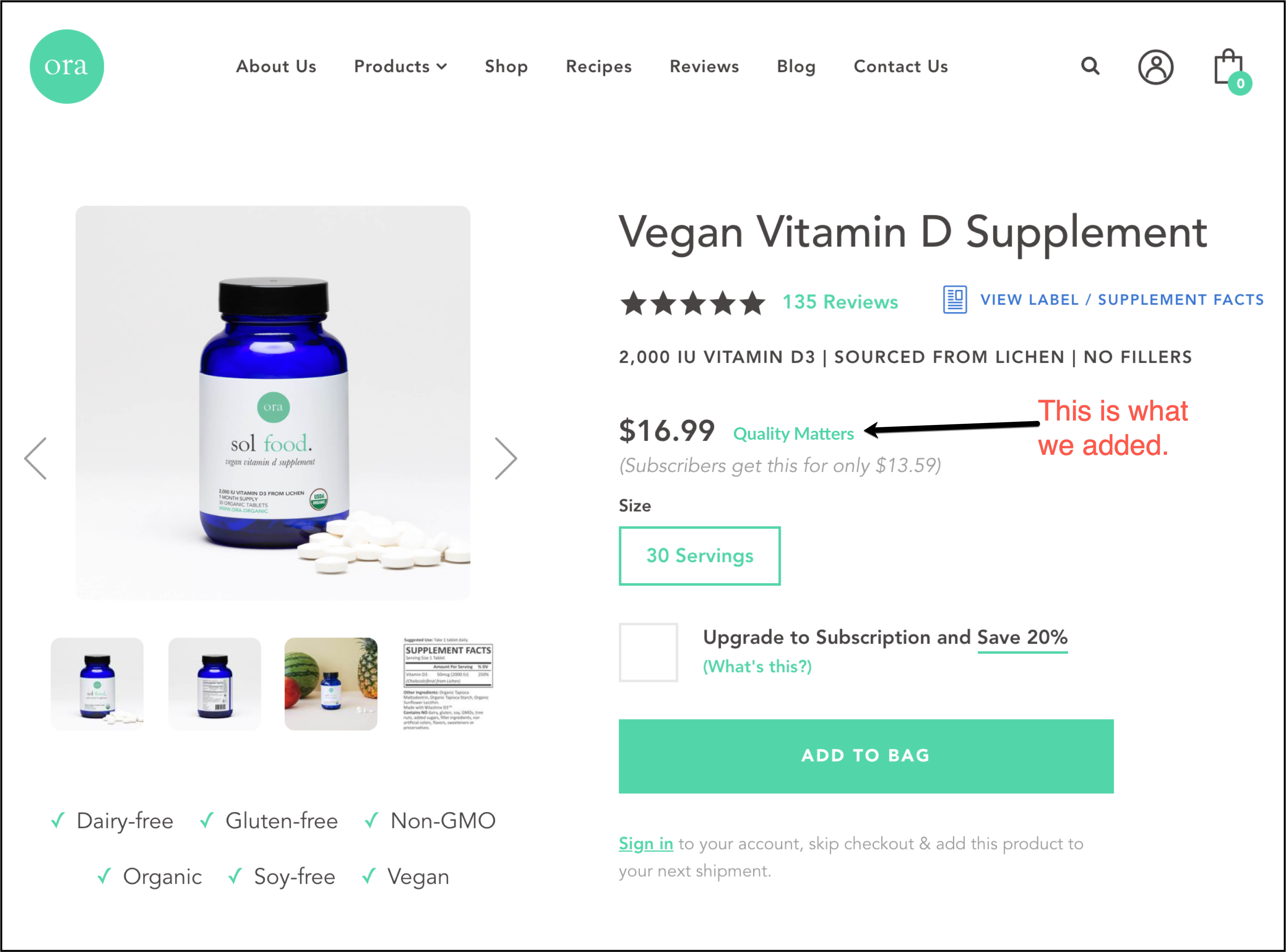
    Ora vegan vitamin D supplement page with our tweak for price justification.
    We added one link “Quality Matters”

    And when the link is clicked, here is the price justification popup message (click the image to zoom view):
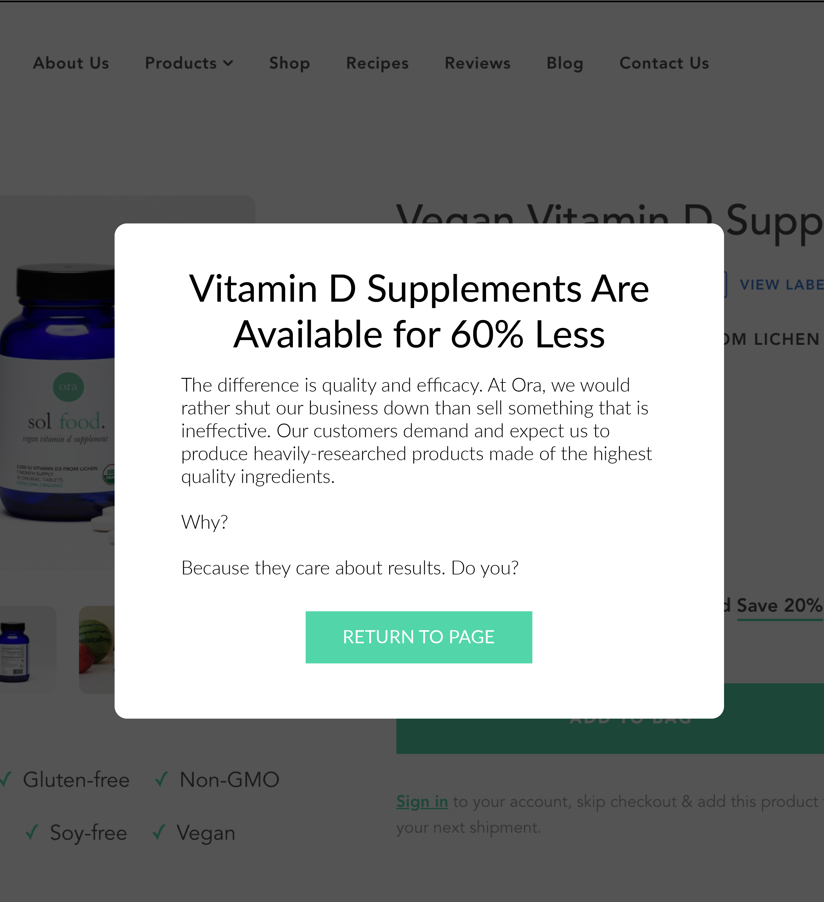
    This popup is being used for price justification.
    Price justification pitch

    Is this the best popup sales pitch? Probably not. So we would A/B test 20 message versions till the golden ticket is found. Here are some things you can talk about in your explanation:

    ā€“ Let the buyer know you had the choice to go with slightly inferior ingredients but decided against it.

    ā€“ How you’ve studied the other options out there. Don’t bad-mouth the competition but make sure your explanation positions you as an expert.

    ā€“ Talk about how hard it was to get the product just right. Shoppers are drawn to stories where the brand started on a journey, encountered a challenge, and was able to overcome it. This buyer psychology principle is called Labor Illusion.

    ā€“ Get into complicated details. This helps demonstrate expertise. I once did a test for a client that sells a pizza-making product. To dramatize, we added a thermodynamics equation, something we knew most wouldn’t understand, but it would signal we were geeks about such details. BTW, that case study is here: Bestseller Sales Up 46.42%.

    ā€“ Let the reader know you’re charging more because our customers (people like them) demand high quality.

    ā€“ Talk about how obsessed you are with quality. How you’d rather shut down the company than sell something you knew was inferior quality.

    Does this approach make sense? /

    šŸ™Œ

    Uh oh! Let's get in touch so I can explain this better.


      We'll talk soon!

      Copy L.L.Bean

      When consumers see a $149 boot, their first thought is, “$149 feels a little too much.”

      Usually, that’s their last thought as they leave your site.

      If they realized boot stitchers train 26 weeks to master L.L.Bean’s trademark triple-stitch technique, they’d likely change their opinion to:

      “Damn, 26 weeks of training?? $149 is a great value.”

      2: Price Justification When You Don’t Discount

      Discounting is a popular eCommerce strategy, but I don’t love it. In the words of Kevin Hillstromā€” Discounts and promotions are taxes placed upon brands for being unremarkable.

      The challenge for the brand is, “How do we compete when everyone around us is discounting?”

      To sidestep the slippery slope ā›·ļø of discounting, pitch the buyer your point of view. There’s a reason you don’t discountā€” share that with your visitor. Explaining why you aren’t giving a discount will make people who agree with your point of view like you more.

      Got an example to share.

      On this jolieskinco.comnot a client)product page, no discount is being offered:

      Not seeing a discount, some may think, “Wonder if there is a coupon code I could find online?” or “I wonder if this item will go on sale soon?”.

      When things are left unsaid, our minds make assumptions. Those assumptions aren’t designed to give the retailer the benefit of the doubt.

      My solution is adding a subtle “Why no discount” call-to-action at a prominent location (preferably near your price):

      When “Why no discount?” is clicked, show a popup to explain your point of view about discounting.

      We ran this as a test for a client. It resulted in a 9% sales lift. Didn’t get permission to make that test data public, but there are 24 other case studies we have permission to share.

      3: Price Justification for a Discounted Product

      We’ve seen how to fix the problem if your price is above expectations (the Ora Organic example above). The opposite can also be a problemā€” where you are giving an incredible discount, and the shopper thinks of it as “too good to be true.” To see two examples of this, read this article: Psychology of Discounting.

      Next Steps After Prices Have Been Justified

      Price Justification is part of a larger discussion about the nine truths about online shoppers. But if this is the first article you’ve seen on our blog, you need to head here pronto: Healthy Skeptics.

      Comments 8

      avatar

      Absolutely genius! I wish I started focusing on CRO earlier. Everything you post is so interesting. I have to figure out how to utilize this.

      Reply
      avatar post author

      So glad you’re liking the content. Gives me the energy to keep on posting.

      Reply

      avatar

      Absolutely brilliant!!!

      Reply
      avatar post author

      Thanks so much.

      Reply

      avatar

      Great stuff Rishi! I love the bonus insights from the amount of times that link is clicked. I think the copy and justification is spot on. You turn the price into a selling point.

      Reply
      avatar post author

      So glad you liked it, Joe. I respect your technical expertise.

      Reply

      avatar

      I love this idea!
      Seems on our website we get plenty of folks to the product page, but then a HUGE drop off.

      And having this link “Quality Matters” seems to take away the price sensitivity and apprehension. It’s like saying THIS PRODUCT IS WORTH IT!, without saying that.

      I’m redoing my mobile product page and I may “borrow” your idea Rishi!

      Reply
      avatar post author

      This idea will definitely help. And there is data to back this. This is something I have A/B tested with great success. A client was so blown away they even wrote a testimonial simply based on this 1 test. Do it, Ron!

      Reply

      IF THE COMMENT SECTION REMAINS EMPTY I'M GOING TO LOSE MY JOB

      Cancel Reply
      Email will not be published
      fried_egg.png

      I like seeing marketing ideas I've never seen before

      True or False? ??

      fried_egg.png

      Then you are in the right place.

      Receive 1 unique conversions idea in your inbox every week. Interested?