Blog
DTC Sites With Great Copy
People are constantly asking me for a list of my favorite DTC sites with great copy.
Their question makes sense because I do study at least 5 DTC sites each week and have been doing that for the last 10 years.
I’m constantly making notes of clever little conversion ideas that I pick up on my daily travels. What I haven’t done is keep a list of DTC sites that just have great copy.
The trouble with keeping an example of a page is that that page may go away. In this article, we’ll zoom out a little and look at DTC brands that just generally seem to be investing in good conversion copywriting. They don’t have good copy on a few pages; they have great copy at each touchpoint.
Good copywriting has infected their whole site.
Ready?
List of DTC Sites With Great Copy
Example 1— Misen
It takes me 3 minutes to determine how much value a DTC brand CEO places on copywriting. It’s clear Misen.com CEO cares a lot about copywriting:
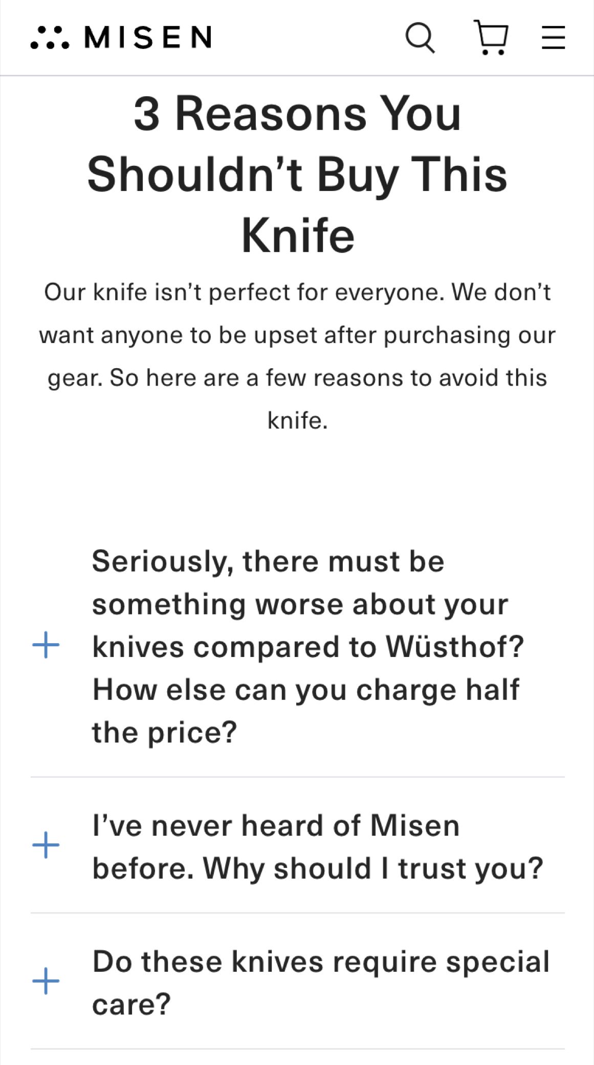
Here is their mobile landing page:
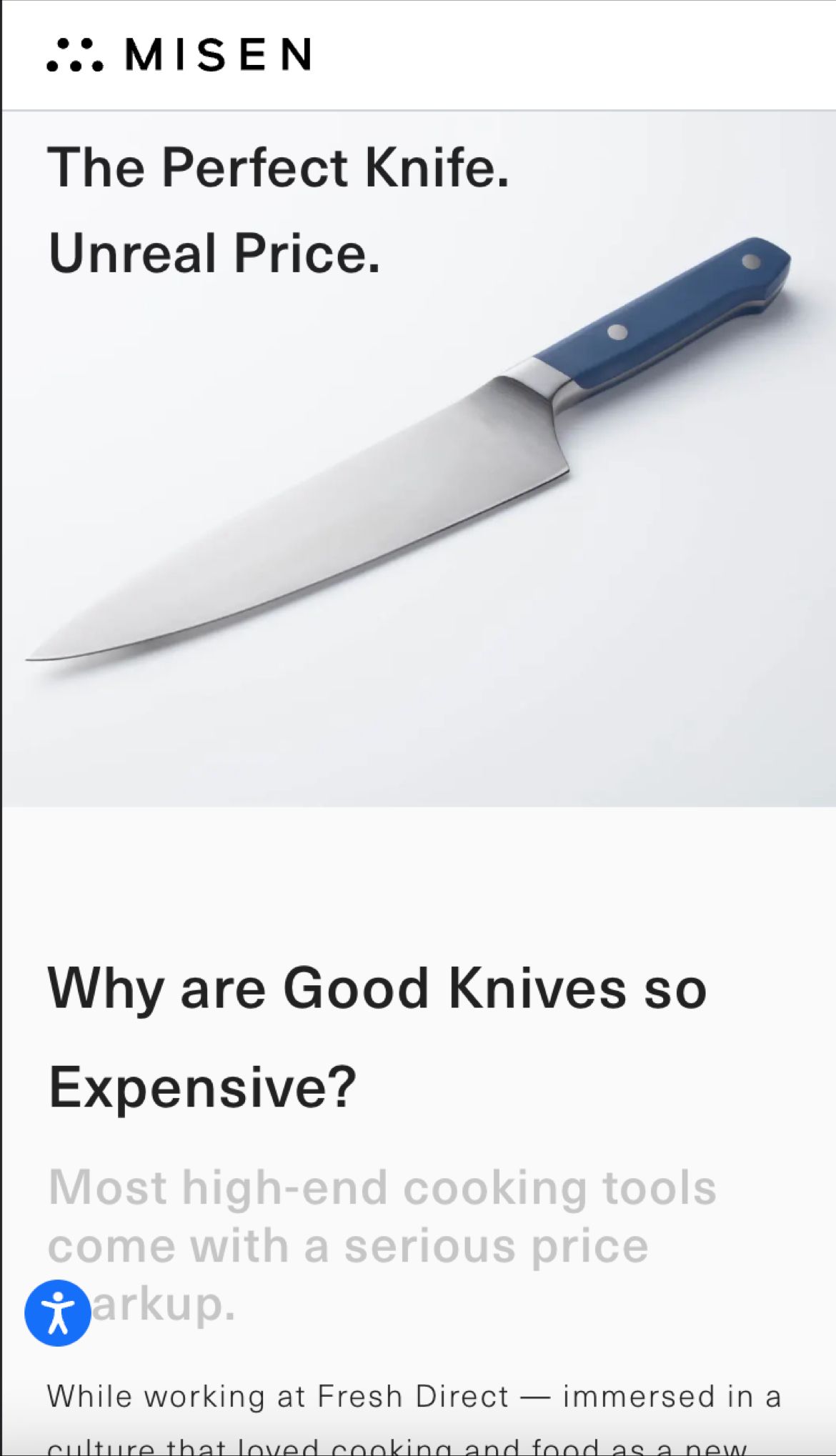
Why I love it: If you are selling something that is great but also not inexpensive, you need price justification in your toolbox.
Just play around on the Misen.com site, and I’m sure you’ll find a bunch of copy nuggets.

Since you're liking this DTC sites with great copy post you're gonna love the conversion ideas I share in my weekly newsletter. Signup below. If it isn't as good as I'm making it sound unsubscribe with one click.
Example 2— TOM BIHN
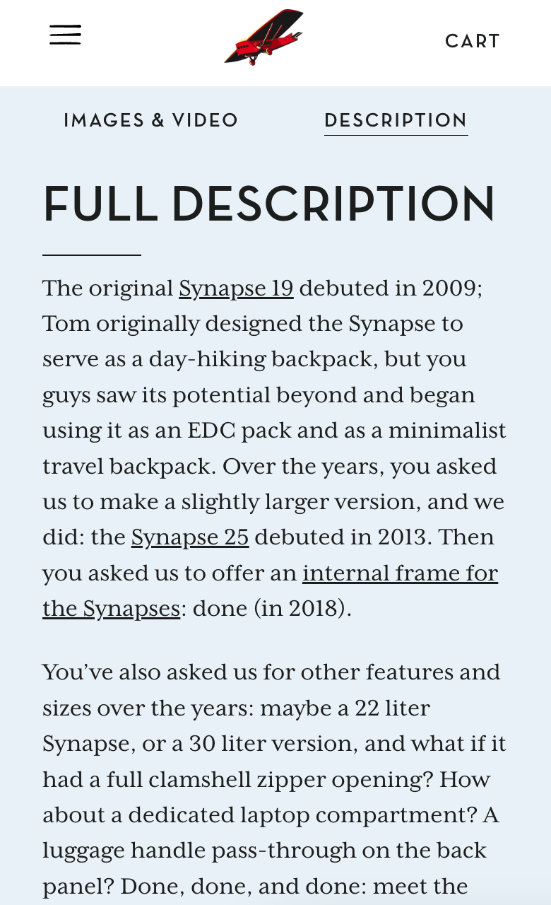
TOM BIHN has so many great pages; you should check them all out. Here is one example (link to page), and below the screenshot, I’ve included a link; click it, and I’ll explain why this is a master class in conversion copywriting.
Example 3— Huckberry
Huckberry.com is a great marketer. Here is a line from their product page:
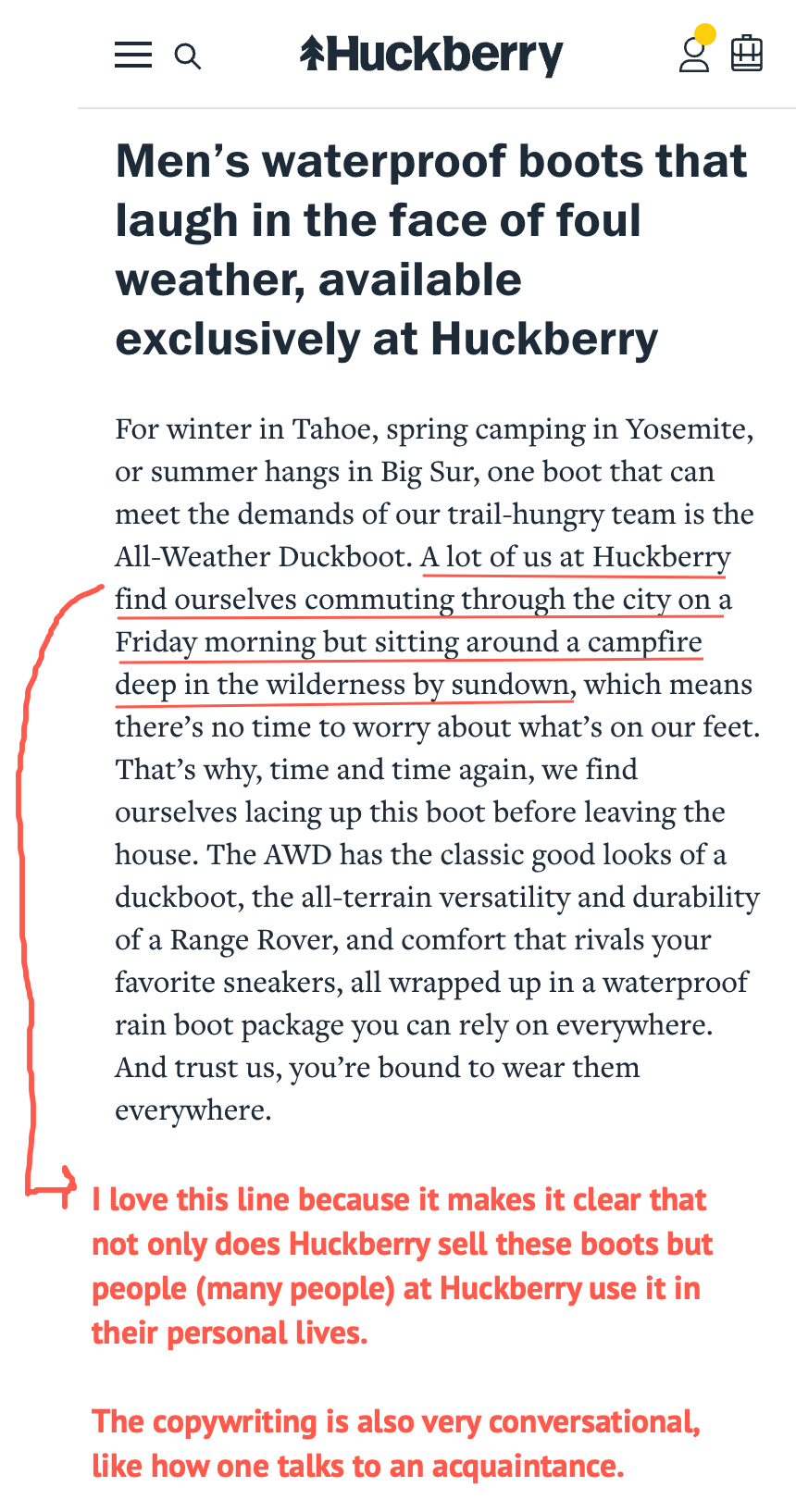
Have a look at the opening of their About Us pitch:
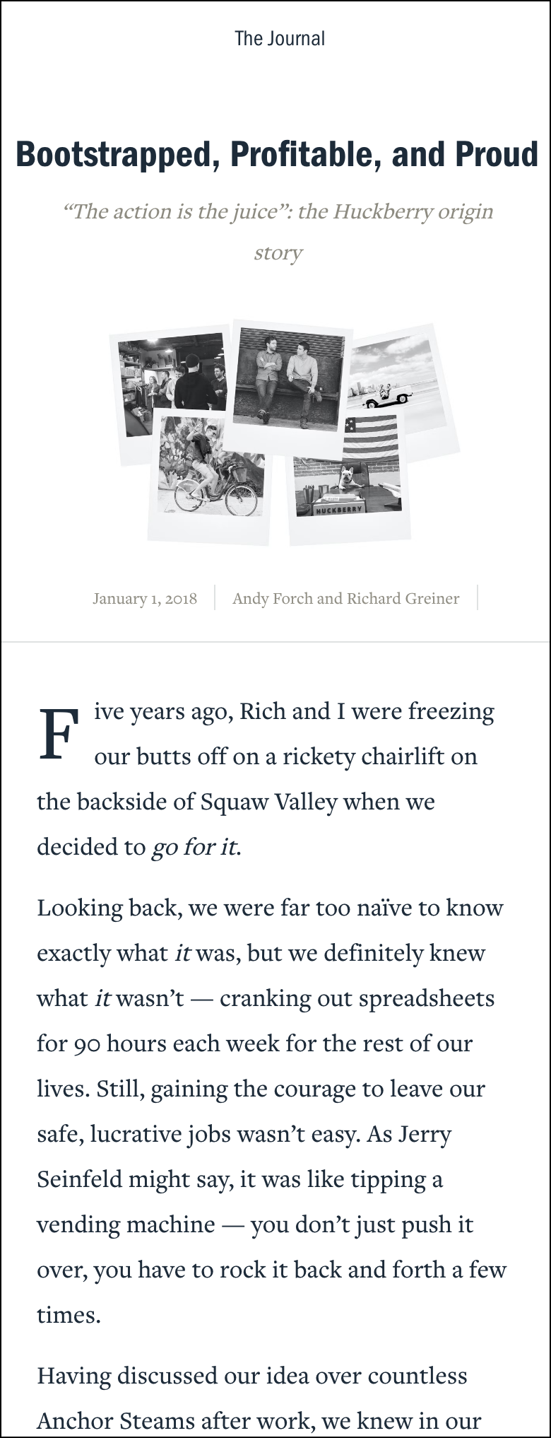
Doesn’t it just pull you in?
Example 4— Zingermans
Zingermans.com is a Michigan-based brand that sells food items like bread, cakes, olive oils, etc.
Something I really like about their product page copywriting is that instead of just saying: this is excellent olive oil from this little village in Italy they have the person on the team who buys that particular olive oil write the description.
Unfortunately, I don’t have a screenshot of that olive oil product description (it has been lost to time), but here is how Zingerman’s describes their Indonesian cashews:

Example 5— Tracksmith
I discovered this gem thanks to Brian Hennessy.
When you go to their bestsellers section, here is how they introduce it:
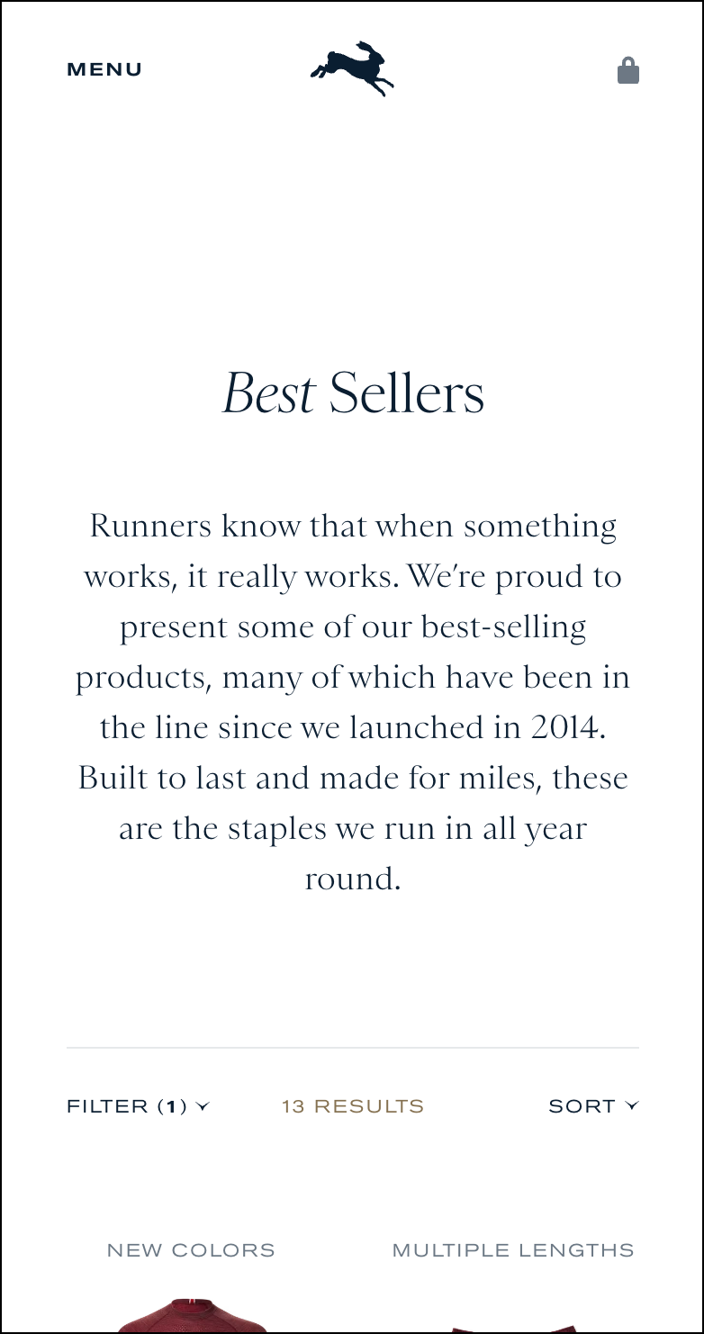
You immediately feel like you are being heard and are part of a tribe. “Many of which have been in the line since we launched in 2014” subtly hints at the enduring nature of these bestsellers and lets the shopper know Tracksmith has been around. It’s a study in subtle copy.
But it isn’t just copy. Even their design is a university course in marketing.
For example, they say everything should be above the fold.
That every inch of mobile real estate is premium.
Have a look at their mobile product page. It breaks all rules:
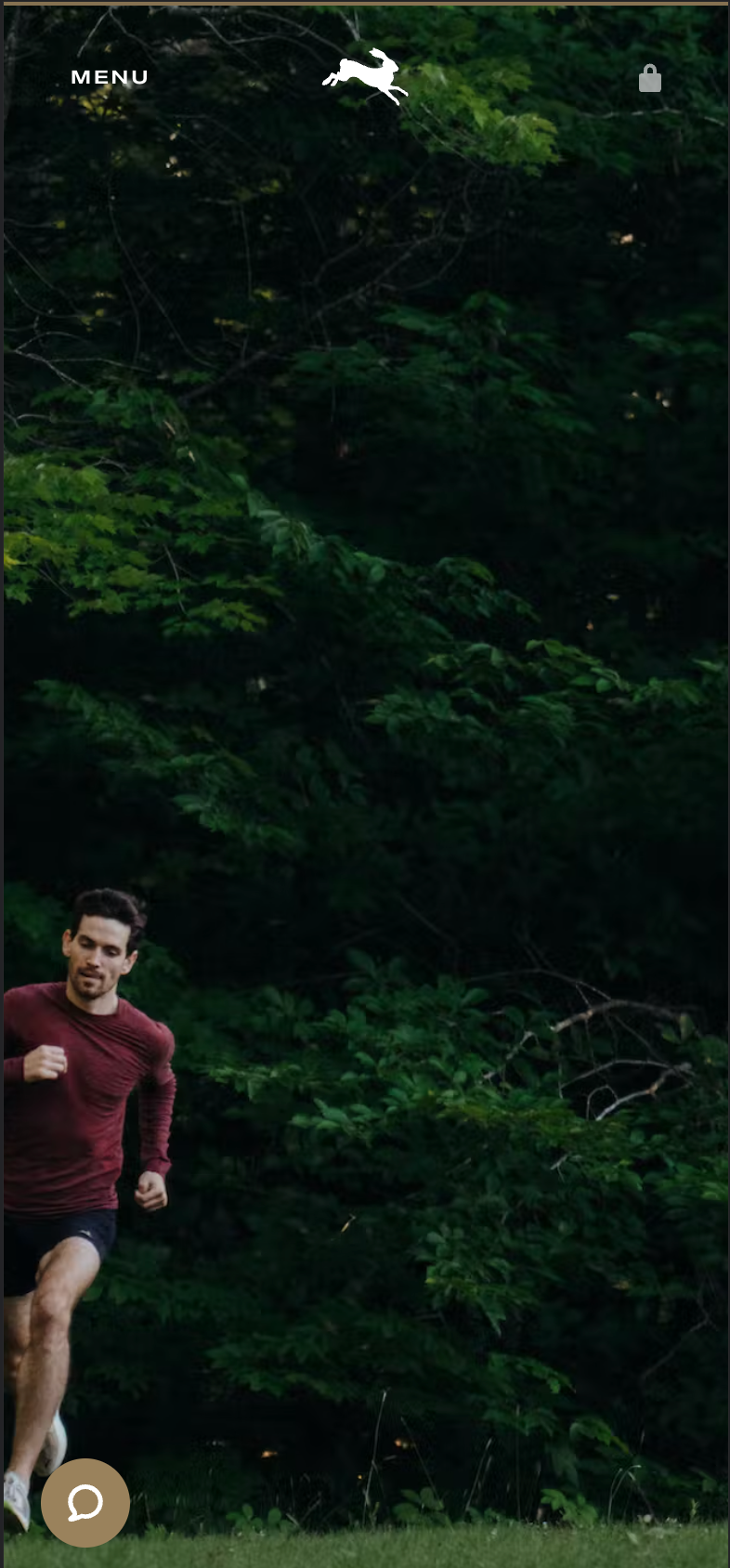
I need to scroll to page 2 to actually see the product details. These types of pattern breaks one can achieve through both copy and design are what get the visitor’s undivided attention, which is step 1 in the conversion optimization journey.
PS: we don’t draw much of a distinction between copy and design. In fact, copy is design.
One final example from Tracksmith. This is part of the description of their product page:
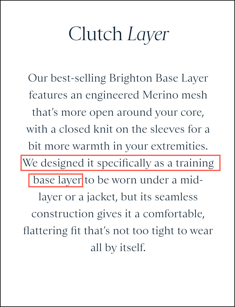
The line highlighted in the red box makes it clear to the reader that there is intention and purpose behind the design choices this brand makes. This is one way for brands to demonstrate expertise.
Example 6— Stauer
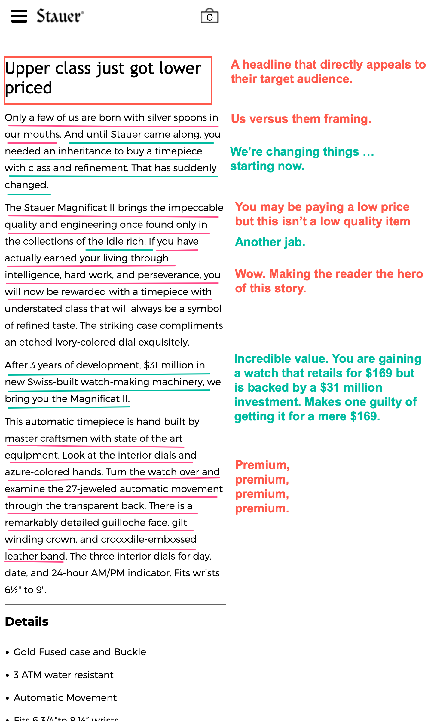
I’m a sucker for old-school direct-response advertising. Very few eCommerce sites utilize that style effectively, but Stauer.com does.
Stauer’s business model can be best described as selling items positioned as premium at ridiculously low prices. Here is a typical product page on their site. Click the image for zoomed view:
Example 7— Glossier
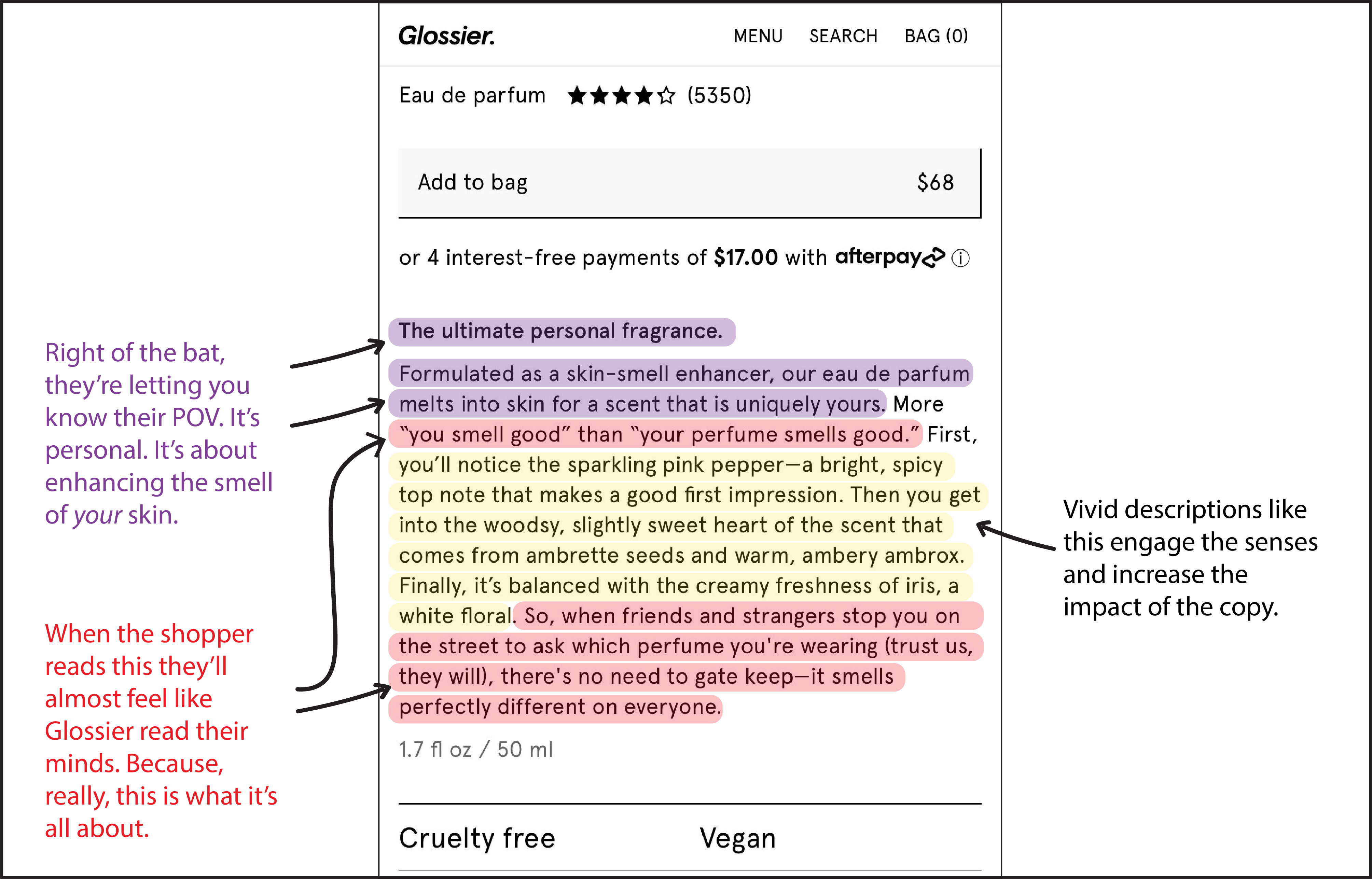
Glossier.com started out as a beauty community that now makes beauty products. Their copy centers their focus on YOU, because they believe beauty is personal. We liked browsing their site and seeing how they describe their products, but we especially loved this one for their personal fragrance.
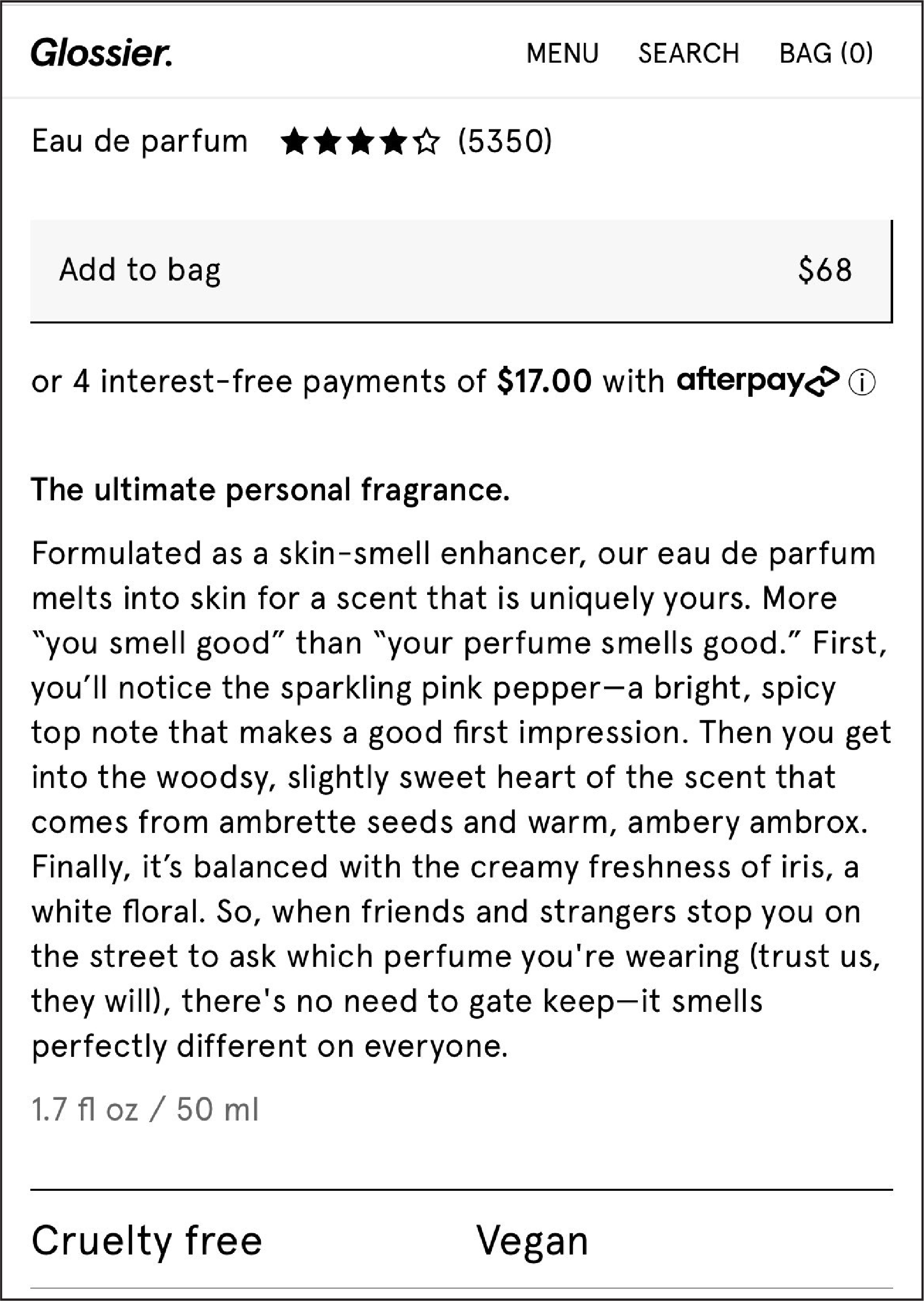
Here’s why we liked it. If you’re on 🖥️ click for a zoomed view)
Example 8— Fringe Sport
I spend a lot of time looking for great product pages and found a great one on a weightlifting site today.
Made a video to show what makes this product page great:
Example 9— SEED
Usually, I find 1 good copywriting example per product page.
This page has 4 home runs.

1: When the user enters your site, their first thought is, “I wonder how these guys compare to the other guys.” SEED.com addresses that immediately.
2: Another question that people often think about is, “Is there evidence to back the claims these guys are making?). This headline addresses that.
3: I love this headline because it clearly distinguishes SEED from other brands.
4: There are so many alternatives available online. The consumer knows this. Most brands try to overlook the competition, but SEED.com is getting in front of that topic by acknowledging it. It’s a genius move.
Want a Little Secret?
We are a group of marketers who don’t care about best practices. Our interest is in discovering things other marketers don’t know so we can give ourselves and our clients an unfair advantage.
Over the last 16 years, we’ve run 100s of A/B tests and learned a lot of fascinating things about buyer psychology. But the most important thing we’ve learned is this: you need to ignore 80% of your site visitors.

