Blog
Your Page Layout Affects Conversion Rates
How content is laid out matters. New visitors will exit immediately if the layout isn’t intuitive.
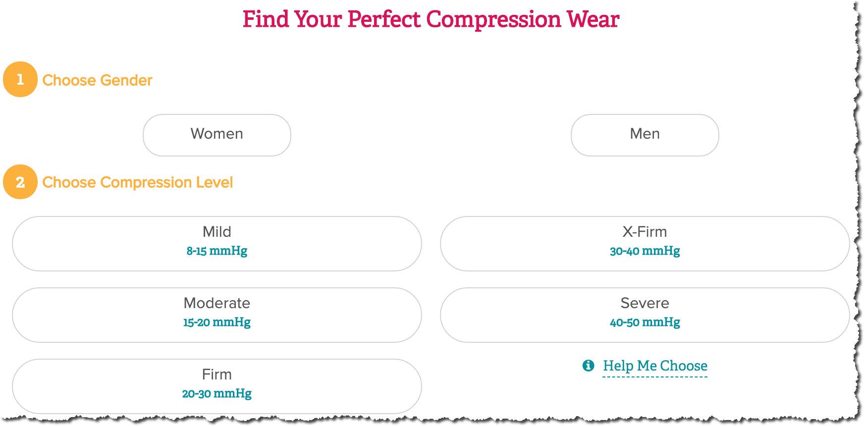
On ameswalker.com there is a product finder wizard. Fair to assume people who are using the wizard are the ones who need the most help.
The second question in the wizard (screenshot below) asks the user to pick compression level. With this option, there is a “Help Me Choose” link (bottom right corner of screenshot). Fair to assume a people who click this link need assistance.
When “Help Me Choose” link is clicked this popup is shown:
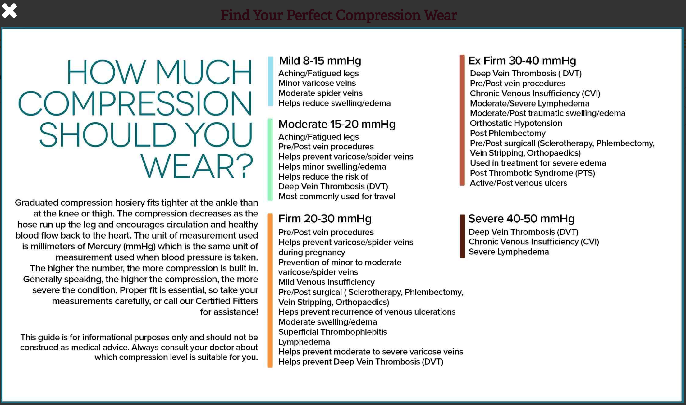
I couldn’t make sense of it. So I asked Preston to see if he can make it better. This is what he did:
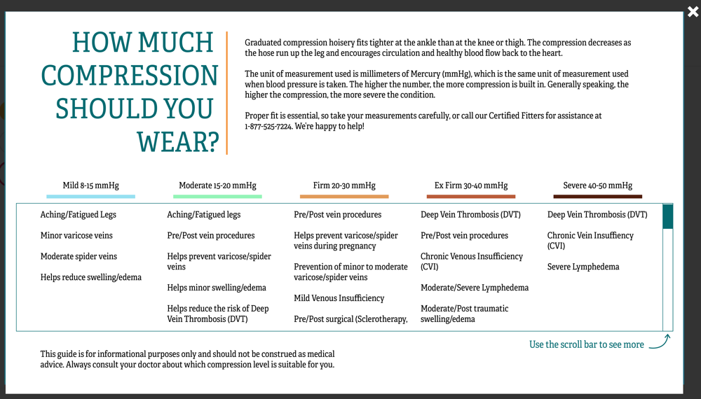
1: I made the lists more readable with extra line spacing. I was confused reading the control because some of the lines would continue onto the next line while others wouldn’t. There was no punctuation and there weren’t any bullet points to help this. The layout I put together solves that issue.
2: I made the intro copy more readable. I also added the contact number here so that users wouldn’t have to close the popup then find the contact information.
3: I added a scroll bar to the lists to limit the amount of content that’s visible at once. I didn’t want to increase cognitive load.
4: Moved close button from top left to top right corner (where people naturally expect to see it).
Ta da:
