Blog
Wonderful Ad
The picture below was taken from a POM advertisement in Money magazine. Lighting wasn’t great so below the ad photograph, I’ve added bigger screenshots of every important ad section.

Section by section analysis (screenshot followed by explanation)–

1: Relevant headline– I saw this ad in Money magazine so the headline LIFETIME RETURNS is particularly relevant and has been used intentionally.
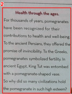
2: Story telling– Many etailers are shy of telling a story, they feel it adds too much fluff. Story telling can be very effective.
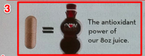
3: Up-selling– POM juice is a recognizable brand that has been nationally advertised for years. They have thousands of customers. The purpose of this section is to up-sell POMx to POM juice customers.
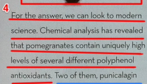
4: Endorsement– Here they are making their case through science. They seem to be saying, “Don’t take our word, listen to Mr. science.”

5: Exclusivity– Look it, if you don’t take our product you can forget about getting the benefits of punicalagin and punicalin.
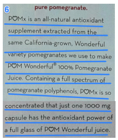
6: Up-selling– Here too they are up-selling to their well established POM juice customer base.
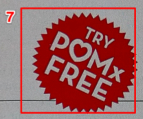
7: Risk reversal– Try POMx for free.
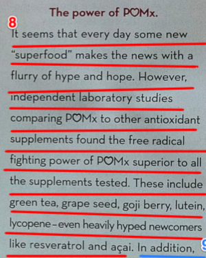
8: Attracting non-POM superfood audience– After up-selling to their own customers twice POMx is now shifting focus to their broader market- superfood enthusiasts. To make POMx stand out they seem to be saying, “Mr. science says POMx is better than the green tea, grape seed, goji berry, lutein, lycopene, resveratol and acai substandard products you’ve been taking.”
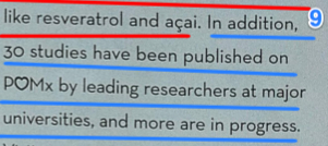
9: Quantification– 30 researchers (a.k.a. very smart people) have studied and written scientific papers about us.
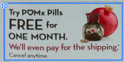
10: But wait there’s more tactic– Not only will we reverse risk by giving POMx for free we’ll even pay shipping.

11: Campaign tracking– In order to know how well the ad worked they’ve provided a unique identifier- discount code MNY30.
[This ad is pretty persuasive. They seem to have analyzed every word. But they’ve also made a huge mistake. The url pompills.com/mny (this is where they are inviting readers) doesn’t work!! I wonder how many thousands of dollars were wasted because of this one mistake?]So why am I sharing a magazine ad on my ecommerce conversion blog? Because this copy and layout format can be tested on your product page or Pay Per Click landing page.




Comments 2
The comments make sense but the ad itself its attractive to the eye and has too much write-up.
ReplyIt’s really nice ad. I would like to have something like this for the promotion of my business products.
Reply