Blog
Subtle Trick
We marketers scream when we want the user’s attention. We use comically large fonts and ugly color contrasts; not because they’re beautiful, but because we know the loudest elements capture attention.
But there is another way.
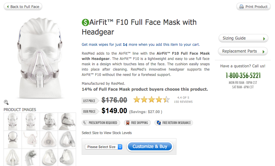
I was on this product page …

… and one of the first elements I noticed was the $ symbol to the left of the product name. How did I notice it when that icon takes only 5% of the screen real-estate? Because the retailer did 4 clever things:
1: They used an icon shoppers are trained to pay attention to, the dollar symbol.
2: They colored the icon green on a white page, making it stand out.
3: They strategically placed it one letter to the left of the product page. Eye tracking studies show shoppers start scanning pages from top left position.
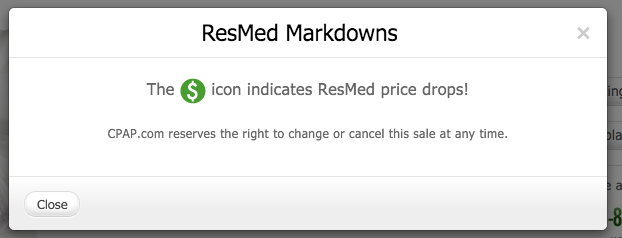
4: They made the icon non-descriptive. The visitor senses it has something to do with pricing (because of $ symbol) but beyond that she doesn’t know what message is hidden behind the icon. So she clicks it. And when I click it I’m shown this powerful urgency message:

There is one other point in favor of the subtle tactic. When you scream and tell shoppers they are receiving an amazing deal they get suspicious (why is this retailer trying so hard?). But anyone who clicks this icon will believe the “… cancel this sale at any time” message in the popup because they’ll think, “if this was just a fake warning they would have made it more prominent. Why would they have kept it so subtle?” And that thought would confirm for the shopper that the warning isn’t a gimmick.


