Blog
Sometimes, Adding Friction Improves Conversions
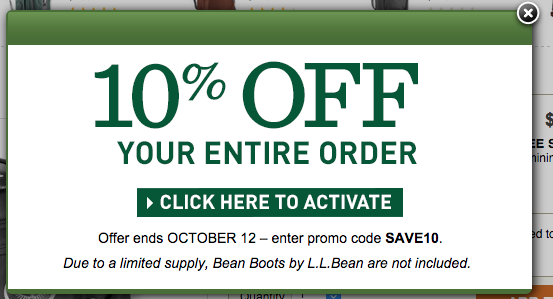
When I landed on llbean.com through a PPC ad I was greeted by this popup–

CLICK HERE TO ACTIVATE button could have been eliminated. They could have just shown the SAVE10 coupon code. Normally, reducing steps improves conversions. But in this case, llbean.com is adding friction (the need to click a button to activate coupon code) and it’s a brilliant strategy. Why? Because CLICK HERE TO ACTIVATE is a trigger that subconsciously influences the shopper. Once shoppers hit CLICK HERE TO ACTIVATE they have taken an action that takes them deeper into the conversion funnel. It’s not like they can’t turn around, they can, but it’s going to be 6% harder. Who knows how long that coupon code will remain activated? Who knows if SAVE10 can be used later without clicking CLICK HERE TO ACTIVATE first? Would it still work?
These questions incentivize the shopper to stay on llbean.com (i.e. away from L.L.Bean competitor sites).


