Blog
Social Proof Experiments
Social Proof is a hot marketing topic, which means every marketer is using it, which means they’re screaming with it.
But here’s the thing: louder your marketing microphone the more the message will get discounted and/or ignored by savvy shoppers.
It’s not like people on your site are new to ecommerce. They likely most definitely visit a lot of other sites. They’re hip.
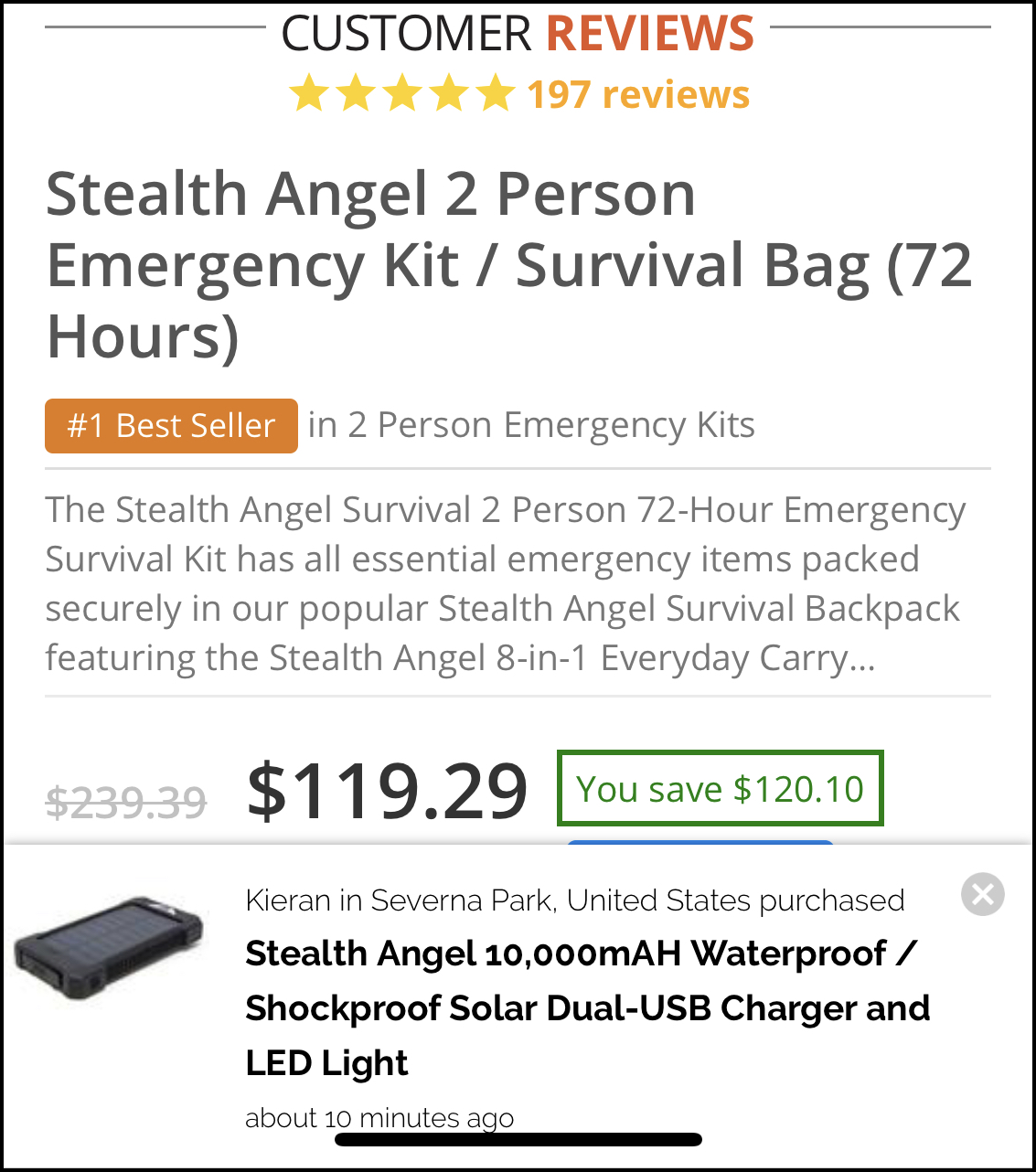
Here is a screenshot I took on my phone. You’ll notice a not-so-subtle overlay on the lower half reminding that someone purchased a product from this site 10 minutes ago.
And because the message is in-my-face I ignored it. I expect marketers to be loud so I dial down anything they say.

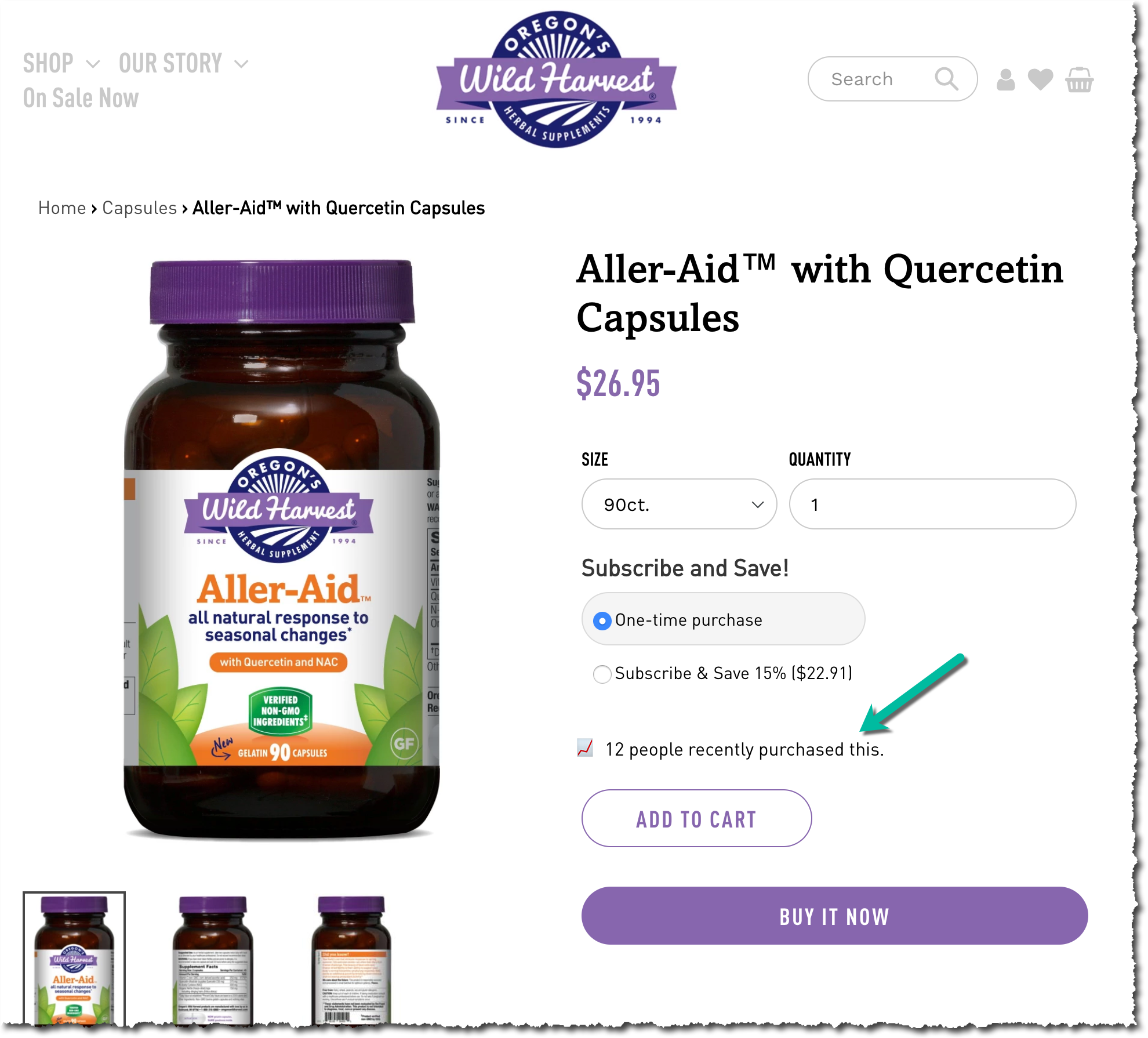
The next example is the opposite (it’s subtle). The marketer only gently suggests a message.
You see, the marketer was able to read my mind, figure out that I would discount their message if they screamed and went in the opposite direction.

Do you scream or whisper?


Comments 4
Ooooooo that’s really cool! Love that Rishi!!!
ReplyRishi Rawat
And I love blog comments! So keep them coming. Glad you liked it. –Rishi
ReplyRishi, another really great post. In your experience, how important is social proof? What sort of results have you seen in your testing? Is social proof really just an extension of the “testimonial” ad format? I assume widgets like that ones you highlighted in your example have thresholds that you can set so it won’t show the messages when there is too little data i.e. 2 people recently purchased this?
Keep up the great work my friend.
ReplyRishi Rawat
Hey, Shilo. Social proof is a powerful concept but I’m not a fan of how most widgets use it. They use it too literally. Like any persuasion strategy, social proof is most potent when used subtly.
I’ve had a lot of success with social proof A/B testing. It’s especially potent when used for PPC landing pages. One client was driving PPC traffic to a category page. We A/B tested adding social proof elements for that PPC landing category page and the conversion impact was statistically significant.
The reason is simple: PPC visitors are in “speed mode”. When searching they “right-click” on multiple paid ads. Then they quickly look at the ad landing page and decide if they want to stay or leave (they most often leave). The biggest challenge for PPC landing pages are abandons. In that situation showing a social proof element gives the visitor an incentive to stay around for a few more seconds. Hopefully, that’s long enough for System 2 to kick in (https://frictionless-commerce.com/system-1-vs-system-2/)
Shilo: I assume widgets like that ones you highlighted in your example have thresholds that you can set so it won’t show the messages when there is too little data i.e. 2 people recently purchased this?
ReplyRishi: That’s right.