Blog
Simplicity Is Key in Landing Pages
As designers, copywriters, and marketers, we overcomplicate things 9 times out of 10. Landing pages are no exception.
Simpler solutions are always better.
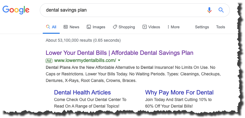
After doing a Google search for “dental savings plan”, we came across this search result:

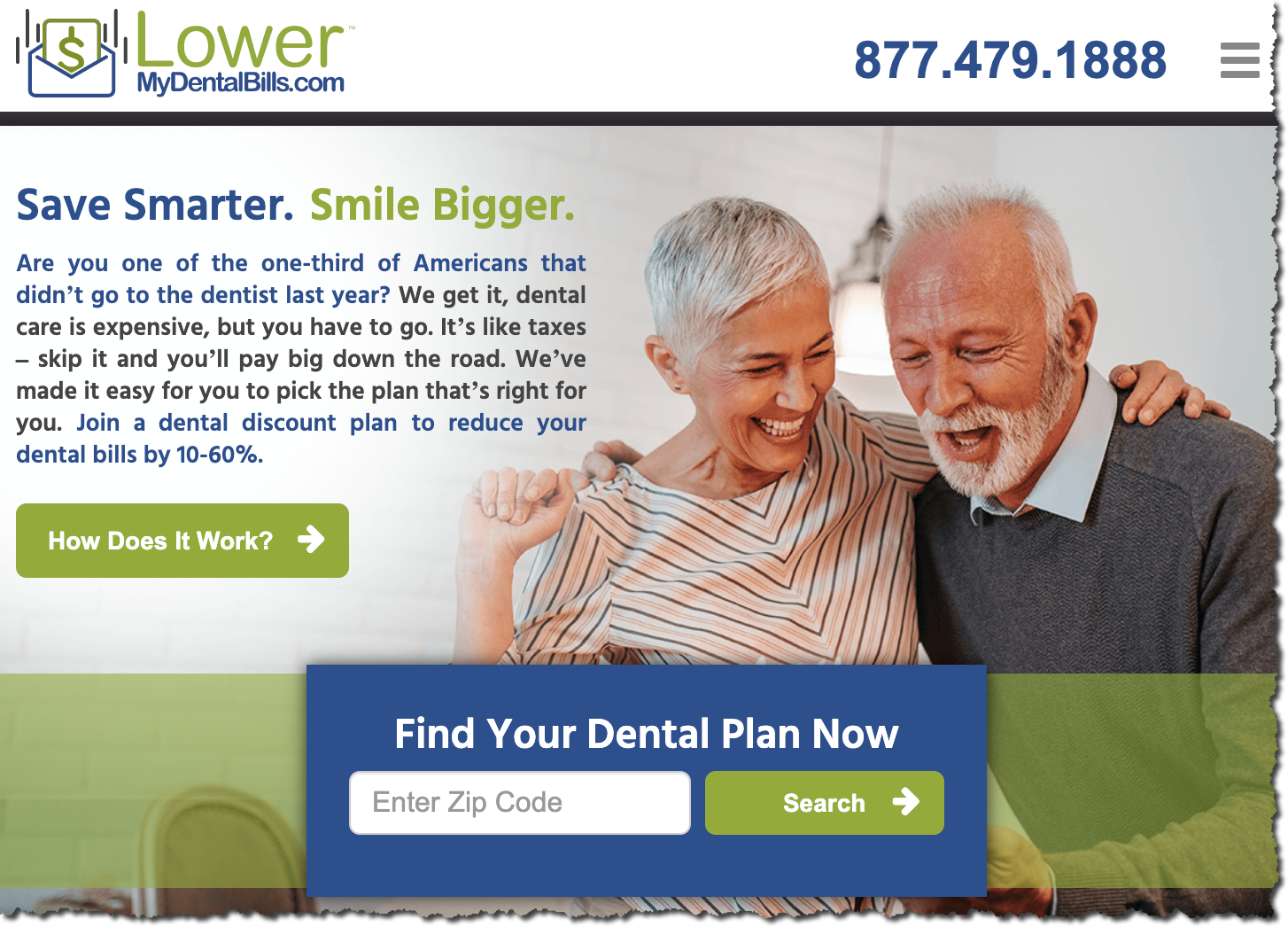
After clicking on this result, we were taken to this landing page:

Why we like this page:

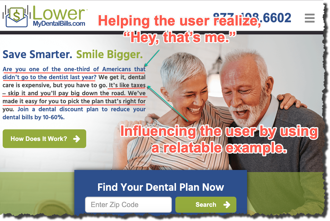
This landing page starts off by doing one simple trick that undoubtedly results in more shoppers staying on the page. The copy is relatable.
In the image above, the first sentence we underlined has a high likelihood of resonating with the shoppers because there’s a good chance they are one of the 1/3 of Americans that didn’t visit the dentist last year. This uses our Serendipity tactic (learn more here).
The second sentence we underlined does the same as most people don’t like paying taxes, but they see the importance/value in doing so.
This copy is simple. It doesn’t explain the technical details about the service. It simply relates to the shopper and makes the experience on the page more personal — more human (something not enough sites do).
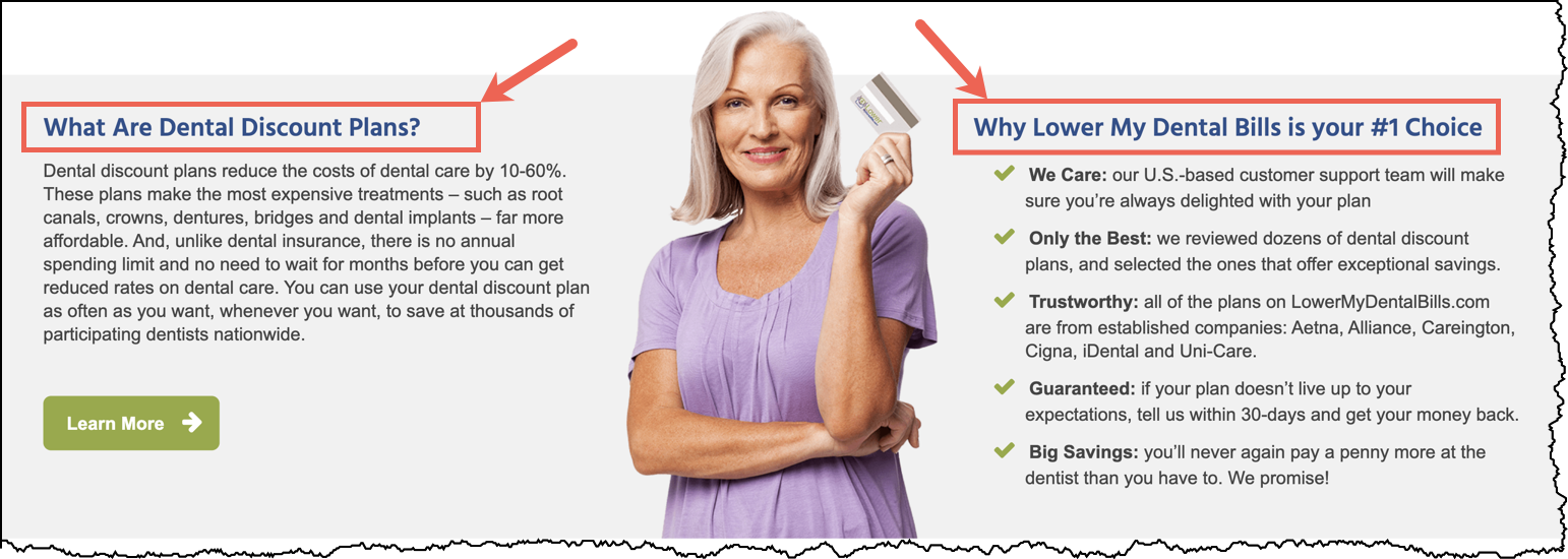
Finally, this landing page also answers the shopper’s most pressing questions. But it does so in a way that is easy to find because the headings immediately let the shoppers know what questions will be answered:

A shopper scanning through the landing page won’t have any trouble finding what they need. Landing pages don’t need to be the most beautiful things with fancy CSS animations, giant and elaborate illustrations, etc. Those are great, but the most important thing is simplicity — getting your pitch across to your shopper and answering their questions quickly, concisely, and without confusion or distractions.
That’s just what Lowermydentalbills.com did on their landing page.


Comments 2
You can do three things on any landing page–
1. Add information
2. Delete information
3. Change information
Based on point 1, if the user on the example landing page is ACTUALLY looking for pricing of a savings plan, then one could add that in, upfront. Or at least show me a range of what the cost could be like in my State. Obviously, if Rishi clicked this, the info for Michigan could be populated, which cleanly leads to ZIP code and other finer details.
Based on point 2, if the user already knows about dental discount plans, then why feed that again? So one could delete that out. Also, extra points act as fluff and could be a deterrent for a user with high motivation– who wants to get the job done as quickly as possible.
Based on point 3, who said old folks have toothaches alone? If the graphical images can match a varied target group, then that should be better based on geographical regions, the time of the day etc.
So, all in all, it’s about the intent and if you learn about their intent and solve the pain points, then we’re in good company. 🙂
P.S., It’s a good landing page example nonetheless, thumbs up.
ReplyRishi Rawat
Hey, Sumantha. As usual, you are 10 steps ahead of us. Your point about assuming the buyer is old (showing old people photo) is very valid. I also like your geolocation point. I also like, “if the user on the example landing page is ACTUALLY looking for pricing of a savings plan, then one could add that in, upfront.”
In fact. all your points are valid.
You are describing ways to make this page 4x better. I’m comparing this page to the crappy landing pages I see every day. So, to me, it’s a good landing page 🙂
How I constructed my thinking: What can we guess about someone Googling “Dental savings plan”? One guess: they are looking for a low-cost plan, have been ignoring dental issues, and anticipate needing dental help soon.
That assumption may not be complete or fully accurate. But it’s a good enough assumption.
And based on that assumption the line, “Are you one of the one-third of Americans that didn’t go to the dentist last year?” connects directly with my psychology. I like this line because:
1: It makes me think, “Hey! that me.”
2: It makes me feel I’m not alone (100 million other Americans are in my same boat).
I don’t see it as fluff. It’s a way for us to connect with the reader.
Reply