Blog
Simple Insight
There are only a few universal truths in ecommerce. One of them is:
If you have a product page with great reviews and you’re able to get 10% more page visitors to notice the reviews you’ll win.
I know what you’re thinking: Rishi, anyone who visits my product page and wants to read reviews can easily do so, the review button is RIGHT THERE (this is you pointing to the location on your screen).
Reality: page visitors miss 83% of what’s on a page.
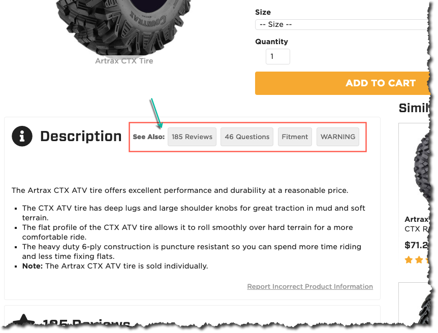
Motosport.com has a simple solution. When the user ignores the reviews graphic on top of the page and scroll to the description section they show them this:

I love this solution because it’s so subtle. The template is essentially unchanged but now the reviews link are 20% more visible.


