Go back

Blog

Reducing Checkout Friction on Mobile Devices

Came across this really interesting article by Baymard Institute with examples of mobile sites where form fields (think checkout pages) weren’t configured properly with keyboard ‘type’.  Do your site checkout pages make any of these mistakes (see notes below screenshots)?
auto-correct
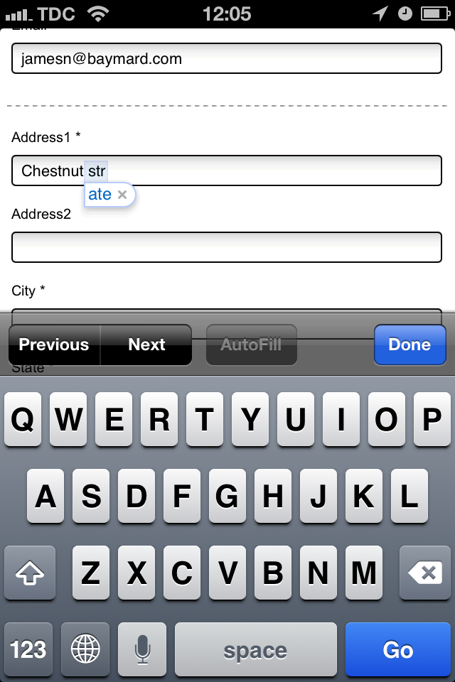
At HP.com, ‘str’ is auto-(in)corrected to ‘ate’ because they haven’t disabled auto-correction.  Lesson— Disable autocorrect for address form fields.  Better still disable autocorrect for all checkout form fields.
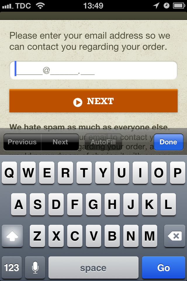
At Cabela's, the e-mail keyboard isn't invoked despite customized the placeholder text.
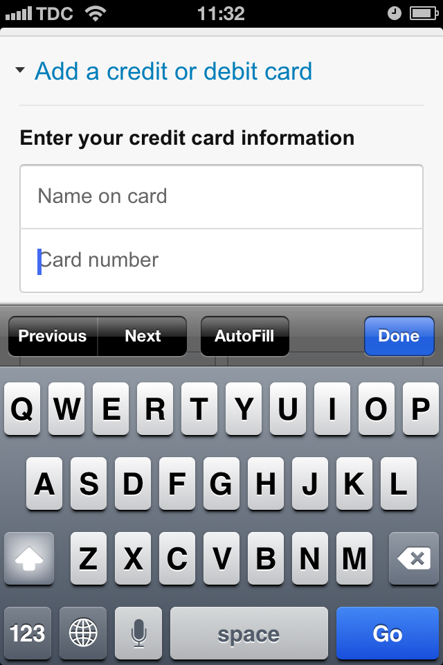
At Amazon, the credit card field doesn't invoke a numeric keyboard, increasing the likelihood of typing errors.
At Amazon, the credit card field doesn’t invoke a numeric keyboard, increasing the likelihood of typing errors.
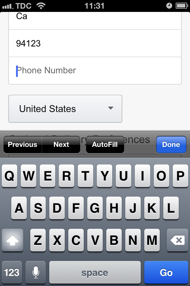
At Amazon, the phone keyboard isn't invoked, presenting a bunch of alphanumeric characters instead.
At Amazon, the phone keyboard isn’t invoked, presenting a bunch of alphanumeric characters instead.


Comments 2

avatar

These small tweaks absolutely make a difference based on my past testing experience (especially invoking a numeric keyboard on phone and zip code fields). I didn’t know you could disable the auto-correct feature. I’ll have to try that one – thanks again for the great articles Rishi!

Reply
avatar

Hi Bill– Always good to get your input. Thanks for following the blog 🙂

Reply

IF THE COMMENT SECTION REMAINS EMPTY I'M GOING TO LOSE MY JOB

Cancel Reply
Email will not be published
fried_egg.png

I like seeing marketing ideas I've never seen before

True or False? ??

fried_egg.png

Then you are in the right place.

Receive 1 unique conversions idea in your inbox every week. Interested?