
Blog
Readable Reviews
Which review is easier and quicker to read?
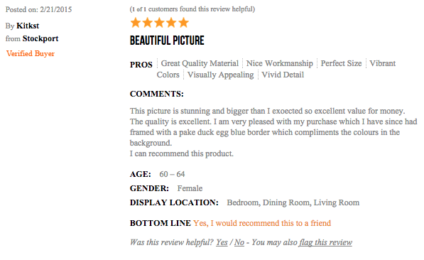
Review 1 (actual size):
Review 2 (actual size):
That’s right, it’s review 2. Always present reviews in larger font size and darker font color. You’ll be happy with the result.
Blog
Which review is easier and quicker to read?
Review 1 (actual size):
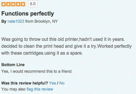
Review 2 (actual size):
That’s right, it’s review 2. Always present reviews in larger font size and darker font color. You’ll be happy with the result.

I like seeing marketing ideas I've never seen before
True or False? ??

Then you are in the right place.
Receive 1 unique conversions idea in your inbox every week. Interested?

We use a specific copywriting formula to convert new shoppers to a site.
Each week we'll email you an example to your inbox. Interested?
See you Monday!
Check your inbox to confirm your subscription. Next stop, higher conversions.
Comments 2
I wonder if there aren’t some second-order effects that are being overlooked. While you are absolutely correct that the second review is much more attractive, the more formal formatting of the first review gives it a significant boost in credibility–and, therefore, value to me as a consumer. I realize that may not at all be what you are trying to convey in this comparison, but I do think that, when trying to create the most effective review format, there are some considerations to be made even beyond the font size and color.
(Ultimately, however, my aging eyes are applauding your recognition of the larger/higher-contrast font!)
Chris
Replybetterretail
Chris said: While you are absolutely correct that the second review is much more attractive, the more formal formatting of the first review gives it a significant boost in credibility–and, therefore, value to me as a consumer.
ReplyRishi: That’s a very good point. Formatting is critically important. If the review is readable but formatting isn’t right then we’ve lost. A chain is as week as its weakest link. Great observation, Chris.