Blog
Quick View Solution
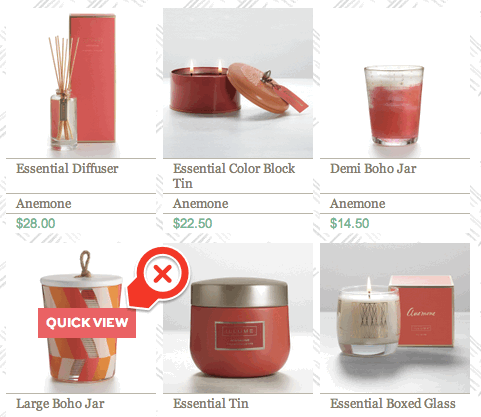
In a previous post I debated if Quick View interface was really needed. Basically, Quick View is a mechanism online retailers use to allow shoppers to buy directly from subcategory pages (bypassing the product page). Example—

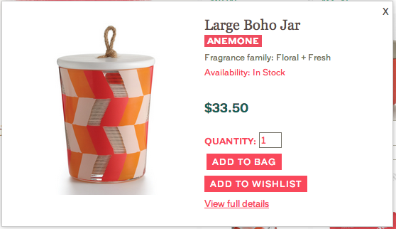
When Quick View is clicked a lightbox like this appears—

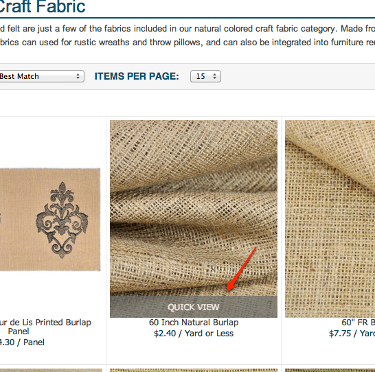
Why I hate Quick View— product images on category pages are shrunk down, and Quick View takes up a fair amount of image screen real-estate. Thus, it’s highly likely people will end up clicking it accidentally, I know I do. If you really must use Quick View do what onlinefabricstore.net does. On their subcategory page they anchor Quick View link at bottom of product image—


