Blog
Helping Shoppers Search Quickly
Vistaprint.com sells 1000s of business cards (among other things).
I saw this ad …

… so I clicked it. That took me to this page– https://www.vistaprint.com/gallery/IAEAAAABAAAAAAA=/premium-business-cards.aspx
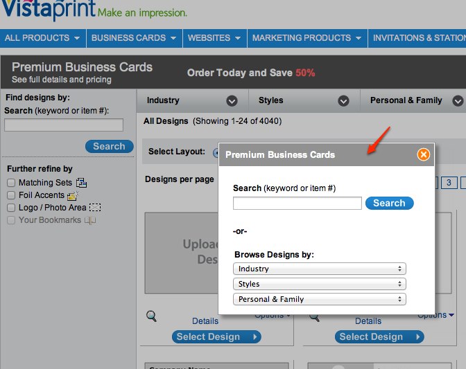
Screenshot–

What I love about this landing page is that it was designed for someone arriving from the ad. Vistaprint.com realizes when shoppers are presented with 168 X 24 = 4,032 card designs (too many options) they use the search interface. But instead of trying to make the search bar more visible through subtle tweaks vistaprint.com shows it as a popup, thus making it impossible to miss. They realize faster visitors get to their desired design higher the likelihood they’ll convert.
Another nifty feature: Since I entered via ‘business cards’ ad vistprint.com knows that’s what I’m interested it. Now when I type vistprint.com on my browser I’m redirected to their “business cards” section. I can return to homepage by clicking Vistaprint logo on top left corner.


