Blog
Product Story Angle Examples
A product story angle (also called PSA) is the theme around with a product story is built.
The job of a PSA is to immediately and powerfully connect with visitors.
Example 1: BioWaveGo
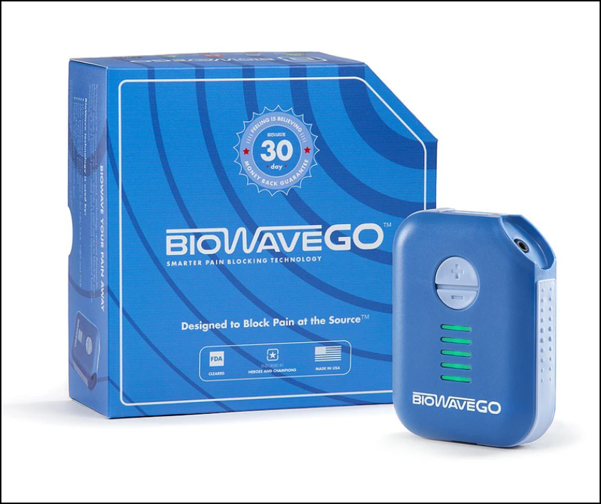
This is BioWaveGO (not a client), a smarter pain management device for chronic pain. You place the pain pads where you have chronic pain and attach it to the BioWaveGO machine. The therapeutic electrical stimulation goes straight to the source of the pain and blocks the pain signal directly at the nerve inside the body. It’s ‘100% drug-free, safe, easy, and comfortable to use’. What we liked best about this product is that it makes for quick, daily pain management treatments that customers can do themselves. You can carry it whether you’re traveling for work, keep it in your office bag for a quick fix, or have it around at home to prevent going to the chiropractor at all.
Here are the angles that should have been used, but weren’t:
Product Story Angle 1:
Headline: Control Your Pain. Anywhere. Anytime.
Why we used this headline:
A visitor searching for a chronic pain management solution like this must a. be experiencing chronic pain already (otherwise why would they even search for this?) and b. have exhausted traditional ways of pain relief that didn’t really work for them. In addition to that, they would have already experienced a dependence on other measures (chiropractor, pain relief creams, medical intervention, etc.) that were time-consuming. We want to attract a visitor with all these clear benefits of using BioWaveGO.
Product Story Angle 2:
Where does it hurt today?
{neck} {lower back} {shoulders} {wrists} {arms} {elbows} {shoulders} {fingers} etc.
Here we are using the active participation strategy. The basic idea of active participation is to take eCommerce from a one-way street (where the marketer is doing all the walking) to a two-way conversation.
When people click {neck} {lower back} {shoulders} {wrists} {arms} {elbows} {shoulders} {fingers} we will show personalized content that shows visuals of how BioWaveGO’s technology works deep inside the upper layers of the skin and brings pain relief.
Why we used this angle:
We already know the visitor is experiencing chronic pain in some part of their body. They have an urgent need to solve it and traditional methods haven’t worked. We want to ensure our copy reads exactly to their needs. By asking for their involvement, we can craft a narrative for them that solves their exact pain point (similar to how BioWaveGO would!).
Product Story Angle 3:
What have you already used?
{pain relief creams} {chiropractor} {medicines} etc.
For each selection, our goal is to show why that option is ineffective and how BioWaveGO’s patented technology trumps that option. This can be in the form of tables: cost, ease of access, ease of use, results, side-effects, etc.
Why we used this angle:
We want to be cautious: our visitors have used other alternatives but they haven’t worked for some reason. However, there is a chance they’ll think that option hasn’t worked for them and may look for a (im)perfect substitute to the same alternate (maybe try another cream or chiropractor). We want to drive home the point that the alternative they’re using is also going to be equally ineffective.
Example 2: HidrateSpark
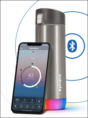
This is HidrateSpark (not a client), the ‘world’s smartest water bottle ever created’. What’s similar to other bottles: the stainless steel vacuum keeps drinks insulated up to 24 hours. What’s smarter: a LED smart sensor that ‘glows’ to remind you to drink water. It also tracks your water intake with a bluetooth synchronization to the Hidrate app on your phone.
Here are the angles that should have been used, but weren’t:
Product Story Angle 1:
Headline: Don’t Read Any Further.
Sub-headline: Okay fine. Grab yourself a glass of water first.
Why we used this angle:
It’s safe to assume we can all do with a glass of water right now, no matter where we are or when was the last time we had a glass of water. We want to create a personalized experience for the visitor to orient them towards what Hidrate can do for them.
Product Story Angle 2:
How many glasses of water did you drink today?
{8+} {6-7} {3-4} {Don’t know}
We’ll personalize the message for each selection.
For 8+, we’ll say: that’s too much! Drinking too much water can cause x,y,z. Get alerts to drink the right quantity of water as per your body’s requirements.
For 6-7 (assuming it’s the recommended number of glasses), we’ll say: You’re a star! But did you remember to drink it throughout the day? 6 out of 10 people who actually drink the recommended number of glasses forget to space it out. So your body might be overhydrated in the morning, but dehydrated by the time the day ends. Don’t be one of them.
For lesser, we’ll say: that’s too less! But don’t worry, 7 out of 10 people forget to drink water in the daily hustle and bustle of life. That’s why we exist: to ensure you’re never dehydrated.
Why we used this angle:
It’ll be extremely easy for a visitor to think they’re actually drinking enough water during the day (even if they aren’t). No matter what water intake level they select, we want to customize our message to that to show why Hidrate is relevant for them.
Product Story Angle 3
It’s not your fault you forget to keep yourself hydrated. That’s just how busy our lives have got. That’s why you need your personal water butler that reminds you when it’s time to hydrate yourself.
Why we used this angle:
“It’s just remembering to drink water on time”: we assume (with experience) that visitors will try to find an alternative to the problem or just pretend it doesn’t exist for them. By taking the blame and pressure off their shoulder, we can put ourselves on their side like a trusted confidante and guide them towards the purchase.
We have more product story angle examples to share.
Example 3: Judy’s Mover Max
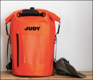
The Mover Max is a 4-person emergency preparation kit by Judy.co (not a client). It has 24 essential items that can help a family of 4 survive a sudden evacuation for upto 72 hours. Why 72? We’ll answer shortly.
Here are the angles that should have been used, but weren’t:
Product Story Angle 1:
Headline: We hate to say this, but you will need The Mover Max sooner than expected.
Sub-headline: Be prepared for a disaster before it strikes.
Why we used this headline:
We had an internal debate about this. Rishi wanted to use this angle: you may never need to use this, but when you do, the Mover Max will be there for your family. Aruna disagreed: Mover Max is for families that are frequently evacuated. Judy has another product for families that don’t fear evacuation at all. We decided to go with Aruna’s. Our visitors (and ideal customers) are families who potentially live in disaster-prone areas. They know they’ll be evacuated any day, but they want to be prepared for it.
Product Story Angle 2:
How much time do you have to learn about the components of the bag?
{3 minutes} {22 minutes}
On click, reveal accordingly.
Why we used this angle:
Mover Max has 24 components. Each of these serves a specific purpose. But not every visitor may have the time to learn about them in detail. We don’t want to scare them with information overdose. What about visitors who do have the time to conduct their in-depth research? We don’t want them to leave us because of ‘lack’ of detail. So we came up with this solution: we ask the visitor how much time they have. If they select 3 minutes, we show them a short, quick pitch that covers the broad questions they could have. If they select 22 minutes, we tell them all the details. 3 and 22 are assumed numbers.
Product Story Angle 3:
Do you know why 72 is the most important number during evacuations?
Then we talk about why the 72 hours after disaster hits is imperative for survival.
Why we used this angle:
Research shows that if you can survive for 72 hours after a disaster hits, you have a higher chance of making it out alive. We have to show our visitors that we’re the experts in understanding disaster preparedness. We’ve not selected 72 hours worth of preparedness randomly: there is hidden expertise.
Next steps
Ok, now that you’ve seen these product story angle examples it’s time we show you how they fit into a product story and how that, in turn, can help massively optimize conversion rates.

