
Blog
Psychology of Ecommerce Sales: Increasing Time on Site
We need visitors to stay longer to improve conversions. Increase time on site with a technique called Priming (Wikipedia definition).
Have a look at your site data. You’ll find a majority of visitors spend comically low time on the site. Typically under 3 minutes.
Think about your own behavior. How much time do you typically spend on new sites? Are you going to read this whole article?
When I visit a site, even if my intention is to stay, I end up exiting too soon. And we know time on site is one of the biggest indicators of future conversion rates.
Could this be happening on your site too?
You can bet your last dollar.
As marketers, our #1 goal needs to be to drive up quality time on our sites. Keyword being quality.
So how does one know what a good time target is?
A good place to start is to create a segment of paid search traffic (non-retargeted). From this group, exclude users who spend less than 20 seconds and visit less than 2 pages. Calculate average time on site for this segment.
Let’s say this number is 5 minutes and 18 seconds.
Ask yourself: how can we get shoppers to spend more time on the site? Priming will help you increase time on site for this group.
Priming is a good tactic.
My company sells conversion optimization services. Businesses consider conversion optimization a damn important business goal. Naturally, they will want to invest time to study my credentials. This would be what their rational brain would say. Yet, the typical time on my site for a new visitor is under 1.5 minutes. Are my customers superhumans capable of completing due diligence in 90-seconds? I’m skeptical. So I could use priming on the site. Here is how it would work.
When someone visits they’ll see a banner with 4 button options (red banner below):
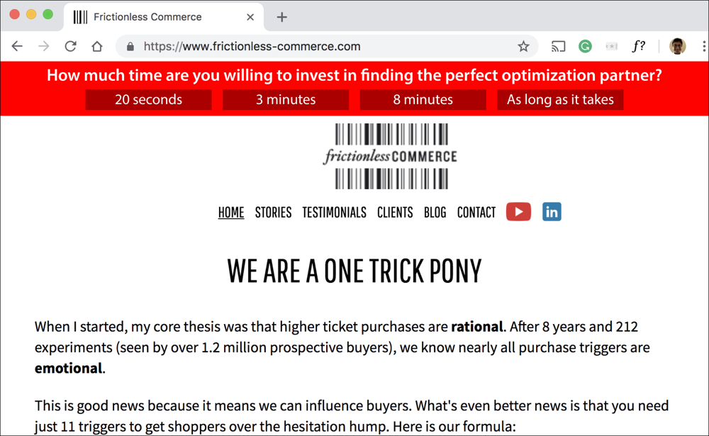
We know what people actually do (spend an average of 1.5 minutes on my site) but guess which option they’ll pick? That’s right, they’ll click the [As long as it takes] button.
But that isn’t the fun part. The fun part is what happens after they make this selection. Because now when the visitor’s irrational brain wants to bail at the 90-second mark the rational side will chime in:
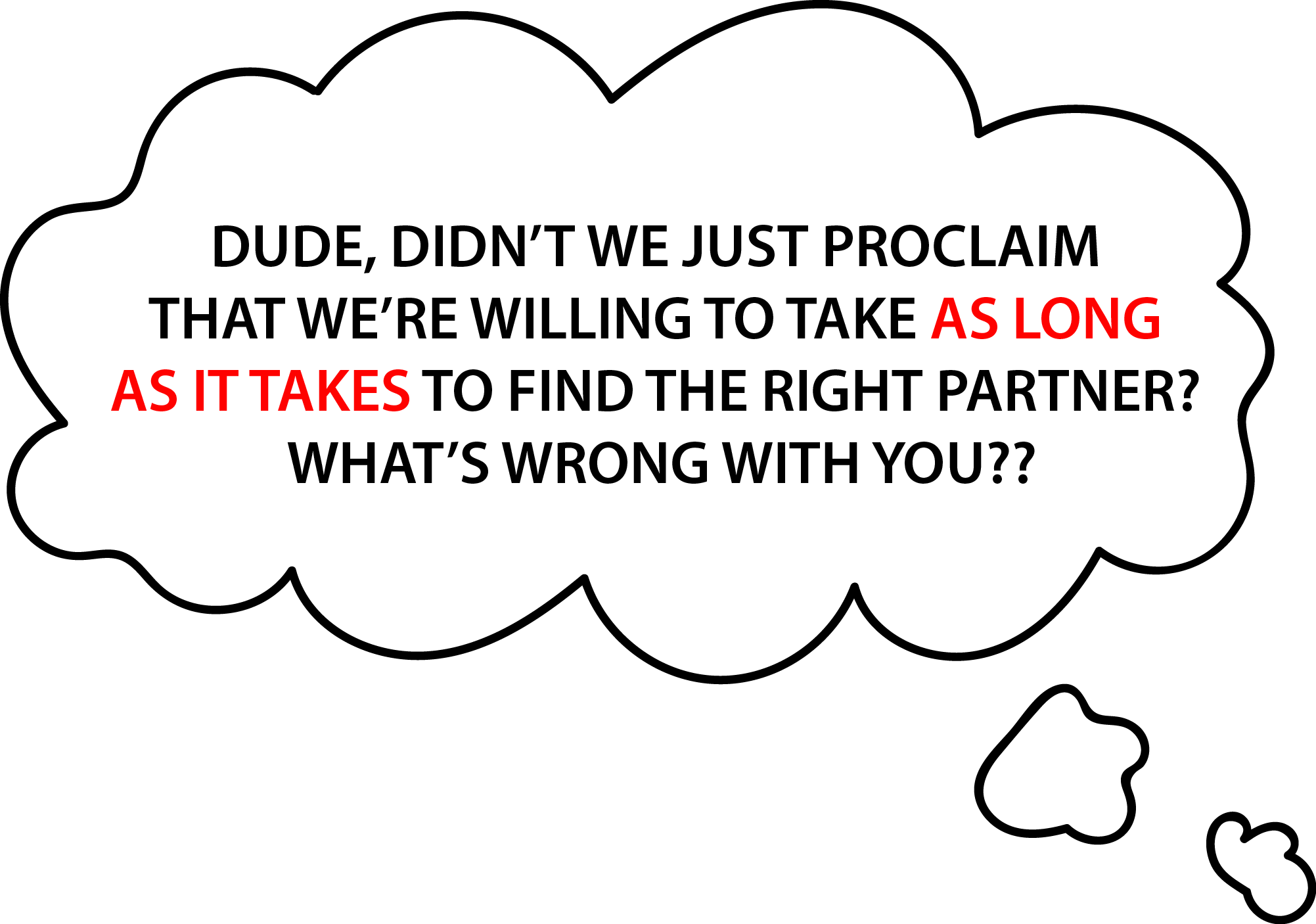
Most will feel so conflicted they’ll end up spending 80% more time on the site.
We even have a case study that uses this priming tactic. See this: https://frictionlessco.wpengine.com/case-studies/pillowcube-sales-up-10-percent/
Here is another way in which you can use priming on your ecommerce site.
About Frictionless Commerce
We’ve been thinking about online buyer psychology for the last 11 years. Why do online shoppers behave the way they do? Does a product that is objectively better than the competition always win or does buyer perception matter most? We’ve learned some fascinating truths.


Comments 8
I love the concept. Why isn’t it up on your site? Or are you A/B testing and I didn’t get the variant?
ReplyDo you think that “We Are A One Trick Pony” is the most effective headline for people coming to your site looking for CRO work? Why?
Mark: I love the concept. Why isn’t it up on your site? Or are you A/B testing and I didn’t get the variant?
Rishi: We’re actually just about to launch a totally new site. I’ll let you know when it’s up.
Mark: Do you think that “We Are A One Trick Pony” is the most effective headline for people coming to your site looking for CRO work? Why?
Rishi: When I put that headline 4 years ago my reasoning was that most agencies focus on a wide variety of services. We focus on just converting first-time buyers. The types of clients I want to attract are people who only want to work with specialists. So the headline was designed to activate one of our 16 conversion optimization tactics called: Confirm Worldview. I haven’t shared with you our 16 point process. Will send you a video in the next few weeks. I think you’ll like it.
Thanks for commenting, Mark.
ReplyRishi, I noticed something about your blog post that caused my brain a bit of work.
I REALLY liked this article. And I was inclined to click immediately to your website. BUT…. I could not figure out how to do so.
You convinced me on the blog post that your company was the RIGHT ONE TO USE. But I left a bit frustrated as there was no (obvious) way to get to your site to talk to you.
My idea is that that image you feature from your site should link directly to the same page on your website.
And there be a call to action to “learn more about Frictionless” and also “work with us” link.
Make it easy for me to get to your site to work with you, don’t create any cognitive load for me. You’ve already got me excited, but it kind of stops there.
Anyway, that’s my .02!
– Ron
ReplyFrictionless Commerce
You’re exactly right, Ron. Update made. This is why an outside perspective (yours, in this case) is so powerful. –Rishi
ReplyWould be worth a test. My main concern would be that for my example, I don’t think people buy health food with that same frame of mind where they would answer to the affirmative because the nature of the purchase is probably more related to emotional food considerations. Your thoughts?
ReplyFrictionless Commerce
Hi, Jonathan. You likely have a valid point. We’ll just need to A/B test. Thinking about your target audience I had another idea (from an earlier blog post). Would do you think about this messaging format? https://betterretail.wordpress.com/2018/05/19/getting-more-recurring-plan-signups/
ReplyEvery time I read your tips, I am absolutely blown away. They are simple but genius.
ReplyRishi Rawat
Thank you 🙂
Reply