Blog
The Power of Visualization
We’re visual animals. Every thought that forms in our brain is paired with a visual. If your goal is to maximize the impact of your sales pitch then visualization is one of your best friends.
How Fast Does the Human Brain Process Images?
Here’s something surprising to many: the human brain processes images 60,000x faster than words. You read that right.
Additionally, 65% of us are what you would call “visual learners”, meaning the majority of us comprehend visual representations of information easier than written or verbal information.
Types of Visualization
There are 3 basic dimensions of visualization that the marketer can use to boost conversions:
— Visual clarity
— Analogy
— Contrast
Visual Clarity Examples
Some ideas are just abstract.
1: Concepts like time is the 4th dimension can be hard to understand because we can’t see time. To better explain the idea Dr. Neil Degrasse Tyson uses a great example. He says: Imagine if two people wanted to meet in NYC. One person would have to tell the other “I’d like you to meet me at the intersection of 5th Ave and West 34th street on the 80th floor.” This person has given the 3 dimensions of length, breadth, and height. But one piece of information still is missing, which is the time of the meeting.
Just hearing this story brings the interplay between space and time alive.
2: Another effective way of creating visual clarity is by using a user story. User stories help the prospective buyer see how the product could integrate into their lifestyle and may even help them consider things they hadn’t considered before.
QVC uses this technique very effectively. I was watching a QVC presentation for a jump starter (it’s a device (photo) to start your car when the battery dies). Here is one example of the 20 user stories they used during that presentation:
“My daughter was at college and she called in a panicked state to tell me her car battery had died. I felt helpless …”
What I love about it is that moment a parent hears this they can instantly see their young adult child being in such a situation (most first cars for young adults are unreliable pieces of crap). Also, they may have been originally evaluating the product for themselves. They didn’t realize it’s also a great gift item.
User stories are powerful visualization tools.
3: I’ve been seeing the US debt number for the last 18 years.
But it’s so comically big and somewhat abstract, it hasn’t shocked the life out of me. Then this image walked in and shit got real.
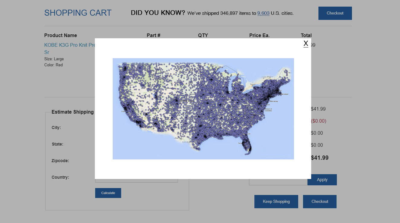
4: You can tell someone your product has been shipped to 3,000 cities but that number is still abstract. On this cart page, we added a see where all we’ve shipped to link. When clicked, this map appears:
Analogy Examples
Here are 2 analogies that can be used with a mattress brand:
1: Each layer in our mattress serves a specific purpose. Together, they’re like a Jenga tower: remove one layer from the system, and the whole point comes crumbling down. These layers weren’t optional for us — they were the only way for us to provide you with the exact level of comfort and deep sleep you’re looking for.
2: Lack of sleep is like credit card debt. We don’t notice it in the short term, but that doesn’t mean it’s not ballooning out of control.
Contrast Examples
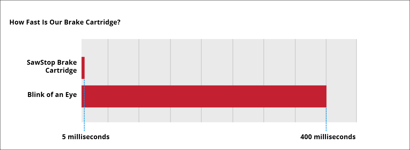
1: SawStop.com is a safety device that stops a saw if your fingers come too close to the blade (which can mean the end of a finger):

It stops the machine in 5 milliseconds but people can’t really imagine how fast 5 milliseconds is. So we added a visual aid:
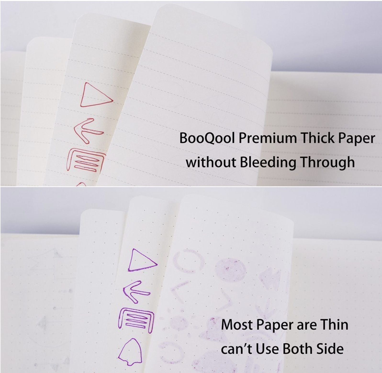
2: I was searching for a journal on Amazon. Bleeding ink wasn’t even a criterion I was looking for but once I saw the image below I was like, “That’s right, it’s important that the pages in the journal don’t bleed!”.
This marketer was able to inject a thought into my mind, and that changed my purchase behavior:
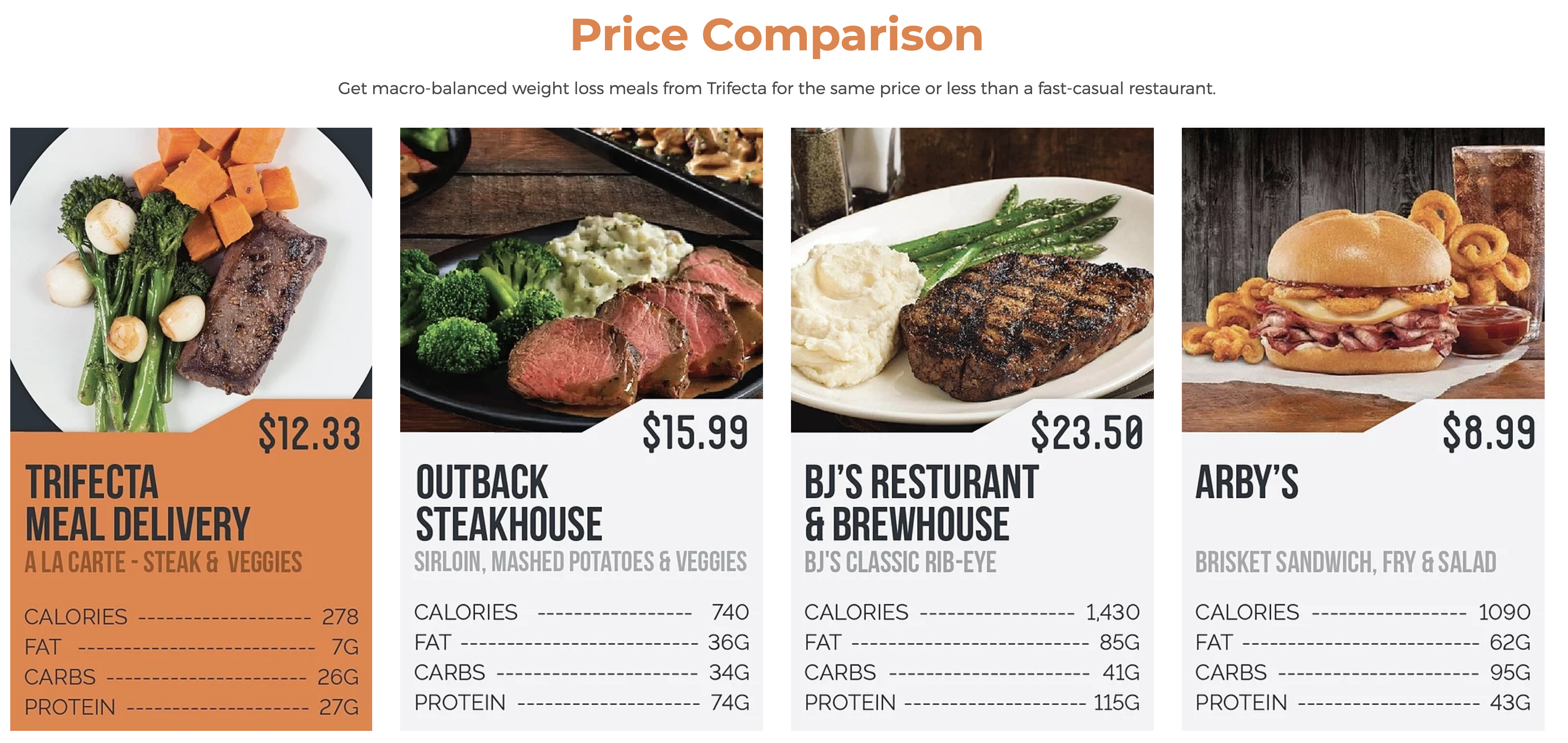
3: How about an example that’ll make you wish it were lunchtime? Trifecta wants to let users know how their plan compares. So they show this:
Note
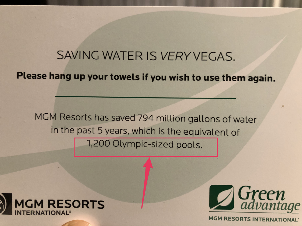
Visualization isn’t only achieved with graphics. You can very much have a visual impact with just words.
In the example below words are being used to evoke a visual image. The user can imagine what 1,200 Olympic-sized pools look like:
QVC Is the King of Visualization
Pay attention to how many times QVC uses visualization techniques in this presentation:
— “It’s a little vortex vacuum for your pores.”
— “Your pores are little wastebaskets.”
— finally, the model holds up the chambers with the opaque liquid to visualize all the crap the device pulls out.
8 more visualizations were used between my recording and typing out this post.
There’s More
Shoppers use a subconscious mental checklist to choose between products. Visualization is #5 on that list. Now that you’ve conquered Visualization it’s time to dominate item #6: Shoppers need motivation to break habits.




Comments 1
This is a terrific idea! I was drawn to the graphic for “blink of the eye & 5 milliseconds” that really put it in perspective.
Hmm…. how can I do this?
One idea is that we have a particular cut of diamond, called Fire Polish, that exhibits more color dispersion (fire) than any other diamond in the world. So maybe a graph on that category page, and also on the product page? I did put up an image, and there are videos – but a graph showing the HUGE difference in “fire” creation of that diamond might tell a better story?
Replyhttps://www.yatesjewelers.com/fire-polish-diamonds.html