
Blog
Popup Shape
Most important detail about showing a popup: Make it unique.
In this example from Rothy’s, they’ve made 2 clever choices:
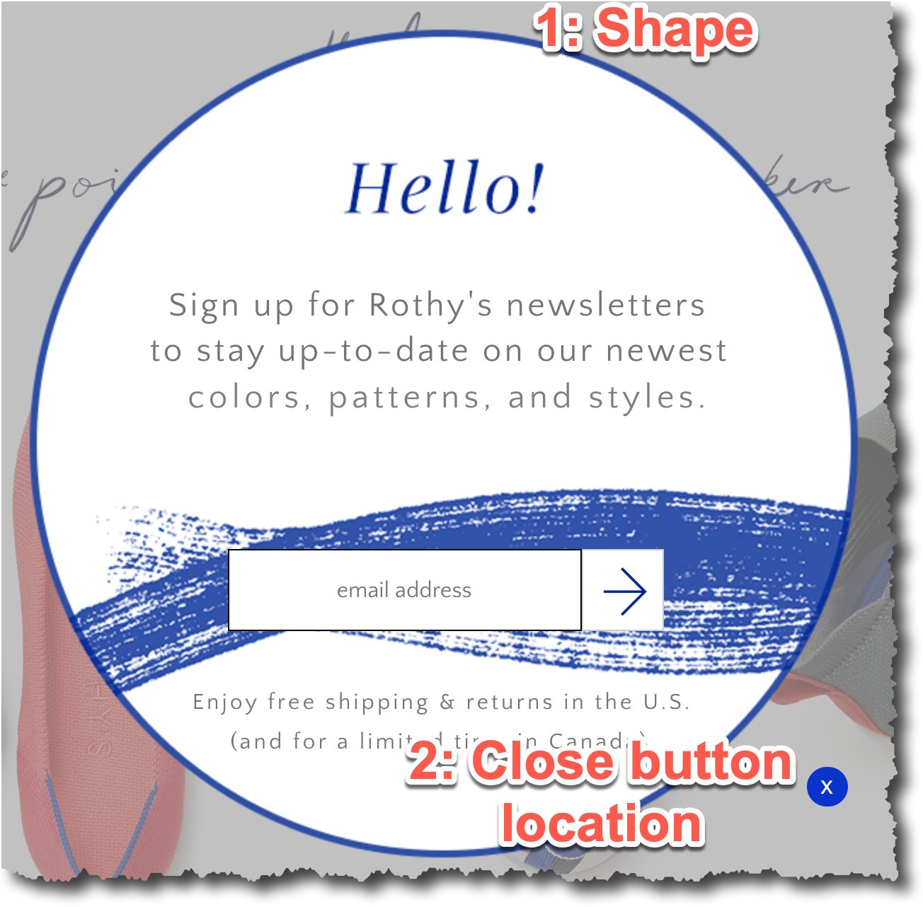
The shape of the popup and close button location.
You might think “how can close button location possibly make a difference?”.
It does, and here’s why: users expect to see the close button at the top right corner. The bottom right corner is unconventional. That means it takes the mind a fraction more time to locate it. In a world were consumers are making snap decisions thousands of times a day this minute switch could make a small difference. And small differences add up.
The unconventional shape works for the same reason: users don’t expect to see a circular popup so they slow down to process it (like you’d slow down if you saw a green elephant on a Safari). As a result, more people end up reading Rothy’s email signup pitch. More readers = more signups.


Comments 2
Hi!
Just wanted to let you know that by moving the “x” button from the top right corner to the top left corner, we have increased our form submissions by over 80%. Thanks for sharing your blog with us!
ReplyRishi Rawat
Wow, this is super impressive. Thanks for letting us know. Also, thanks for being a reader.
Reply