Blog
Annoying Popups
I hate popups.
BUT.
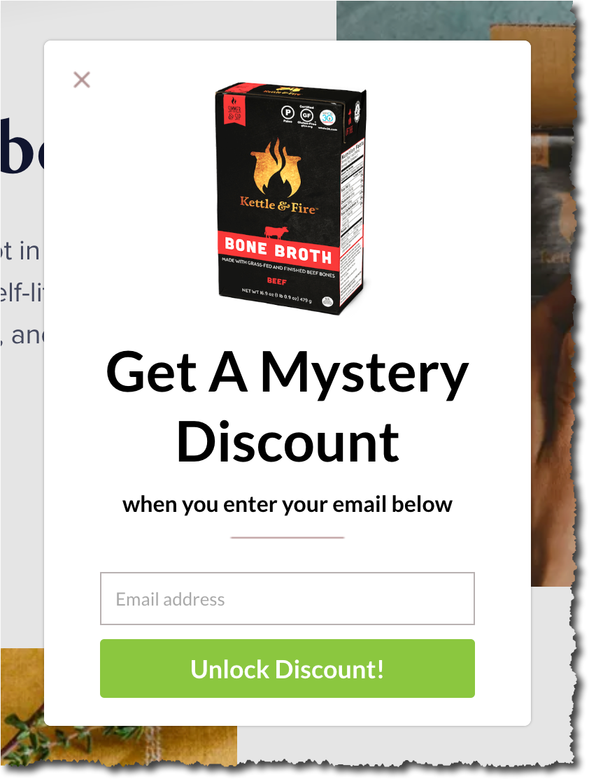
There is no denying that the word “mystery” has a magnetic pull:

(taken from kettleandfire.com)
Bonus: Notice the unconventional location for their close button. This isn’t a mistake. It’s very intentional. By placing it where users don’t expect it the marketer is buying 5 precious milliseconds for their message to register. Every millisecond counts.


Comments 5
Very cool. Just curious: what was the discount they offered?
ReplyRishi Rawat
You know what? I was so intrigued by the message and in such a rush to blog about it I forgot to signup!
ReplyThis is genius! I actually like this popup.
ReplyIt registered enough for me to want to find out more 🙂 Impressive!
ReplyRishi Rawat
I’m so happy to see your first comment, K. Glad you liked the concept. Comment more often. It makes me happy.
Reply