Blog
Personalized Product Description
The most important page on an e-commerce site is the product page. The smartest way to maximize conversions on that page is by using personalization to tell your story.
Wait, why is my product page the most important page on my site? Isn’t it my homepage?
The product page is where your buyer is choosing between buy and don’t buy. This is where they are voting with their wallet.
But product pages aren’t personalized. They are the exact same for every visitor. Does this make sense to you? If someone walked into a physical store and asked an employee a question, would it make sense for the employee to give the same reply no matter what the question was? Heck no. Do that and your retail store will be bankrupt in 60 days.
So why do we do this online?
Look, if you’re selling a sport hydration drink mix, you can get away with a basic product description. The price point is relatively low and the use cases are pretty easily understood (it’s a hydration mix for people who are into active sports).
But if you’re selling a complex product that appeals to different audience type, then you have a problem because in order to cover ALL details and address ALL questions for ALL users you would need A LOT of words. But only 30% of that content is relevant to any one buyer group.
What is a marketer to do? How can they personalize the product page?
We think we’ve invented a brand new solution. I know it’s new because I’ve studied over 1,500 product pages in the last 4 years and I have never, not once, seen it.
To illustrate the idea we created a concept for GOAL ZERO’s Yeti 150 portable station (note: not a client).
We picked this product because it’s a complex sale and costs around $200. Different user types reach this page, each with their own sets of questions.
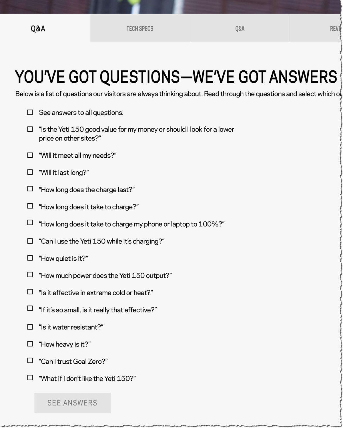
Instead of showing a really long description our concept replaces all the content and shows a questionnaire where the content was:

The user clicks checkboxes that apply to their purchase criteria. And we’re smart: to hedge our bets, our first checkbox is “See answers to all questions”. This is for people who hate checkboxes and just want to see the content (I want to convert everyone).
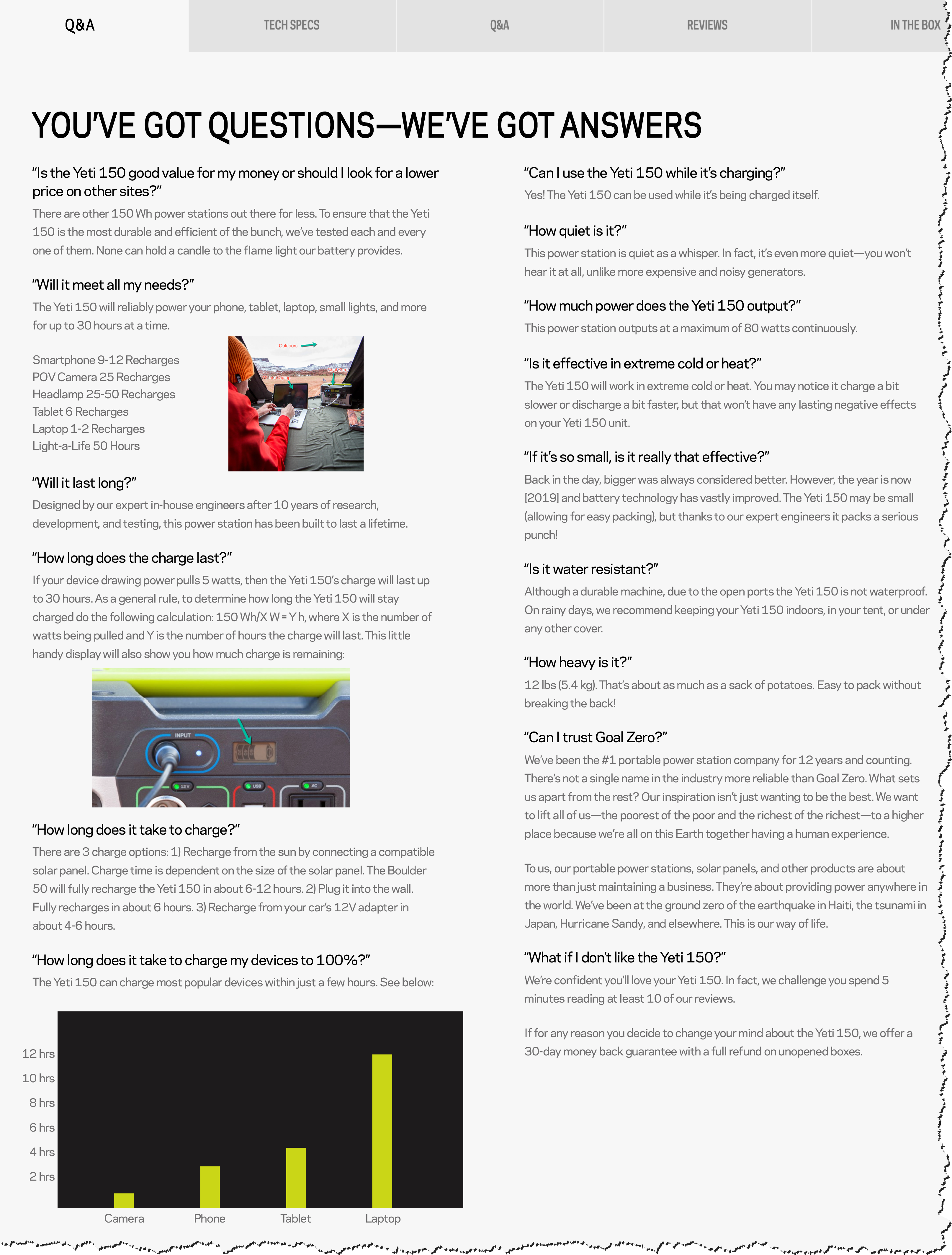
Once the user selects their checkboxes and clicks the SEE ANSWERS button, we reveal their personalized product page content:

To recap: the product page content has been reduced by 70% without cutting any of the questions this shopper cares about. Win-win.
PS: If you’re on LinkedIn much you can should definitely connect with me. I’m posting ecommerce conversion ideas every day, multiple times a day.


Comments 4
Sheesh, that is very cool. I love how you are customizing the experience to the user. I definitely appreciate that when businesses do that to me (although its usually in person businesses instead of online ones).
ReplyLove this idea Rishi!
ReplyHowever, to play the Devil’s Advocate, would lessening content cause a negative impact on SEO? Google loves content….
Rishi Rawat
This content would still be behind the SEE ANSWERS button. But I am no SEO expert.
ReplyWell, then I think this is a great idea!
Reply