Blog
Optimizing Your Best-Selling Product Pages
If you’re like me, then you love spicy food. Hot sauce is your best friend. Recently, I came across a site called Hot Sauce Depot, which specializes in selling hot sauces, salsas, dry rubs, and more from a number of top brands.
When I visited one of their best-selling product pages, this is what I saw:
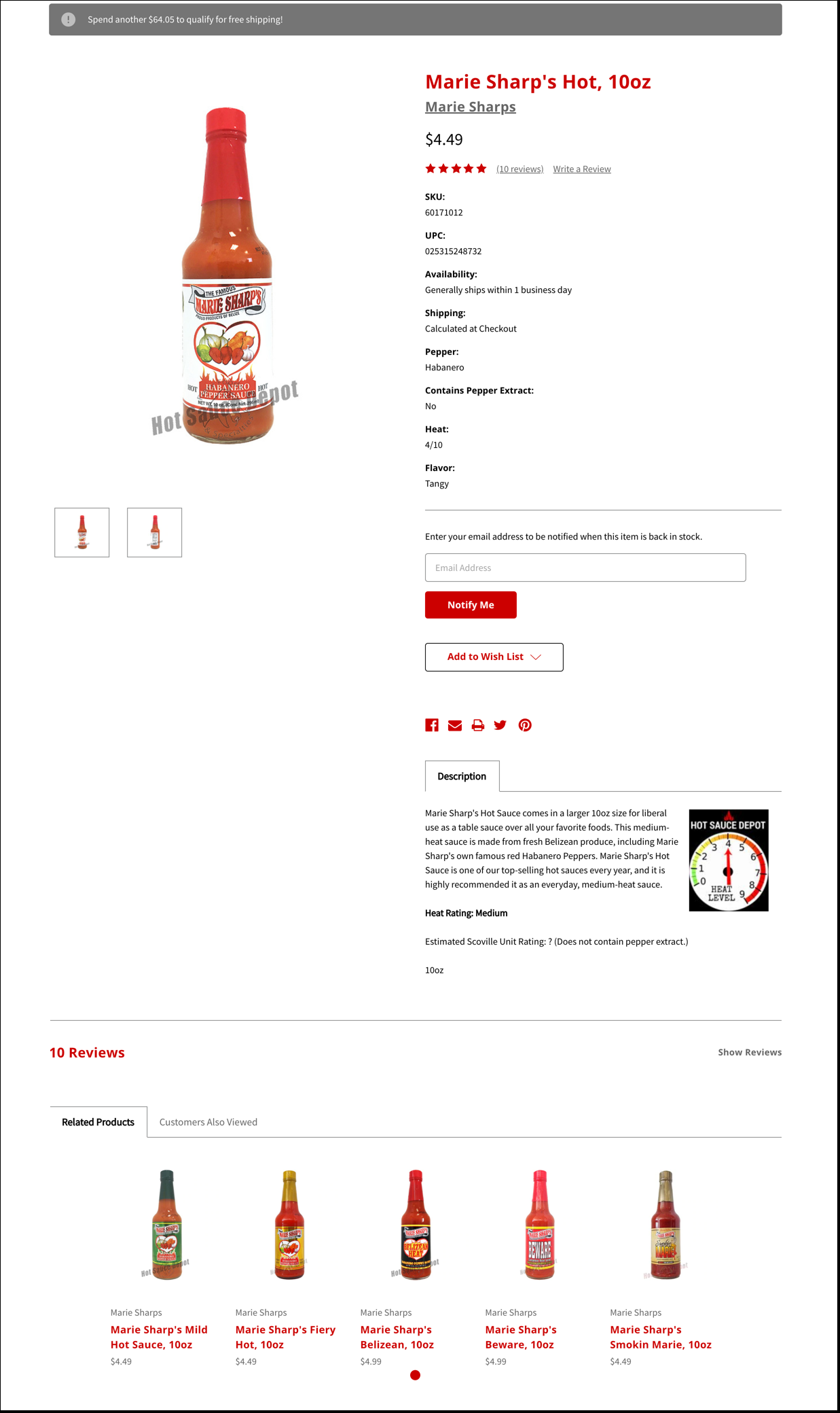
In short, I didn’t see a whole lot. The product description was minimal, the reviews were hidden by default, it wasn’t immediately clear how hot this sauce was (which is the most important question a shopper needs answered when on a hot sauce site), and the product description was given lower priority than… the SKU and UPC numbers?
Even if Hot Sauce Depot did things this way due to having a large number of B2B sales, it’s still possible to find a better balance between accommodating your business customers and consumers.
Here’s what we did…
Change 1
The most important question a consumer needs answered on this page is “how hot is this sauce?” Right now, the shopper needs to scroll to the bottom of the page…
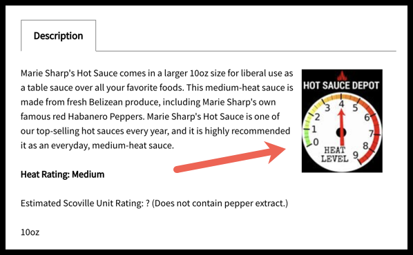
Or find this little bit of copy…
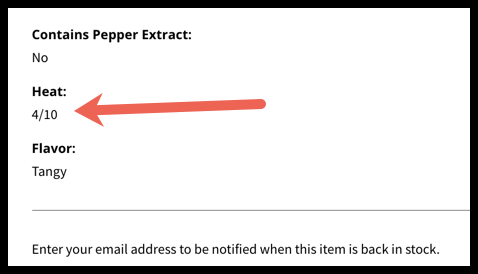
…To find the answer.
Why not answer this right away in a visually compelling way? That’s just what we did in our concept:
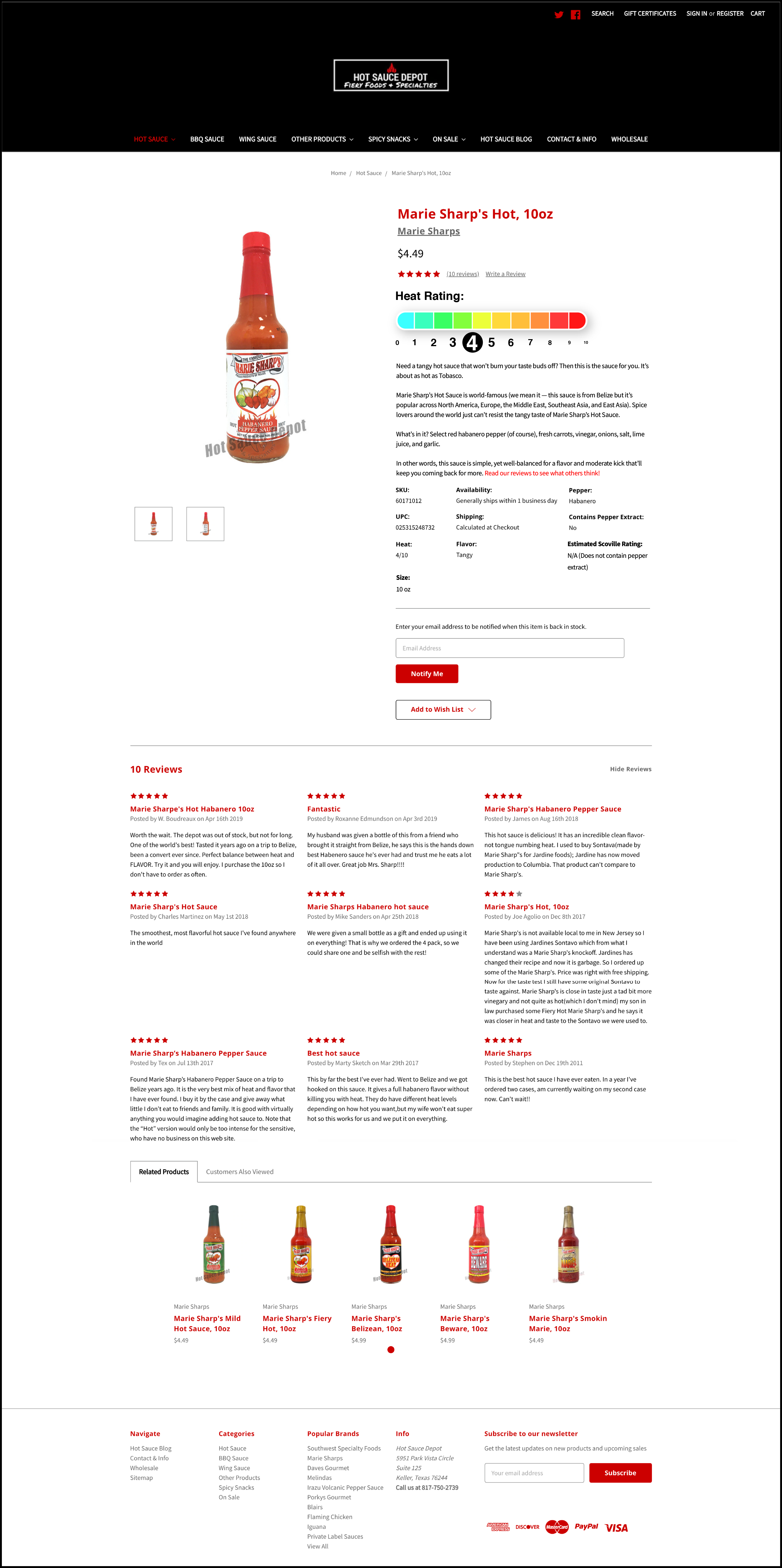
Here’s a closer look:
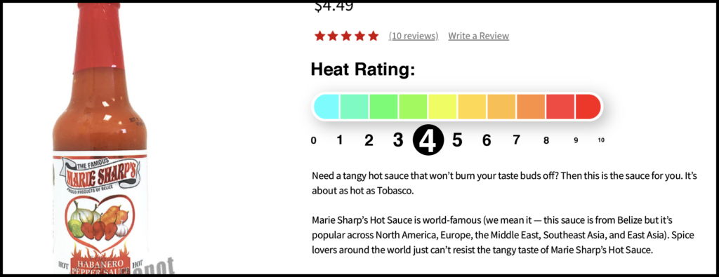
We replaced the current graphic at the bottom of the product page with the above heat scale. This is strategically positioned just below the product price and name to draw as many eyes as possible. That way shoppers can immediately know if this is the hotness they want or if they need to find a different sauce on the site.
Change 2
The next thing we did was rewrite the product description and restructure the description:
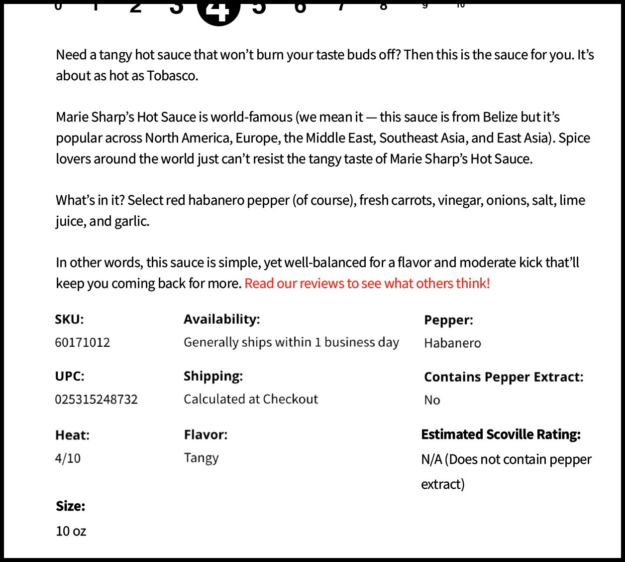
Not only have we added more personality to the copy to make it more engaging, we’ve placed the actual description above things like the SKU or UPC numbers. To better illustrate how hot this sauce is, we’ve also compared it to Tobasco (which is a popular sauce and serves as a good baseline for measurement). This is our Visualization CRO tactic, which you can learn more about here.
Change 3
When you first looked at the product page, you probably didn’t notice that the product had reviews. That’s a big problem because this is supposed to be one of their best-selling sauces!
Right now, the product page hides the reviews by default like this:

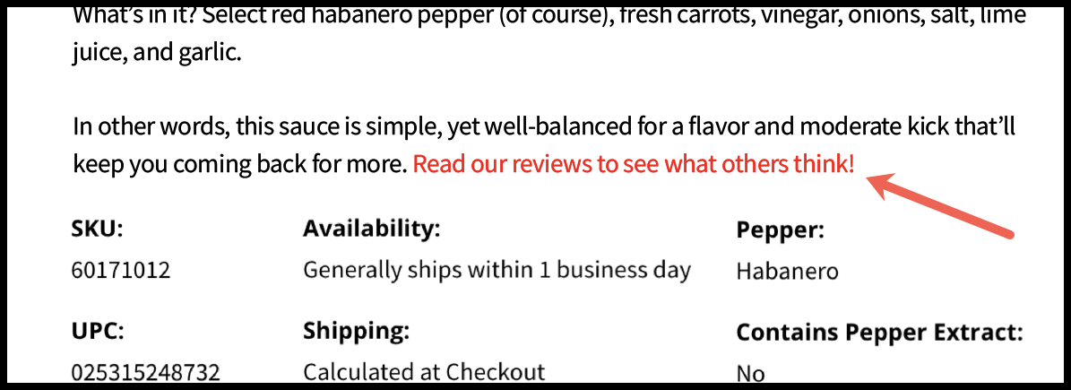
In our concept, we showed the reviews by default. Not only that, but we also included a hyperlink in the product description that, once clicked, scrolls shoppers down to the reviews (the goal is to increase the number of shoppers that read the great reviews):
We highly recommend taking a look at your best-selling product pages. There’s likely room for improvement and that improvement can mean a huge difference for your business. Have a million different products on your site? Just pick a handful of pages and start from there. We promise the effort will be worth it.


Comments 8
Boy I hope they hired you! These are great suggestions!
ReplyRishi Rawat
Thanks, Lisa.
ReplyAhhhh you’re communicating what people are looking for and you’re making it easy. A big colorful picture is easier to understand than 4/20 – less thinking involved. This is cool! Thank you for sharing your process Rishi!!
ReplyPreston Swarthout
The easier we can make the shopping process, the happier the shopper! It’s always important to walk in the shoes of shopper to understand what they need. Thank you for your comment, Tommy!
ReplyI would go on to add:
1. I’d show testimonials which are also relevant.
Say, the landing page drew traffic from a paid campaign where people are searching for hot sauces.
Now, two things– I’d show users who generally prefer hot sauce (range 8+), and collect their review and show that to the audience why it’s a best-seller being a 4+ [Should intrigue the audience, why did a traditionally 8+ user choose a 4+ hot sauce, something special, in it? I wants it ;)]
Secondly, I’d collect the reviews of users, who generally like it mild and how they use it with their daily food.
2. I’d also add a tooltip explaining what a “heat rating” is. I don’t want users to see this as 4/10 stars and just move on to a different product [solving it for a student in class 5].
3. I would also add more images, with nutritional information, charts etc
4. Product video, anyone? Perhaps, with Megan Fox? [Calling all Autobots… strike that, Avengers, assemble- Give us Scarlett Johansson :P]
Overall, great stuff, Rishi!
I sure hope hotsaucedepot.com takes notice of this. 🙂
ReplyRishi Rawat
Sumantha: I’d show users who generally prefer hot sauce (range 8+), and collect their review and show that to the audience why it’s a best-seller being a 4+ [Should intrigue the audience, why did a traditionally 8+ user choose a 4+ hot sauce, something special, in it? I wants it ;)]
ReplyRishi: I really like this suggestion. Very contrarian idea, which is exactly what I’d expect from you.
Rishi, another great idea. As retailers we often struggle with thinking about global changes to the PDP vs just looking more closely at our best selling products and making sure the specific PDP answers prospective buyers’ questions clearly.
I’ve seen and used some simple criteria in the past for building pages.
What is the buyer trying to accomplish with this product e.g. what’s their urgent need, target condition, the why behind this purchase?
What are the most important questions a buyer needs to answer before buying this product?
Keep up the great work.
ReplyPreston Swarthout
The questions you listed out are so important to establishing a better, more thoughtful relationship with the shopper. There’s no better way to establish trust than by providing answers for the shopper’s most pressing questions or highlighting how the product/service is the solution for their problem before they have a chance to even ask questions. Thanks for your comment, Shilo!
Reply