Blog
Shoppers Are A Jittery Bunch
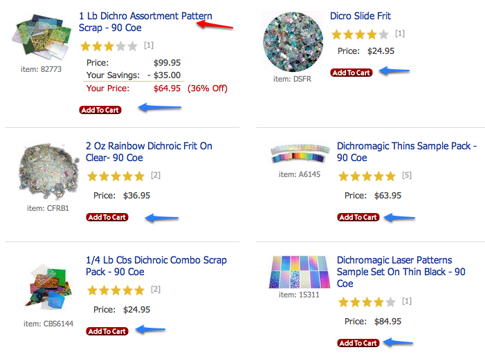
If your category pages allow visitors to directly add an item to cart (pointed by blue arrows below) …

… you should run a test in which Add to Cart is replaced by Learn More. I recently ran that test and noticed a 73.9% lift in product page visits. My theory on why Learn More outperformed Add to Cart— When visitors see Add to Cart at the category page they feel they don’t have enough information to make an informed decision. They feel pressured. Learn More communicates that the next page will provide more information.
You and I, so-called ecommerce experts, might believe any potential buyer would intuitively know link pointed by the red arrow above is what one needs to click for more information. Unfortunately, we aren’t the typical online shopper.


Comments 1
Interesting…
Reply