
Blog
Make Sure Your Test Element is Visible
When people run experiments, they are simply looking at the outcome of the experiment and determining if it was a success or a failure. This can be a problem.
We started adding tracking to see how many people were actually clicking on our test elements. Turns out, the number is low. If people aren’t seeing our test element and interacting with it, it’s impossible for the test to predict the positives and negatives of our experiment.
To illustrate our point (because we can’t show actual client examples), we’ve picked a typical example closely related to a real experiment we have tested to show you the process.
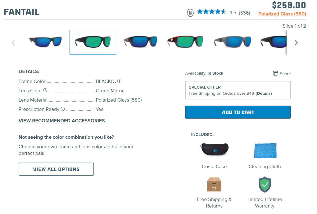
Costa is a premium sunglasses retailer that is relatively known…but they are in a very highly saturated and competitive market. With companies such as Ray-Ban, Oakley, Versace, and many others, why would the user choose a less known brand such as Costa over these others? Below is the default Costa product page without our idea implemented:
In this instance, we are creating a call-to-action that expresses why the user needs to choose Costa for their next pair of sunglasses. When the user clicks on the call to action, a message will be displayed to them. Here is the design (the red arrow is not part of the design):
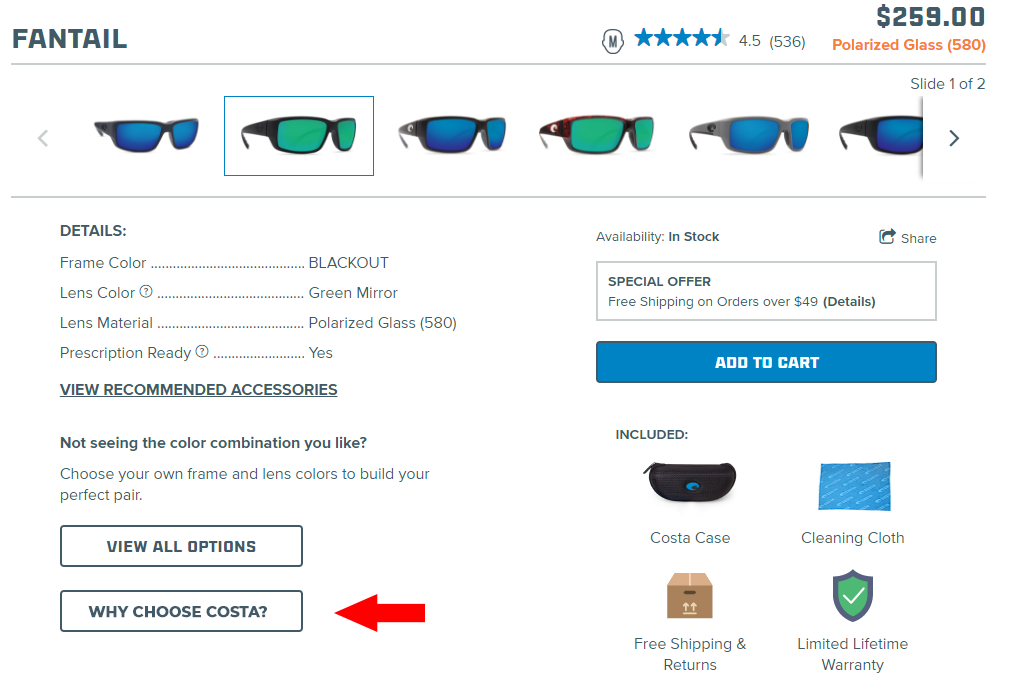
This element might be completely overlooked due to its location (away from the add to cart) and how similar it is to the “view all options” button. Since the element is somewhat hidden shoppers will not interact with the popup message and as a result, the test would not move the needle. The idea would be scrapped as a dud.
One of our core tactics is Visibility and a super important element of Visibility is importance hierarchy. Importance hierarchy is making sure the most persuasive elements on a page have the most visibility. It doesn’t matter how great our content is within this experiment, if no one sees it then what’s the point? We decided to change the location of the button (placing it right by the add to cart button) and made it stand out more. Here is the second design (CLICK ME! text is part of the design):
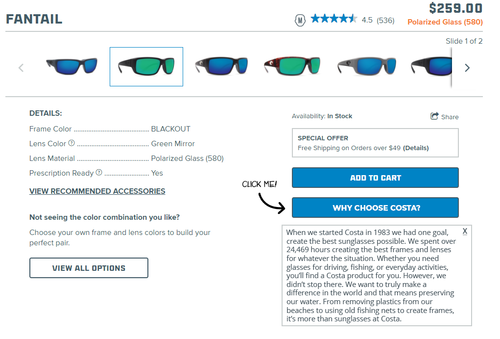
Copy reads: When we started Costa in 1983 we had one goal, create the best sunglasses possible. We spent over 24,469 hours creating the best frames and lenses for whatever the situation. Whether you need glasses for driving, fishing, or everyday activities, you’ll find a Costa product for you. However, we didn’t stop there. We want to truly make a difference in the world and that means preserving our water. From removing plastics from our beaches to using old fishing nets to create frames, it’s more than sunglasses at Costa.
Not only is this button in a better location (directly below the add to cart), the color makes it stand out from the mostly white background. More people will notice it and be curious about what the contents are, and that’s where we are able to capitalize on the story of the company.


