
Blog
How to Boost Conversions on Your Checkout Page
About the Site
SOG Speciality Knives & Tools is a company that specializes in producing high-quality knives and other survival/outdoor tools and gear.
The Problem & Why It Matters
This will come as no surprise to you, but there’s no site in the world with a 100% conversion rate on the checkout page. That means there’s always room to boost conversions there. We suspect SOG would be happy to see a lift on their checkout page.
Why does this matter though? If your company is 100% online, then even just a 5% improvement on the checkout page means a 5% lift in annual sales. For a company that generates $5 million per year in sales, for example, that means $250,000 more per year. It’s a no brainer.
How Messaging Solves the Problem for New Buyers
To reduce the drop off rate and boost conversions on the checkout page, added a call to action at the top of the page:
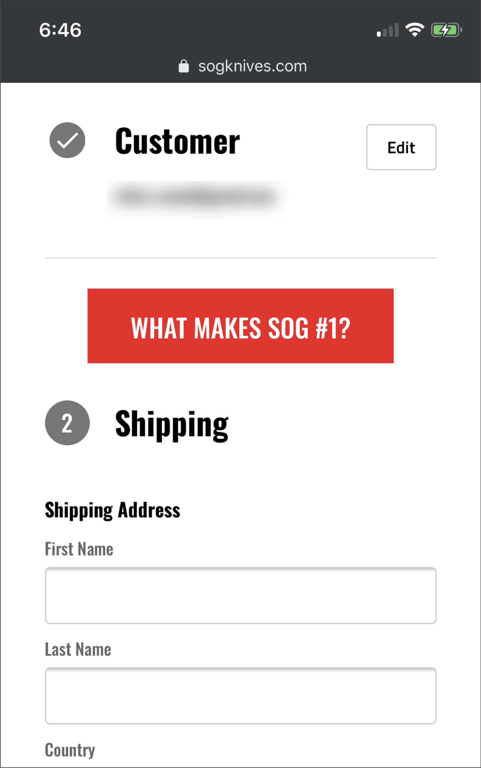
When shoppers click the call to action, they’ll see this lightbox window:
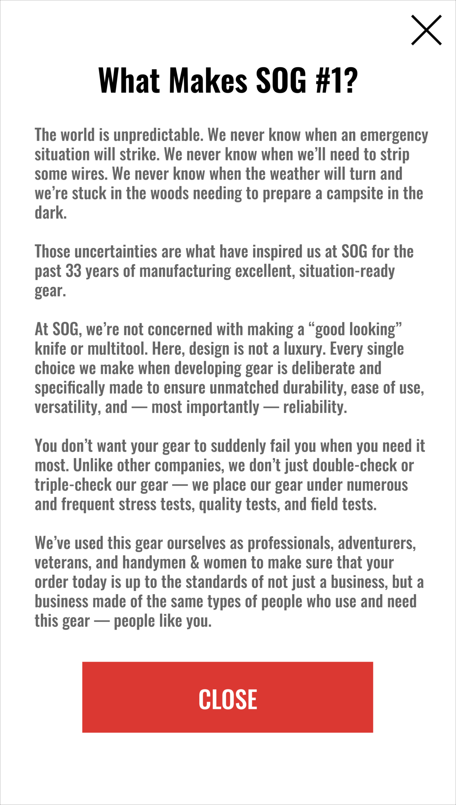
The primary goal of our messaging is to provide shoppers with a final point of assurance before dropping off. In our lightbox window, we crafted copy that does two things:
- It lets shoppers know that SOG values quality over looks, which we believe will appeal to their target audience. Their audience is looking for a knife, a multi-tool, or gear that can withstand unforgiving climates, difficult tasks, and harsh hobbies.
- It lets shoppers know that the people behind SOG are like-minded people. They use these tools themselves and they engage in the same sort of activities as the shoppers. This creates a sense of relatability that we believe the shopper will respond to in a positive way. Our past testing has proven this to be the case more often than not.
We’re confident this sort of messaging can drive more shoppers through the checkout and increase the number of transactions.
Why We Picked This Location to Insert This Message
We placed our call to action above the fold of the checkout page because we want to ensure that as many people as possible see our message. If we place this call to action too low on the page, we’re not going to reach the shoppers who dropped off before scrolling down.
As for the message itself, we placed it here to target shoppers with the highest purchase intent. They’ve already come this far, but even then some still need an extra push to get over the conversion hurdle. An additional point of assurance — like our lightbox window — can do just that.


Comments 2
Back in the “old days” of door-to-door selling we had a mandate labeled “Don’t buy it back!”
ReplyThis meant that once the customer was ready to buy it, stop talking and close the sale. So often a salesperson would say something like “… And there’s a 30 day guarantee!” at which point the customer might say, “Only 30 days? That’s not good enough…” and the salesperson would lose the already closed sale. Test messages carefully as the wrong message could “buy it back.”
Rishi Rawat
This is a very astute point, Mark. You’re totally right. Selling once the buyer is convinced is a bad idea. Every test needs to be set based on the reality of the situation. If the SOG website doesn’t have friction on this step of their mobile checkout they shouldn’t test this idea. If they do (meaning mobile shoppers are having last-minute jitters) they should test confidence messages. In our concept, we’ve proposed one such idea.
Reply