Blog
Improving Your Marketing Messaging in 2019
Many businesses offer consultation services to help their customers find exactly what they need or improve a certain aspect of their life.
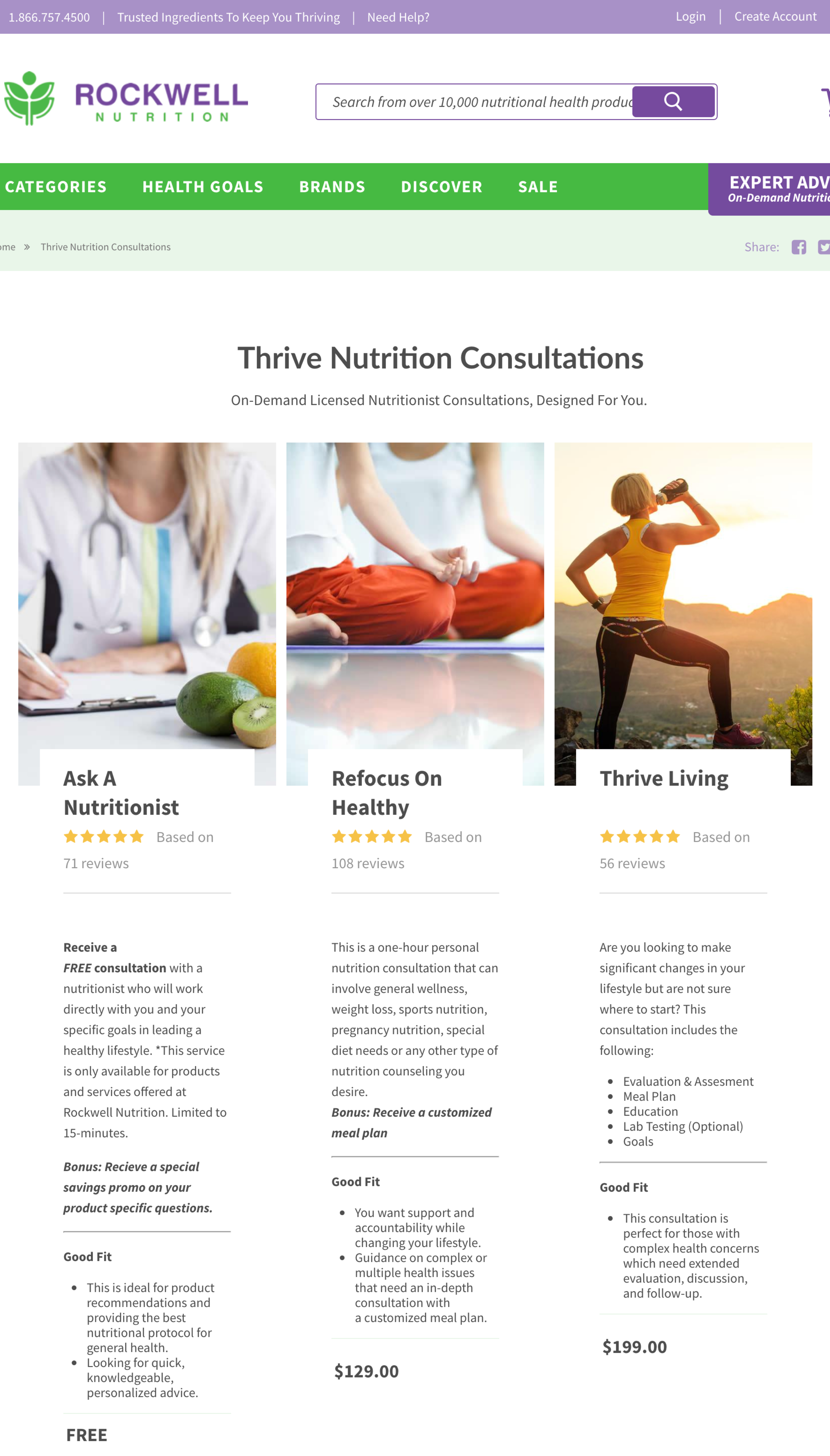
Often, these consultation services are split up into different “levels”. There may be a free consultation, a more expensive consultation package with more features, and an even more expensive package with even more features. Take this page from Rockwellnutrition.com for example:

Shoppers land on this page after clicking on the “EXPERT ADVICE On-Demand Nutritionists” button call to action on the top right corner of any page on the site.
What do we know about shoppers who click this button?
They’re signaling to us that they have some sort of anxiety or concern and they see value in expert advice.
That means our marketing messaging needs to address that. We need to connect with the shopper, sympathize with them, let them know we understand that trying to improve one’s health can be an intimidating task when there are so many products, diets, tricks, and schemes out there.
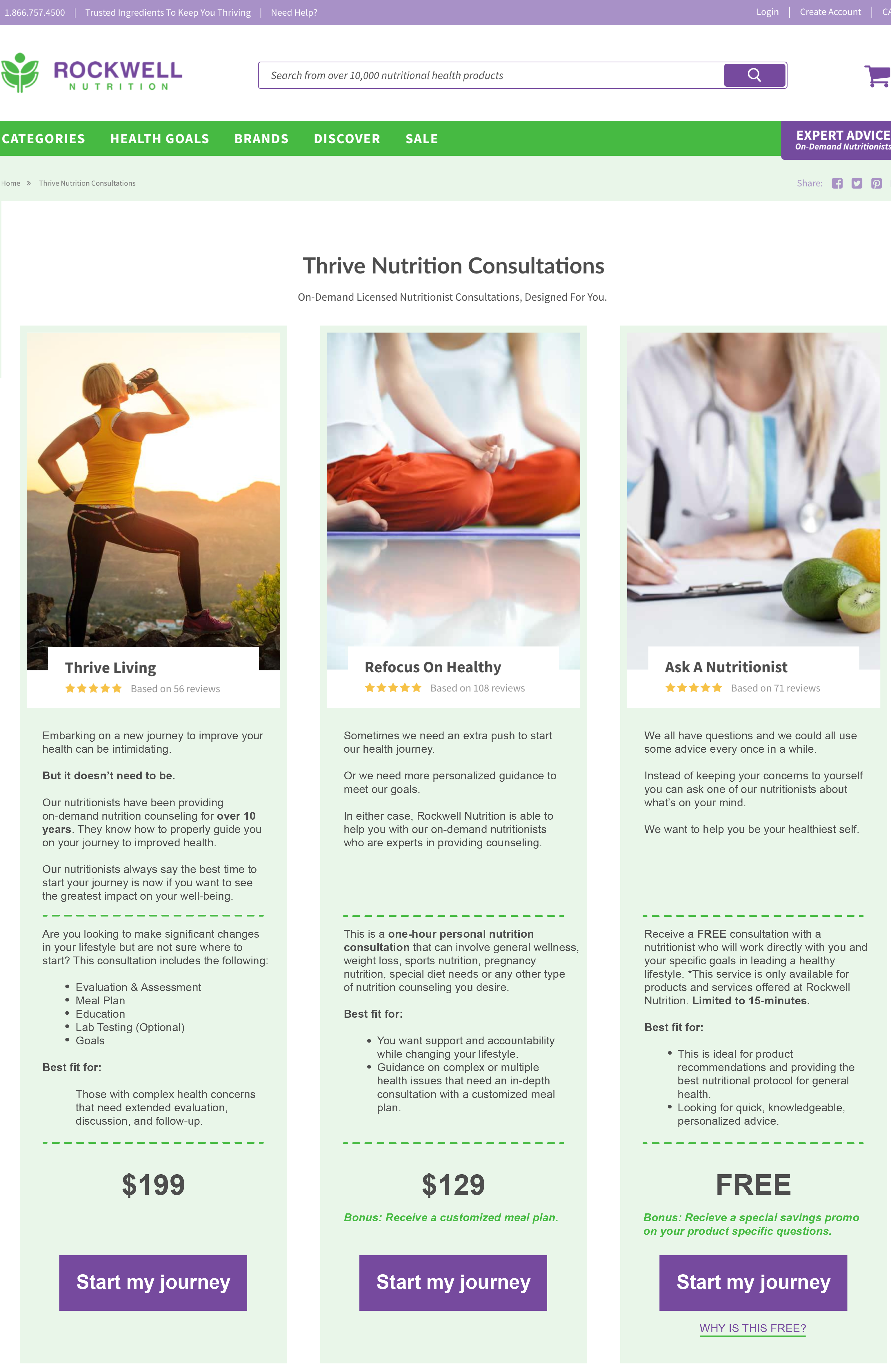
We came up with a concept to do just that:

In our concept, we’ve made 3 major changes:
Change 1:
You can see that we’ve added intro copy to each consultation package. For example, the $199 “Thrive Living” option reads:
Embarking on a new journey to improve your health can be intimidating.
But it doesn’t need to be.
Our nutritionists have been providing on-demand nutrition counseling for over 10 years. They know how to properly guide you on your journey to improved health.
Our nutritionists always say the best time to start your journey is now if you want to see the greatest impact on your well-being.”
With this messaging, we’re letting the shopper know we understand the situation they’re in. But we’re not just identifying the problem. We’re also letting the shopper know we are credible (“on-demand nutrition counseling for over 10 years”) and we have the resources to help them achieve their goals.
Change 2:
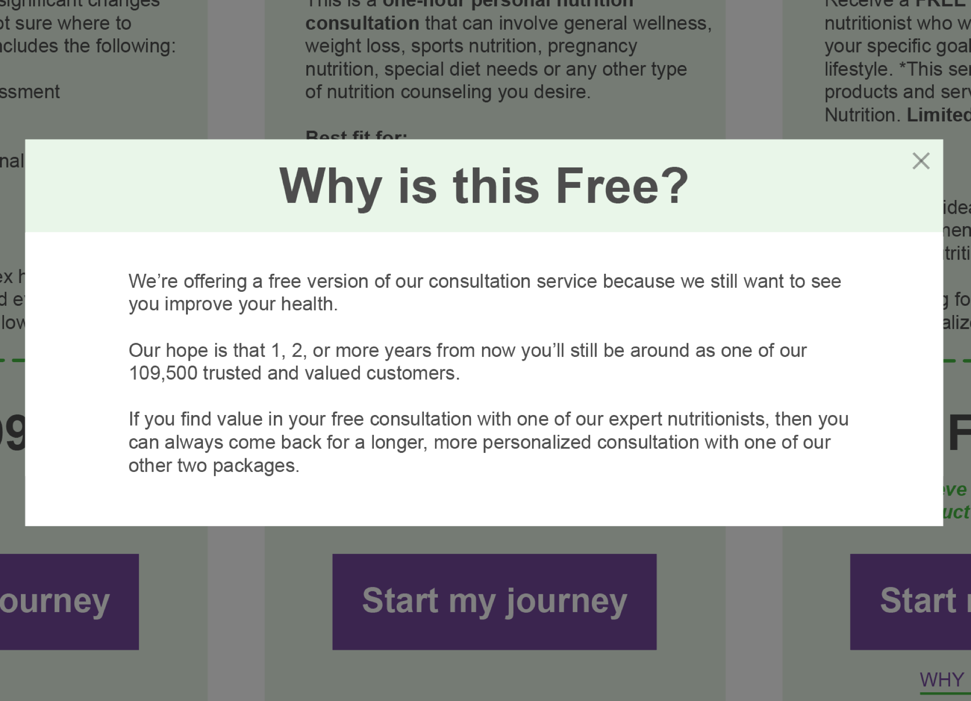
We’ve also added a call to action below the FREE option that says “WHY IS THIS FREE?” When shoppers click this, they’ll see this lightbox window:

The lightbox window reads:
WHY IS THIS FREE?
We’re offering a free version of our consultation service because we still want to see you improve your health.
Our hope is that 1, 2, or more years from now you’ll still be around as one of our 109,500 trusted and valued customers.
If you find value in your free consultation with one of our expert nutritionists, then you can always come back for a longer, more personalized consultation with one of our other two packages.
We’ve added this content to build Likability by letting shoppers know we still want to help them improve their health even if they don’t want to commit to one of the bigger consultation packages.
We also took this opportunity to build more credibility by mentioning the number of customers Rockwell Nutrition has.
Change 3:
We’ve also reformatted the page for two reasons: 1) to increase the appeal of the $129 and FREE options for shoppers who may be more price sensitive, and 2) to make navigating through this page easier for shoppers.
By reordering the consultation packages in order of most expensive to least expensive, we’re tapping into the shopper’s psychology. Our data shows that when shoppers are presented with a more expensive option first then see a less expensive option, they’re typically drawn to the less expensive option (in this case, the $129 and FREE consultation packages).
We’ve also added this button . . .

. . . to the bottom of each consultation package. On the current page, there is no clear “next step” for the shopper—no button or immediately recognizable hyperlink to take the shopper to the page where they need to purchase their consultation package. The shopper is actually supposed to click on the image or heading at the top of the consultation package, but that’s not very clear.
This button makes that next step clear.
Can you apply these strategies to your site? Can you modify your marketing messaging to sympathize with your shoppers?


