
Blog
5 Ways to Fix Leaks WITHOUT a Redesign
The goal is always to increase sales, but there are very few cases when a site redesign is the best solution. One doesn’t rebuild their entire home because the kitchen cabinets look dated.
And that’s why we wrote this article.
Here you’ll find 4 practical things you can do in the next 2 weeks to improve sales.
1. Focus on Converting New Users
As marketers, we spread our attention across various marketing functions (in the image below, “WOM” is “word-of-mouth”):

In reality, we really should focus on:

Why Should We Focus on Converting New Users?
Why new visitors matter: 68% of your site visitors are new (Databox survey). These are people who have a need but don’t know who you are.
If we aren’t succeeding at generating more conversions from first-time buyers, then all other metrics suffer too.
But if you can improve conversions of new users by 15%, not only will that reduce the cost of paid search (since you are now converting with fewer paid visitors), it’ll also improve revenue from future sales, word-of-mouth, cross-sells, and up-sells. A rising tide raises all ships.
The gross impact of a 15% lift in conversions of new buyers equals around a 30% lift in overall revenue. Now that’s a solid return, and exactly why it’s smart to focus on new users.
How Do We Influence New Users?
The #1 question in the minds of first-time buyers is, “Why should I trust what this company is saying?“
You see, this is where the power of storytelling comes in. By making your story 20% more persuasive, you will directly improve the conversion rate of first-time buyers by 20%. We’ve tested this on at least 50 e-commerce sites with great results.
Let’s get one thing out of the way: when we say “storytelling”, we’re not talking about fabricating facts.
Every product innovation has a compelling origin story. However, creators are so close to it they forget how special it is — they don’t think it’s relevant to talk about the 38 times their prototype failed. As a result, they don’t feel comfortable nerding out about their passion. But these are precisely the things your audience is looking to connect over (whether they know it or not).
What’s the Anatomy of a Compelling Story?
- Show how this was a personal struggle. Your visitors are struggling with a problem (that’s what brought them to you); if you can convince them that their struggle is your #1 concern, you will entice them.
- Let readers know they aren’t alone. Hundreds, thousands, even millions have experienced the same problem as your visitor.
- Prove that your passion goes beyond just making the next buck. If Jon Favreau said, “I’m so excited about The Mandalorian. It’s going to make me so much money”, then we’d be super unenthusiastic and it would cause statistically significant financial ruin. Instead, what Jon Favreau will likely say is, “We’re so excited to explore a new storyline in the Star Wars saga” or “I like the image of the Mandalorian because it really hearkened back to the Westerns and samurai films that had originally influenced [George] Lucas”. In fact, Jon Favreau actually said that second one (source).
- Demonstrate value for money. Whether you’re selling a low-cost solution or a premium one, your target audience demands value for money. So prove it.
- Prove that you designed your solution after considering all other available options. Explain how your solution is the best for a very specific audience. The last thing frustrated shoppers want to do is to research more companies. But don’t let that fool you — they will do their research and leave your site to do so. So, by gently suggesting that you’ve done the due diligence yourself, you’re giving them a compelling reason to end their search right there and pull out their credit card.
- Prove to the reader that the buying power is with them. This will signal that they are driving the experience.
- Make the reader feel good about themselves. Flattery can go a long way, but it must be subtle and genuine or else it can have a negative effect.
- Make them feel smart. See above.
- Show your human side. People buy from people they like. So show your sense of humor, display vulnerability (“38 prototypes failed”, “at times I almost gave up”), demonstrate that you’re trustworthy. The reality is that the majority of sites (upwards of 90%+) don’t do this and shoppers are stuck staring at buttons, clicking links, and forgetting that real people are behind the business they’re learning about.
Just this one idea will help improve sales without a redesign. But you want more, I get it. Read on …
2. Think Mobile First, Second and Third
Over the last 16 years, we’ve analyzed data for 150 totally different e-commerce websites.
What many marketers thought (or still think): we used to believe users almost exclusively researched on their phones and purchased on their desktop. This is 100% false today.
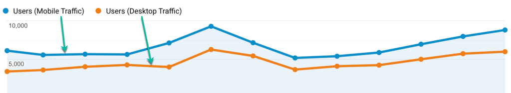
Reality: here is what we see today . . .
Mobile versus desktop traffic (actual data):
Conversion rates on mobile versus desktop (actual data):
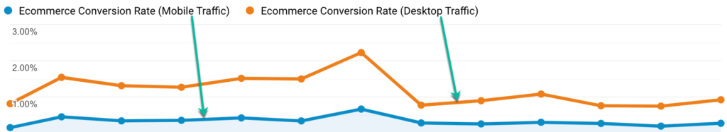
Although the desktop conversion rate is higher, plenty of sales are still happening on mobile.
But more importantly, if the majority of your traffic is mobile, you should be spending the majority of your time looking at and optimizing your mobile site.
News Flash: your mobile conversion rates can be higher than desktop. All it takes is a little TLC and a laser focus on your mobile strategy.
How Can I Start to Fix My Mobile Sales?
Create a free Hotjar.com account and record only your mobile visitors. Why? So you can study user behavior.
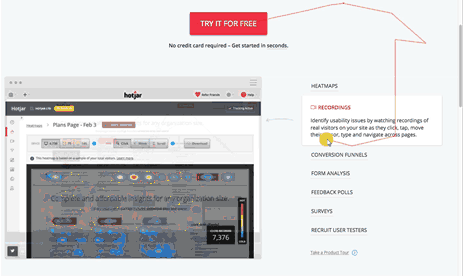
Do this for the next 7 days: in the morning, visit your mobile site and spend 15 minutes walking in the shoes of a new visitor (i.e. experience your site from the perspective of a first-time buyer who is unfamiliar with your business and product or service). Then spend 15 minutes looking through Hotjar recordings and make note of 2 key “aha” moments.
Post lunch, visit your top 3 competitors on your phone, and note 2 key “aha” moments.
Do this for 7 days and you’ll have a list of 28 critically urgent ideas for improving your mobile site.
We spend so much time looking at our desktop sites that we are totally disconnected from our increasing mobile traffic.
OK, so this next idea is my favorite way to improve sales without a redesign…
3. Rewrite the Product Descriptions of Your Top 3 Bestsellers
It’s likely your best-selling product pages drive upwards of 50% of your overall sales. That’s great. But how often are you testing on these pages?
If you don’t have an A/B test running right now, you might be definitely are leaving money on the table.
Example Time
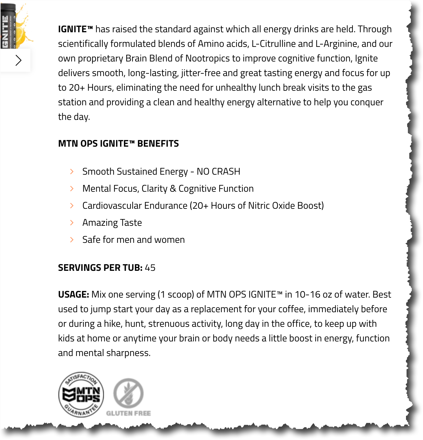
MTNOPS.com (not a client) sells energy and nutritional products for those who train and love the outdoors. Their site looks and functions great, but there’s still always room for improvement.
We looked at one of their bestsellers— their IGNITE energy blend — and rewrote their product description.
Here is the core story they are telling on their product page:
And here is the concept we would run as a test:
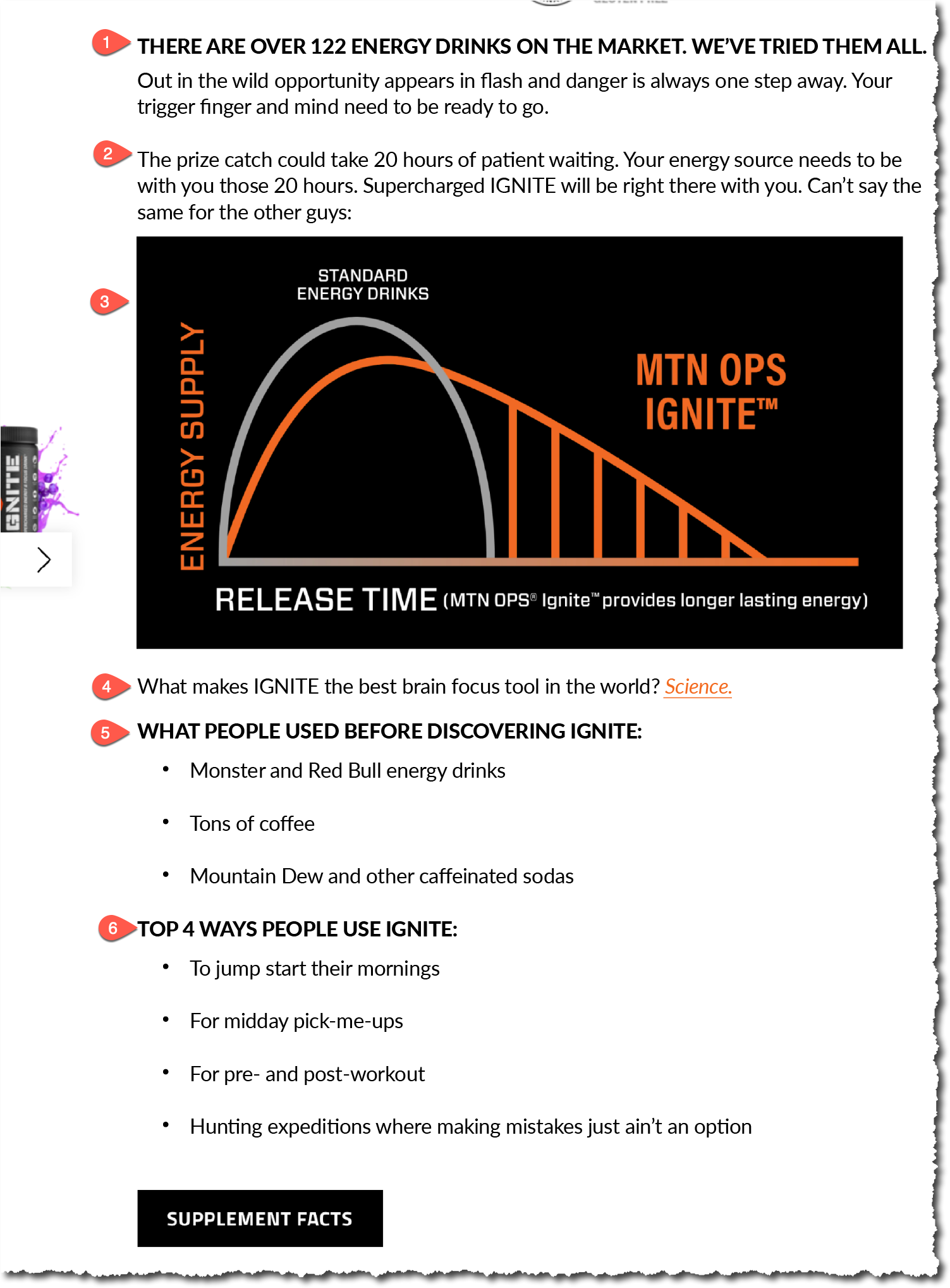
Idea Explanation
Forget about the tactics we used. What we’d like to talk about is why we made the changes we did. Pay attention to the numbered list above:
- We added the heading: THERE ARE OVER 122 ENERGY DRINKS ON THE MARKET. WE’VE TRIED THEM ALL.
This heading is very effective because the biggest competition for MTN OPS is other energy brands. What this headline makes clear is that there are 122 alternatives out there. What’s particularly clever is that we said WE’VE TRIED THEM ALL, and not THEY ARE ALL TERRIBLE. There is a reason for this. Because had we said the latter we would be making a marketing claim and shoppers are savvy enough to discount marketing claims. So we didn’t make a claim. Instead, we simply stated WE’VE TRIED THEM ALL.
Our brains are programmed to fill gaps, so when people read this they’ll think, “since they’ve tried all the competitors, it’s clear the folks at MTN OPS felt their energy drink was better. Why else would they have launched this product?”
See what happened here? The reader completed the punch line for us. There can be no better marketing. - People don’t buy products, they hire them to do a job. A lot of the people who shop on this site are hunters, which means they think about hunting. So our copy paints a hunter specific picture.
- A picture is worth a thousand words. So we show a graph to communicate how effective this product is.
- Buyers are skeptical, as they should be. So we back up the claim by adding a link called “Science”. And clicking this reveals 3rd party analysis.
- Visitors to MTN OPS have been using inferior substitutes to get their fix. By listing these substitutes we’re helping the reader think, “Hey, that’s what I’ve been doing!”
- Finally, we’re showing all the ways in which this product can be used.
As you can see from example above to improve sales you can just rewrite your product page and bypass a site redesign.
4. Work on Your Top 3 PPC or Organic Landing Pages
First impressions matter. According to a 2020 Wolfgang Digital report, the average bounce rate for a retail e-commerce site is 41%. (Source).
This means 59% of the traffic you are working so hard to attract are coming and then immediately leaving. They don’t even go beyond page 1.
This isn’t your fault. Shoppers are extremely finicky. But you can’t run a business with a 59% leakage rate.
The fix
Set up Hotjar recordings for these top 3 landing pages. Before looking at the recordings, write down your theory for what might be happening on those landing pages. Now watch the recordings.
- Are shoppers behaving as your theory speculated?
- What’s different?
- Why do you think they’re behaving the way they are?
The #1 thing to know about landing pages is that landing traffic is super distracted:
- These people have never seen your site before, they aren’t familiar with your page layout.
- Everything is new to them.
- They are in “quick look” mode (think back to your own online behavior).
Selling them on your solution is miles into the future. For now, forget conversions. Instead, we need to focus on preventing landing traffic from exiting within the first 10 seconds.
Landing pages have just one role:
Slowing visitors down so they’ll spend 30 seconds on your site instead of just 10. Our goal is to drive up engagement 20 seconds at a time. Now is the time to think of ideas for slowing people down.
One tactic we use on landing pages is crafting copy that directly connects with and engages the audience. The idea below is great because it is such an effective way to improve sales without having to hire an agency to redesign your whole site.
You might have guessed by now that we like to avoid redesigns most of the time because there are better ways to increase sales.
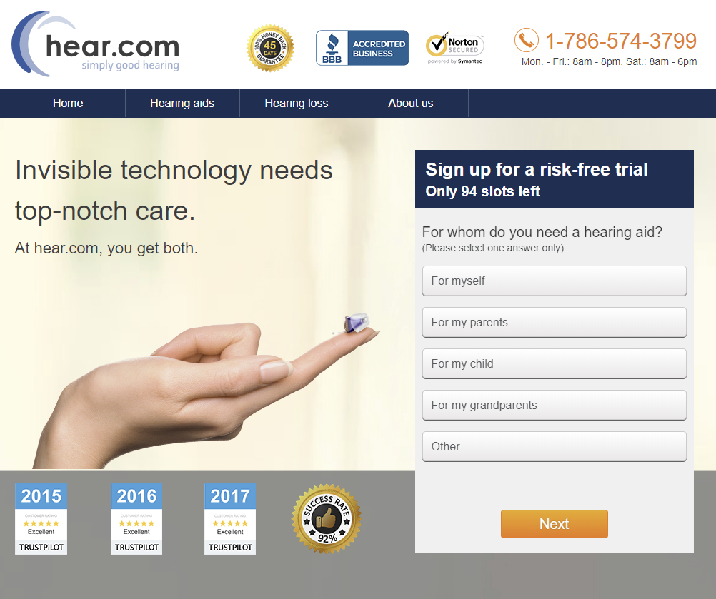
Example Time
It takes the average user 7 years to acknowledge that they need a hearing aid. People visiting hear.com (not a client of ours) would likely be in that camp.
Imagine that this is their #1 landing page:
This would be our test concept for the landing page (notice the question that’s been added to the top of the page):

You’ll notice we didn’t touch the design. Instead, we added simple text. As marketers, we spend so much time developing the most elegant design we forget that shoppers are there to do a job, not admire your work.
Our above concept forces the user to interact with the “Guess how long … ” question.
If a user selects the wrong answer, this is what they’ll see:

The user is encouraged to try again.
This what a user will see if they select the correct answer:
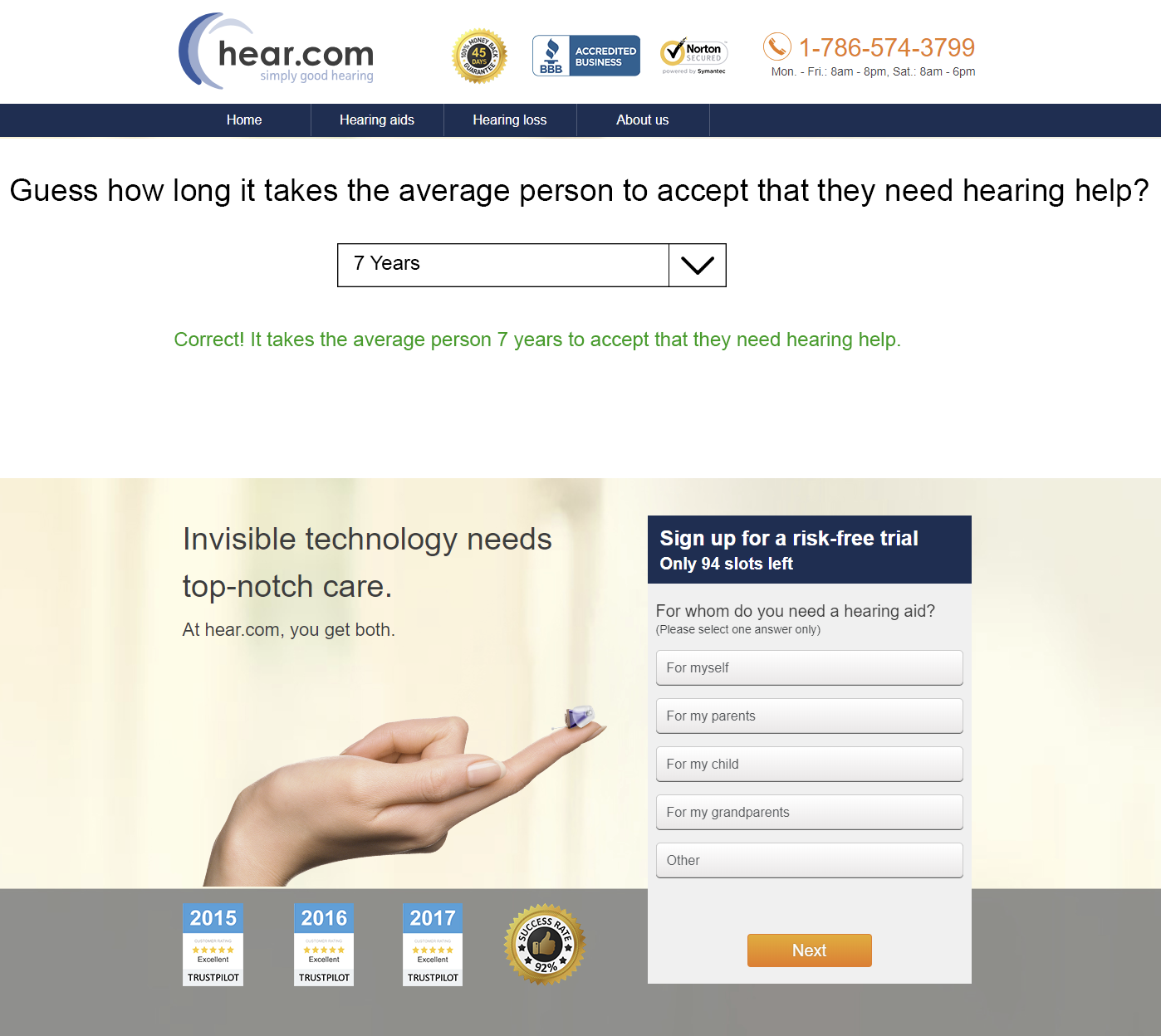
Saw what we did there? We inserted a question that directly connects with the audience. And then we allowed them to engage with it.
Not only does this warm them to our solution, but more importantly, it slows them down.
The 4 ideas above are guaranteed to improve sales without the need for a redesign.
5. If You Don’t Have the Time
We understand — you sometimes always have a lot on your plate. Focusing on a new project like this can be overwhelming. Additionally, you’ve grown accustomed to your site, product, and/or service. And that can make it difficult to truly see where problems are.
If this is how you feel, then working with a team that is singularly focused on boosting conversion rates (that’s us) can be a great idea.
Sound good to you? Great, pick a time on our calendar and let’s talk!
Bottom line: Don’t do a redesign Make small strategic buyer psychology informed adjustments, and improve sales without a redesign.
A Little About Us
Thank you for reading this article. We are Frictionless Commerce and over the last 16, we’ve thought about just one thing: how do we get online shoppers to convert? We’re fascinated by buyer psychology. Once we’ve understood how your site visitor thinks we use our 9 point copywriting process to convince and convert them.
If you’re on LinkedIn much you can should definitely connect with me. I’m posting ecommerce conversion ideas every day, multiple times a day.


Comments 19
Love this post! There is so much actionable advice. Need to start at the top and work my way down.
Very valuable information. Sometimes as business owners we get caught up in the day to day tasks that we don’t see these things. We get so used to our website that we overlook areas that can be improved. It’s good to have some outside insights like this.
I’m saving this one and starting this week working through the list.
THANK YOU!
ReplyRon yates
Rishi Rawat
Thanks, Ron. Took me 10 years to create this list. You are the first person I shared it with.
ReplyThanks for the link to the article. Making some notes as I read it.
Regarding point 1, this is PRECISELY the secret to our success with https://www.efisystempro.com. I try to put compelling content into each product page, but more than that our “EFI Pro Hangout” blog answers some of the most pressing questions regarding the EFI system that we sell. I do this in a clear, concise manner that is very professionally done (IMO.) Once I post an article I push links to a few strategic forums and FB pages and let folks eat what I’ve put out for them. I invite questions and provide great personalized answers when I get them.
This is not something that lends itself to every website. It works for EFI System Pro because there are deep questions that need in-depth answers. It also works because there is a huge and growing community surrounding aftermarket EFI systems. There is neither for our https://www.racing-seats-usa.com website. This doesn’t mean it can’t be done, but it is viewed as contrived, at best, and disingenuous at worst. Shopping at sites like this needs to be like removing a bandaid. Help them get it done as quickly and painlessly as possible. They will see through anything else as a marketing ploy.
Point 2: SO TRUE! I recognize the need to focus more of my time in this area and hope to do that. This is a great process for doing it.
Point 3: As we’ve recently shown, this sometimes simply has limited impact. I think that certain types of product websites lend themselves to a serendipity marketing style. Energy drinks are a perfect example. If you try to market energy drinks with my style you are going to fail. However, when you try to market EFI Systems in an energy drink fashion the customer wonders if you are taking your product (and, by extension, them) seriously. Taking a light attitude toward energy drinks is very effective. Not so much for $2000+ EFI Systems being sold to baby boomers.
Point 4: This is a great point I need to assign to our digital marketing team member.
Point 5: Of course!
ReplyRish, this is an excellent post. I actually just referenced it on my LinkedIn account: https://www.linkedin.com/posts/shilojones_5-ways-to-fix-leaks-without-a-redesign-activity-6627219206402383872-W2mQ
My wish for marketers this year is to simply test more. In my experience, most tests don’t move the needle so it requires digging much deeper this post helps people start thinking more deeply about the types of changes they can make.
ReplyRishi Rawat
Oh man, that made my day. Actually, it made my whole week 🙂
ReplyRishi,
ReplyAs always, great post. I especially love the compelling story section of #1. It’s surprising to see how many companies we work with that don’t understand the value of the words on the site. WORDS matter and your points are right on.
Thanks for sharing your brain.
Rishi Rawat
Thanks, Brita. Means a lot. I think sometimes we’re so close to the problem it’s hard to see the obvious stuff. For example, my own site doesn’t do a good job telling a story. Cobblers Children Syndrome.
But this is why it makes sense to hire an outsider.
ReplyI’d love to see a “checklist” where you grade my https://WalkinPets.com according to each of these concepts.
The only area I would question is making the site 100% focused on new users. This is great — and obvious — but our existing customers need to feel like a part of our community. I appreciate it when I go to a site, they recognize me, and welcome me back.
“Sometimes you want to go
ReplyWhere everybody knows your name
And they’re always glad you came
You want to be where you can see
The troubles are all the same
You want to be where everybody knows your name”
Rishi Rawat
Hi, Mark. Thanks for the comment. Just realized I made a mistake with the title for point #1. I called it “Focus on New Users”. I meant to say “Focus on Converting New Users”. A subtle but important distinction. Thanks for your input.
ReplyKnowledge bomb! Thanks for another great article Rishi. My vote is for #1.
ReplyRishi Rawat
I vote for #1 too! Thanks, Gajan.
ReplyThis part really stood out to me: “See what happened here? The reader completed the punch line for us. There can be no better marketing.”
It’s so easy for me to get carried away talking, but it seems much smarter to focus on the conversation in the other persons head and focus on interacting with that.
Cool stuff Rishi!! 🔥
ReplyRishi Rawat
So glad you liked it, Tommy.
ReplySuper good stuff, Rishi!
More and more companies need to test these ideas out and I’m sure you can greatly help them.
Best wishes,
ReplySumantha
Rishi Rawat
Thanks, S.
ReplyI like that all of these are pretty straightforward and actionable.
I think you make a great point about mobile first and how it can move the needle, and I also like the idea of focusing on converting the new people. I also like the product descriptions for your top products idea.
ReplyRishi – Love this!
By chance is there a pdf that I can print and save?
Thanks for your great ideas. Now I need to start implementing!
ReplyGreat post with a wide range of strategies to help businesses improve their site without having to “throw the baby out with the bathwater.” So many times we hear companies say they need to stop and redesign their site, when what they need to do is stop and rethink their site. This especially means viewing their site from multiple perspectives. Your second point on “Think mobile first, second and third” is so true. Most companies we talk to haven’t even realized that their mobile traffic has surpassed their desktop in the past 5 years. Going all-in on mobile can have immediate impacts to your business’s performance.
One additional tip we recommend is having a Mobile Day at work. For one day, have everyone at the company work off their mobile devices to have them feel the frustration of navigating and consuming content on phones. Then in the afternoon, ask them to spend 30 minutes browsing their company’s site. Have them note what they like, don’t like, where they got confused or lost, and what they found useful or not. The amount of issues, questions, and ideas that come from all across the company can be invaluable to improving and evolving the site for your business. Tapping into the collective thoughts of your whole staff versus just relying on the web team will bring a completely fresh perspective to your process and often fill your testing pipeline with great new ideas.
ReplyRishi Rawat
I love the idea of “Mobile Day at work”. Great insight (I might steal this).
I also like the added benefit of getting ideas from all employees (and not just the team responsible for the site).
Reply