Blog
How to Write Product Description that Sells (with Example)
Product descriptions aren’t appreciated enough and knowing how to write product description that sells is a special skill. But there is a formula for it, which we reveal in this post.
Let’s start from the top.
Google a term like “cell phone charger” and you’re likely going to see a top-of-page result like this. What you’re looking at is Google’s Product Listing Ads (definition) result:
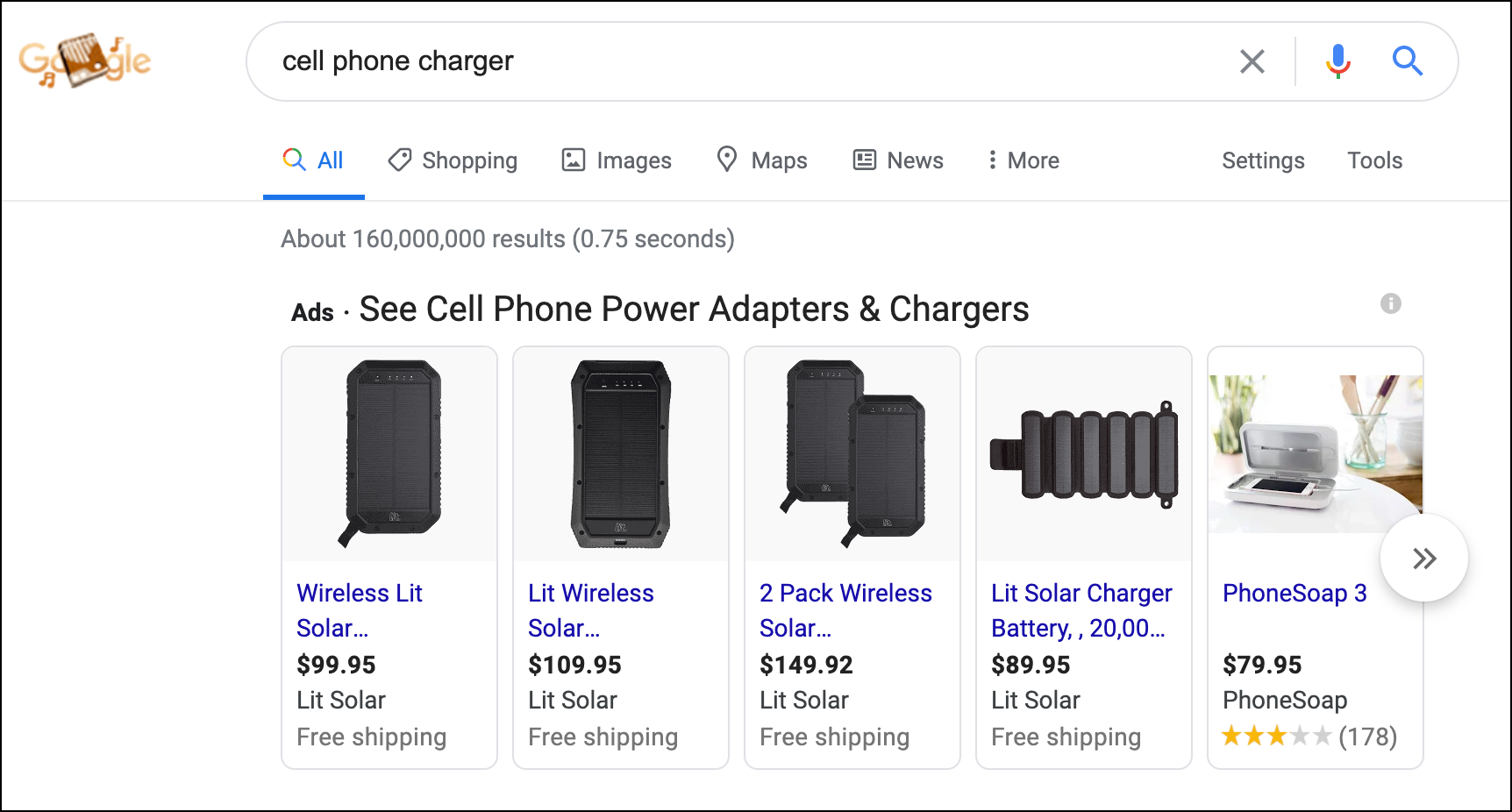
This means that even though you’ve been obsessing over your homepage design, for most new visitors their first impression of you will be on your product page. Your product page is the homepage, so you better make an impression.
You spent money to attract this visitor. This visitor was different. Unlike 91% of new
This visitor was digging you.
They then went a few steps further and looked at a few product pages to finally zero in on THE product page.
Once the user is on the product page the only thing that matters is the product description. Sure, you have product reviews— but those are things other people are saying about you. Do you really want sales to be at the mercy of reviews of other people?
That is why having a killer product description really matters.
If we fail now everything else that’s been nailed till this point will be lost.
There are many best practices for product descriptions:
“Focus on Benefits”
“Tell a Story”
“Use Power Words That Sell”
“Know your Audience”
“Scannability”
These strategies are great but they aren’t exactly rare. Marketers already use them. Your competitors also use them, which means in order to have an impact you need to work extra hard on “Tell a story” if you decide to go with that tactic.
Let me share two interesting ideas.
Product Description Example 1– Different POV
What if we flipped the way the product description was written? Instead of treating your product as an inanimate object what if we brought it to life and let it tell its own story?
That’s exactly what Ora.organic does on its organic probiotic product page:
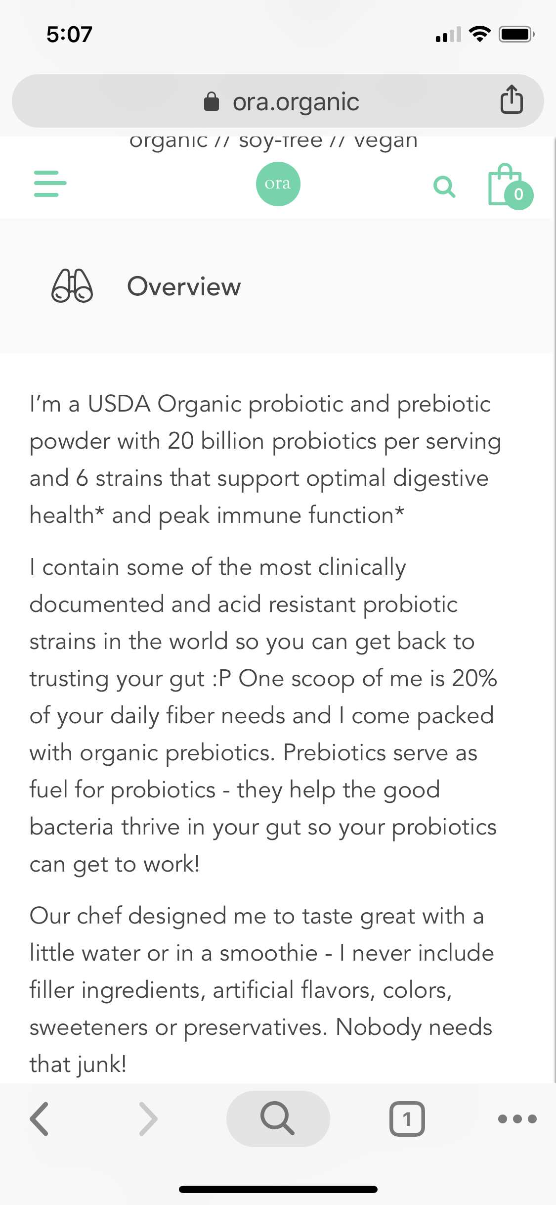
This is a genius tactic. I study online retailers 8 hours a day. Have been for the last 13 years. This is probably only the second time I’ve seen this tactic used
Run an A/B test. Test this on your best-selling product page and let me know how it did
Product Description Example 2– Expert Review
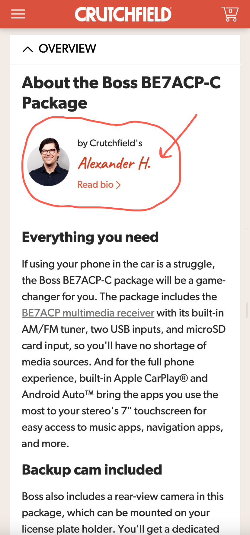
This is a product description on Crutchfield.com.
It’s such a genius idea to have the product described by a product expert on your team.
The shopper is reading an expert opinion 🆚 a marketer’s syrupy pitch.
These two examples are a good place to start but if you want to really learn the secret to how to write a product description that sells you need to dive into the fascinating world of buyer psychology. In the following section, we’ll give a detailed step-by-step guide on conversion rate optimization, buyer psychology, conversion copywriting, and product page optimization.
Revealing It All
Let’s start by answering the most important question:
Why Listen to Us?
We’ve spent the last 16 years in our marketing lab 🧑🔬 🧪, experimenting on online shoppers. We’ve learned a crap ton and are ready to share those learning.
We want more marketers and CEOs to know about it.
Eventually, we’ll make this into a book. If you want an unfair advantage over competitors now is the time to steal our ideas because once they are published the cat will be out of the bag.
Each chapter in our forthcoming book will feed into the next. Click the link that best describes where you want to start the story:
Chapter 1: is all about conversation rate optimization (CRO). It talks about the history of CRO, statistics of CRO, and describes how most agencies do CRO. We need to describe how most are doing it before revealing our process (that’s the topic of Chapter 4.)
Chapter 2: For every 1,000 product pitches encountered the shopper buys 1️⃣ item (and we’re being generous). If the goal is to have the consumer choose your product we need to understand their selection criteria– we need to understand their buyer psychology. Marketers who nail this will always outrun their peers.
Chapter 3: Conversion optimization work typically focuses on design and layout changes. We don’t limit ourselves to design and layout. Through extensive experimentation, we realized that the thing that moves the conversion needle 🧭 are the words and ideas expressed on the page. Conversion copywriting is where it’s at.
Chapter 4: Marketers make a fatal mistake. They focus on optimizing the whole site. We focus on the tip of the spear. The most important page on your entire site is your product page. To understand why this is, read this post: Product Page Optimization.



Comments 7
Love it! It shows so much character, it’s interesting and engaging. I will try this.
ReplyRishi Rawat
Yes, test it. Also, what do you think about this idea? https://frictionless-commerce.com/blog/using-video-in-popup/
ReplyThat is fun! Love the life here!!
ReplyHow about humanizing the product further as an illustration and storyboarding. You can achieve the same output with higher engagement at 1/10th the word length?
ReplyRishi Rawat
I absolutely love this idea. You have taken the basic idea of this post and made it 10x better. I envy you 🙂
ReplyGreat idea!
Perhaps they’re currently testing this, because it already appears different on their product page.
ReplyRishi Rawat
I had noted this idea 6 months ago. And 3 months ago I noticed Ora removed it. They may have removed it because it didn’t fit their brand voice (even if the concept won) or because it creates a unique challenge for the marketing team: “if the idea wins do we rewrite ALL our product pages this way?” That’s a question I’ve had to deal with many times.
Reply