Blog
How to Optimize B2B Lead Form Pages for Better Results
After searching for “video management software” on Google, we stumbled upon Costarvideo.com—the website for Costar Video Systems. After reviewing their site, it became clear that Costar is primarily a B2B (business-to-business) seller of video management software, surveillance cameras, digital video recorders, and other similar security products.
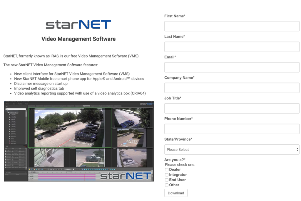
The focal point of their site—the element they are trying to draw the shopper’s attention to—is undoubtedly their video management software, StarNet. This is what their StarNet page looks like:

Costar’s goal on this page is to get shoppers to download their software after filling a lead capture form. How can we improve the conversion rate on this page?
B2B sites are often filled with jargon and words that are unique to that specific business. On the StarNet page, Costar mentions in the features section that StarNet offers “video analytics reporting supported with use of a video analytics box (CRIA04).”
As marketers, we often make the assumption that shoppers will understand everything we say on our sites. This is a habit we need to kick. While some shoppers (and certainly return shoppers) will be familiar with what a video analytics box is, many others will not be, especially if this is their first time searching for security video solutions. To tackle this issue, we developed a concept for this page:

In our concept, we’ve made 3 key changes.
Change 1:
Let’s take a closer look at the features section:

Beside “video analytics box (CRIA04)”, we’ve added a tooltip. Once clicked, the following lightbox window will appear:

This lightbox window features a video from Costar’s YouTube channel that provides an in-depth explanation for the CRIA04 video analytics box. For shoppers who had no idea what a video analytics box was, they now know. This new information makes the product more compelling for them because now they have a better understand of how it works and what benefits it provides.
Change 2:
Another way B2B sites can improve conversions by helping shoppers visualize the product or service. Costar takes a baby step in this direction by including an image of their video management software interface on the StarNet page.

However, the image is small, which means it’s difficult to see all the details. To help shoppers visualize the product a bit easier, we’ve made the image clickable in our concept. Once clicked, a much larger version will appear in a lightbox window:

Now shoppers will really be able to see what the interface looks like and how it works.
Change 3:
Lastly, we wanted to take advantage of something called the Zeigarnik Effect. In marketing, the Zeigarnik Effect is used to refer to the shopper’s better recollection of unfinished tasks instead of finished tasks. Shoppers want progress when they see something is incomplete.
In our concept, we’ve hidden the lead capture form by default:

Instead, the shopper is now required to click a button that says “DOWNLOAD NOW”. When they do, the full lead capture form will be revealed. Now that shoppers have begun the process of downloading the software, they will feel more obligated to fill out the form because it’s incomplete.
Another marketing practice you’ve likely seen that takes advantage of the Zeigarnik Effect is a progress bar. Progress bars serve as visual reminders that a task is incomplete, but nearing completion.
Each of these changes contributes to better conversion rates. Can you adopt any of them on your own site?


