Blog
Helping Shoppers Choose Between Similar Products
Travelpro sells garment bags, suitcases, executive briefcases, rolling travel duffel bags, totes and backpacks on their site, travelpro.com.
With all those choices—which at first can seem so similar—it becomes difficult for some shoppers to figure out which one best suits their needs.
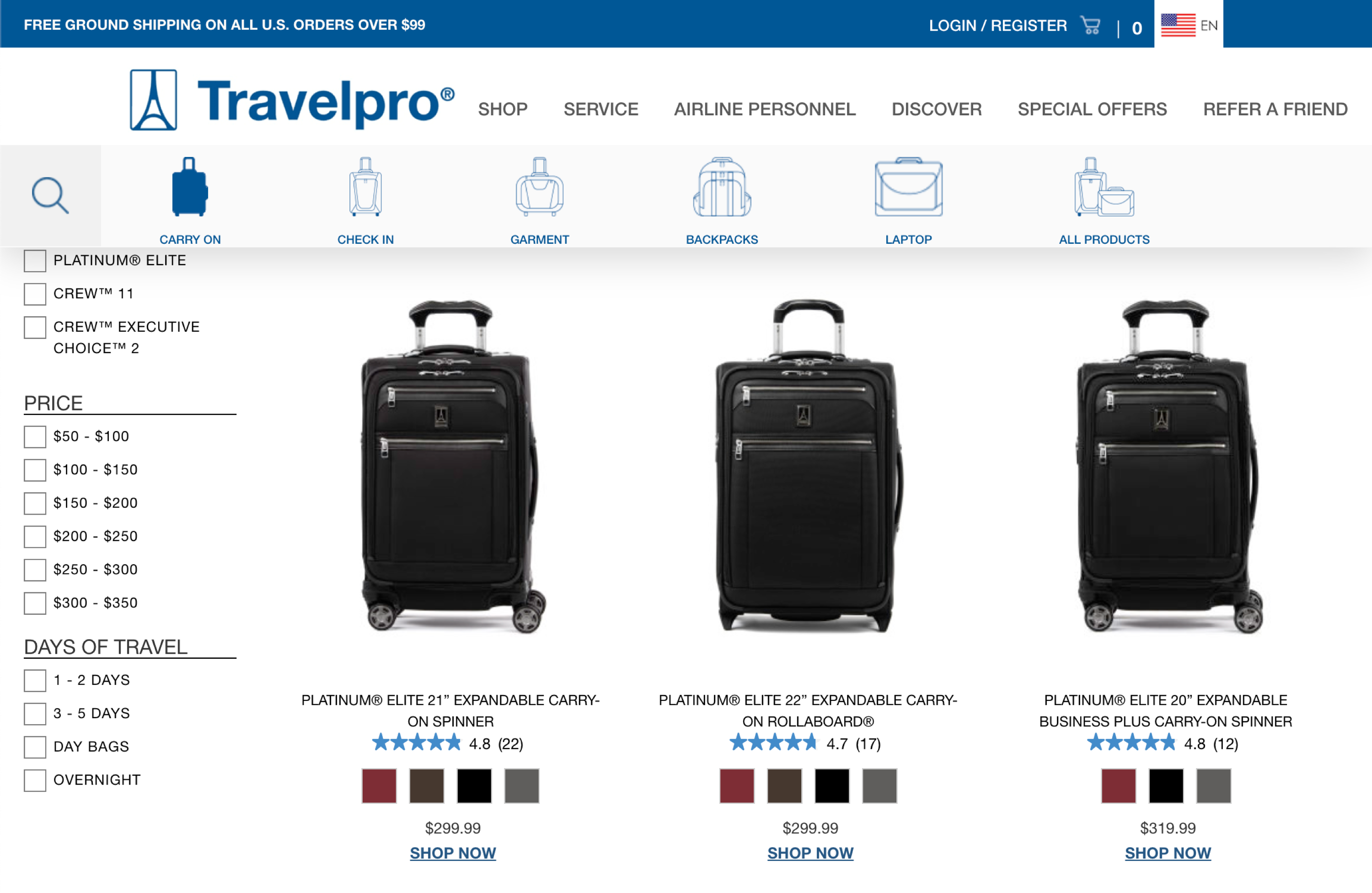
Let’s look at their carry on luggage category page:

Can you spot the immediate differences between these 3 popular products? They’re similar in size (21″, 22″, and 20″). They have similar color options. Two of them are the same price.
Long story short, it’s difficult to really tell what separates these products. The challenge is that category pages have limited real estate to play with. The next best option is to make a change to the product pages to quickly let shoppers know the differences between each product.
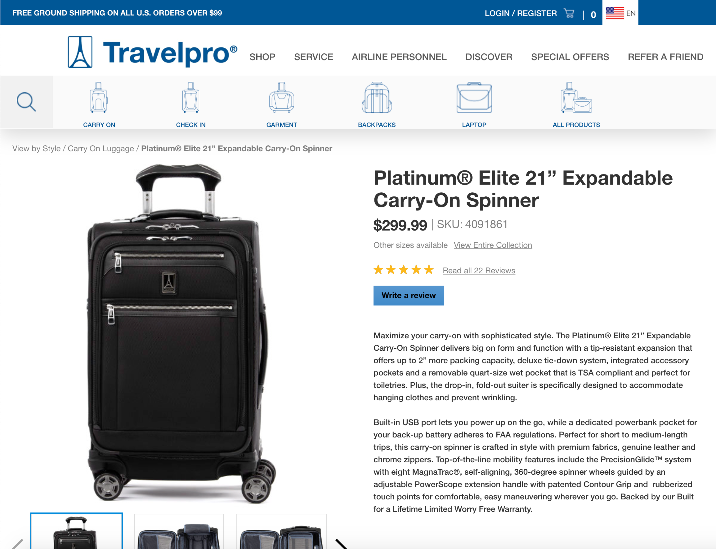
Let’s take a look at one of these product pages:

Below the fold, there is a product demo video that shows shoppers exactly what they’ll get from this product. However, we’re not convinced that as many people as possible are watching this video. It’s detached from the product description and there is no messaging letting shoppers know what the video talks about.
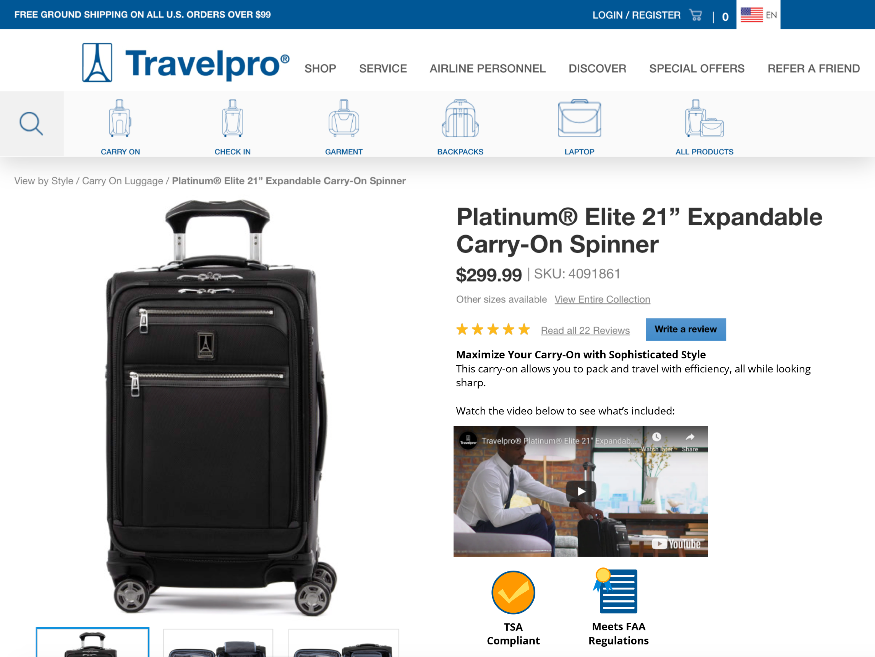
In a concept we created, we increased the visibility of this demo video to immediately let shoppers know what makes this product special:

In our concept, we’ve reduced the product description to a minimum. Instead, we wanted to lead the shopper into the video, which explains the product visually (sound isn’t even needed).
This will immediately let shoppers know if the product meets their needs.


