Blog
Gift Ideas
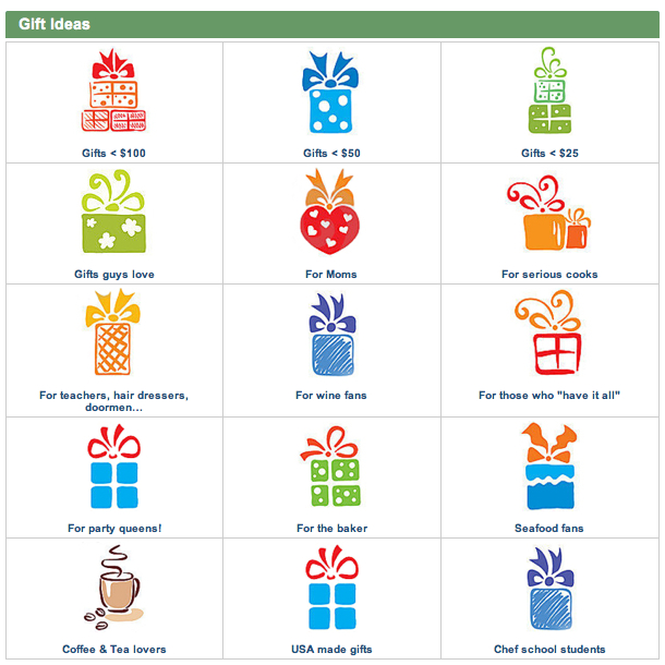
MetroKitchen.com is a site that specializes in cookware. They have a simple, yet very effective Gift Ideas page …

… where shoppers select a relevant option and see a list of highly targeted gifts.
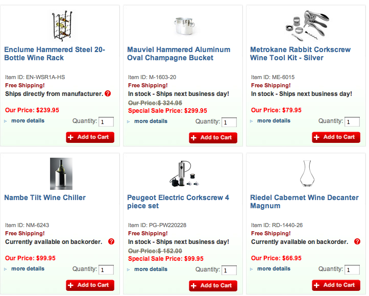
Opportunity: On “For wine fans” page (for example) MetroKitchen.com just lists products–

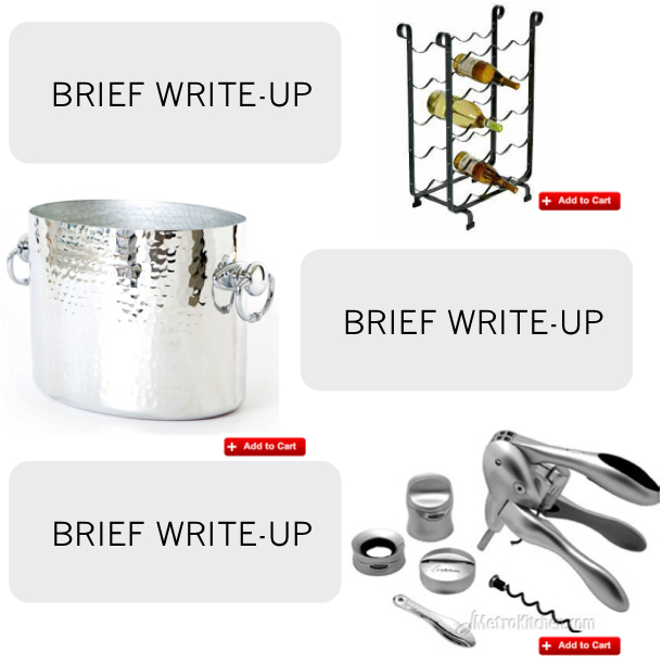
Which means I have to click the first item, read description, hit back button, click the second item, etc. I wish they had presented Wine Gifts in this format …

… so the shopper could read a short description for each product and then visit product page to make purchase.


Comments 4
Yep, good point. Also, if it was reformatted it could easily be leveraged as an email to a subset of their customer list…They do segment their list don’t they?
ReplyYou’re right, that would be a good email. And no, I don’t know if MetroKitchen.com segments their list.
ReplySmart thinking.
The start page (under $100, under $50 etc) needs warming up as well – how about:
* Fewer choices – 15 is way too many
Reply* Icons that show the category – not just a pretty box 15 times
* Bigger font for the category name
betterretail
Excellent suggestions, John.
Reply