Blog
Coupon or Discount Pop-up Not Boosting Conversions? Try Gamification
What Does Gamification Have to Do With CRO?
Gamification (definition) is a strategy to add excitement to a task and is designed to improve engagement. There is a direct correlation between time on site (TOS) and conversion rates. I know this because I’ve been studying ecommerce data for 11 years and have seen data for over 120 different ecommerce businesses.
Context
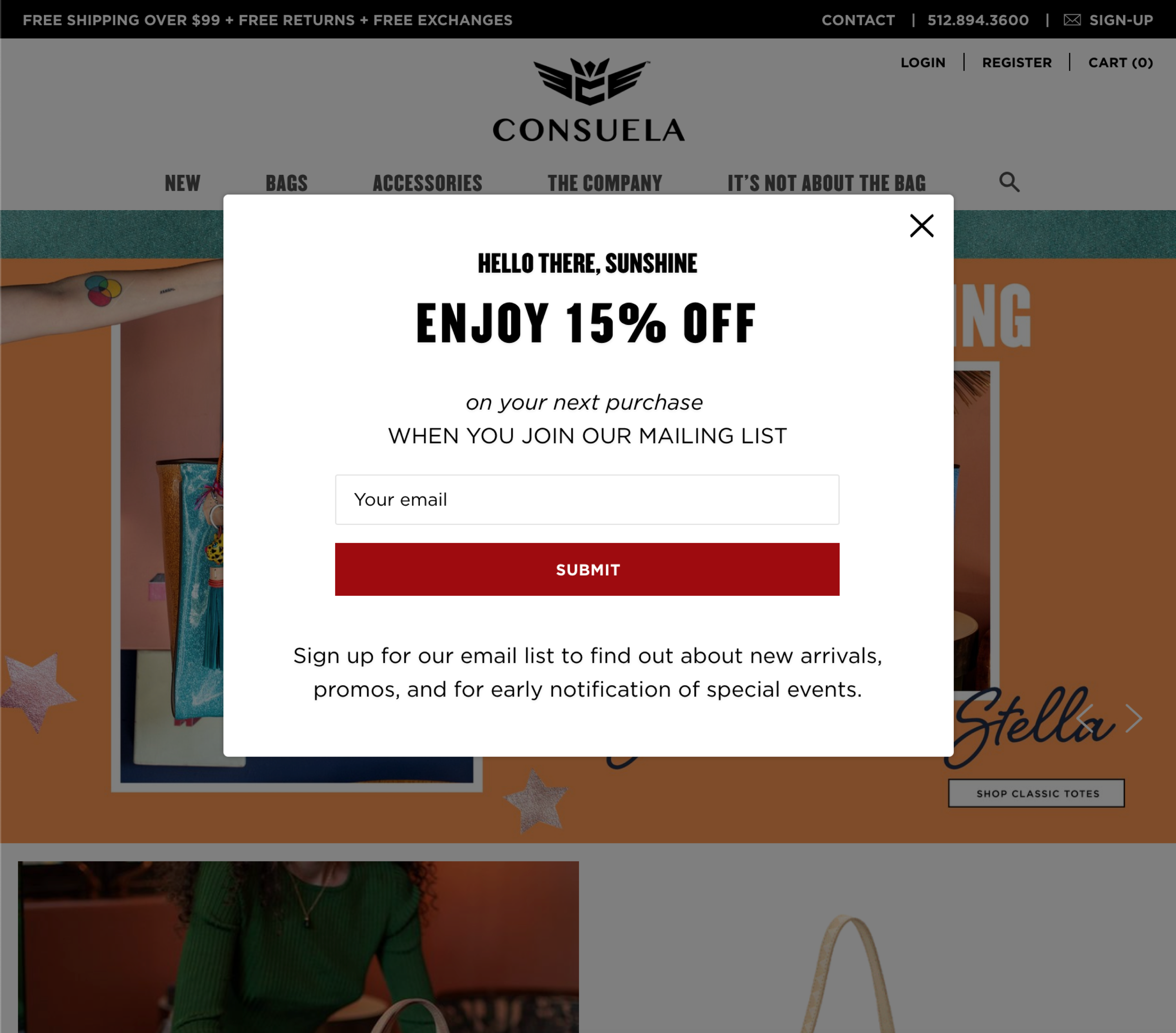
Many sites are now offering 10% or 15% off the shopper’s current or next purchase. These discounts are typically shown to the shopper in a pop-up. However, shoppers have become increasingly used to this. In effect, many have become desensitized—they instinctively close out of the pop-up before reading beyond a single phrase and, most importantly, before entering their email address.
If shoppers are becoming desensitized to this type of messaging and offer, what else can we do to drive more conversions?
The Idea
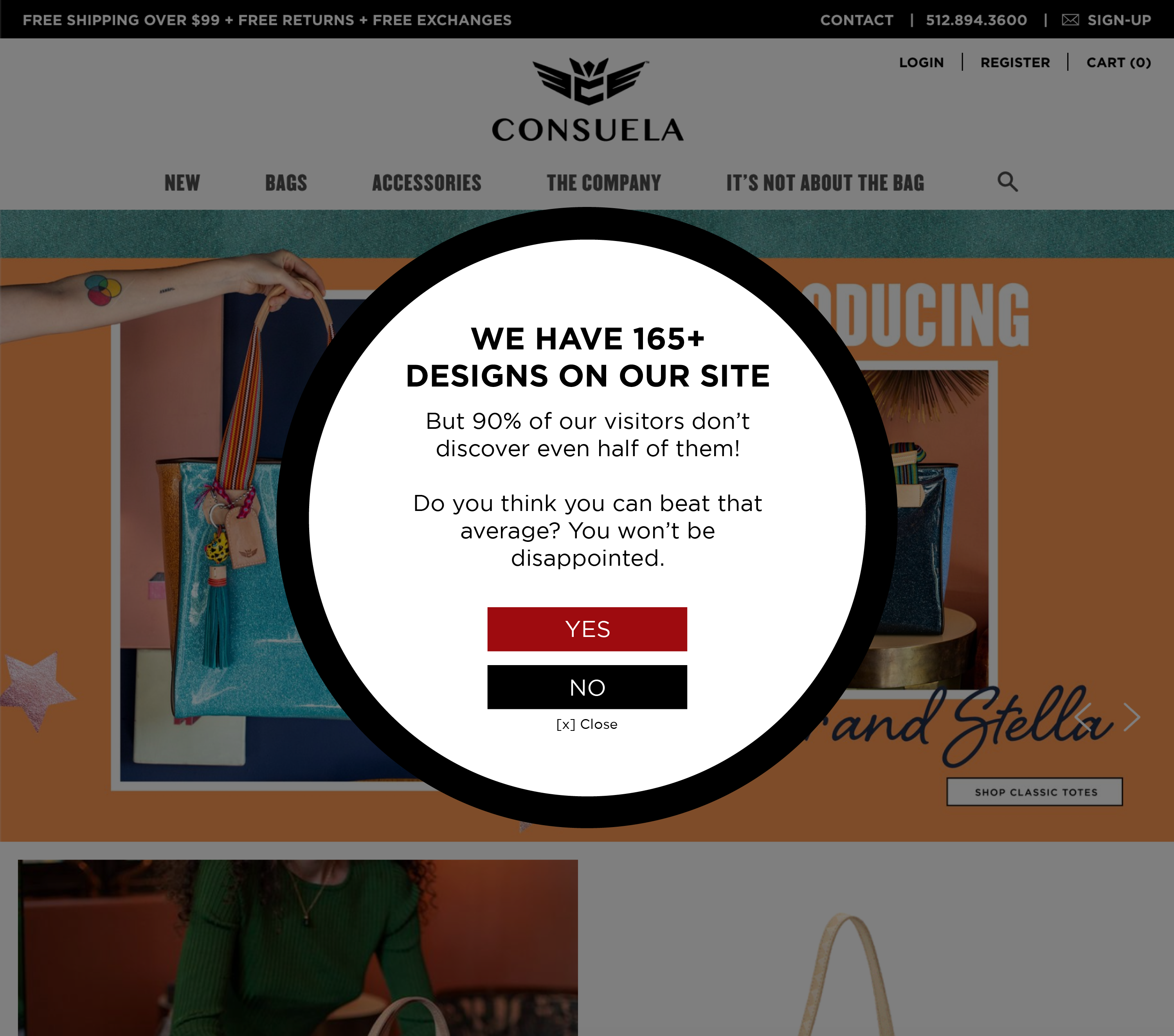
Our idea is simple: challenge your shopper. In this example, we’re using gamification to drive CRO (conversion rates). Note: even though we are using gamification, this is still a Priming technique designed to increase time on site.
Gamification Time on Site Example 1
Here is a discount pop-up that appears on Consuelastyle.com:

And here is the alternate pop-up we’re proposing (consuelastyle.com isn’t a client):

Gamification time on site example 2
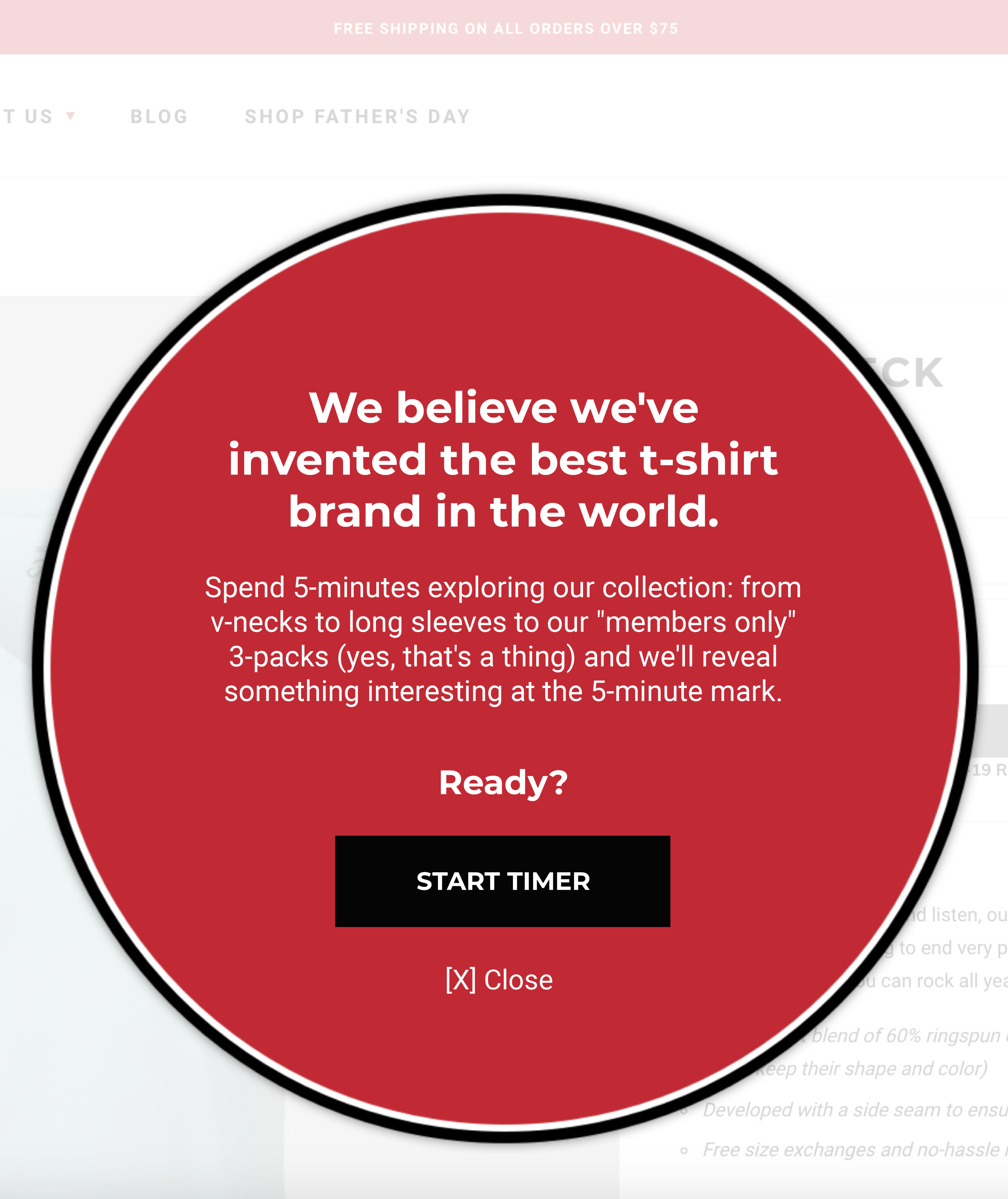
Here is the same idea but using a different copy angle:

The text reads:
We believe we’ve invented the best tee-shirt brand in the world.
Spend 5-minutes exploring our collection: from v-necks to long sleeves to our “members only” 3-packs (yes, that’s a thing) and we’ll reveal something interesting at the 5-minute mark.
Ready? [start timer]
Logic
This idea is perfect for a site where there is an element of discovery: like a jewelry site, or a wallpaper design site, a clothing store, etc. It’s basically a fun way to inspire new visitors to explore more of your stuff.
In our concept, we’re not offering a discount. Instead, we’re using gamification to encourage the shopper to explore the site. After conducting hundreds of split tests there are two things we definitely know about shoppers:
- About 83% of the content on a site is invisible to shoppers. Shoppers don’t see most of your awesome content.
- Shoppers who stay longer, see more pages, discover more things, are more likely to buy.
And that’s why we changed the pop-up from a bribe to a challenge with a 15% discount reward. Reward revealed after the visitor has explored 10 designs.
Are there parts of your shopping experience you can gamify?
8/2/20 Update: Just discovered another example. This one doesn’t use a pop-up. It’s quite inventive:
If You Like This Email Signup Gamification Idea, You’ll Also Like the Following
Product Reviews & Buyer Psychology
Making Long-Form Content Mobile Friendly
Learn more about how we help clients radically improve conversion rates


Comments 5
Excellent idea. I tackled this basic theme of getting more people to find more of my 2000 product choices with a very left-brained solution: by implementing a very robust search framework. It’s very useful, but it took me a long time and really didn’t do more than put a dent in this particular problem. Gamification is a right-brained technique that sends all the positive signals for a brand: It shows you are friendly, playful, and don’t take yourself too seriously, which generates immediate subconscious goodwill.
ReplyI love this idea Preston and it would be a lot of fun to test it out and see if it generates a better response than the small % of emails captured from the discount offer. I actually don’t think it would outperform the discount offer as it’s currently designed because the gamification mechanics didn’t go far enough unless there is some feedback loop after somebody clicks the YES button. You never know though so definitely worth a test. I am intrigued by the idea of pushing that concept to test other emotional triggers. For example, what about working on the emotions of Interest & Admiration by popping their Viva Babes program (screenshot attached)?
https://consuelastyle.com/pages/its-not-about-the-bag/
Would people exposed to that content form a stronger emotional connection with the brand so that even if they didn’t buy during this visit they’d move Consuela into their consideration set for a future handbag purchase? Or, would they actually spend more time on the site and ultimately convert?
What about tapping into the emotions of Romance and Sexual Desire? Which emotional triggers would work best for the first time visitor to the site?
Keep up the good work my friend.
ReplyRishi Rawat
Hi, Shilo. One detail we didn’t mention is something you eluded to. When the user clicks YES and has visited a certain number of product pages (say, for example, 6) that’s when the 15% discount is revealed. Further, the gamification mechanics would work better if there was a non-distracting way for a user who clicked YES to see how close they are to the surprise. That way they know it’s not an endless quest. Testing such ideas using VWO can get complicated which is why I’ll be directly coding such experiences on client sites and setting them as A/B tests. What you are seeing here is the simplest version of the concept.
I also like your Viva Babe idea plus your suggestion about exploring other emotional triggers.
Thanks for adding your thoughts. –Rishi
ReplyLove this idea Rishi. Your newsletter always has original, useful ideas and I read it every week!
ReplyRishi Rawat
Thanks so much, Lisa. That made my day 🙂
Reply