
Blog
Fitting Long-Form Content on a Page
Thursdayboots.com has a clever solution for preventing user distraction.
When users need more context, instead of opening a new page or tab they show the extra content on the page itself.
For example, if a user is scrolling and decides to read more about Highest Quality. Honest Prices. promise (screenshot below) …
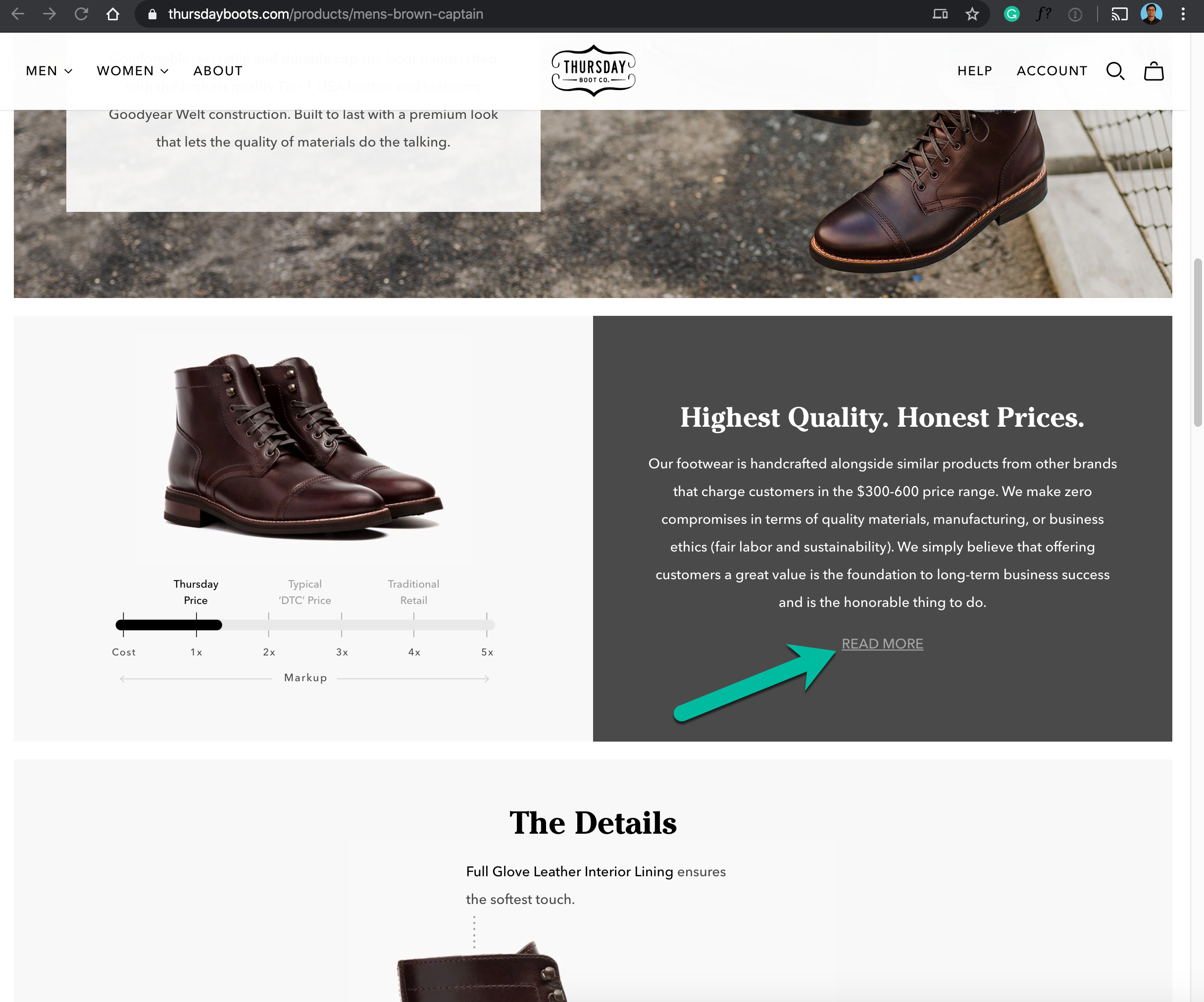
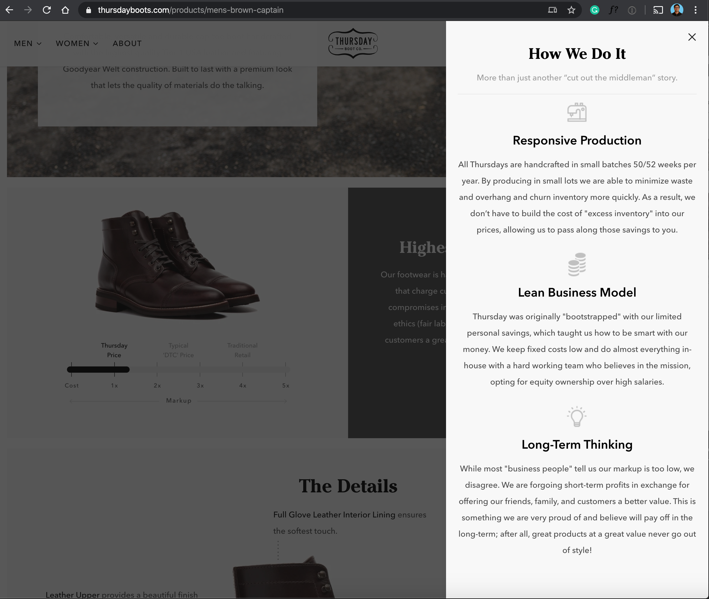
… instead of taking the user to a new page (risky because shoppers are easily distracted) Thursday shows a slide-out overlay.
This is especially useful for lengthy content. With a slide-out design, the user can scroll a long column of text while the background page remains fixed:
And you can apply this same strategy to the mobile version of the page:
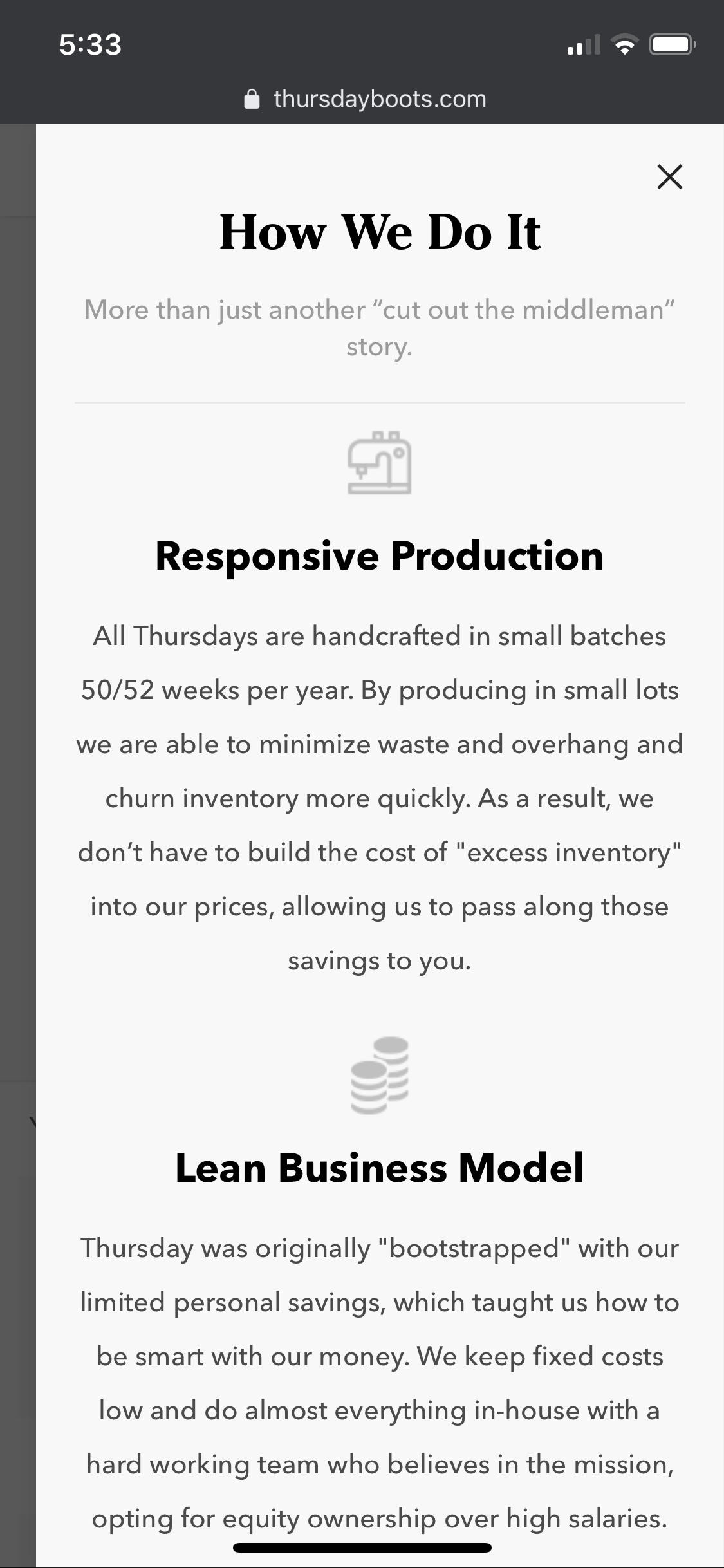
One nice feature of the mobile slide-out is the little gap on the left margin which acts as a visual cue. It lets users know clicking X (the top right corner) will return them to where they started. Visual cues matter.


Comments 1
I love the phrasing “Highest Quality. Honest Prices.” That is cool!!
Reply